weekly SiblingChris' 52 in 2014 (Week 21 and 22 added)

Messages
1,353
Name
Chris
Edit My Images
Yes
Last edited:
So I may need some help on this one right from the start

I've been playing with the colour balance of this for what seems like an age, but I just can't quite seem to get it right - there seems to me to be some tad blue-ness to the highlights I am struggling to get right, so any suggestions welcome


Week 1 - Line/Linear 1 by Sibling Chris, on Flickr
 
Last edited:
I like the colours and composition, its a tad (and only a tad) dark IMO. I can't see any blue, what software are you using? In lightroom 5 if there are any colours I don't like in the image I drag the saturation down in the HSL tab. In my photo this week I completely desaturated green to disguise a few fits of stay grass :D
 
I like the colours and composition, its a tad (and only a tad) dark IMO. I can't see any blue, what software are you using? In lightroom 5 if there are any colours I don't like in the image I drag the saturation down in the HSL tab. In my photo this week I completely desaturated green to disguise a few fits of stay grass :D

That's exactly what I did, but maybe I'd been staring at it so long I convinced myself it still wasn't quite right :)
 
Like what you've attempted, also looks a tad dark to me,,,,'
 
A nice concept, but personally the focus in the middle of the shot doesn't do it for me; to really draw my eye in I think it should be towards the end on the line. An increase in blacks/contrast would help give the image more impact IMO. Still a lovely image though, I like the framing.
 
Hi, cofffeeeee :)

On theme and I can see a hint of blue. You have some nice textures and decent detail.

Crit, not keen on the focus/shallow DOF as I'd like the lower one in focus and then for the focus to fall off.

Week 1 done. Not may left :exit:
 
Hi, does seem to be a tad blue but nothing to bad could do with a little more light though
 
Thanks all for taking time to comment,

Ok so one vote for shallower DoF, one for wider DoF, one for focus point further back and one for focus point further forward? I guess you can't please everyone all of the time ;)
 
Hey Chris.. good to see you still in :)

Line - Well you do have a good variety of comments, you have caught some great detail in them beans... i'm not going to confuse things even more by mentioning the crop :naughty: :exit:

Cheers DK, I guess you are talking about the top needing a little off rather than showing a partial bean? I only actually cropped the width to remove some of the black background area

So I tweaked the thing in Flickr, warmed and brightened it a little and cropped ever so slightly at the top

How's this now? Personally I think it's definitely better...


Week 1 - Line/Linear 2
by Sibling Chris, on Flickr
 
Like the reprocessed image with higher contrast better. Thanks for telling us they are coffee beans - I thought they were figs when I first saw them.
 
Nicely done Chris....I like the dark background as is.....any lighter and the image may not work as well.....would be tempted to try and dodge the highlights as a means to increase contast...just a thought
 
Possibly a wider crop and a different angle for me Chris :)
 
Second edit looks the best. Maybe the back ground could have been just a touch lighter to enable us to see some more of the texture of the surface?
Good shot though and I like the subject. :)
 
Well done Chris, have to say the edit, (minor as it is) has made a massive improvement, lighter, brighter, better colour and the crop of the half beans works so much better!
 
Hi Chris...glad to see you back for another year of torture fun filled weekends :D

Liking those beans but then I'm partial to close up stuff......think Andy mentioned the DOF.... nowt wrong with the way you have done it but I'd also prefer the foremost bean in focus with fall-off to the end of the shot...nicely re-edited with the tones as well (y)
 
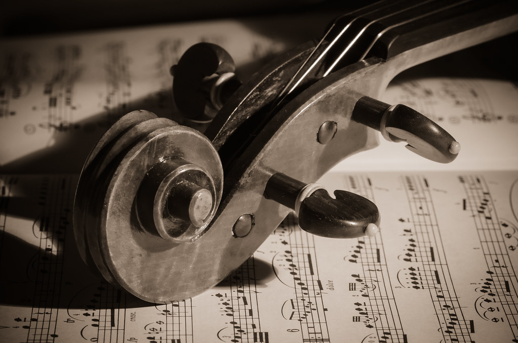
Well I left it till the 11th hour this week. I knew what I wanted to do and had been considering different composition and lighting options, finally took inspiration from another similar shot on flickr
Used my new sigma 105mm macro lens, very happy with it so far. Shopping around for speedlights now...will this obsession ever end? ;)


Week 2 - Play
by Sibling Chris, on Flickr
 
Nice light - nice composition, greater DOF that I would have maybe expeceted (plenty for the shot BTW).

Well processed too - fits the image perectly.
 
Play liking the vintage look to this one and the detail, focus and textures work well.

Uber crit would be the light on the strings.

Cheers.
 
Really like that Chris. The sheet music in the background makes all the difference.
Should have done something like this for my 'play' shot. God knows we've enough instruments belonging to my eldest daughter!
 
Hi Chris, catching up with both images so far:

Line - an original idea and I like the colours of the coffee beans and the low viewpoint. I would prefer to have seen the nearest bean in focus but that's just a personal choice.
Play - fits the theme perfectly and I really like the warm sepia tones and the vintage effect. The music sheets were a good choice too.

Looking forward to following your thread (y)
 
Another (y) from me Chris, most things been covered above, but I will say, I like the light on the strings :)
 
Back
Top