
You are using an out of date browser. It may not display this or other websites correctly.
You should upgrade or use an alternative browser.
You should upgrade or use an alternative browser.
weekly Viv1969's Try at 52....The Sequel....2016 Week 50, 51 & 52.... And finished
- Thread starter viv1969
- Start date
- Messages
- 4,155
- Name
- Paul
- Edit My Images
- Yes
Hi Ruth - I'm loving that Vast shot. I really like the compression you've achieved at that focal length (at least it looks longer than "normal"). Nice layers in the background and just super shadows and light throughout.
The only thing that bugs slightly - and it really is minor - is the lack of separation between the tips of the dunes in the midground and the rearmost mountains... just a squeeze more space between them vertically would help for me. Still, a lovely image!")
The only thing that bugs slightly - and it really is minor - is the lack of separation between the tips of the dunes in the midground and the rearmost mountains... just a squeeze more space between them vertically would help for me. Still, a lovely image!
OP
- Messages
- 29,452
- Name
- Bat-Frog
- Edit My Images
- No
Love "Vast" Ruth, great image
Phil
That is beautiful Ruth - those lovely soft flowing lines of the dunes with fg interest in the form of those shrubs and all set against that pale blue bg. Excellent.
That's lovely. Like the mix of shadows/light in the foreground.
That really is a WOW shot Ruth ...that must be a view that you'll never forget.
Vast - Wonderful shot")
Wow...that is a jaw dropping scene and shot, Ruth. What an experience! The shadows and lines are mesmerising. I love the texture of the sand up close, too - I'd almost like a tiny bit more in the foreground. Gorgeous
Horizontal - great shot I like the shape of the glass plant holder against the straight lines and the subtle lighting.
Vast - Wow what a fantastic view. the shapes and shadows of the dunes are great
I like the blues and the shapes of the dunes
Hi Ruth - I'm loving that Vast shot. I really like the compression you've achieved at that focal length (at least it looks longer than "normal"). Nice layers in the background and just super shadows and light throughout.
The only thing that bugs slightly - and it really is minor - is the lack of separation between the tips of the dunes in the midground and the rearmost mountains... just a squeeze more space between them vertically would help for me. Still, a lovely image!
Thank to everyone for their great comments.
I'm very sorry I'm behind on commenting myself.
I'm struggling a bit with "mojo" at the minute, but determined to get through it.
Once again...huge thanks.
OP
- Messages
- 29,452
- Name
- Bat-Frog
- Edit My Images
- No
When I saw these I thought, blimey, It must have been a rough night to wind up leaving your jeans in the street.
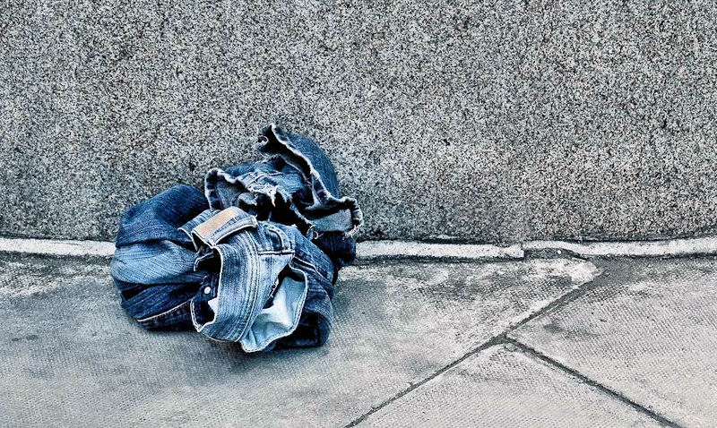
And then I happened across a gate which is sorely in need of a new lick of paint which also seemed to fit the bill.
(No saturation boost on this, the paint really is THAT turquoise).

And then I happened across a gate which is sorely in need of a new lick of paint which also seemed to fit the bill.
(No saturation boost on this, the paint really is THAT turquoise).
D
Deleted member 78683
Guest
Hi Ruth. There's a story behind the denim shot but I too prefer the flaky paint with it's delightful texture and shadows and colour.
- Messages
- 1,612
- Name
- Steve
- Edit My Images
- Yes
Would be interesting to know why someone left a pair of jeans just laying around, also got me thinking was it you that found an shoe laying around for the abandoned theme?
Paintwork one is great, have you taken the colour out of the wood or was it bleached like that? Looks good in contrast to the paint whichever way.
Paintwork one is great, have you taken the colour out of the wood or was it bleached like that? Looks good in contrast to the paint whichever way.
OP
- Messages
- 29,452
- Name
- Bat-Frog
- Edit My Images
- No
1st rough, that's the ironing done then. ( roughly speaking)
2nd rough, nice colour
( and rough texture too)
Cheers Chris
I did wonder quite what was happening with the jeans ....but now we'll never know
I love the paintwork one...all that lovely flaky texture and colour ....spot on for the theme and a super shot.
Thanks Susie. Those jeans were so random
Hi Ruth. There's a story behind the denim shot but I too prefer the flaky paint with it's delightful texture and shadows and colour.
Thanks Carl.
I pretty much knew the paint was the better shot for the theme.
Just couldn't resist the jeans!
!
Would be interesting to know why someone left a pair of jeans just laying around, also got me thinking was it you that found an shoe laying around for the abandoned theme?
Paintwork one is great, have you taken the colour out of the wood or was it bleached like that? Looks good in contrast to the paint whichever way.
Thanks for looking Steve.
Yes...I photographed a single shoe on the high street for Abandoned.
No desaturation of the wood in shot 2.
The age of the wood, and the colour of the flaking paint was what caught my eye.
OP
- Messages
- 29,452
- Name
- Bat-Frog
- Edit My Images
- No
has to be the gate for me love the colour and the texture of the paint against the greyish wood works well
Hi Viv.
It has to be the first image for Rough. It leaves the viewer wondering / imagining a story, though I do have to agree that the other shot has great texture, colours and sharpness.
Both roughs are good, the denim, well we have all had those nights out...haven't we? And the old gate, great colour and texture.
Rough - I like them both as others have said the first gets you thinking about the story behind it, and the second has good colour, contrast and texture
Oh my...not more abandoned clothing - where do you find them?! Living far too sheltered a life here obviouslyI love the colour of that turquoise paint - it really leaps off the page. Great texture, too.
Hey Ruth
amazing dunes, amazing colour contrast.
and I love that flaking paint.
Thanks for all of your comments everyone.
I'm always quite bemused by random abandoned clothing...how do people not notice? Or maybe they do!

The peeling paint was a good find though.
I was going to use an image of the whole gate, but it didn't show the roughness so well.
OP
- Messages
- 29,452
- Name
- Bat-Frog
- Edit My Images
- No
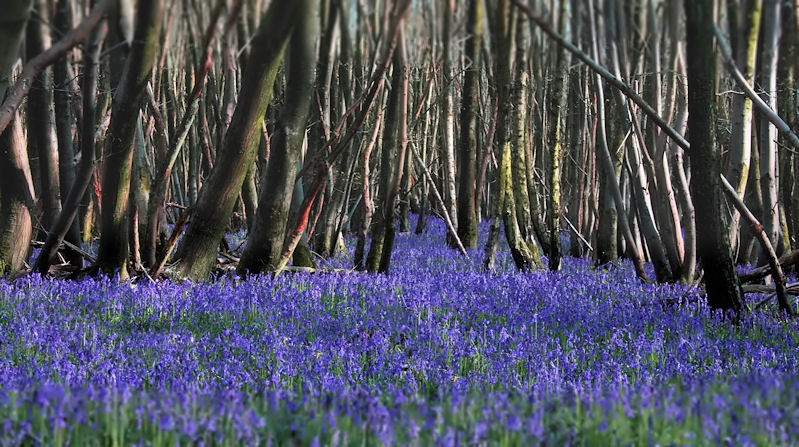
I'm trying to resist the temptation of posting my second bluebell shot...
Thanks Em.
They're lovely when you see so many aren't they?
Pictures just can't do them justice at all.
They stretch as far as you can see in all directions.
The blur top and bottom is done in post.
It's a Marmite thing, I know, but personally I find it pulls your attention right into the middle of the scene.
D
Deleted member 78683
Guest
That's beautiful Ruth - I particularly like the way the bluebells meander in and out of the trees into the far distance. Amazing colour
OP
- Messages
- 29,452
- Name
- Bat-Frog
- Edit My Images
- No
wow ... as bluebell woods go, that's a stonker. Love the bleak barren looking tree uprights and colour contrast.
Thanks David.
I try to go and see them every year and this is by far the most I've ever seen there, and the brightest colour.
That's beautiful Ruth - I particularly like the way the bluebells meander in and out of the trees into the far distance. Amazing colour
Thank you Carl.
They really do stretch as far as the eye can see.
Covered - I don't think I could have resisted either, not enough bluebells in my nearest woods. I like the colour showing through the gaps in the trees into the distance.
Appreciate your comment minx....thank you.
I like the OoF effect, combined with the position of the trees it gives a kind of tunnel effect.
Thanks Tim, that what I thought too; at least it's what I wanted to acheive
- Messages
- 13,393
- Edit My Images
- Yes
Hey Ruth
Rough - Althopugh I love flaking paint and old wood, the below is a great example, with real nice detail, but for me there is something about the jeans image, maybe it's the curved wall bottom and converging slab joints, or maybe just the colours/tone, either way, really like that
Covered - Spring woodlands perfect for the theme, although I would like to see more of the bluebells there is some lovely light on that mass of tangled tree trunks
- Messages
- 4,523
- Name
- Mark Gameson
- Edit My Images
- Yes
Hi Ruth
Rough really like the details in the flaking paint and timber but the image of the jeans leaves so many questions and I think that's why I like it slightly more.
Covered - Lovely image a real sign the better weather is on its way* lovely lighting too
* I can give no guarantee of this
Rough really like the details in the flaking paint and timber but the image of the jeans leaves so many questions and I think that's why I like it slightly more.
Covered - Lovely image a real sign the better weather is on its way* lovely lighting too
* I can give no guarantee of this
- Messages
- 677
- Name
- Sheylara
- Edit My Images
- Yes
Vast - That’s an epic shot, something very cinematic and grand about it!
Rough - Haha, great find for the theme, really liking it (the jeans)! I like the turquoise paint, too. Lovely piece of abstract art there!
Covered - Bluebells heaven! It seems to go on for miles beyond the tree trunks. Really interesting shot. The tree trunks look like they’re moving, wading through a sea of bluebells.
OP
- Messages
- 29,452
- Name
- Bat-Frog
- Edit My Images
- No
I like how they lead you further into the trees. Now I know what those blue flowers are that I sometimes pass on the school run
They do seem to be everywhere this year.
Thanks for looking
Hey Ruth
Rough - Althopugh I love flaking paint and old wood, the below is a great example, with real nice detail, but for me there is something about the jeans image, maybe it's the curved wall bottom and converging slab joints, or maybe just the colours/tone, either way, really like that
Covered - Spring woodlands perfect for the theme, although I would like to see more of the bluebells there is some lovely light on that mass of tangled tree trunks
Ta very much. I don't think pictures can do the bluebells justice tbh.
Hi Ruth
Rough really like the details in the flaking paint and timber but the image of the jeans leaves so many questions and I think that's why I like it slightly more.
Covered - Lovely image a real sign the better weather is on its way* lovely lighting too
* I can give no guarantee of this
Thanks Mark.
Your weather prediction seems to be on the money.
Ruth, the gate and that turquoise is great. I bet it would look great printed A2 size
Thanks Chris, much appreciated!
That forest floor really is Covered in Bluebells Ruth ....love those twisty tree trunks too.
Tahnks Susie.
It's a shame there wasn't a little more foliage on the trees. I bet there is after the weather we've had this week!
Vast - That’s an epic shot, something very cinematic and grand about it!
Rough - Haha, great find for the theme, really liking it (the jeans)! I like the turquoise paint, too. Lovely piece of abstract art there!
Covered - Bluebells heaven! It seems to go on for miles beyond the tree trunks. Really interesting shot. The tree trunks look like they’re moving, wading through a sea of bluebells.
Thanks Sheylara....The bluebells did just go on and on.
Covered - you can't have to many bluebells - beautiful
I totally agree!!
Thanks for commenting


OP
- Messages
- 29,452
- Name
- Bat-Frog
- Edit My Images
- No
The first one Ruth, truely excellent imagery
Though I do also like the swirliness of the second one.
Thank you Tim.
It's bugging me a bit that the "zip" is swerving slightly to the left as it runs down. Grrr.

- Messages
- 11,218
- Name
- Tim
- Edit My Images
- Yes
But that's what zips do IRL, they've almost never straight.Thank you Tim.
It's bugging me a bit that the "zip" is swerving slightly to the left as it runs down. Grrr.
- Messages
- 7,412
- Name
- susie
- Edit My Images
- Yes
Must admit I'd like it straight and centred Ruth but that's just my ocd. Excellent idea for the theme, I did buy crayons ages ago to do something like this, but I think the grandsons have demolished them. I love those bright vibrant colours, perfect choice for the theme, it looks fabulous full screen on the iPad
OP
- Messages
- 29,452
- Name
- Bat-Frog
- Edit My Images
- No
Thanks Susie.Must admit I'd like it straight and centred Ruth but that's just my ocd. Excellent idea for the theme, I did buy crayons ages ago to do something like this, but I think the grandsons have demolished them. I love those bright vibrant colours, perfect choice for the theme, it looks fabulous full screen on the iPad
The first version was a square crop and centred...just didn't work for me.
The slightly skewiff zip section is bugging me though
D
Deleted member 78683
Guest
I'm plumping for #2 Ruth - more unusual angle and all those hexagonal and circular shapes crammed together and vying for space. Very Colourful.