weekly Viv1969's Try at 52....The Sequel....2016 Week 50, 51 & 52.... And finished

Really like that Ruth great composition and some lovely lighting.

Thanks Mark....Very much appreciated.

Good take on the theme, added interest that you got the same author on the Kindle as on the book. Perhaps could do with a little shadow, my brain can't decide if it is vertical or horizontal even though it must be lying down.

Thanks Chris. There's no vertical BG here. You're right.....they were both laying on the floor.
I'm only sorry I didn;t have the same book on the Kindle, but I have no duplicated books. If I have the book, it ain't on the Kindle :)
 
nice idea though it does need a bit of grounding looks a little floaty to me could be my monitor i suppose,
i have a kindle not sure that I prefer a proper book though it seems a little odd to me
 
I like the composition and sharp details; the black bg somehow goes well with the obvious drama contained within the pages of Lee Child novels. :clap:
 
technology - I like that both books have the same author, and the set up. Good shot
 
Beautiful image for effort and really like your take on 'technology'.
 
Technology is such a good photo, Ruth .Liking the exposure and framing.
 
Very nice ... good placement, lighting, no reflections. (y)
 
'sfunny, we were just talking about Lee Childs last night in 'tpub (about how redundancy from Granada was his motivation to start writing).
Once again, a great strong black background, well composed and spot on theme. As others have already said, well lit and (y) on not getting any unwanted glare.
 
Like the idea for Technology. Nice composition, well lit and the black background works well.

Got to ask ruth which do you prefer kindle or book, nice take BTW

nice idea though it does need a bit of grounding looks a little floaty to me could be my monitor i suppose,
i have a kindle not sure that I prefer a proper book though it seems a little odd to me

Nicely shot Ruth... as others have said, good lighting on the kindle and no glare from the book. I agree with Allan above re: floaty background but sometimes that's how it comes out! Well done (y)

I like the composition and sharp details; the black bg somehow goes well with the obvious drama contained within the pages of Lee Child novels. :clap:

Hi Ruth ...that's an excellent idea for the theme, it works really well, I like this one a lot, simple but effective :clap:

A nice take on the theme Ruth and beautifully composed and lit. I love a real book...but my Kindle is a lifesaver when my husband needs to sleep!

technology - I like that both books have the same author, and the set up. Good shot

One of my favourite words is juxtaposition, very apt here. Nice deep blacks.

Cheers.

Beautiful image for effort and really like your take on 'technology'.

Hey Ruth :)

Effort - Wow !!! love this image, well images, a good quick story told, wonderful detail brought out with great lighting :clap:

Technology - A perfect combination, like that you have chosen the same author on each element :)

Technology is such a good photo, Ruth .Liking the exposure and framing.

Very nice ... good placement, lighting, no reflections. (y)

'sfunny, we were just talking about Lee Childs last night in 'tpub (about how redundancy from Granada was his motivation to start writing).
Once again, a great strong black background, well composed and spot on theme. As others have already said, well lit and (y) on not getting any unwanted glare.

Thank you very very much everyone for your lovely comments.

I know I've been a lazy moo this week with regard to commenting and replying, so note to self...."MUST TRY HARDER"!
 
So onto week 15.....Horizontal.
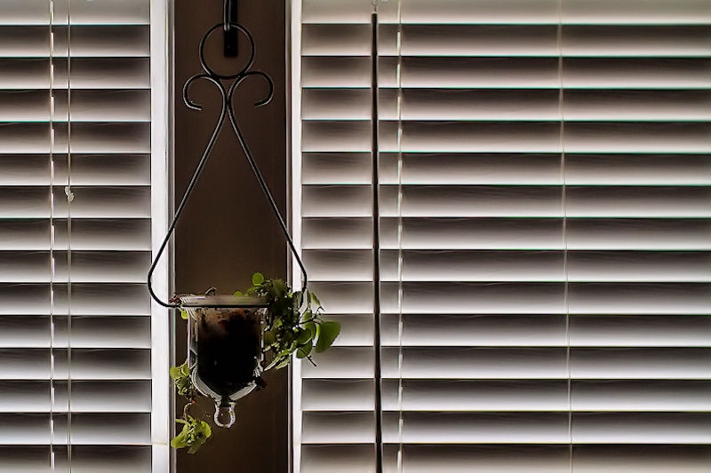
I knew there'd be a few "blind" pictures this week, but this is what popped into my mind when I saw the theme, so I stuck with it.

 
Hi Ruth I like that the composition of the 2 blinds is great I love the subtle lighting and colours
 
Hi Ruth. I like the way the subdued lighting from the blinds picks out the edges of the glass plant holder in particular. Very nicely composed - elegant as Paul says. :clap:
 
What a good idea for Technology, Ruth. Simple but very effective, and well captured against a clean background with even light and no glare. Very nice indeed :clap:

Horizontal is really well captured and perfectly composed with the two sets of blinds and that off-centre hanging plant pot that balances everything and breaks up the lines. The light is lovely too, and Paul has the right description for this one, in "elegant" (y)
 
Personal - Interesting subject! And the fact that you’ve done five prints instead of just one makes it five-fold interesting. Well done. :p

Effort - Aww, wow, great documentary of a hatching chick. They do put in a lot of effort to be born, unlike human babies! Love the last shot of it “walking away” and the marks inside the shell. That’s just brilliant storytelling! :)

Technology - I like that - two different technological productions of the same book.

Horizontal - Lovely lines and colours. The plant looks really nice between the blinds. I love how you’ve composed the shot and lit it.
 
Hi Ruth ...great minds think alike :) I like the composition with the two blinds ...it works really well.

Thanks Susie. I had a fairly busy weekend, and I knew I wouldn't get much of a chance during the week.

Hi Ruth I like that the composition of the 2 blinds is great I love the subtle lighting and colours

tHANKS mARK, MUCH APPRECIATED :)

I like that a lot, Ruth. I also really like that "plant pot" you're using! The lighting from the blinds either side has worked really well on that as well as the obvious louvre look on the blinds themselves. A very elegant image :clap:

Thanks Paul.
The little pot, whilst looking cute, is next to useless for growing anything in for long....it has no drainage.

Hi Ruth. I like the way the subdued lighting from the blinds picks out the edges of the glass plant holder in particular. Very nicely composed - elegant as Paul says. :clap:

Cheers Carl. :)

Love the composition of this one, Ruth. The unusual shape of the hanging plant just breaks up the repetitive straight lines nicely.

Many thanks Stan. :)

Really nice colour and lighting, ...artistic!

Thanks Clive! :)

Oooo love that composition again Ruth, the light is so nice and subtle too, what a lovely aspect (y)

(the long bar thing gets on my nerves though, but nowt you can do with that, well quickly anyway :D so ignoring that)

That pole, when twisted, opens the slats of the blinds. The cords raise or lower.
Damn thing just won't hang right :LOL:

What a good idea for Technology, Ruth. Simple but very effective, and well captured against a clean background with even light and no glare. Very nice indeed :clap:

Horizontal is really well captured and perfectly composed with the two sets of blinds and that off-centre hanging plant pot that balances everything and breaks up the lines. The light is lovely too, and Paul has the right description for this one, in "elegant" (y)

Thank you Andrea....very much appreciate your comments :)

Personal - Interesting subject! And the fact that you’ve done five prints instead of just one makes it five-fold interesting. Well done. :p

Effort - Aww, wow, great documentary of a hatching chick. They do put in a lot of effort to be born, unlike human babies! Love the last shot of it “walking away” and the marks inside the shell. That’s just brilliant storytelling! :)

Technology - I like that - two different technological productions of the same book.

Horizontal - Lovely lines and colours. The plant looks really nice between the blinds. I love how you’ve composed the shot and lit it.

Wow, thanks for catching up Sheylara.....Glad you're liking the thread :)
 
Like the off-centredness and overall House & Garden cuteness. (y)
 
Like the off-centredness and overall House & Garden cuteness. (y)

Horizontal - Lovely shot - very well composed and certainly on theme:clap:

That's a very classy shot - beautifully composed. I agree with David - it could be straight off the pages of an upmarket lifestyle magazine.

Hey Ruth.
It fits the theme and has an added extra to enhance interest. :)

Many thanks all.
Been struggling this week, both with time and theme.
Forgive my shabbiness in responding!
 
Week 16 - Vast

Been racking my brain all week and have come up empty-handed, so my apologies but I'm playing an archive placeholder from 2011.
Death Valley Dunes.

 
That is beautiful Ruth - those lovely soft flowing lines of the dunes with fg interest in the form of those shrubs and all set against that pale blue bg. Excellent.
 
Back
Top