weekly WyX's 2013 Photo52

Both angle and rustic much better this time around, big improvement, well done. :)
 
Hi Wuyan

Angles - #1 of the single flower works better for the theme but agree that #2 is a better shot - nicely exposed

Rustic - #1 did not give me any real feel for the theme , partic as you said that it was from ikea :D. But i do like the 'face' that you have mananged to create. #2 fits the theme but i am not a fan of milky water shots so it kind of does nothing for me :shrug: The same shot with fast moving water would be more to my taste, possibly cropping the greenery from the right. Good pov tho
 
Quick catch up, I'm afraid :D

Quite like Angles. Well exposed and nice detail.

Rustic. Interesting interpretation and good detail.

Cheers.
 
Hi there :wave:

Angle...can see what you were aiming for but the reshoot is much better....lovely focus on the petals , stunning blue sky (y)

Rustic.....hmmmm...good thinking re going for a side on view but think the nails needed to be not quite so new....the water image though is great....get a real sense of speed of the water (y)
 
Direction: the Eiffell Tower shot is very nice; at first I didn;t think it was on theme, but the fountain makes it so. Tacky is very, maybe even more so shot through glass! Value, yes, the "product shot" approach doesn't quite work here, and the composition isn't interesting enough otherwise. I had similar difficulty with a shot of a film.

(On your question: that's not a film in demand in the filmy section, and I suspect not as good (or no better than) the Agfa Vista 200 ISO colour film we're getting in Poundland these days. So yes, someone could use it, but with postage at £2.60 I'm not sure you'd get many takers.)

Greed: that's a shot of bits of two banks. I don't see the compositional elements that make it very interesting.

Angle: the theme connection is there, if not so obvious (better in the first). The sky colour and the flower are lovely; best shot on the page by a mile!

Rustic: I think I prefer your second one, which has more interest beyond just texture. Is this you getting your NDs out? I don't like the over-smooth milky effect, but I think this one works fine.

Thanks for your feedback. The film has already been sold for £1 each :(

The greed shot was me really stuck on theme. I wonder if a more headon shot works better in this case.

For Rustic, I was going for the shadow texture over the milky water.

Both angle and rustic much better this time around, big improvement, well done. :)

Many thanks!

Hi Wuyan

Angles - #1 of the single flower works better for the theme but agree that #2 is a better shot - nicely exposed

Rustic - #1 did not give me any real feel for the theme , partic as you said that it was from ikea :D. But i do like the 'face' that you have mananged to create. #2 fits the theme but i am not a fan of milky water shots so it kind of does nothing for me :shrug: The same shot with fast moving water would be more to my taste, possibly cropping the greenery from the right. Good pov tho

I really should have bought a flashgun with me, the sky was much more interesting when I did shot 1.

Quick catch up, I'm afraid :D

Quite like Angles. Well exposed and nice detail.

Rustic. Interesting interpretation and good detail.

Cheers.

Cheers.

Hi there :wave:

Angle...can see what you were aiming for but the reshoot is much better....lovely focus on the petals , stunning blue sky (y)

Rustic.....hmmmm...good thinking re going for a side on view but think the nails needed to be not quite so new....the water image though is great....get a real sense of speed of the water (y)
haha, I guess if I had found and used a rusted nail, it would be much more on theme for Rustic shot 1. Thanks for your comments.


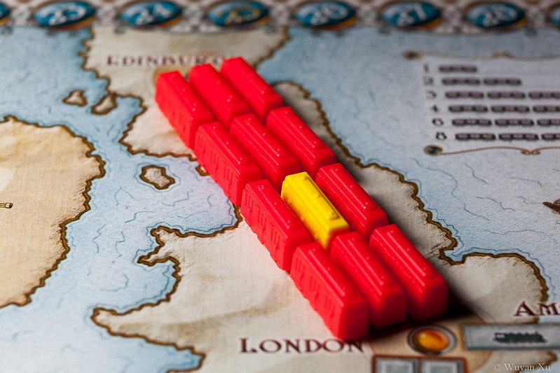
"Kind" is coming, "one of a kind". Was walking the street for actual kind emotions, but unfortunately didn't find any, so a setup shot will have to do.
 
Week 18: Kind

One of a Kind. Was going for the emotional image, but after a bit of wondering about in Luton, there isn't any. So had to do a setup shot on the theme: one of a kind. This is using boardgame Ticket to Ride, totally recommend getting and playing it. :)


52 - 17 - Kind, one of by wuyanxu, on Flickr
 
Good take on the theme.

Sharp enough subject, nice dof, had to think a little about the title though :)
 
Nice and simple, works well for me.

Godo thing you didn't go for another train based boardgame, "Train", that wouldn't have fit the theme quite so well...
 
Good take on the theme.

Sharp enough subject, nice dof, had to think a little about the title though :)

Thanks, the title was yoda talk :D

Nice and simple, works well for me.

Godo thing you didn't go for another train based boardgame, "Train", that wouldn't have fit the theme quite so well...

Ticket to Ride is great :D not very related to trains, more joining routes, but it's a fantastic boardgame, definitely recommend it.
 
week 19 Vertical + Reshoot of Work

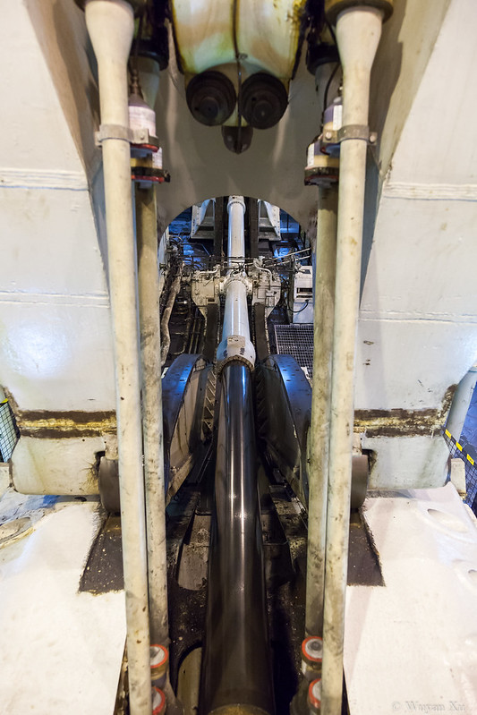
Went on board HMS Illustrious on Sunday, so decided to do all this week's photo on that. The vertical plane lift fitted the subject.


52 - 19 - Vertical lift by wuyanxu, on Flickr

But then, I personally like the following one better. However, it's not as fitting to the week's theme.


Take off by wuyanxu, on Flickr


Reshoot:

Work was seriously lacking in my previous attempt. I was stuck because I can't really take photos at were I work. But this one sums it up pretty well.


Merlin by wuyanxu, on Flickr
 
Hi Wuyan :)

Vertical - I really like the take off ramp myself, I'd be tempted to clone out a few bits with some sky and make it more of a letterbox shape crop

The 1st shot is a interesting but I can't picture what it is

Re-Shoot - I prefer this much more than your first shot, little wider to the left would be good :)
 
Hi
Kind - ok for theme. Good colours of trains but b/g looks a bit too much oof for me,

Vertical - #2 for me cos of low pov and symmetry and colour, Would be better without the line of flags.

Reshoot of Work - good focus - like the nose emblem. Nice treatment of a grey scene. agree with DK about the crop.
 
Hi ya


love the 2nd image for Vertical...Top Gun sprang to mind when I sw it...nice low POV , some detail in the sky & great that the painted lines disappear out of frame at the same point (y)

Kind..one of a...simple , strong colors , nicely laid out...yup , works for me :)

Work....coooooo , what to you do for a living ??
 
I also prefer the second shot for vertical (although I see what you mean about it being less on theme then the other).
Like DK I would be tempted to clone out a few bits (the city & the people) leaving just the ramp against the sky, I think it would have even more impact that way.
 
Hi Wuyan :)

Vertical - I really like the take off ramp myself, I'd be tempted to clone out a few bits with some sky and make it more of a letterbox shape crop

The 1st shot is a interesting but I can't picture what it is

Re-Shoot - I prefer this much more than your first shot, little wider to the left would be good :)

Thanks. The first shot is of the vertical lift they use on the aircraft carriers. It's one of the main arm surrounding the hydrophilic. I see what you mean, it is quite hard to make out.

I think if I have and know how to photoshop, for the ramp shot I'd have removed the bit of rope going across. it's just hideous.


Vertical #2 for me. Nice low perspective and good symmetry.

Cheers.

Thanks, that was what I was going for. (y)


Hi
Kind - ok for theme. Good colours of trains but b/g looks a bit too much oof for me,

Vertical - #2 for me cos of low pov and symmetry and colour, Would be better without the line of flags.

Reshoot of Work - good focus - like the nose emblem. Nice treatment of a grey scene. agree with DK about the crop.

I thought people like tightly cropped aircraft shots? I'll shoot wider next time, thanks. (y)


Hi ya


love the 2nd image for Vertical...Top Gun sprang to mind when I sw it...nice low POV , some detail in the sky & great that the painted lines disappear out of frame at the same point (y)

Kind..one of a...simple , strong colors , nicely laid out...yup , works for me :)

Work....coooooo , what to you do for a living ??

Thanks for the kind comments, was there quite a while lining up with my UWA.

I do defence electronics, so it's kiiiiind of related. :thinking:


I also prefer the second shot for vertical (although I see what you mean about it being less on theme then the other).
Like DK I would be tempted to clone out a few bits (the city & the people) leaving just the ramp against the sky, I think it would have even more impact that way.

Thanks for your reply. I really need to learn photoshop...... :bonk:
 
Yep, pattern alright.

Nicely executed but doesn't look straight, must be an optical illusion because it makes the edge of the photo also look not straight.
 
Hi

Was just thinking the same as Mark, im sure the left side can be adjusted in photoshop.

Liking the colours and symmetry of the windows.
 
The first pattern image is great. It gives a really cool effect if you scroll the browser window up and down.

I've got to ask what you do for a living?
 
hi Wuyan

Vertical - for me that is a cracking shot. We know from our perceptions that the building is vertical and yet by the angls and the crop you have created a much more interesting shot.(y) That right hand edge is just one crazy optical bafflement because of the angle of the building, the angles of the 2 rows of windows, one behind the other and the vertical element of the frame. Really well thought out
 
Hi Wuyan
i like your version of vertical as is.
I know the building is vertical but feel that sometimes these angles work/look better than a straightened image. (y) Iain
 
Yep, pattern alright.

Nicely executed but doesn't look straight, must be an optical illusion because it makes the edge of the photo also look not straight.

There was a tree in the way so I had to stand slightly to the right, so this created the converging lines. I lined up the right edge of the frame, unfortunately the left edge isn't straight.

Hi

Was just thinking the same as Mark, im sure the left side can be adjusted in photoshop.

Liking the colours and symmetry of the windows.

Thanks, not a photoshop user, I'll see what I can do in Lightroom.

The first pattern image is great. It gives a really cool effect if you scroll the browser window up and down.

I've got to ask what you do for a living?

haha, thanks. I am in defence electronics, Merlin helicopter has one of our products.
 
I have got a feeling you two got vertical and pattern confused? :p

hi Wuyan

Vertical - for me that is a cracking shot. We know from our perceptions that the building is vertical and yet by the angls and the crop you have created a much more interesting shot.(y) That right hand edge is just one crazy optical bafflement because of the angle of the building, the angles of the 2 rows of windows, one behind the other and the vertical element of the frame. Really well thought out

Thanks for your comment. :)

Hi Wuyan
i like your version of vertical as is.
I know the building is vertical but feel that sometimes these angles work/look better than a straightened image. (y) Iain

To tell you the truth, I did try go for straight on, except there was a huge tree blocking my view. Accidental success :nuts:
 
Wuyan, one of a kind works well in its way, nice take on the theme and sharp on the yellow one.

Vertical: first shot looks like a hydraulic ram on a landing grea, tailgate or similar. The shot is confusing at first, but there's a lot to lie in it: different colours, textures and shapes. I'me with you on the second one: really like it, even if a bit tenuous to the theme (but not totally divorced from it: the Sea Harriers were vertical landing even if short take-off). I like the bunting, the sky, that line going off to the helicopter on the right, and its rotors leading back in (well, almost).

Pattern: nice built pattern, those windows work really well.
 
Week 21 Movement:

First go at panning, not as sharp as I'd like when I got back to the computer. :( Debating whether a angled version would be good as most car panning shots seems to be like that, but unsure if it would work with a boat.


52 - 21 - Movement by wuyanxu, on Flickr
 
Err so I did. :bonk: Just delete 'Vertical' from my comments and substitute 'Pattern' - I think that my admiration of the shot is no less diminished

Thanks!

Woah, gave me vertigo!
But it's pattern alright.
excellent (y)

Thanks for your kind comment.

Vertical. Great patterns, shadows and nice angle. I do prefer symmetry, though.

Cheers.

Thanks, but life isn't always symmetrical :p

Wuyan, one of a kind works well in its way, nice take on the theme and sharp on the yellow one.

Vertical: first shot looks like a hydraulic ram on a landing grea, tailgate or similar. The shot is confusing at first, but there's a lot to lie in it: different colours, textures and shapes. I'me with you on the second one: really like it, even if a bit tenuous to the theme (but not totally divorced from it: the Sea Harriers were vertical landing even if short take-off). I like the bunting, the sky, that line going off to the helicopter on the right, and its rotors leading back in (well, almost).

Pattern: nice built pattern, those windows work really well.

Thanks, I do admit vertical number 1 could be better and it's hard to get it without explanation.

Hi ya


OMG...Pattern is killing my eye's & OCD....the right edge looks perfectly straight against the photo edge but ....oh what the hell.....lots of patterns going off , muted colors ...yup a (y) from me

haha, thanks!
 
Movement is pretty good for 1/25 sec, also the boats going to have an element of up / down movement which you can't compensate for.

Cabot circus is far better (for me), its a shopping centre, its gonna be busy :LOL: Great candidate for a fake miniature scene too!
 
Hi ya

2nd shot for below works best for me...much more a feeling of looking down ,nice n sharp and really good lighting :)

Movement....quite liking that ,looks sharp enough to me ,just put a little more room in front of the boat to give it room to move in to :)
 
For Below I am not sure what I prefer. Probably #2 because it has more of a sense of scale and depth to it, but I find the shadows a bit distracting...not that you could really do anything about it!

I like your movement shot a lot, but it would have been awesome with the boat and skipper sharp...no idea how you would achieve that. My hands are shakey at the best of times, so I think if/when I try a panning shot it won't be half as good....maybe I'll strike lucky and there will be a theme called "missed" :)
 
Last edited:
Movement - def a sense of the theme there. Good colours and enoug focus for me.

Below - #1 for me is well on theme - looking below at people who are themselves looking below (y) Just wold have been good if in shot was the item or person that they are pointing at. #2 is fine for the theme and lots of interest but the grid of shadows puts me off a little
 
Movement:

I think this has real movement, don't beat yourself up over the panning I think it works great just as it is. (y)

Below: as it happens I prefer the one "below" that roof is brilliant. Good colours and detail, lots to look at. :)
 
Hi Wuyan,
#2 for below gets my vote too.
The busyness of the scene really works, giving the viewer lots of detail to look at around the centre.(y)
 
Back
Top