weekly WyX's 2013 Photo52

Thanks all for your feedback, really appreciate it.

Below - My favorite is the second one of the Cabot circus. Good colours and nice n sharp. The first doesn't really do anything for me. I keep thinking the girls want the toilet!!

Thanks. I'm not sure, I also think the girl wants the toilet...... :thinking: hehe

Movement is pretty good for 1/25 sec, also the boats going to have an element of up / down movement which you can't compensate for.

Cabot circus is far better (for me), its a shopping centre, its gonna be busy :LOL: Great candidate for a fake miniature scene too!

Thanks. would be good spot to use a tilt-shift lens. It's where the car park with the weird foot bridge goes into the shopping centre.

Hi ya

2nd shot for below works best for me...much more a feeling of looking down ,nice n sharp and really good lighting :)

Movement....quite liking that ,looks sharp enough to me ,just put a little more room in front of the boat to give it room to move in to :)

Thanks, I'll keep that in mind. Also wonder if a tilted perspective would work? like those used for race cars?


Need to catch up, didn't have had a lot of time to go out photography over last week. But I did go to Peak District during the Size theme week and London Motor museum last weekend, so will be trying to fit those photos into the themes.
 
Wuyan, sorry I've been slow in commenting recently.

Movement: this is a nice variation on the panning theme, and seems to me to have worked really well. Lots of things make it more obvious the boat is moving, not just the motion blur, but the boatman's tensed attitude, hand on the controls, the waves, the wake, etc. Good shot.

Below, definitely the first one for me. It's not just the roof that makes the second one look too busy, there's also no real subject, whereas the first has those young people with their attention focused down below!
Thanks for your feedback.

For below, that is my thoughts as well, but being a landscape shooter, I thought I'd also include a crisp shot that I know what I am doing.
 
Week 23: Size

Was stuck on size, thought this game of Totopoly with the tiny horses might fit the theme. 2nd shot was just a view from top of the mountain, reminding us how tiny we all are.


Totopoly by wuyanxu, on Flickr


Peak District by wuyanxu, on Flickr


Week 24: Process

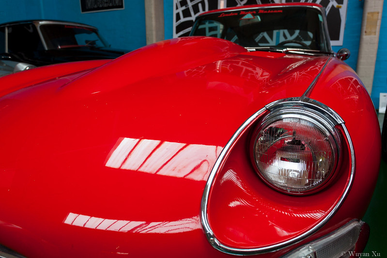
Got to wonder what was the design process that came up with this beautiful machine.


Jaguar E-Type by wuyanxu, on Flickr
 
Hi Wuyan, nice to see you've caught up. Good bunch of pics, The E-Type is my favourite, lovely colour (y)

I'm at a bit of a loss as to what to say about your rock pic. Sorry, it does nothing for me.

Wonder what tomorrow will bring?
 
Hi Wuyan

Size - good dof and focus. good colour and the hand helps to define the size/theme.

Process - did not get the connection to the theme without the explanation, but good pov , focus and colour. The cars to top left are a bit distracting.

Rock - does not do alot for me, sorry. Not that clear that it is rock - perhaps a closer shot of the rear where the other rock of the wall would contribute :thinking:
 
Im really impressed with those images mate. Great colours in 1 & 2 and i like the composition on the car. Keep it up. You are getting better and better.

Thanks for your kind comments!

Hi Wuyan, nice to see you've caught up. Good bunch of pics, The E-Type is my favourite, lovely colour (y)

I'm at a bit of a loss as to what to say about your rock pic. Sorry, it does nothing for me.

Wonder what tomorrow will bring?

Great catch up Wuyan (y)

I too really like the Jag shot, a bit more room at the top would be nice :)

Rock too concrete for me but good to get a shot in :)

And Size I like too, nice DoF and again good composition, can clearly see what you intended - Spot On (y)

Hi Wuyan

Size - good dof and focus. good colour and the hand helps to define the size/theme.

Process - did not get the connection to the theme without the explanation, but good pov , focus and colour. The cars to top left are a bit distracting.

Rock - does not do alot for me, sorry. Not that clear that it is rock - perhaps a closer shot of the rear where the other rock of the wall would contribute :thinking:

Thanks all for commenting.

I couldn't find any thing that goes well for Rock around here. I promise to do a better one when I get a chance! I have a great one taken on Isle of Wight a few months back, but that's not allowed, so I promise I'll reshoot it when I see the opportunity.


Got the 3 new ones ready to post. Still need to do reshoot....
 
Hey :)

Pair - Simple, clear, well set up and taken, I can't crit that at all :clap:

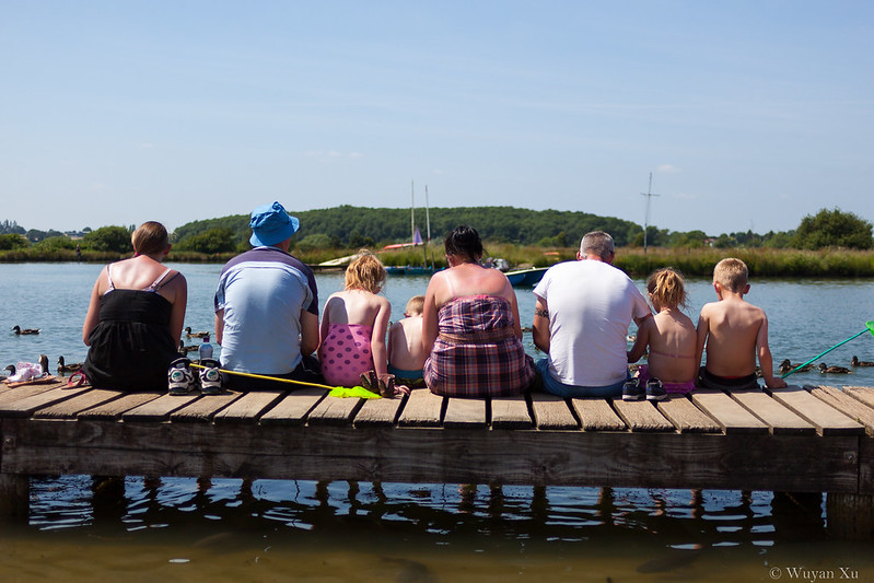
Shape - Thinking a shallower DoF and a slight level would help what is a good idea, i'm liking as you say that they are all different shapes/sizes in a row and facing away :)

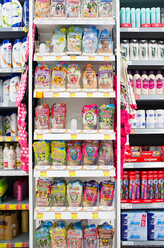
Plenty - Hahaaaaa, like that :D - I'd crop off the sides if I was you (and reduce highlights and give a bit of a colour boost), would really emphasize the plenty of the similar products - good catch up again (y)
 
Size - nice and sharp
Process - I do like a nice e type (y)
Rock - not keen I'm afraid, sorry
Pair - bang on topic, I like this
Shape - nice idea
plenty - bong on theme but maybe a little 'busy' I think the cropping idea would work well
 
Hi, Pair, really works for me. Has a really summery feel to it. Nice and bright with cracking DOF.

Space, I wouldn't have got the connection, but now I can see it. Yeah, nice bit of social commentary. Only crit, maybe a slightly shallow DOF as the BG distracts me a tad.

Plenty, who doesn't love a good facepack :D On theme, I'd like to see the RH same space as the LH IYSWIM.

Cheers.
 
some absolute crackers there!

pair, is just perfect in my opinion, colour balance, exposure, composition, just all round great :clap:

shape - again a really strong image, and creative take on the theme. I think it would have benefit from you being more straight on to the jetty rather than the angle it is at, also a slight rotation?

plenty - this is a good one too, a bit too vivid and perhaps overly sharpened for my taste though.
 
Hi :wave:
Pair: Great pic...like the reflections in glasses...good dof and colours :clap:
Shape:nicely spotted, different take on the theme
Plenty:as others have said a bit busy but good idea
 
Hi Wuyan,
Pair: excellent. Simple clean clear composition and you have the exposure just right in my opinion.

Shape: I like the idea, and I really like the feet dangling down the other side of the jetty, if only it were level? perhaps you could straighten/level it with the crop tool?

Plenty: another good idea, but the whole thing is too busy for my taste, and the empty shelves don't say plenty to me either... they say non left! , sorry :(
 
Hi Wuyan

Pair - spot on - lovely bright summery feel to it and sharp where it needs to be

Shape- very good idea and I like the composition. As Brian says, the dangling feet are good. I would consider straightening it and cropping a bit off the top.

Plenty - another good idea but I think that the area to the right looks more plentiful and the groupings of colours seem to work better. Original might benefit from a tighter crop.
 
Thanks all for your time to look at my thread and comment.


Hey

Pair - Simple, clear, well set up and taken, I can't crit that at all :clap:

Shape - Thinking a shallower DoF and a slight level would help what is a good idea, i'm liking as you say that they are all different shapes/sizes in a row and facing away

Plenty - Hahaaaaa, like that :D - I'd crop off the sides if I was you (and reduce highlights and give a bit of a colour boost), would really emphasize the plenty of the similar products - good catch up again (y)

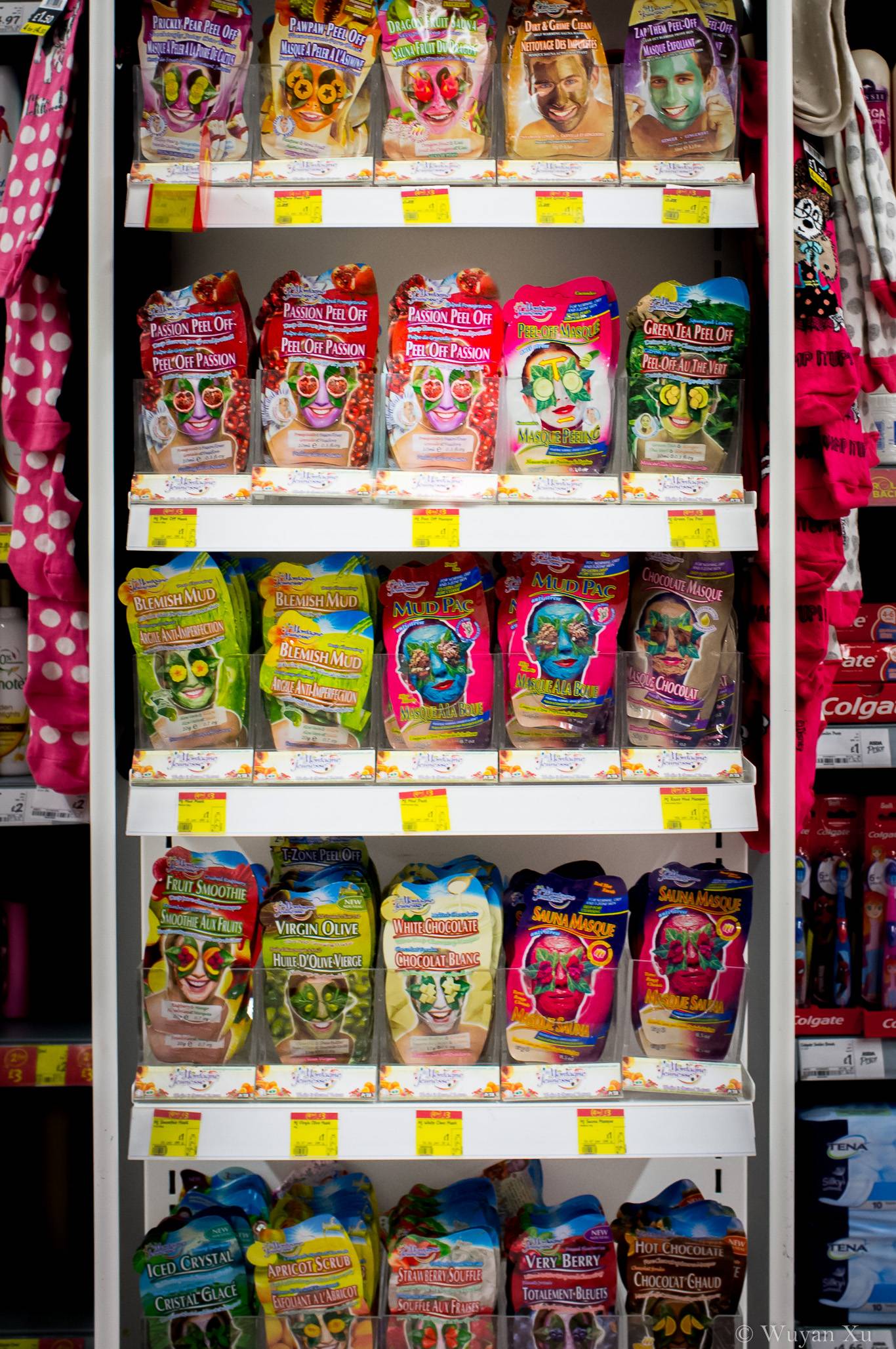
Thanks for commenting. Please see below for edited Plenty, taking your comments on board.

Size - nice and sharp
Process - I do like a nice e type (y)
Rock - not keen I'm afraid, sorry
Pair - bang on topic, I like this
Shape - nice idea
plenty - bong on theme but maybe a little 'busy' I think the cropping idea would work well

Thanks for your time to comment. Edit of Plenty will be posted up below.

Rock is my reshoot as part of catch-up. Posting that up in a few hours.

Hi, Pair, really works for me. Has a really summery feel to it. Nice and bright with cracking DOF.

Space, I wouldn't have got the connection, but now I can see it. Yeah, nice bit of social commentary. Only crit, maybe a slightly shallow DOF as the BG distracts me a tad.

Plenty, who doesn't love a good facepack :D On theme, I'd like to see the RH same space as the LH IYSWIM.

Cheers.

For shape theme, because it was taken with 35mm and focused a bit further away, it quite hard to get shallow DOF. The photo was already taken at f2. When I envisioned this photo, I was also going for blurred out background.

some absolute crackers there!

pair, is just perfect in my opinion, colour balance, exposure, composition, just all round great :clap:

shape - again a really strong image, and creative take on the theme. I think it would have benefit from you being more straight on to the jetty rather than the angle it is at, also a slight rotation?

plenty - this is a good one too, a bit too vivid and perhaps overly sharpened for my taste though.

Thank you for your kind comments.
Hum, I thought I am already straight on with Shape? I did make a note to try to be as straight as possible when taking the shot. I also applied LR5’s auto straighten tool, which moved the image ever so slightly.

Hi :wave:
Pair: Great pic...like the reflections in glasses...good dof and colours :clap:
Shape:nicely spotted, different take on the theme
Plenty:as others have said a bit busy but good idea

Thank you for your comment, will be cropping Plenty to make it seem more plentiful :p

Hi Wuyan,
Pair: excellent. Simple clean clear composition and you have the exposure just right in my opinion.

Shape: I like the idea, and I really like the feet dangling down the other side of the jetty, if only it were level? perhaps you could straighten/level it with the crop tool?

Plenty: another good idea, but the whole thing is too busy for my taste, and the empty shelves don't say plenty to me either... they say non left! , sorry :(

Many thanks for your time to comment.

Shape, I’ve tried to be as level as possible and use the auto straighten tool in LR5. Doesn’t seem to be effective here :(

Plenty, I was going for plenty of types. I plan to crop the image a bit to make it less busy.

Hi Wuyan

Pair - spot on - lovely bright summery feel to it and sharp where it needs to be

Shape- very good idea and I like the composition. As Brian says, the dangling feet are good. I would consider straightening it and cropping a bit off the top.

Plenty - another good idea but I think that the area to the right looks more plentiful and the groupings of colours seem to work better. Original might benefit from a tighter crop.

Many thanks for your comment.

Shall be cropping Plenty to get a less busy photo, hope that turns out well, stay tuned. :)
 
Edited Plenty:

h81Xikj.jpg
 
Big catch-up:

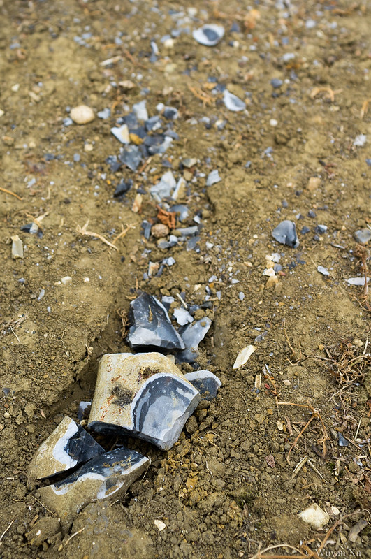
27. Reshoot, Rock

Previous rock was terrible, so it makes an obvious reshoot candidate. Saw these broken rocks on the ground, probably broken by tractors, they made for an interesting subject.


52 - 27 - Reshoot (Rock) by wuyanxu, on Flickr


29. Speed

2 for speed. First one is standard panning shot, second one is more arty approach to a fairground ride. Which one do you prefer?


52 - 29 - Speed by wuyanxu, on Flickr


52 - 29 - Speed by wuyanxu, on Flickr
 
Connection- great shot, well done At first thought it was just one plane with a walker on each wing, not til I took a closer look did I realise it was actually two planes, so close together. Wow!
 
Mono--liking the colours, black and orange, just sun a little too central for me.
 
'Ello, Rocks reshoot, on theme but doesn't really grab me. Perhaps a lot closer to loose the distracting bits :thinking:

Speed, nice panning and well composed. Pity about the folk in the BG.

Speed #2, again well executed. Pity about the oblique angle.

I'll be back later (y)

Cheers.
 
Rocks - What Andy said really... tighter crop to take advantage of the great shine/reflection on the main chunks

Speed- The panning shot for me too but I'd be tempted to clone out the walkers to just get the great colours of the fields

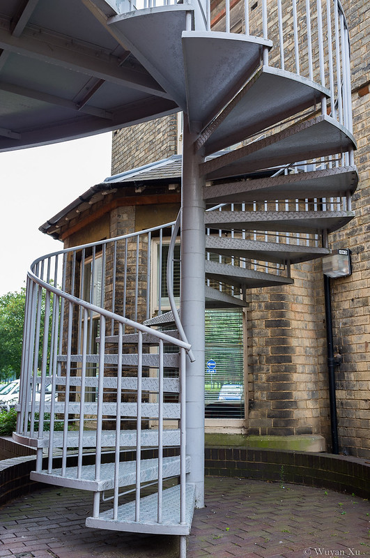
Step - The houses as the subject are too insignificant for me, the pic is more of the road, I'd like to see a pic of the houses :)

Mono - I also really like the colours in the shot and also agree a different crop would improve it even more

Connection - Again too central for me, but a Great capture!!!

Great Catch up (y)
 
Last edited:
Hi, not seeing Steps :thinking: 'Houses in steps', nope does help I'm afraid.

Mono, I see where you were going and I appreciate your different take, but IMO doesn't say Mono. Nice oranges, though.

Connection, more like it. Well captured and good detail. Bit closer (as in crop) is my only crit.

Cheers.
 
Hi Wuyan, well done on the catch up.

Plenty edit is much better in my opinion. (y)

Rock re-shoot - hmmm, perhaps a close up of the fractured rock would have been more interesting?

Speed - I prefer the fairground one.

Mono: - I disagree with Andy, I think it is mono ie. a single colour. Anyway it's a lovely shot that would make great wall art in the right room.

Connection - I agree with Lynne, great timing - a bit closer would be even better.
 
Hi Wuyan,

I know what you mean about "arranging stuff". However, grat DoF with your chilli.

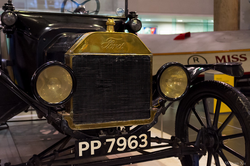
Ive just had a look through some of the other images and really like the "Beginning" shots. Good details and reflections on the Ford
 
Hi Wuyan, is this catch up thing is becoming a bit of a habit? :D

Nice set of pics, you have some crackers on your flickr. You should have no trouble with "power"(y)
 
Last edited:
Back
Top