weekly DK's 52 in 2014 - Wk's 52 'Support' Added - AND FINISHED :)

It's odd when we think of the positions and things we go through to get an image for this 52 :D

Thanks David :)

If you're unsure on which image you like, or have tried say two different variations on a theme, then of course post the options up in your thread if you would like others to choose... If you look at the spreadsheet I add a tick per image submitted :)

Generally we only post one on the 'Photo's only thread' to link to your thread for the week, but that slips occasionally too... I blame Marsha :)


Thanks darkest
 
Close - As others have said, all good shots, the first one stands out for me as it is very natural and quite simple.
 
Hi Dean, #1 gets my vote, I think it's the more natural background that the ladybird is standing on which gives it context over the other one.
I like the vivid colour of the flower shots too, but the ladybird shot has more about it IYSWIM?
Good work matey (y)
 
Close - As others have said, all good shots, the first one stands out for me as it is very natural and quite simple.
Cheers Kev :)

Hi Dean, #1 gets my vote, I think it's the more natural background that the ladybird is standing on which gives it context over the other one.
I like the vivid colour of the flower shots too, but the ladybird shot has more about it IYSWIM?
Good work matey (y)
Thanks Iain :) I see what you mean for sure, but I must say the ladybug really was not happy on the plant, was in a desperate hurry to get off :D

I like both the ladybird shots but prefer the first one as it looks more natural.
Cheers Mark :)
And thanks Alet :)

I agree with Mark. The first one looks a lot more natural and is my favourite of the two. Great macro
Annnnnnd thanks Gav :)


I prefer them natural too :)
 
Hi Dk matey
I like looking at lots of shots but it don't half make this typing lark a bit of a b.....er.

Play - I am now well into taking shots of our 6 month old grandson so appreciate the difficulty but I think that both are OK and on theme. #1 has a better context and a pity that we cannot see more face - but good pov which engages the viewer in the play activity. #2 has good eye contact and a nice expression - possibly needs a bit more of the stuff at the left to indicate Play rather than Concentration

Close - #1 - good colour and nice detail of body and water droplets - very good b/g - just that the antennae seem a bit lost.
#2 - good focus and vibrant colour - dreamily abstract. crit is that white bit at the bottom
#3 - I like the focus and the pov - b/g lets it down
#4 - by pulling away , the abstract feel and impact of the colour has been lost.
 
Hi
Close....ladybird is my choice ( where did you find one of them at this time of year?)
Like detail in both but find there is nothing for my eye to rest on in second (if that makes sense)
 
Hi DK...Both are pleasing shots...though if pushed to choose, I vote for no 1. I think no 2 needs to be closer to capture the abstract feel fully.
Thanks Jason :)

I may well try that later :)

Hi Dk matey
I like looking at lots of shots but it don't half make this typing lark a bit of a b.....er.
Doesn't it just :D

Play - I am now well into taking shots of our 6 month old grandson so appreciate the difficulty but I think that both are OK and on theme. #1 has a better context and a pity that we cannot see more face - but good pov which engages the viewer in the play activity. #2 has good eye contact and a nice expression - possibly needs a bit more of the stuff at the left to indicate Play rather than Concentration
Thanks Alan.. I certainly see what your saying and couldn't agree more :)

Close - #1 - good colour and nice detail of body and water droplets - very good b/g - just that the antennae seem a bit lost.
#2 - good focus and vibrant colour - dreamily abstract. crit is that white bit at the bottom
#3 - I like the focus and the pov - b/g lets it down
#4 - by pulling away , the abstract feel and impact of the colour has been lost.
Excellent... great feedback and perfect pointers, appreciated :clap:

Hi
Close....ladybird is my choice ( where did you find one of them at this time of year?)
Like detail in both but find there is nothing for my eye to rest on in second (if that makes sense)
Thanks Anita... Yep your right :)
 
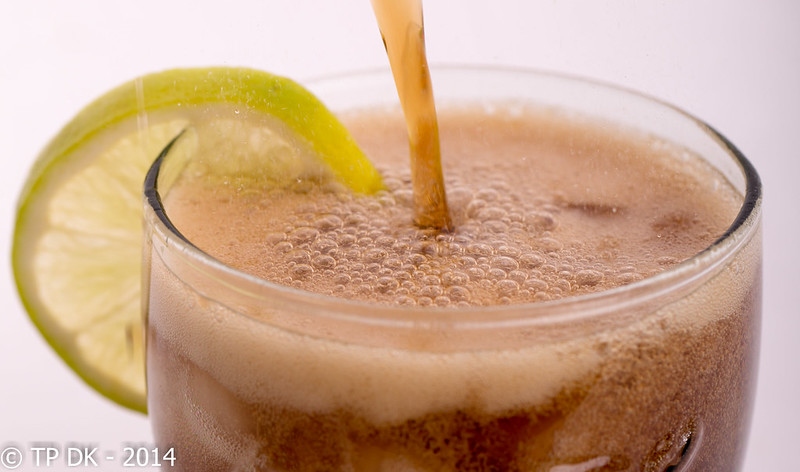
Well here we go - Wk 4 - 'Bubble'

Not the best of DoF focus, I now realise I should have been further away and cropped to get my image with a greater DoF, but hey ho, I took the pics and packed all away before editing, lesson learned again :banghead:

I think I will try and do these again in the week if I can (away on business for a couple of days so may be a bit of a tough call)


Wk 4 - 'Bubble'
by TP DK, on Flickr


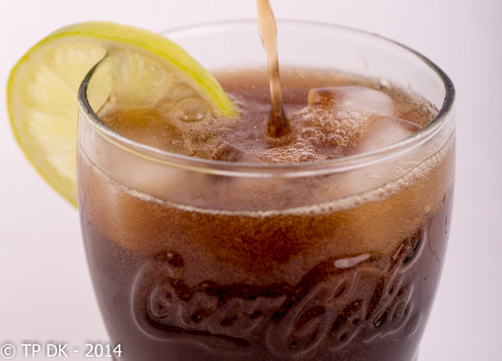
Wk 4 - Bubble' 2
by TP DK, on Flickr
 
Last edited:
I like the bubbles on the first, good composition as well and the DOF works for me. You can almost taste the sugar :D
 
Definitely 1st for me DK, great image (y) you can even see the carbon dioxide? gas bubbles bursting out the pop (y)
 
Last edited:
Hi, I like the inclusion of the Coca Cola logo but order #1 as the bubble are, as said, more prominent.

Cheers.
Cheers Andy :)

Although I like the coke logo too I didn't get it quite as central as I thought I had :(

<EDIT> god damn it !!! can't post from my windows tablet tonight... keeps saying server error :mad:
 
Last edited:
I like the bubbles on the first, good composition as well and the DOF works for me. You can almost taste the sugar :D
Hahaaaaaa - Thanks Kev :)

I think you have already made you own crit, but I still like the shot. Second version works best for me.
Thanks Richard - Looks like opinion is divided quite evenly tonight :)

Definitely 1st for me DK, great image (y) you can even see the carbon dioxide? gas bubbles bursting out the pop (y)
Cheers Phil... that's why I was trying to get in so close and losing the Coke logo, but still the DoF and shutter speed not quite enough to get what I was after
 
The second is good, but the first is miles better for me, just has more bubbles in it. And a better placemnt of the lemon on the side.

Lovely, can even see / feel the fizz coming up of the sea of bubbles.

Top Work mate!
 
Deffo the first image for me DK... great dof the more I look at it...
Thanks Colin :)

The second is good, but the first is miles better for me, just has more bubbles in it. And a better placemnt of the lemon on the side.

Lovely, can even see / feel the fizz coming up of the sea of bubbles.

Top Work mate!
Ooo Cheers Graham :)
Oh definitely the first for me, nice and sharp in all the right places and the mist from the bubbles bursting gives that extra depth. I want a glass now!
Hahaaaa Me too Marsh... damn dry at the moment !!!

Thanks for the comment as usual :)

#1 for me too. Very nice shot.
Thanks :)

#1 for me - a much stronger image.
Cheers Sarah... really wasn't so sure if it needed the logo/more of the glass or not :)
 
Hi DK

Gotta go with the flow and choose #1. Lots of bubbles, both in the glass and in the foam. The stream from the top is very strong and good colour . Agree with you re Dof. would be really good if more of the lemon was in focus cos the insides of them always look like they have bubbles too.
Cheers matey... another for a tinkle on re-shoot week :)
 
Hi Dean, my vote goes to #1 for bubble content but mixed with a little of the composition of #2, specifically the logo.
Both nice 'clean' looking images though matey (y)
What lighting have you used here?
 
Back
Top