You are using an out of date browser. It may not display this or other websites correctly.
You should upgrade or use an alternative browser.
You should upgrade or use an alternative browser.
weekly mercurius's 52 in 2014: catch up Weeks 28 - 31
- Thread starter mercurius
- Start date
Hi, Sense impression, not heard of that one
Sense of motion, maybe.
That said, I do like ICM and I like this one. The slight angle in the movement works well.
Cheers.
Hi I think it fits with sense of movement not sure about your explanation but i do like it as an abstract image
Well, as a great fan of abstract, I love itI would probably have seen it as sense of movement too, but your explanation above sounds good

pretty but not really on theme.
I'm also seeing sense of movement. Not as keen on the brown patch though. The diagonal movement is a nice change from a straight up and down approach.
Thanks for your comments.Nice bright colourful image, Sense of movement to me too
Same here - wouldn't have had a clue what this was meant to be if it hadn't already been explained.. lol
Thanks. Seems to have been a bit of a Marmite shot...onwards and upwards to the next theme, I think!Nice done mate....I like the sence of movement and the fact that there is visibible bands of green, brown and blue as the eye moves upwards
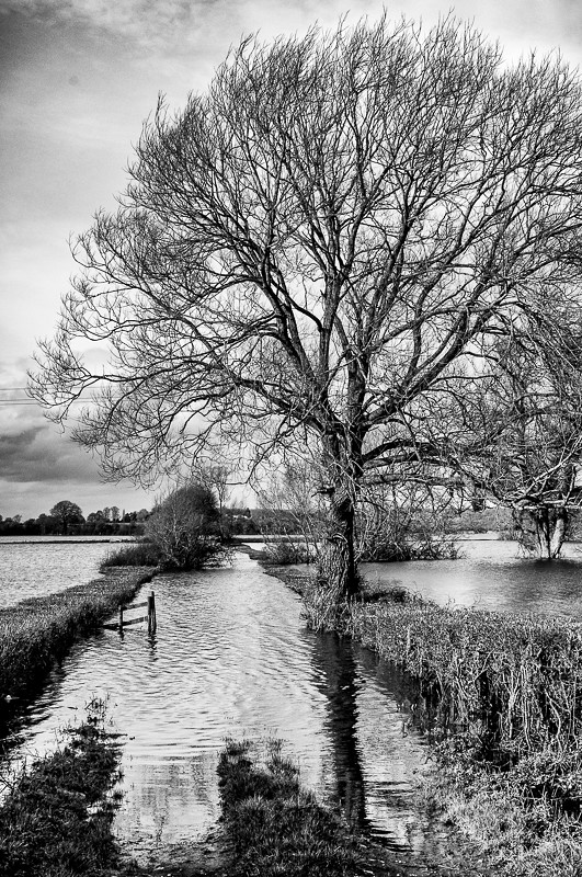
Week 8: Ending
This is the ending of the lane as it disappears under the floods on the Somerset Levels, in colour and b/w versions:
#1

Ending 2 by carthurjohn, on Flickr
#2

Ending 3 by carthurjohn, on Flickr
This is the ending of the lane as it disappears under the floods on the Somerset Levels, in colour and b/w versions:
#1

Ending 2 by carthurjohn, on Flickr
#2

Ending 3 by carthurjohn, on Flickr
- Messages
- 37
- Name
- Dave
- Edit My Images
- No
Love the B&W one really brings out the detail in the clouds, water and tree.
- Messages
- 8,398
- Name
- Lynne
- Edit My Images
- Yes
Hi M
Sesne....the more I see of this type of shot the more I like them , the slight angle to your shot makes it stand out a little from the norm
Ending....mono is lovely , really gritty with plenty of detail Just need to clone out the dust bunny & clean your sensor
Sesne....the more I see of this type of shot the more I like them , the slight angle to your shot makes it stand out a little from the norm
Ending....mono is lovely , really gritty with plenty of detail
- Messages
- 9,095
- Name
- Mandy
- Edit My Images
- Yes
Ending - I like it good take on the theme, I have to also go for the b&w image.
- Messages
- 4,833
- Name
- Alan
- Edit My Images
- Yes
Hi
Sense - on theme for me with that sense of motion. Good use of a diag comp.
Ending - on them. B&W is best shot - good detail as Allan @alsjazzera points out
Sense - on theme for me with that sense of motion. Good use of a diag comp.
Ending - on them. B&W is best shot - good detail as Allan @alsjazzera points out
- Messages
- 646
- Name
- Michael
- Edit My Images
- Yes
Thanks. Seems to have been a bit of a Marmite shot...onwards and upwards to the next theme, I think!
Now I love Marmite but thats where it ends I'm afraid.... I actually find it hard to look at with out my eyes feeling strained
Ending - I used to live not far from there and drove those roads regularly. Its so sad to see and your B&W image sums it up so well
- Messages
- 6,502
- Name
- Peter
- Edit My Images
- Yes
Yet another vote of the mono conversion. It seems give more interest with some lovely detail in there.
Thanks Allan.Hi B+W for me a nice conversion too it seems to bring the detail out
good take on the theme too
Good point. Didn't have a wide enough lens to get more in and didn't want to clip the top of the tree.B&W pic is the one, great detail maybe a bit more of the path in the shoot would have made it a bit easier to recognise the end of the road idea?
Thanks.Love the B&W one really brings out the detail in the clouds, water and tree.
Good spot! Thought it was my screen, but you're right about the DB.Hi M
Sesne....the more I see of this type of shot the more I like them , the slight angle to your shot makes it stand out a little from the norm
Ending....mono is lovely , really gritty with plenty of detailJust need to clone out the dust bunny & clean your sensor

Thanks Mandy.Ending - I like it good take on the theme, I have to also go for the b&w image.
Thanks Judi.Ending... I like it fits the theme, lovely shot
Thanks Michael. They're certainly going through it down there at the moment.Now I love Marmite but thats where it ends I'm afraid.... I actually find it hard to look at with out my eyes feeling strained
Ending - I used to live not far from there and drove those roads regularly. Its so sad to see and your B&W image sums it up so well
Thanks Peter.Yet another vote of the mono conversion. It seems give more interest with some lovely detail in there.
Thanks Sarah.Mono conversion for me - very nice
Thank you.Nice shot for 'ending' - I like both the colour and b&w versions
Thanks Jason.Aother votes for the mono version as I like the way that it accentuates the ripple shadows. Nice use of lead in lines too!
Yes I see what you mean about the colour version.Another for the B&W. I like the detail in the water and the sky which is lost in the colour version.
Interesting view. Most people seem to have opted fro the b/w version.Both images are nice I prefer the coloured version
- Messages
- 13,760
- Edit My Images
- Yes
Nice Ending shot - Like the B&W myself... the converging lines of the hedges draw my eyes up into the pic very nicely 
The goblin
<span class="poty">POTY Winner 2015</span></br>
- Messages
- 4,407
- Name
- Marsha
- Edit My Images
- Yes
Hi, I've recently developed an interest in this style of abstract shot, so I think it's rather good, especially on the slight diagonal 
What's ICM?That said, I do like ICM and I like this one. The slight angle in the movement works well.
The goblin
<span class="poty">POTY Winner 2015</span></br>
- Messages
- 4,407
- Name
- Marsha
- Edit My Images
- Yes
Oooo loving the ending shot  I too vote for the mono version and agree that the dark top left corner needs to go. Dust bunnies, ughh, aren't they annoying!
 I too vote for the mono version and agree that the dark top left corner needs to go. Dust bunnies, ughh, aren't they annoying!
- Messages
- 19,461
- Name
- Andy
- Edit My Images
- Yes
Hi, I've recently developed an interest in this style of abstract shot, so I think it's rather good, especially on the slight diagonal
What's ICM?
Intentional Camera Movement
Thanks DK.Nice Ending shot - Like the B&W myself... the converging lines of the hedges draw my eyes up into the pic very nicely
Thanks Andy.Quite like this one, especially the B&W. Nice detail and good orientation.
Not keen on the dark upper left bit or the dust spot
Cheers.
OK thanks for commenting.Oooo loving the ending shotI too vote for the mono version and agree that the dark top left corner needs to go. Dust bunnies, ughh, aren't they annoying!
- Messages
- 9,095
- Name
- Mandy
- Edit My Images
- Yes
Simple and effective fits the theme for me.
Thanks for your comment, Mandy.Simple and effective fits the theme for me.
Thanks Graham.nice bright BG, done well to keep the rim of the glass visible, like the interest of the drips coming down the insides..
Thanks Judi.Nice and simple fits the theme nice shot
- Messages
- 6,502
- Name
- Peter
- Edit My Images
- Yes
I probably agree with Michael on this one I'm afraid. The drips of the coloured liquid add a little interest though.
- Messages
- 13,760
- Edit My Images
- Yes
I think it needs a slight straighten, again works for the theme and I'm liking the detail of the drink dripping on the glass edge - nice effect 
Thanks for the comment - and no need to apologise. It's an honest view and I agree! Going through a particularly arid patch at the moment - and the photography's not much better.Fits the theme, theres some nice colour in the "Brandy"? but otherwise not very inspiring sorry.
Thanks Peter.I probably agree with Michael on this one I'm afraid. The drips of the coloured liquid add a little interest though.
Thanks DK - a glass half-full comment indeed!I think it needs a slight straighten, again works for the theme and I'm liking the detail of the drink dripping on the glass edge - nice effect


 and I really like them both.