
You are using an out of date browser. It may not display this or other websites correctly.
You should upgrade or use an alternative browser.
You should upgrade or use an alternative browser.
weekly rpn's 2021 52 Photo Challenge - Week 52 SHOWCASE added **COMPLETE**
- Thread starter rpn
- Start date
- Messages
- 1,293
- Name
- Stuart
- Edit My Images
- Yes
Up close
Lots of detail and sharp in the right places
Personal
Was the out of focus area created on purpose, it's definitely add to the overall image.
Green
Lots of variation in the colour with shades throughout the image.
Snapper's Choice
Did you try different shutter speeds or were you successful with the first attempt. The horizon looks every so slightly leaning to the left, with my eyes anyway.
Looking down
A great album shot and something a bit different, I'm wondering what she is thinking.
Indigenous
According to a Google search, your grandson is left handed, the image made me wonder what side the Sgian Dubh should be and the general consensus is on your dominate hand side.
OP
- Messages
- 10,490
- Name
- Stan
- Edit My Images
- Yes
Great idea Stan")
Indigenous
It all works great. A proud nation.
Giid thinking. The bottle really adds something!
Great idea for the theme Stan.
Up close
Lots of detail and sharp in the right places
Personal
Was the out of focus area created on purpose, it's definitely add to the overall image.
Green
Lots of variation in the colour with shades throughout the image.
Snapper's Choice
Did you try different shutter speeds or were you successful with the first attempt. The horizon looks every so slightly leaning to the left, with my eyes anyway.
Looking down
A great album shot and something a bit different, I'm wondering what she is thinking.
Indigenous
According to a Google search, your grandson is left handed, the image made me wonder what side the Sgian Dubh should be and the general consensus is on your dominate hand side.
Thank you all for the nice comments. Apologise for not being able to reply individually life has been getting a bit hectic again. I'll try to find some spare minutes to comment on others' posts soon.

OP
- Messages
- 10,490
- Name
- Stan
- Edit My Images
- Yes
Plant
The green of the plant stand out well against the browns of the background. Nice light and vignetting.
Thanks, Dominic. quite easy to spot this little plant amount all the dead leaves.
")
OP
- Messages
- 10,490
- Name
- Stan
- Edit My Images
- Yes
It maybe gets a little too dark at the top for my taste, but I love the way the plant stands against the browns.
Thanks, Nick. Just a little too heavy with the vignette slider.
The shadows make for a very atmospheric image. You can almost feel the coolness of the shade.
Thank you, Helen.
OP
- Messages
- 10,490
- Name
- Stan
- Edit My Images
- Yes
I think plant is a wonderful image, the natural vignette frames the sapling perfectly and the colour combinations are really nice. fantastic image.
Thank you, Jim.
I couldn't recall what you shot with, but on first glance at the shot I felt that had to be Fuji
The plant pops well against the background.
Thanks, Tim. Fujifilm X-T4 was used for that shot. I still use a Nikon D800 and I would say 50:50 between the two cameras.
OP
- Messages
- 10,490
- Name
- Stan
- Edit My Images
- Yes
A couple from me this week.
1 St. Machar Cathedral, a site of worship since 580 AD has been dominating the skyline of Old Aberdeen and, I suppose, dominating people's lives in those early years.
Week 29 Dominating (1)
 Dominating by Stan, on Flickr
1 St. Machar Cathedral, a site of worship since 580 AD has been dominating the skyline of Old Aberdeen and, I suppose, dominating people's lives in those early years.
Week 29 Dominating (1)
Dominating by Stan, on Flickr
Last edited:
OP
- Messages
- 10,490
- Name
- Stan
- Edit My Images
- Yes
2 Granite Hill communication tower, constructed in the mid-1950s for BBC TV and now use by BT, local radio stations and offshore oil rigs communications. A landmark on top of the highest hill dominating the city.
Week 29 Dominating (#2)
 Dominating by Stan, on Flickr
Week 29 Dominating (#2)
Dominating by Stan, on Flickr
OP
- Messages
- 10,490
- Name
- Stan
- Edit My Images
- Yes
Communication tower for me looks very imposing
I think I slightly prefer the comms tower too.
I think because it's a cleaner shot with less distractions. (Maybe)
Thank you, Allan and Tim. This is a new mast built in 1965, the original 1950s one was only half the size of the current one.
OP
- Messages
- 10,490
- Name
- Stan
- Edit My Images
- Yes
I do like a church, but I prefer the comms tower for the theme - looks almost evil, perhaps due to its starkness in B&W (no doubt some would say it is but that's for another type of forum) Both great shots though
Cheers, Simon. It looks to me like a prop from the set of Dr. Who shooting with a wide-angle lens from this low viewpoint.
OP
- Messages
- 10,490
- Name
- Stan
- Edit My Images
- Yes
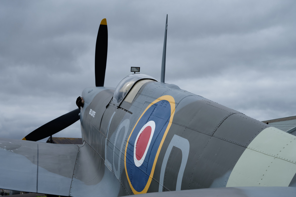
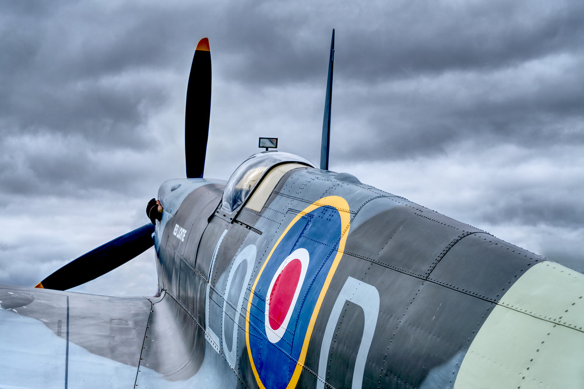
A technique I've attemped only a couple of time previously in the early days of my photographic hobby. This was taken during a visit to an air museum yesterday. When I spotted this iconic aircraft with the nose angles upward the film title "Reach For The Sky" just pop into my head. Only afterward that I thought it may suit the HDR technique.
Week 30 Snapper's Choice and HDR Technique
 Reach For The Sky by Stan, on Flickr
Week 30 Snapper's Choice and HDR Technique
Reach For The Sky by Stan, on Flickr- Messages
- 4,902
- Name
- Pete
- Edit My Images
- Yes
What a cool photo, bit of a nitpick here would be to crop out the background bottom left and the horizontal tail section.
Pete
Pete
OP
- Messages
- 10,490
- Name
- Stan
- Edit My Images
- Yes
I like that.
I like the confidence to not necessarily show the whole plane.
And in this instance I think the HDR adds a little drama to the sky - although it’s hard to say how it compares to the original.
Thanks, Kell. I found just part of some subjects makes a bigger impact than showing the whole thing. Here the SOOC (straight out of camera) shot.
OP
- Messages
- 10,490
- Name
- Stan
- Edit My Images
- Yes
What a cool photo, bit of a nitpick here would be to crop out the background bottom left and the horizontal tail section.
Pete
Thanks, Peter. I was two minds about cropping out the tailplane because I want to keep as much of the RAF logo as possible. Anyway, here is the cropped version
OP
- Messages
- 10,490
- Name
- Stan
- Edit My Images
- Yes
^^^^ What Pete said. Cool shot and an angle I've done that works well for a static display!
Thanks, Dave.
Fair play, that's exquisite! Fabulous detail
Thanks, Simon.
OP
- Messages
- 10,490
- Name
- Stan
- Edit My Images
- Yes
Snappers choice
I also like the pov you've gone for. The hdr looks pretty good, not over doing it.
Thanks, Dominic. Trying my best to avoid being heavy-handed with the sliders.
Love the spitfire Stan and the composition you have chosen. The HDR really does seem to add drama too.
Thanks, Beb.