
You are using an out of date browser. It may not display this or other websites correctly.
You should upgrade or use an alternative browser.
You should upgrade or use an alternative browser.
weekly susiejb 52 /2014 Support
- Thread starter susiejb
- Start date
- Messages
- 4,352
- Name
- Martin
- Edit My Images
- Yes
First lemon definitely. The blue picture looks like a primordial soup, fine if one is into ancient bacteria. 
- Messages
- 9,095
- Name
- Mandy
- Edit My Images
- Yes
I do like the first of the lemon shots.
OP
- Messages
- 7,548
- Name
- susie
- Edit My Images
- Yes
Thanks for taking the time to look and comment folks...its good to know that one of the pics has been a success and it's soooo encouraging.
Martin I do like messing with inky messy stuff.... but never quite heard it described like that
Kev yes maybe I should have gone for a tighter crop, normally I tend to like those random abstract patterns but I think in this case they have gone too out of focus to be any use.
Andy I used a Raynox 150 and was tempted to put the 250 but was sort of 'bubbled out' so I called it a day.
and it's soooo encouraging.First lemon definitely. The blue picture looks like a primordial soup, fine if one is into ancient bacteria.
Another for the first lemon shot, good DOF and lighting on the bubbles. I like the main bubble in the first shot but the lighter areas around it are a bit distracting for me.
Martin I do like messing with inky messy stuff.... but never quite heard it described like that
Kev yes maybe I should have gone for a tighter crop, normally I tend to like those random abstract patterns but I think in this case they have gone too out of focus to be any use.
Hi, Bubble #3 for me. Well composed and cracking detail. Pity you could not have got a bit closer to the lower part.
Good show.
Cheers.
Andy I used a Raynox 150 and was tempted to put the 250 but was sort of 'bubbled out' so I called it a day.
Last edited:
- Messages
- 13,760
- Edit My Images
- Yes
Ah Haaaaa great minds think alike
I think I'm preferring the second lemon shot, a nice sparkle to the bubbles and a bit brighter too, although I do also like the bubble on the submerged lemon too
I think I'm preferring the second lemon shot, a nice sparkle to the bubbles and a bit brighter too, although I do also like the bubble on the submerged lemon too
- Messages
- 1,159
- Name
- Simon
- Edit My Images
- Yes
I made this comment earlier in the "no comments" thread by mistake, so moving it to here!
#1 looks really good full screen.
#2 I like better though, I think.
I can't explain why, but it appeals to me more. (And no, it's not related to anything G&T ish - I'm T Total )
#1 looks really good full screen.
#2 I like better though, I think.
I can't explain why, but it appeals to me more. (And no, it's not related to anything G&T ish - I'm T Total
)
OP
- Messages
- 7,548
- Name
- susie
- Edit My Images
- Yes
I made this comment earlier in the "no comments" thread by mistake, so moving it to here!
(And no, it's not related to anything G&T ish - I'm T Total
I did think of putting a bottle of Gin in the background but I decided it was a bit distracting
Edit- I had to Google marbling inks, looks interesting
They belonged to my youngest son when he was at school ....and that was a very long time ago...I just knew that if I kept them they would come in handy one day...you can actually get some good pics with them...if you like abstract
but be prepared to make a messThank you very much everyone ... I must admit I took loads ( probably hundreds
) of pics and in the end I felt totally confused at to which ones to pick, but it looks as if I made the right decision.I am not quite sure how to reply to everyone...trying out a new method here
oh that didn't quite work as I thought ... better luck next time ! but thank you to everyone...I tried to include all the names but it didn't quite work out.
Last edited:
The goblin
<span class="poty">POTY Winner 2015</span></br>
- Messages
- 4,407
- Name
- Marsha
- Edit My Images
- Yes
Hi Susie, I like the first lemon shot as well, I would maybe crop some of the bottom right hand side though to the top edge of the glass.
- Messages
- 8,398
- Name
- Lynne
- Edit My Images
- Yes
Hi Susie
I'm quite taken with your 1st Bubble shot using the marbling ink....very abstract but with lovely color's & a definite bubble that has a great catch light in it
I'm quite taken with your 1st Bubble shot using the marbling ink....very abstract but with lovely color's & a definite bubble that has a great catch light in it
- Messages
- 6,502
- Name
- Peter
- Edit My Images
- Yes
Another vote for the first of the lemon shots. The angle and close crop work well.
OP
- Messages
- 7,548
- Name
- susie
- Edit My Images
- Yes
Hi Susie
I'm quite taken with your 1st Bubble shot using the marbling ink....very abstract but with lovely color's & a definite bubble that has a great catch light in it
You may well see them again Lynne before the the 52 weeks are up......one of my favorite's for experimenting.Another vote for the first of the lemon shots. The angle and close crop work well.
Thanks Peter......I just couldn't make a choice between the two.
Hi, I keep going between the two lemon shots - i think the last lemon shot is the one for me but the top of the glass does take my eyes away from the bubbles!
Thanks Sarah , maybe a closer crop would be better.....I think they both have good and bad points

- Messages
- 9,095
- Name
- Mandy
- Edit My Images
- Yes
Fits the theme perfectly number 1 for me, but it looks like you have had some light spill on to the background like, what happened to me. It's a tricky thing to get right, so well done for having a good go at.
- Messages
- 13,760
- Edit My Images
- Yes
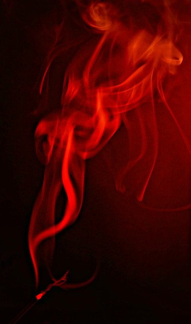
Yeah certainly a good try Susie... I too like the red shot the most, really pleased so many are having a go at this, a difficult effect indeed
OP
- Messages
- 7,548
- Name
- susie
- Edit My Images
- Yes
Fits the theme perfectly number 1 for me, but it looks like you have had some light spill on to the background like, what happened to me. It's a tricky thing to get right, so well done for having a good go at.
Thanks Mandy....I nearly strangled myself with my lights a few times trying to get them right
OP
- Messages
- 7,548
- Name
- susie
- Edit My Images
- Yes
I seem to have missed your bubble pic - sorry
I prefer the 2nd smoke picture, colours are a lot nicer (to me)
Thanks Sarah.....it seems like ages since I did the bubbles.....I did lots of different colours on the smoke pics but my OH liked the red and I liked the blue so I decided on those two in the end.
well done for giving it a go its not an easy theme
Craig
Thanks Craig
Last edited:
OP
- Messages
- 7,548
- Name
- susie
- Edit My Images
- Yes
#2 for me. Nice and abstract.
Cheers.
Thanks Andy
Yeah certainly a good try Susie... I too like the red shot the most, really pleased so many are having a go at this, a difficult effect indeed
Thanks DK....I took over 400 shots so I did give it a good try. I find it fascinating, so I shall definitely be giving it another try in the near future. I think it's a bit out of my depth at the moment. At least the house smells nice
OP
- Messages
- 7,548
- Name
- susie
- Edit My Images
- Yes
Susie, well doneYou've done a lot better than me, I didn't even know where to start with photographing smoke
Thanks Phil....your PlayDoh pic is great ...it really made me smile.well done Susie I didn't even try that like the red one even tho' you have a bit of light spill
Thanks Judy, much appreciated.
No 2 for me Susie...Love the abstract feel and green and blue hue....did you rotate horizontal in PS?
Thanks Jason...yes I did rotate it ...not sure if it looked better vertical or not.....is PS Photoshop...I don't have that unfortunately.
- Messages
- 1,412
- Name
- Elaine
- Edit My Images
- Yes
Susie, I love the red smoke! Makes me feel guilty for copping out so easily
OP
- Messages
- 7,548
- Name
- susie
- Edit My Images
- Yes
well I am really looking on each week as a challenge so I am trying to give things a go. I managed to burn my first idea down to a heap of ash before I got a decent pic...but it was a really good idea ...I may try it again if I get time later in the week.You have had a lot of catching up to do so you are excused