7th time down avenue 52 COMPLETED

Messages
14,766
Name
Michael
Edit My Images
No
Welcome everyone, thanks very much for dropping by. Started doing this in 2010 and not missed a year!

Will be doing my best to keep to posting weekly, the last couple of years have seen me cathing up quite a lot, health issues still plaguing me, so lets see how I go.

Doing this certainly keeps me going, no matter how many times I fall behind I still come back and complete.

Caitlin, my daughter might be joining in again, will add her pics if she does.

So on with the first theme, song title or lyrics

Here we have "Dream when your feeling blue" (frank sinatra)
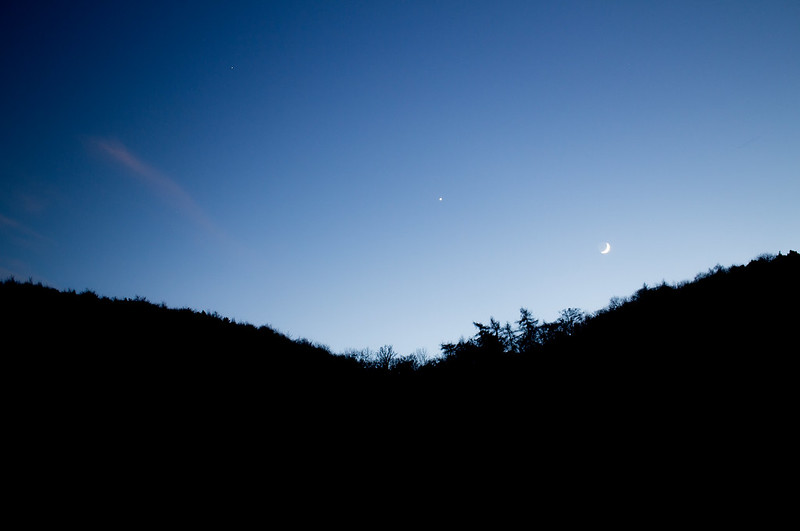
Moon with venus and mars by Michael Johnson, on Flickr
 
Last edited:
I don't know the song, Michael, but your image is a great match for it, with the lovely blue sky and bright moon and is it Venus? I'm not sure quite so much foreground is necessary, but I do like the silhouetted leaves reaching up into the blue. It's a simple and very effective image (y)

Well done on starting your seventh 52, too. I'm in awe!
 
Nice silhouette of the hills against the blue sky. And great capture of the moon and Venus (and is that Mars in the top left?).
 
I don't know the song, Michael, but your image is a great match for it, with the lovely blue sky and bright moon and is it Venus? I'm not sure quite so much foreground is necessary, but I do like the silhouetted leaves reaching up into the blue. It's a simple and very effective image (y)

Well done on starting your seventh 52, too. I'm in awe!

it's a Frank Sinatra song,

Nice silhouette of the hills against the blue sky. And great capture of the moon and Venus (and is that Mars in the top left?).

Thanks both, it is the moon venus and mars. I couldn't decide on how much foreground to keep,this has had some cropped off.
 
Welcome back to the challenge, sorry to hear you still have health issues bugging you. This is a great image for your chosen song, a nice shade of blue in the sky and you have framed it perfectly. I look forward to seeing what else you produce throughout the year.
 
As Em said, thats a lovely image with great colours and seperation.
 
Thanks very much evryone (y)

A real nice sky and silhouette Michael, really pleased you are back in again, and hope you manage to get back to weekly again too, good luck :)

Nice shot like the silhouette and song :)

Welcome back Michael. Hope to see a few more of Caitlin's shots across the year :)
A nice blue hour shot, capturing the blue of the sky before it gets too dark.

Welcome back to the challenge, sorry to hear you still have health issues bugging you. This is a great image for your chosen song, a nice shade of blue in the sky and you have framed it perfectly. I look forward to seeing what else you produce throughout the year.

I like that - gorgeous blues against the black Michael.

As Em said, thats a lovely image with great colours and seperation.

Welcome back, Michael and Caitlin.

Good start.

Cheers.

Seventh year ...well done Michael :)

I love this one ...it suits your song title perfectly and it really does have a wonderful dreamy look.
Looking forward to seeing Caitlin hopping in occasionally too.
 
Oh I do like that Michael. Simple composition with just the moon and a star (or two) on view. Excellent
 
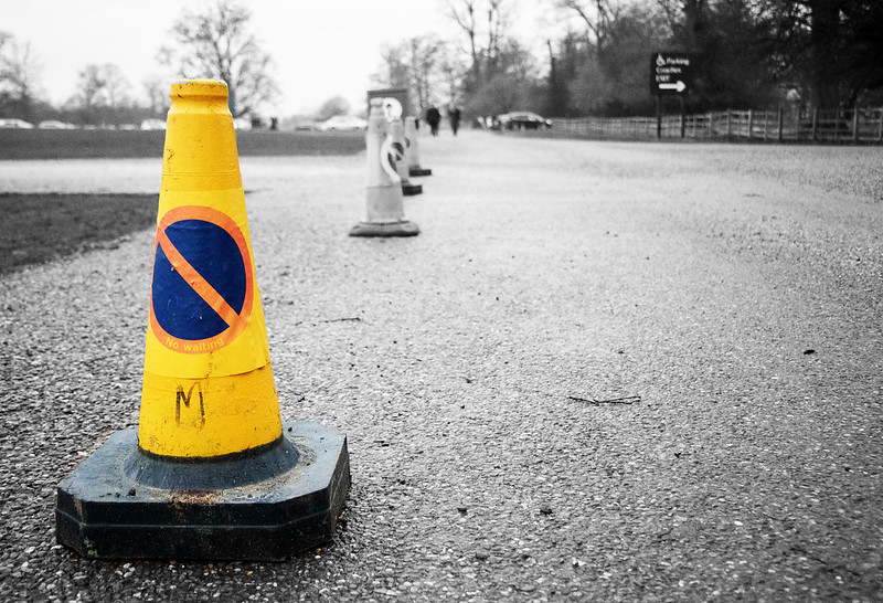
Good take on the theme. I'm not so sure about the selective colour. I wonder if it would be better further back in the frame as my eye seems to stop at the colour rather than want to travel on through the picture.

I like the idea using the selective colour, but agree with Emma saying it might of been better further back.

I toyed with the idea, I shall give it ago and see how it looks.
 
Would you get a better sense of the row if a couple of steps to the right or left avoiding the inclusion of that sign at the end which sort of spoils the impact somewhat. I like the the selective colour actually, it does draw attention the order.
 
Hmmm I'm torn actually, as yes the eye would be lead down the row of cones if not SC, but also I presume the 'Order' in this occasion is the 'No Waiting' wording on the main cone, which if further back would be hard to see and read :thinking:

Would you get a better sense of the row if a couple of steps to the right or left avoiding the inclusion of that sign at the end which sort of spoils the impact somewhat. I like the the selective colour actually, it does draw attention the order.

The no waiting was the bit I was concentrating on, I could have probably gone vertical for this and avoided the sign, I did turn round but the picture didn't really work at all,

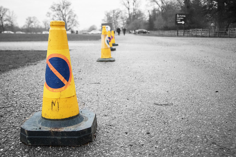
Here is a version with all the cones in sc, personally I don't think it works, the colouring looks messy, I should have have turned them all round the same way!

order by Michael Johnson, on Flickr
 
Hi there Michael & Caitlin,

"Dream when your feeling blue" is dreamy & blue. (y)

The cones ... I think I prefer them all yellow with BG greyed out.
 
Yes, :agree: looks better all yellow. Good take in the theme Michael. Order as in No Waiting as well as the alignment of the cones.
 
I prefer your second version, it does look better with all the cones in yellow. Great idea, and I like the PoV and the processing.
 
Not a fan of the SC, Michael.

Low POV. Gritty and there is an Order about it.

A few distractions in the BG, people for one and a twig on the floor (ODC :)).

Cheers and looking forward to future submission.
 
Hi Michael,

Wow, seventh year of doing a 52, that's amazing. Good luck with this year.

Missed your week 0 submission somehow but glad I looked back as I really like it. A simple idea but nicely executed, I like the inclusion of the black foreground as I feel it balances the image well.

Week 1 - When I first saw the image I had assumed the order related to the line of cones (which I felt suited the second image better) but understanding your thoughts were on the no waiting sign then I think the first image works better to highlight that.
 
week 1 I have to agree with some of the others the SC doesn't work for me for this image, but I do like the low POV, and I agree the cones should all be facing the same way and perhaps a vertical shot would help the image, a good effort tho (y)
 
I don't like processed selective colour I'm afraid. I like how you composed it, but i may have tried a pace to the right just to open the cones up a little without the order of the line being diminished. I too would have removed the people in the far distance. Very original though and a fantastic POV :)
 
Now see here Michael... there ain't no point doing selective colour if ur going ta change ur mind... I like the one cone tbh.. great sense of order and a processing technique like fingernails on a chalk board.. good choice
 
I Really like this, simple but very effective.
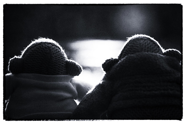
It makes me think they're at the cinema, on the back row, on a first date.
 
Ahhh! Looks like a couple sitting Comfortably in front of the telly. Like the backlighting.
 
I Really like this, simple but very effective.
It makes me think they're at the cinema, on the back row, on a first date.

Very nice image, good lighting

Ahhh! Looks like a couple sitting Comfortably in front of the telly. Like the backlighting.

A nice couple sitting in comfort, with TEA, good shot and on theme :)

That's a belter, Michael, makes me wanna be there, all wrapped up, warm and comfortable.

Cheers.

Gorgeous lighting

Thank you all, pleased it's well received, it was a right place right time moment with the lighting.
 
Back
Top