Monthly AdamGP86's 12 for 13

Messages
136
Name
Adam
Edit My Images
No
I've decided I should get my camera out more often and thought that a one a month challenge would be a good start.
No real theme for this challenge other than to try and get out and experiment.
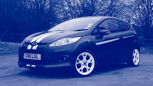
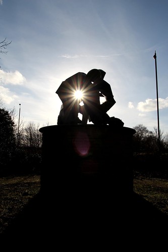
January's image:


IMG_4116 by AdamGP86, on Flickr

Went for a walk round dove dale last weekend with the camera. It was a bit overcast so I thought I would have an attempt at catching water with a slowish shutter.
 
What Christine said ^ .

Come onboard the 2013 12-ETC project. There'll enough themes every month for you to pick from. Over the years I found these type of 'Theme Projects' more challenging. Apart from stepping out of your comfort zone it also makes you think more about the subjects, ideas and locations to take the shots etc.
 
Had a look over the ETC thread, sounds like a fun challenge I'll turn this thread into an E.T.C thread
 
I did think about attempting another theme this month but since it was a cold foggy night and I had nothing else to do I thought a 2nd attempt and physiograms would be fun.

This time I taped a chunk of bluetack to my torch to throw it off balance and tried taping some blue electrical tape over the torches lens to get some colour into it

Unlike the first 2 which I used layers to stack the effect these are straight out of the camera.

January ETC #3


IMG_4215 by AdamGP86, on Flickr

January ETC #4


IMG_4217 by AdamGP86, on Flickr

January ETC #5


IMG_4221 by AdamGP86, on Flickr

January ETC #6


IMG_4224 by AdamGP86, on Flickr
 
Hi Adam. Those all look good, but number 1 is the best I think. I really like the "wispy tail" effect it has.

Are the first few converted to B&W, or is your torch really that colour? Either way, they work really well.
 
Those are great Adam, the blue ones are my favourite, they almost look 3D like. Well done!
 
Hi Adam. Those all look good, but number 1 is the best I think. I really like the "wispy tail" effect it has.

Are the first few converted to B&W, or is your torch really that colour? Either way, they work really well.

Thank-you,

None have been converted to black & white, I used a fairly powerful white torch.
The first 2 have been duplicated & flipped then layered with lighten mode. the rest are straight out the camera.
 
This is turning out to be quite a challenge. I had a go at multiplicity but it was a disaster, had fun trying anyway.

I had some free time today and a couple hours with a clear sky and low sun. So this month I have chosen "Natural Light" & "Contre Jour"

#1 Natural Light

IMG_4820 by AdamGP86, on Flickr

#2 Natural light

IMG_4822 by AdamGP86, on Flickr

#3 Contre Jour

IMG_4808 by AdamGP86, on Flickr

#4 Contre Jour

IMG_4810 by AdamGP86, on Flickr

#5 Contre Jour

IMG_4829 by AdamGP86, on Flickr

#6 Contre Jour

DPP_0001 by AdamGP86, on Flickr

I've never played with Contre Jour before but have liked what i have seen in this style so had good fun trying it out experimenting with different settings & angles.
 
Last edited:
Well done Adam for getting this month all done in one afternoon.

Just wondering whether in 2 natural light the description sign/board could be better cropped out or not?

I like 3 Contre Jour the best amount the set and again thinking whether a square crop would be better without the lamp posts and the black foreground. I like the sun light bursting through the gap though.
 
#3 Contre jour for me too. I agree with Stan about the possible crop but love the way you've positioned the sun. That's a great sculpture to photograph. Well done on attempting multiplicity too, even if it didn't turn out well.
 
Hi Adam, good shots. I do think the two natural light ones are a little washed out, but perhaps all they need is a slight vibrancy or saturation boost.

The first contre jour one is the best by far, especially with the square crop. Fantastic starburst!
 
Ok, so I took a trip to Carsington today and got lots of footage here's my first few for March

1 - Droste Effect

droste2 by AdamGP86, on Flickr

2 - Droste Effect

droste1 by AdamGP86, on Flickr

3 - Harris Shutter Effect

harris2 by AdamGP86, on Flickr

4 - Harris Shutter Effect

harris3 by AdamGP86, on Flickr

5 - Tilt Shift

tiltshift1 by AdamGP86, on Flickr

I had some fun with these and learnt a lot figuring out how to edit the harris & tilt shift photos.

1 left todo , I'm going to give the last one some thought before uploading...
 
Hi Adam, I like your second Droste shot best, as it has more going on in it I think; more infinity!!

I like the second Harris Shutter one best too. Great effect on the boat. Slight shame you've moved the camera and so also got the effect on the trees etc in the background.

Tilt Shift doesn't work at all I'm afraid :( I can see that you've applied the blur, but it's just not giving me the "toy scene" effect I'm sorry to say, even when viewed bigger on Flickr. I think you need a lot more height.
 
Thanks for the feedback, it pretty much backs up what I was already thinking. I'm tempted to have another go at the tilt-shift this month now I have a better idea what I need to shoot.
 
My final one for this month a planet panorama


PlanetPanorama by AdamGP86, on Flickr

This has been a challenging set this month and I've learned a lot, I'll perhaps revisit these techniques in the future and try to better them.
 
That's an unusual planet panorama, and I can't work out if I like it or not! It's interesting that its symmetrical eft to right; how did you make it?
 
That's an unusual planet panorama, and I can't work out if I like it or not! It's interesting that its symmetrical eft to right; how did you make it?

I took a photo I liked and mirrored it before using it to generate a planet panorama
 
Hi, there, catch up time.

#1 Natural Light, on theme and nice long shadow. Sky is a tab blown and I'd like to see a bit of detail in the sculpture blacks

#3 Contre Jour, like it. Lovley sun burst. Branches on LH side could be closed out or step to the right.

1 - Droste Effect, nice. i didn't do this one. Works well.

4 - Harris Shutter Effect, like the colours in this one.

5 - Tilt Shift, almost there. They do work better from an elevated perspective.

Planet panorama, nice idea. Bit too much water IMO.

Caught up now :D

Cheers.
 
First one for April

1 - Time lapse
( 1 shot every 10 seconds , cropped to 16:9 with slight panning )

[youtube]N_jbUhoGXK4[/youtube]
 
Hi Adam.

I like your time lapse. I do agree with Stan that it's a bit long given that it's plain blue sky towards the end; I think you could have cut it at 20 seconds, just after the second aeroplane trail. Adding (royalty free), relaxing music would help a lot too.

I especially like your second Shallow DoF shot; one of your best so far I'd say :)

Duotones don't do a lot for me, so I probably won't be doing one, but I agree that the colour you've chosen suits your subject extremely well. The only thing I'd say is I think it needs a tighter crop, so that the car almost fills the frame.
 
Last edited:
I used my tamron 17-50 2.8, I did get some shots with more zoom showing but I liked this one best, there was a flash at the end of the capture which froze most of it just keeping the burst in the bottle from a torch shining into it in a dark room.
 
I like that a lot Adam. It's very clever, and very effective, to keep the zoom within the bottle. I can't really fault it :)
 
I was going to try a long exposure but it didn't really work out. So instead I took another shot from the same shoot as the previous duo-tone and had a go at a 2nd one. This time using a much tighter shot with a slight crop. I also picked slightly different colour shades which i think may work a bit better

6 Duo-tone


duotone2 by AdamGP86, on Flickr
 
Hi Adam.

I like your reshoot for duotone. The tighter crop does work very well, and the new tones seam to give it slightly more contrast.

Good subject for the technique :).
 
Back
Top