weekly Arlandria's 52 Thread :: NEW - Up, Duo, Direction

Hi Vicky - you have been busy catching up, well done!:):clap:

Win - I like your use of DOF on this, I'm not sure if it would look better having the point of the pencil in the shot as well!

Mineral - another well lit picture, in this one though I think I would like to see more of it in focus but that might not be possible!!

Thanks Sarah :) I think I agree with you about the pencil and I definitely agree about the focus - it wasn't possible to get more in focus without more light available and I don't have any flashes. I had it on a cushion under the hob/extractor light with a bright camping light on the go next to it and all the kitchen lights on - I didn't have any more to bring!!

Hi Vicky
very well lit with no blown bits , you've added your own crit re the clarity so just a (y) from me....Imagine how good that would look if it were a real diamond !

Given that it's the size of a (man's) fist... I should be so lucky!! :LOL:

It certainly works Vicky, can't add anything other than what you mentioned yourself.

Thanks very much Michael!

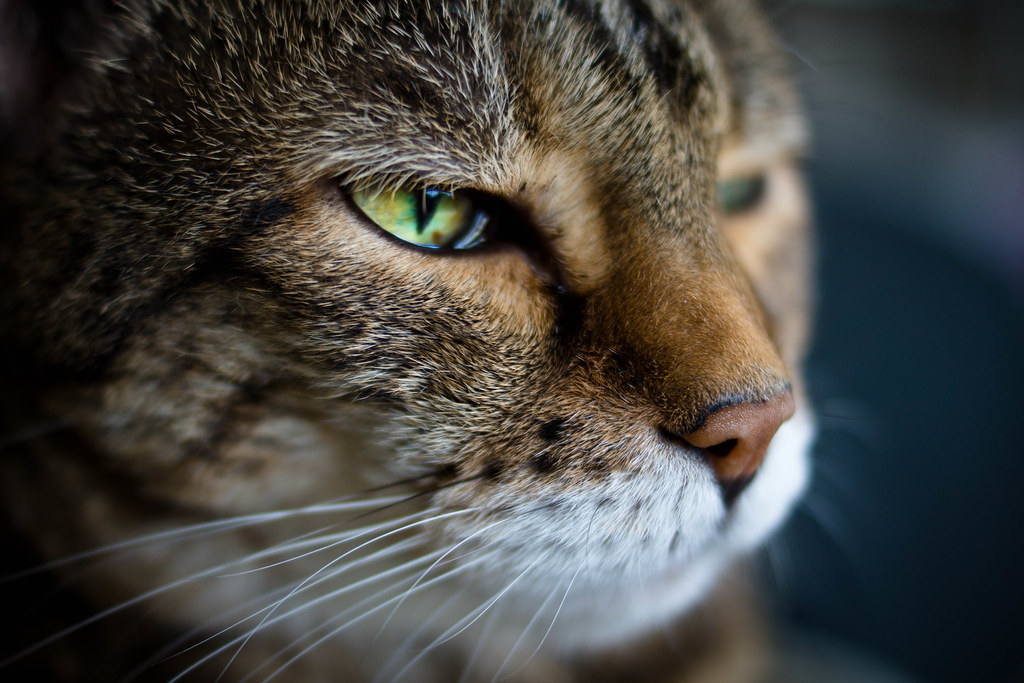
What can I say Vicky. From flight on, they're all perfect, nearly. I say nearly, because I'm not so keen on contrast; lovely cat, on theme, and well captured with good eye contact, but I just think its a shame the PP has been necessary to get contrast, as it's spoiled an otherwise nice shot for me :(

Letter I love BIG time!

Again your personal style is coming through, which is very very nice to see :)

Blimey. Such flattery - I'm blushing. Thank you! Contrast isn't my favourite shot either, but I couldn't find a willing model for what I wanted to do, so had to settle for the willing model I had.


Win – Nice use of a shallow DoF. I thinking that losing the table at the top right hand corner would improve things.

Mineral – I like this a lot. For me it just needs the background tidying up a little and it would be spot on.

I hadn't noticed that the background needed tidying - thanks for spotting it. I'll go back and sort it at some point... when I'm caught up!


Hi Vicky

Letter - Now that is great, agree with you about the focal point and think a wider shot may not be as striking, love the dof and tones

Win - Great Idea, now that's a great score, somebody have a few extra letters :LOL: again like your choice of depth of field and the focal point on the winning score

Mineral - Nice lighting and good dark background

Dark - Not sure what it is, but like the image

Somebody got a word spanning two triple word scores :D Thanks!


Hi, Vicky, catch up time :D

Flight: like it. Great contrast and moody sky.

Temperature: well composed and I like the lighting and even the shadow off the pill. I'd like to see a tad more contrast on the pill.

Straight: nice industrial feel. The thing next to the level looks a tad hot.

Contrast: plenty of overall contrast and very cute cat. I'd like to see Marie stand out a bit more, especially around the head, back and belly.

Letter: Now this I like :clap:great vignetting, muted colours, sharp where needed.

Win: on theme. is 203 the winner, as it's circled?

Mineral: nice black BG. Hard to tell how big it is, could be tiny or fist size. Nice contrast; would like to see the bottom in focus.

Dark: like it. It's the kind of photography I'd like to do more. Great negative space and the shadow from the poll is great...go on, what is it?

Cheers :clap:

The pill was soooo hard to get contrast-y. What's there was mostly added in PP. I agree it needs a little more, but couldn't get it without it looking fake.

203 is definitely not the winner - not sure why my scorekeeping husband circled it to be honest, but once it was there, it couldn't be removed.

Lovely dark shot fades nicely into the darkness is it the roof?

Dark is... some corrugated somethingorother. It's on the high part of the wall on the other side of the tube track, above all the ads, on the Waterloo end of the Waterloo and City line. There looks to be some kind of platform up there and there's something light it up, and every day I look up and think, "ooh, that's contrast-y". Then contrast came up and I had a different idea so let this one go, then couldn't get it in time, so was very happy when dark came up! I've stuck an outtake on Flickr so you can see a bit more of the context.

Outtake
 
I was SURE I had commented here before! :thinking:

Small - I like the lighting and the colours, but there is nothing in it to give me a sense of scale -- I don't see "small".

Letter - I really like this; the tones are lovely and I think the DoF is just right.

Win - It might just be me, but wouldn't the winning score normally be circled? :thinking: I find the photo a bit of a contradiction due to this, the lower score circled while focus is on the higher (winning?) score.
 
Win - Good shot although agree with Sarah about the pencil tip
Mineral - Well lit and on theme. Think DOF a bit tight at the bottom
Dark - It is, and like the transition between light to dark (bottom to top)
 
Hi Vicky

Small catch up.

Win - like the idea of the scorecard but find this shot a bit underwhelming.

Mineral - spot on theme if it's a diamond :). Good lighting and like the way that it is suspended in space. Not sure of the focus but my eyesight is getting worse so may not be the best judge.

Dark - really like that for the theme. excellent idea, well taken. Andy has mentioned the value of the 'negative space'. Now i have no idea what that means but, without my knowing, perhaps it is that which contributes to the excellence of the shot.
 
Last edited:
Hi Vicky, well I haven't find very well keeping up :bonk:

Flight, I like this one, but like you say, don't really love it! I actually like the different shades in the cloud.

Contrast, what a gorgeous puddy cat, her beautiful coat is wasted in B&W but this shot works for the theme.

Letter, love everything about this, the tones, the composition the double content, everything:clap:

Dark, very simple and very clever(y)

Mineral, nice lighting on this, maybe a bit more DOF to get more of it in focus, or was that deliberate to hide some imperfections? Failing that see if a jewellers will lend you a big rock;)

Chill, another simple shot, I like the clean white look.

Straight, you say it's boring but I really like it(y) Maybe not something you'd frame but for the theme it fits brilliantly on many levels.

I think I got all the shots covered, I'll try harder now to keep up!
 
Thanks very much for your comments everyone! I won't respond to them individually as a lot have already been covered.

I really like the dark shot. Nice use of blacks and the darker tones. I didn't think you were allowed to take photos in the Tube - naughty :LOL:

First I've heard of not being allowed to take photos on the tube - but checking the TFL website, you're not wrong! They have an utterly ridiculous policy about people needing permits and the only (affordable) permit prevents you from uploading your work online. Then there's a laundry list of things you're not allowed to photograph / film, which all seem to imply that the reason behind it is that they want the tube to look good. I fully intend to ignore this rule forever. In theory it means I can't take a snap of a friend with my camera phone and post it on Facebook without paying them £500 for the privilege, which is just... oppressive. I mean if I wanted to pitch up with a tripod and play with time lapse for a couple of hours or film part of a movie there then of course that needs to be monitored and regulated, but this is just silly.
 
Week 34 : Body

7855718944_6b04f59332_b.jpg

All sizes on Flickr

I went for a slightly more literal interpretation of the theme - this is my somebody.
 
Hi Vicky


Great DOF & lighting on your somebody (y) I really have no idea when it comes to people togging so the only thing I can say in terms of crit is ...I find his arm a little distracting..I suspect a crop just about where there is a little bit of the bg peeking through between his arm & body may be the ansa :thinking: but I'm really not sure . Nice catch lights in his eye's as well :)
 
Hi, Body, like it. Great candid, and what I mean by candid, is it doesn't appear to be planned. Nice rich colours, great DOF to give some narrative and good focus. I might have been tempted to crop out the arms from the bottom and the pillar is a bit distracting.

Overall I like it and he looks very happy having his photograph taken.

Cheers.
 
Week 35: Liquid

7862609102_0a3579d22d_b.jpg

All sizes on Flickr

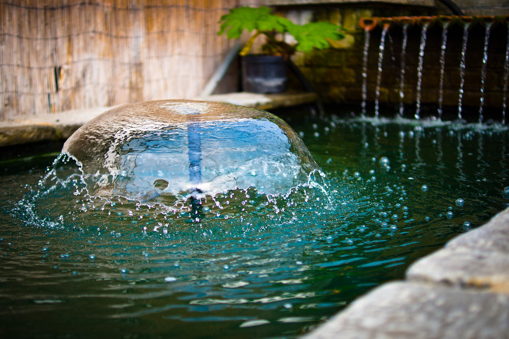
My own critique would be that ideally I'd like everything to be in focus with more DOF, but then I'd have had to sacrifice the individual water droplets, which I do really like. I'd be interested to do a longer exposure on this to see how they compare, but sadly I was shopping at the garden centre with the in-laws so didn't have the time to spend playing around.
 
Week 11: Shiny (Reshoot)

7862610536_510a5008e8_b.jpg

All sizes on Flickr

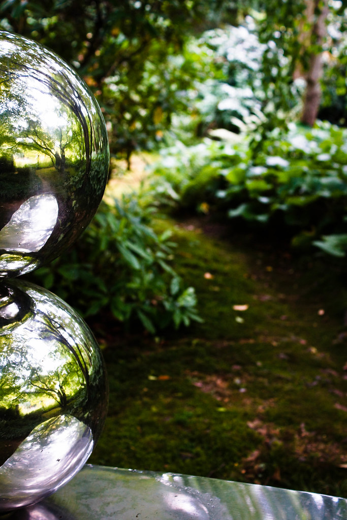
I think Shiny was my weakest photo so far, so jumped at the reshoot! This is taken at the Hannah Peschar Sculpture Garden in Ockley, Surrey. It was pretty difficult to get a shot without me in it because it was so very shiny (I had no tripod with me) but just about managed it in the end.
 
First of all Thanks for your attempts to save my appalling liquid effort much appreciated now on to yours....

Body a nice portrait though the bg is a little busy but I'm sure it means a lot more to you than it will to us. He must be very proud having us all crit a pic of him.

Liquid love the centre piece and you are right about not wanting to lose the focus on the water droplets I do think a slower exposure would ruin it my only crit again is the bg a little busy but I'm sure it would have been difficult to get another angle in a garden centre.

Shiny reshoot is excellent love the bg being out of focus.

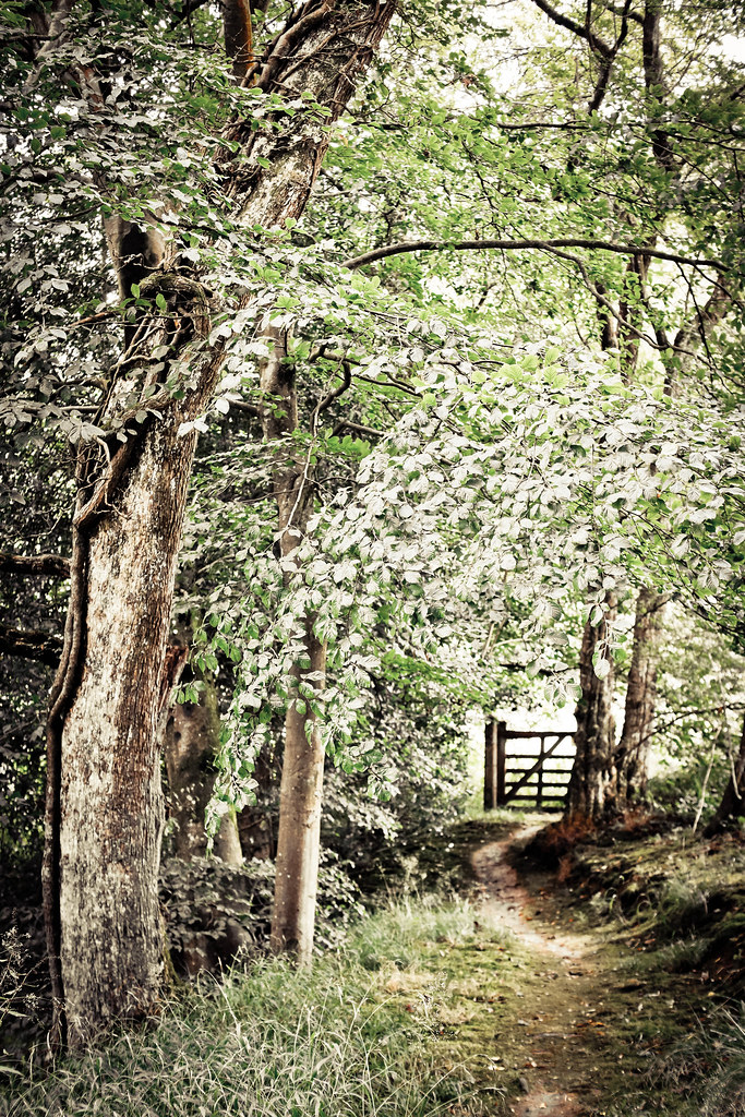
Entrance is a good composition though seems a little bright maybe a bit of a darken although that maybe just me I tend to darken things too much.
 
Hi Vicky

Body - good candid shot ss Andy says. I like the b/g as it gives context without distracting. Nice colours .. Would do something about the bare arm.

However this was not what i was expecting when you said in#1426 on theme site "I have the body in the bag" :eek:

Liquid - good shot and agree with everygthing that you say about b/g against need to get the liquid right. Good effort

Shiny - very good. Like the composition and the contrast between the sharpness of the image in the spheres and the oof vegetation (y)

Entrance - fits theme and after longer look I like the pp too. Wasn't sure at first. I think that I would have cropped out the top piece above the arching branch as I think that would give a stronger frame.
 
hi Vicky, you have had a busy week!!

Liquid - the fountain looks great and is the main focus, I wonder if you go again whether you could get a shot of just the fountain but I don't think I'd go any slower as you would loose the drops!

Shiny - I like your composition on this and you've down well not to get your reflection in!

Entrance - I wasn't too sure about the pp on this at first but I keep going back to it and its grown on me! All you need now is Little Red Riding Hood skipping down the path!!:):)
 
Liquid – Just the right shutter speed and I like the colours

Shiny – Interesting shot. I’d have been tempted to crop at the bottom of the top sphere which seems to make for a stronger shot.

Entrance – I’m sorry the pp is working for me on this one - apologies. I’m wondering whether a B&W conversion would emphasise the silvery appearance you’ve already given it.
 
Hi Vicky, wow four shots you have been busy!

Body, I agree with others about a slight crop on the LHS to sort out the arm and BG, but otherwise a nice shot.

Liquid, I like it as it is:clap:

Shiny, reshoot is fabulous:clap:

Entrance, I have a bit of a Florabella issue just now so really liking the bright edit, great spot for a portrait shoot(y)
 
Week 2: Fear

7855692064_5bf35eb30c_b.jpg

All sizes on Flickr

It took me a while to decide whether this one really says "fear" or not, but I've so much catching up to do that I think I have to go with it!

I was going for the angle of something that induces fear rather than the expression of fear itself. I dunno about you guys, but if I were a mouse, I'd be fearful of that face!

I feel a little like I'm cheating as it's another cat shot - but at least this time it's a different cat...! For the other cat lovers here, this is Lara, my mum's Bengal.
 
Last edited:
Great DOF & lighting on your somebody (y) I really have no idea when it comes to people togging so the only thing I can say in terms of crit is ...I find his arm a little distracting..I suspect a crop just about where there is a little bit of the bg peeking through between his arm & body may be the ansa :thinking: but I'm really not sure . Nice catch lights in his eye's as well

Thanks Lynne, on reflection I agree with the comments about the arm. I may try some other crops to see how they work.

First of all Thanks for your attempts to save my appalling liquid effort much appreciated now on to yours....

Body a nice portrait though the bg is a little busy but I'm sure it means a lot more to you than it will to us. He must be very proud having us all crit a pic of him.

Liquid love the centre piece and you are right about not wanting to lose the focus on the water droplets I do think a slower exposure would ruin it my only crit again is the bg a little busy but I'm sure it would have been difficult to get another angle in a garden centre.

Shiny reshoot is excellent love the bg being out of focus.

Entrance is a good composition though seems a little bright maybe a bit of a darken although that maybe just me I tend to darken things too much.

Thanks very much! Not so much proud as embarrassed, I fear! The bg is Covent Garden and it was a candid so there wasn't any staging or prep of any kind. With liquid I really wanted the spouts in the bg as well as the mushroom as the main focus just to really hammer home the theme. I wish I'd had more time to experiment here! The light / brightness is what I love about entrance - though it is a little deviation from my usual style and it's more extreme so I'm sure it's not to everyone's taste.

Body - good candid shot ss Andy says. I like the b/g as it gives context without distracting. Nice colours .. Would do something about the bare arm.

However this was not what i was expecting when you said in#1426 on theme site "I have the body in the bag" :eek:

Liquid - good shot and agree with everygthing that you say about b/g against need to get the liquid right. Good effort

Shiny - very good. Like the composition and the contrast between the sharpness of the image in the spheres and the oof vegetation (y)

Entrance - fits theme and after longer look I like the pp too. Wasn't sure at first. I think that I would have cropped out the top piece above the arching branch as I think that would give a stronger frame.

Hehe... yeah, I was intentionally implying a more exciting shot I suppose! What I find very strange is that 99% of my non-TP photos are of people and cats, whereas here I'm taking all sorts of shots. I was very aware that I hadn't posted a portrait yet (excluding secure, which I wouldn't really count as a portrait as there's no face) and with a theme like body I felt I had to. Thanks very much for all the feedback!

hi Vicky, you have had a busy week!!

Liquid - the fountain looks great and is the main focus, I wonder if you go again whether you could get a shot of just the fountain but I don't think I'd go any slower as you would loose the drops!

Shiny - I like your composition on this and you've down well not to get your reflection in!

Entrance - I wasn't too sure about the pp on this at first but I keep going back to it and its grown on me! All you need now is Little Red Riding Hood skipping down the path!!

I have indeed! I did have a long weekend though, hence all the shots. Shiny was particularly tricky, it took me a good 4-5 shots before I managed to get one without me in - I was stood there with the camera out at arms length and using live view (which I HATE to do) while onlookers were getting up in my frame and pointing at me. Very hard to politely tell the in-laws to stop gawking and MOVE! Don't they know that us togs have to suffer for our art?!

Really like the pp on entrance Vicky. Shiny, like the composition of this one and great reflections there too.

Thanks very much, this is the sculpture that inspired the visit so I'm really pleased I got a good shot from it :)

Liquid – Just the right shutter speed and I like the colours

Shiny – Interesting shot. I’d have been tempted to crop at the bottom of the top sphere which seems to make for a stronger shot.

Entrance – I’m sorry the pp is working for me on this one - apologies. I’m wondering whether a B&W conversion would emphasise the silvery appearance you’ve already given it.

Portrait crop, or landscape? Or maybe square? I think there's a lot of possibility in this one and depending on what you're going for there's a lot of successful crops. I stuck with this one for two reasons: 1, I try not to over-crop as a general rule, and 2, I liked the leading line from the windy path on the right-hand side, particularly as a similarly shaped path is reflected in the top ball. With Entrance I specifically avoided B&W as I was aware that the PP was in a similar vein to Contrast and I didn't want to do anything too same-y. I also worry that, as with Contrast, a fair bit of detail might be lost. But as I said I'm in love with the PP here so might be slightly biased! :)

Hi Vicky, wow four shots you have been busy!

Body, I agree with others about a slight crop on the LHS to sort out the arm and BG, but otherwise a nice shot.

Liquid, I like it as it is:clap:

Shiny, reshoot is fabulous:clap:

Entrance, I have a bit of a Florabella issue just now so really liking the bright edit, great spot for a portrait shoot(y)

Thanks Marsha! Yes it would've been a great spot for a portrait shot, I should've roped my better half into the frame for one, but was a bit rushed (I was being asked why I was taking a photo of a gate - well because it's pretty, obviously...!) so it didn't occur to me :( Oh well - an excuse to go back! I have to confess that I needed to Google "florabella" - now that I did I'm so glad! I'm a LightRoom girl myself but do have PS, might have to have a play at some point :) Thanks for the (unintentional) tip!
 
Week 12: Magical

7890002382_72879ac751_b.jpg

All sizes on Flickr

Four photos for the price of one!

I felt I really needed all four photos here to demonstrate the sheer magic behind this laugh. I happen to think this lady is pretty magical all the time, but when she laughs - which she does a LOT - she does it with her whole body and soul. It's wonderful to watch. Laughter is a pretty magical thing.
 
Hi

Fear - on theme for me, exactly as you say, inducing fear. Good shot and angle, good colours.

Authority - on theme. Like the point of focus and the pp. Would have been good to have seen more claw sunk into the mouse. - looks like a fairy mouse.

Magical - nice set - again good pp. The b&w really works by allowing focus on the subject and reducing the background, which, although oof, i suspect has many colours etc. Little ring of light doesn't help but well done handling the exposure
 
Fear he does look mean with those eyes slightly narrowed fits the theme purrfectly

Authority is a superb shot well spotted lovely pp :clap:

magical bang on theme too puts over the idea well
 
Oooo Vicky stay away from Florabella.com it's addictive:eek: I've just bought the colorplay set, they're amazing!

Fear, I initially looked and thought he's more menacing than scared looking, but then read your description about it, fits the theme very well! Lovely focus on the eye.

Authority, I like the soft tones on this with the paw and especially the claw nice and sharp.

Magical, I thought this was joy :bonk: It's very clever, I can't see where one shot starts and another finishes, excellent PP(y) I like the halo effect of lights over her head as well.
Oh I want to know what's so funny? I need some if that, haven't laughed like that in ages!
 
You guys are the best - such positive and helpful comments! Thank you all :)

Marsha, I wasn't close enough to hear what was so funny unfortunately :( I thought it'd be a good contender for Joy too, but I already had that one :)
 
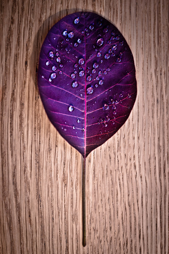
Week 21: Random

7912497566_e0d7c9839b_b.jpg

All sizes on Flickr

The soft, misty rain we've had this morning made our purple foliage look like someone had dumped silver glitter all over it. Couldn't resist a close-up of those tiny, randomly-placed droplets!

I'm really pleased with this shot. I think the background works really well and keeps the "natural" look and theme. I love the purple colour too, very vibrant and jewel-like. I wish I'd got everything absolutely perfectly crisp, but sadly lighting didn't allow (I think it's time to put flashes on my Christmas list).

If you look reeeeeeally closely, you can see me in one of the droplets :D

The shot was originally taken landscape (with the stalk on the right), and I have a copy that way too which I'm using as desktop wallpaper. It's nice, but I think it works better this way up.
 
Just been looking at most of your work, all are very nicely done. Very inspirational... Got me thinking?
 
Body, Lovely portrait, with what could have been a very distracting BG dealt with very nicely.

Liquid, Wonderful, truly wonderful!

Shiny, Nice shot. Maybe says "reflection" more than shiny, but those two are very similar anyway.

Entrance, Nice, but somehow missing a little depth I think?

Fear, no, for me it doesn't quite say fear, but who cares because it's one of te nicest cat shots I've seen!

Authority, very clever, and very nicely executed!

Magical, yes, that really is magical!

Random, Stunning colours! Great composition! Great choice of background! I just love it!

I know I keep banging on about it, but you do have a definite style that I like, and it's bugging me that I can't quite work out how you do it! It's a combination of tone and vividness, DoF, and possibly vignette I think.
 
Just been looking at most of your work, all are very nicely done. Very inspirational... Got me thinking?

Inspirational is high praise indeed :) Thanks!

LIking random Vicky, love the colour of the leaf against the background, it stands out very well. I also like the fact you have rotated it too, seems to suit it well.

Thanks Michael! The colours were edited separately to enhance the leaf and slightly desaturate the wood, so I'm pleased it's come out well.

Well that's definitely random! Love the colours of the leaf against the background too :clap: the only thing that niggles slightly (and it's only a niggle) is the curve in the grain of the wood, it looks almost like it's been taken with a fish eye lens on the left side!

Ugh, tell me about it - when I rotated it and saw it I very nearly redid the whole lot! After a bit of staring I've convinced myself that it adds interest. Honest.

Body, Lovely portrait, with what could have been a very distracting BG dealt with very nicely.

Liquid, Wonderful, truly wonderful!

Shiny, Nice shot. Maybe says "reflection" more than shiny, but those two are very similar anyway.

Entrance, Nice, but somehow missing a little depth I think?

Fear, no, for me it doesn't quite say fear, but who cares because it's one of te nicest cat shots I've seen!

Authority, very clever, and very nicely executed!

Magical, yes, that really is magical!

Random, Stunning colours! Great composition! Great choice of background! I just love it!

I know I keep banging on about it, but you do have a definite style that I like, and it's bugging me that I can't quite work out how you do it! It's a combination of tone and vividness, DoF, and possibly vignette I think.

Muahahahaha :) I do have a couple of presets set up in Lightroom that I almost always use - one for tone, and one for contrast/presence/"punch"/vibrance/etc. I almost always add a vignette too - so I think you can and have worked it out!

Thank you so much for your feedback everyone, it's great to see what I'm getting right and what I need to work on :)
 
Random shot is pretty stunning. Great colour and I agree that the background is spot on.
Minor niggle is that the top of the leaf loses a bit of clarity and the shadow to left distracts the eye. Overall a super entry for the theme.

Oh wow. It might be the pinot grigio, but I'm blushing! Thank you so much.

I completely agree - clearly I'm in desperate need of flashes (or maybe in the interim a bunch of torches?) so I can sort out my lighting! Christmas it is :)
 
Fear - Can't see the fear myself but as you say if I was a mouse ...... :LOL:

Authority - I really like this image. The pp'ing compliments it very well.

Magical - Great quadtych (I'm sure that's not the right word :)lol:). I like the felling of motion between frames. Well seen and captured.

Random - Enough lovely image. The only thing I could crit is the shadow at the top but other than that I like the complimentary colours and the addition of gthe water drops really does make this stand out as a top image.
 
another really good pic as has been said only crit would be the shadow I know how difficult it is to light things with basic equipment I resort to using a torch sometimes. You always come up with something interesting though :clap:
 
Hey Vicky :)

I can't believe how far behind I am with comments - sorry, here goes...

Body - Good natural pose, like the catchlights in the eyes and as expected from you, spot on depth of field and good lighting on his face (y)

Liquid - Like the low point of view, I disagree with your personal crit, I like the shallow dof I think the background would distract too much if it was deeper, the water droplets are frozen nicely, and the colour in the water and it's angle work very well

Shiny re-shoot - Liking that a lot, I'm sure Iain will too... he like shiny stuff too :D

Entrance - I'm torn with this one, it seemed too bright to me too at first, but after looking closer, the gate at the end of the windy path balances it well, and as you say the trees then seem to take on a metallic type of look (thats what I think now - so will stop looking before it does my head in)

Fear - Without the explanation I didn't see fear, just a great looking pussy cat, a great shot still (y)

Authority - Excellent I really like that, what a great idea well executed :clap:

Magic - A good sequence of shots, now that is a great laugh well caught, would love to know the joke and hear the laugh too, she looks like she may pee her self :D !!!

Random - Oh Yes, the purple so stands out on that oak, and the glistening water drops are a nice touch

Phew... glad to have caught up on yours :)
 
Back
Top