You are using an out of date browser. It may not display this or other websites correctly.
You should upgrade or use an alternative browser.
You should upgrade or use an alternative browser.
BlueHaze project52 week 05 Mineral
- Thread starter BlueHaze
- Start date
- Messages
- 29
- Name
- Cathy
- Edit My Images
- No
For me the ultimate comfort is a nice warm bath 
 DSC_4661_edited by Cathy Dickens, on Flickr
And because it doesnt happen very often because of this little terror destroying my peace and my props haha
 DSC_4598_edited by Cathy Dickens, on Flickr
 DSC_4661_edited by Cathy Dickens, on Flickr
And because it doesnt happen very often because of this little terror destroying my peace and my props haha
 DSC_4598_edited by Cathy Dickens, on Flickr
- Messages
- 3,925
- Name
- Carl
- Edit My Images
- Yes
Brave taking your camera near water but nicely composed and spot on theme. As for your "little terror" ... my gosh what a super model for your photography !!!
- Messages
- 3,401
- Name
- Ian
- Edit My Images
- Yes
I originally thought the bath shot was OOF but as has been said, seems to be on the candle which is absolutely fine! Nice warm glow from it and no doubt it was comfortable in there too, though I'm not so sure I would have been with my camera in my hand! [emoji1]
- Messages
- 23
- Edit My Images
- No
Baloo
Pleurodelinae and proud
- Messages
- 4,212
- Name
- Roger
- Edit My Images
- Yes
Excellent interpretation of the Comfort theme, like the pink tint to the picture, the composition is excellent with the flowers and bit of foam on the feet. I might of tried to get the left hand flower in focus as well. Think this shot really works with comfort,warmth and a touch of pampering. Nice one.
- Messages
- 29
- Name
- Cathy
- Edit My Images
- No
Thankyou all for your nice comments  really happy with how it turned out.
Thankyou she is very fun to photograph when she plays ball, if not she is easily bribed haha
Yes i was being extra careful as the camera is the bfs, dont think he would be too happy if i chucked his pride and joy in the bath lol.
As for your "little terror" ... my gosh what a super model for your photography !!!
Thankyou
no doubt it was comfortable in there too, though I'm not so sure I would have been with my camera in my hand!
Yes i was being extra careful as the camera is the bfs, dont think he would be too happy if i chucked his pride and joy in the bath lol.
Minx
Papillon
- Messages
- 2,516
- Edit My Images
- Yes
Song Title - I don't know the song but it is a striking photo.
Order - I agee my eye is drawn to the church in the background on the first, so I like the second picture better I like the blueness of both shots.
Comfort - I like the glow of the candle light and the reflections in the tiles. I would have hidden the lable but that is a personal choice as clearly others like it.
LC2
Negan
- Messages
- 10,457
- Name
- Tim
- Edit My Images
- Yes
Works nicely Cathy. I like the colours you've captured and the lighting from the candle.
Your little model does look like she can communicate well with the camera. I suspect we'll see a few more of her in your 52.
Make the most of it, come the teenage years they don't often want to be in front of the lens.
Your little model does look like she can communicate well with the camera. I suspect we'll see a few more of her in your 52.
Make the most of it, come the teenage years they don't often want to be in front of the lens.
- Messages
- 5,787
- Name
- Storm Trooper
- Edit My Images
- Yes
Hide the label on the candle and have the focus on your feet and its spot on for comfort.
- Messages
- 29
- Name
- Cathy
- Edit My Images
- No
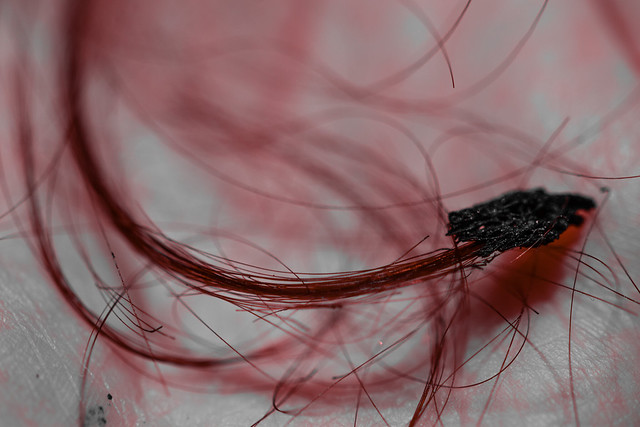
What happens when you stick your head on a lit candle when your busy trying to take photos 
 DSC_4941_edited by Cathy Dickens, on Flickr
 DSC_4941_edited by Cathy Dickens, on Flickr
Last edited:
- Messages
- 662
- Name
- John
- Edit My Images
- Yes
Ouch !!
- Messages
- 13,760
- Edit My Images
- Yes
I'm liking your comfort image Cathy, although the label on the on the candle distracts me a tad, but lovely light and good props too, looks very inviting 
Hairy - Oh dear - like that one too, very unusual and perfect for the theme
Hairy - Oh dear
- Messages
- 3,925
- Name
- Carl
- Edit My Images
- Yes
Oh dear ... risky business photography ... does it classify as a dangerous pastime for insurance purposes? Nicely themed ... the hard way.
- Messages
- 29
- Name
- Cathy
- Edit My Images
- No
Think you did a good job of editing Week 3, those colours were not at all prevalent on the original you showed me. Good job!
Also remind me not to let you take the camera near water, or fire, next time
Yeah it looks compleatly different on the laptop screen, weird.
Well better me damaged than the camera lol
- Messages
- 9,095
- Name
- Mandy
- Edit My Images
- Yes
Comfort - I like your comfort image, good placement of the candles, nice soft warm colours in the image, good take on the theme.
Hairy - fits the theme and looks painful, more care needed around the candles.
Hairy - fits the theme and looks painful, more care needed around the candles.
- Messages
- 29
- Name
- Cathy
- Edit My Images
- No
Thanks for the comments guys 
Thanks steve 2 for the price of one lol.
haha yeah, my bf was like "Urgh whats that smell?" lol
Comfort - one of the best for the week, really like the composition and warm colours....and it even gave you the shot for the next week!
Thanks steve
I bet that smelt horrible! A little gross
haha yeah, my bf was like "Urgh whats that smell?" lol
- Messages
- 29
- Name
- Cathy
- Edit My Images
- No
Little bit late on the smooth but i wasnt very inspired by anything.
04 Smooth
 DSC_5242_edited by Cathy Dickens, on Flickr
05 Mineral
 DSC_5173_edited by Cathy Dickens, on Flickr
04 Smooth
 DSC_5242_edited by Cathy Dickens, on Flickr
05 Mineral
 DSC_5173_edited by Cathy Dickens, on Flickr
- Messages
- 662
- Name
- John
- Edit My Images
- Yes
Smooth looks really tasty, Cathy and the you've caught the waterfall just right to contrast with those lovely greens. It seems a little bit saturated (no pun intended!) with the stonework rather orange. ? artificial stone. Well done
- Messages
- 3,925
- Name
- Carl
- Edit My Images
- Yes
Ooooo that chocolate looks very smooth indeed - like the lighting. Of course water has Minerals in it - don't listen to anyone that says otherwise (tee hee). A slow shutter speed has captured movement in the waterfall nicely.
- Messages
- 29
- Name
- Cathy
- Edit My Images
- No
Of course water has Minerals in it - don't listen to anyone that says otherwise (tee hee)
Haha i did look it up, water in itself isnt a mineral but it contains minerals, thats good enough for me lol.
It seems a little bit saturated (no pun intended!) with the stonework rather orange.
Yeah i agree with you, having a bit of trouble editing atm, different computer screens make the image look compleately different
- Messages
- 9,095
- Name
- Mandy
- Edit My Images
- Yes
Smooth - I guess it is an image for the theme, maybe one to come back to at some point.
Mineral - I do like this, the way you have captured the waterfall is very good.
Mineral - I do like this, the way you have captured the waterfall is very good.


