

You are using an out of date browser. It may not display this or other websites correctly.
You should upgrade or use an alternative browser.
You should upgrade or use an alternative browser.
Carl's 2016 TP52 Challenge **Completed**
- Thread starter Carl Ayling
- Start date
OP
- Messages
- 3,925
- Name
- Carl
- Edit My Images
- Yes
conversion suits, it certainly has seen better days, if it could only talk....
Hi Carl - that's really neat. I like the composition / positioning and processing works a treat too. You could pull the white point or exposure up a fair bit if you'd wanted less of a low-key look but I'm guessing that was your intention to accentuate the abandonment? It's well put together - nice one.
Well spotted, Carl. A subject out of place and well past its best. I like the dark processing too; it underlines the decay.
Fits the theme Carl. When I was taking my living world shot we came across similar abandonments, mattresses that were abandoned in the woods. It seems to me it was more effort to drag the mattress into the woods than to take it to the local council dump, you have to ask why...
Blimey, what a sight. Nice find, nicely shot & processed.
What a great find Carl ...although its ato whoever dumped it. It really works well ...perfect processing and perfect for the theme too.
Really moody, creepy photo. I like it!")
Hi Carl, nice find indeed
Your spiky shot is brilliant Carl - love the lighting on it and it must have been really hard to capture that movement. Abandoned is wonderful too with its darkness and all those textures...though it is making my skin creep a little!
Thank you all for your generous comments. So no takers then for the easy chair .... upholstered in a colour of choice, free delivery ?!?
- Messages
- 4,562
- Name
- Mark Gameson
- Edit My Images
- Yes
Really nice image for Re-shoot Carl nicely seen and very well processed
- Messages
- 688
- Name
- Sheylara
- Edit My Images
- Yes
Fleas and bed bugs sold separately or free of charge?Thank you all for your generous comments. So no takers then for the easy chair .... upholstered in a colour of choice, free delivery ?!?

OP
- Messages
- 3,925
- Name
- Carl
- Edit My Images
- Yes
Thank you Mark.Really nice image for Re-shoot Carl nicely seen and very well processed
It does come with a free starter colony so you don't have to start from scratch (groan)Fleas and bed bugs sold separately or free of charge?

OP
- Messages
- 3,925
- Name
- Carl
- Edit My Images
- Yes
Thank you Bernd.Great find for the re-shoot, and great processing
- Messages
- 332
- Name
- Richard Miller
- Edit My Images
- Yes
Excellent! Love the processing! The image is good and the POV makes the feeling of decay! Does anyone else see a sad face in the arm backrest area? No just me!!
OP
- Messages
- 3,925
- Name
- Carl
- Edit My Images
- Yes
Thank you LizReally like your 'spiky' shot, lots of movement and atmosphere. The old chair certainly fits the theme for abandoned. I like the processing for this one I think it really helps set the scene.
Thanks Richard. Nobody's mentioned it but you got me looking now ... ghostly !!Excellent! Love the processing! The image is good and the POV makes the feeling of decay! Does anyone else see a sad face in the arm backrest area? No just me!!
OP
- Messages
- 3,925
- Name
- Carl
- Edit My Images
- Yes
Week 11 - Artificial
I'm lagging behind a little - helping (skivvying) with my daughter's bathroom re-fit so tight for time. In stripping out the tiled plasterboard, we came across a section of plywood that had been tiled over - it looked like this when stripped down:
 That added to an image of coloured drinking straws which looked like this
 . Merging the two images together in PS produced this - an abstract of several elements of an artificial nature (straws, plywood, tile adhesive and also a small plastic waste pipe stuck in the ply). Probably "marmite" but I like the effect and colours.
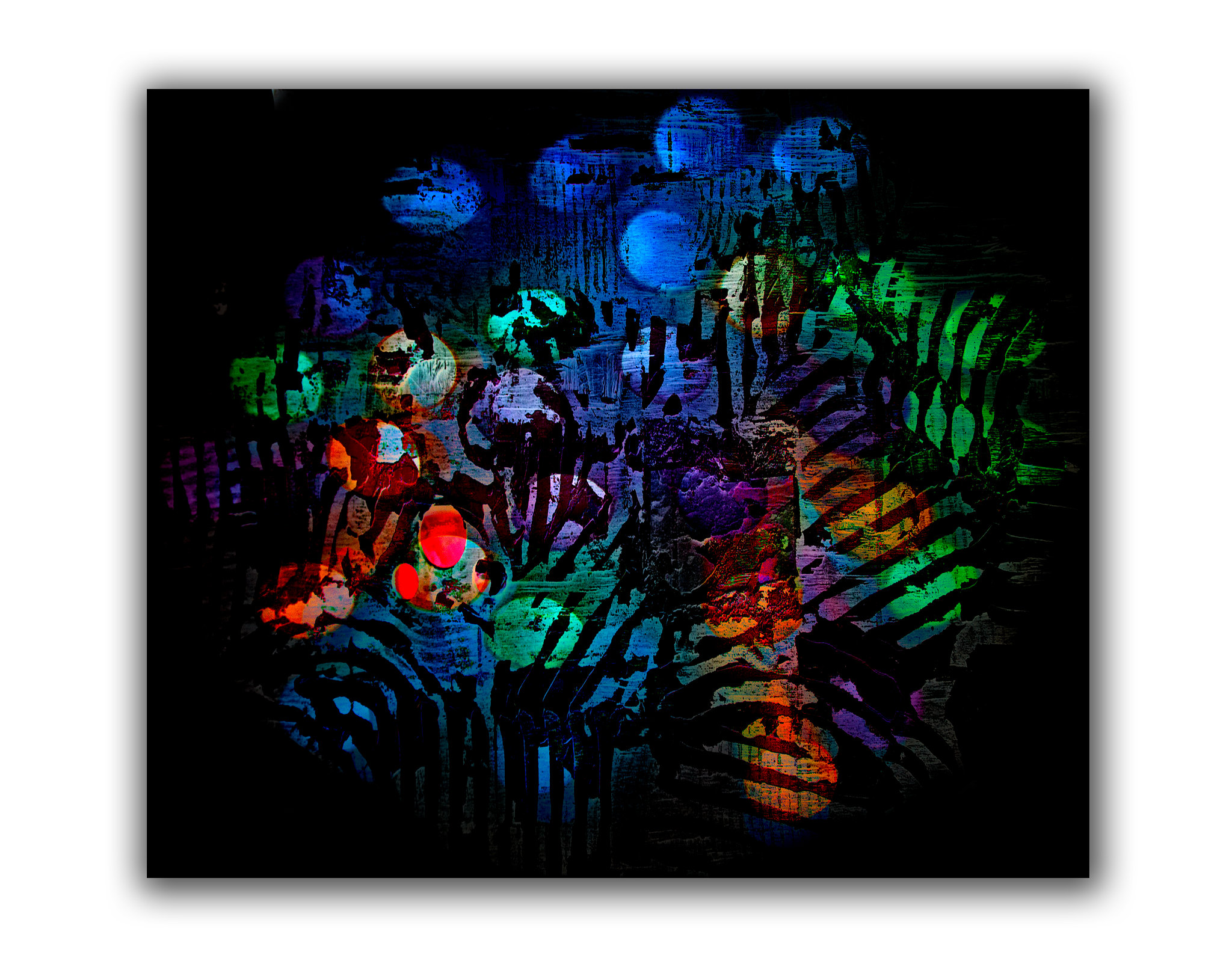 Straws3 by Carl Ayling, on Flickr
I'm lagging behind a little - helping (skivvying) with my daughter's bathroom re-fit so tight for time. In stripping out the tiled plasterboard, we came across a section of plywood that had been tiled over - it looked like this when stripped down:
Straws3 by Carl Ayling, on Flickr- Messages
- 5,433
- Name
- Andrea
- Edit My Images
- Yes
Really like that, Carl . I've no idea why it works so well, and can't image the thought process that put the two images together, but it really does work. Great idea, excellent execution, and a result that I could easily see hanging on a wall somewhere. Great stuff 
. I've no idea why it works so well, and can't image the thought process that put the two images together, but it really does work. Great idea, excellent execution, and a result that I could easily see hanging on a wall somewhere. Great stuff
OP
- Messages
- 3,925
- Name
- Carl
- Edit My Images
- Yes
Thanks Tim - I was a little surprised at the result I have to say.I like that carl. An inspired eye to put those two images together to come up with a composite like that.
Thank you Viv - toilet wall would be more appropriate given the source of one of the contributing images ha ha.Carl, I absolutely LOVE that. It screams "Gallery Wall" to me. Really well done.
Thanks CobraVery nice composite Carl, lovely colours and textures
Thanks Andrea. I know exactly what you're thinking about the thought process - "who in their right mind?" ...... and there lies the answer - the result of a warped mind.Really like that, Carl
OP
- Messages
- 3,925
- Name
- Carl
- Edit My Images
- Yes
Thanks Clive - a tad unusualCleverly done, and very original.
Thank you Susie - not obvious without the write-up but I was struggling to find something a bit different.I had to hop into this one Carl because it was intriguing me as to which topic it was for......now I know
Thanks Chris - not necessarily creative, just weird maybe ha ha.Very nice abstract, I thought it might be an album cover when I first saw it. As others have said very creative use of the two photos.
OP
- Messages
- 3,925
- Name
- Carl
- Edit My Images
- Yes
Thank you Emma - that's kind of you to say; sadly talent & I never quite got it together but I do acknowledge when it passes me by ... usually at a distance.Wow...that is wonderful - very artistic and completely engaging. You are a very talented man - I can only imagine the resulting disaster if I tried to merge straws and plasterbord...!
Ha ha ha - funnily enough I think the guy I'm helping also spells it your way .... to do more with failure in education surely than casting nasturtiums about my work ethic ...... You are a very talented man. skivvying? skiving, I'd call it. Thanks for sharing.
. Thanks David.Thanks Paul. A bit of an experimental fluke really - playing around in PS and a random thought coming together.Well that's very interesting, Carl. I think it's a super end image based on a cracking straw shot. Well done for pulling it all together as the result is super. It could also work as camouflage (in a disco!)
- Messages
- 13,760
- Edit My Images
- Yes
Nicely put together Carl, I would never have guessed they were straws, thanks for showing us the base elements/images, that really helps me get my mind around it - nice one
OP
- Messages
- 3,925
- Name
- Carl
- Edit My Images
- Yes
Thanks DK. A bit zany but Hey! it got the tick.Nicely put together Carl, I would never have guessed they were straws, thanks for showing us the base elements/images, that really helps me get my mind around it - nice one
OP
- Messages
- 3,925
- Name
- Carl
- Edit My Images
- Yes
Week 12 - Personal
Running out of time again so a chance discovery of a colour match between a (stone) heart and red apple set my mind for a quick set-up ... Love of course is very Personal.
 Love Apple by Carl Ayling, on Flickr
Running out of time again so a chance discovery of a colour match between a (stone) heart and red apple set my mind for a quick set-up ... Love of course is very Personal.
Love Apple by Carl Ayling, on Flickr
OP
- Messages
- 3,925
- Name
- Carl
- Edit My Images
- Yes
Thanks Tim. I took a few with and without the hot spot and quite liked it in - gave it a point of interest as it were.Nicely matched colours as you say Carl. Quite a decent shot. The hot spot does attract the attention, was that your intension?
- Messages
- 7,548
- Name
- susie
- Edit My Images
- Yes
It works really well Carl the stone is a gorgeous colour and an excellent choice for the theme, it looks great on Flickr. The light spot looks fine to me, I think it can be a mistake to take all the shinyness out, many things are naturally shiny and reflective, and removing every ounce in a photo can make it look very flat, that's my opinion anyway, not that it's worth much
Last edited:
OP
- Messages
- 3,925
- Name
- Carl
- Edit My Images
- Yes
Thank you Mr.M.Clever idea Carl, works well as is, ( I don't mind the hot spot either)
Thank you Andrea - the shots I took without the light reflection did seem too flat.Lovely strong reds, Carl, and a great match of colours and textures between the apple and the stone. The light spot and shadows add shape to the heart
Thank you Susie. I agree with you wholeheartedly - it did look very flat without. On the contrary Susie, as one of the regular and consistent reviewers, I value your opinion highly. I'm very appreciative of anyone who takes the trouble to comment.It works really well Carl the stone is a gorgeous colour and an excellent choice for the theme, it looks great on Flickr. The light spot looks fine to me, I think it can be a mistake to take all the shinyness out, many things are naturally shiny and reflective, and removing every ounce in a photo can make it look very flat, that's my opinion anyway, not that it's worth much
- Messages
- 4,182
- Name
- Paul
- Edit My Images
- Yes
Hi Carl, that's a really nice composition and the lighting works well for the shadows and texture/shape detail. I'm a bit undecided on the highlight - it's there and it would be very hard to control it perfectly, so part of me thinks you may as well make a "thing" of it - which you've done effectively. Well done, it's a simple but really pleasing image which I could imagine printed on a canvas and hung up
OP
- Messages
- 3,925
- Name
- Carl
- Edit My Images
- Yes
Thanks Paul. I can see that it could be a distraction but it does help define/accentuate the contours of the heart. It seemed to me better with than without ... not that I'm the best judge of these things.I'm a bit undecided on the highlight - it's there and it would be very hard to control it perfectly, so part of me thinks you may as well make a "thing" of it - which you've done effectively.
Thank you Chris. Not sure how/why the association occurred to me ... quirky really.Very well seen and photographed, the colour and texture of the apple are perfect for the stone. As Paul says I can see that hung up somewhere.
Thanks Clive.Nicely taken and great colour.
- Messages
- 4,562
- Name
- Mark Gameson
- Edit My Images
- Yes
Very clever idea Carl really like it. The colours are great. I like the hot spot as it does draw your attention to the shape of the stone
- Messages
- 4,182
- Name
- Paul
- Edit My Images
- Yes
Thanks Paul. I can see that it could be a distraction but it does help define/accentuate the contours of the heart. It seemed to me better with than without ... not that I'm the best judge of these things.
I disagree with the bit in bold btw - your compositions are always strong and well thought out - I think you've done well here and sorry if my comments suggested otherwise!