
OP
Fuji Dave
I'm in Clover
- Messages
- 21,611
- Name
- Dave
- Edit My Images
- No
I think your choice for the main thread was right. Singing faces are so hard to capture pleasantly, whereas the drummer just looks like he's in motion (which I guess he is).
I like the hidden details such as the fact he's barefoot.
I like your shot of the drummer more Dave, it looks more natural to me
Bright
I like the drummer, a bit more space to the right may have looked better, but i understand it might not have been possible.
Liking the drummer there Dave, he's certainly enjoying himself. The 1st would be great with a bit of eye contact.
Thank you folks for the comments and for looking.
")
") ). The drummer is a stronger image in my eyes.
). The drummer is a stronger image in my eyes. Elegant
 Derelect
 Sam Brown
 Prince Regent Home
 Round
Round")


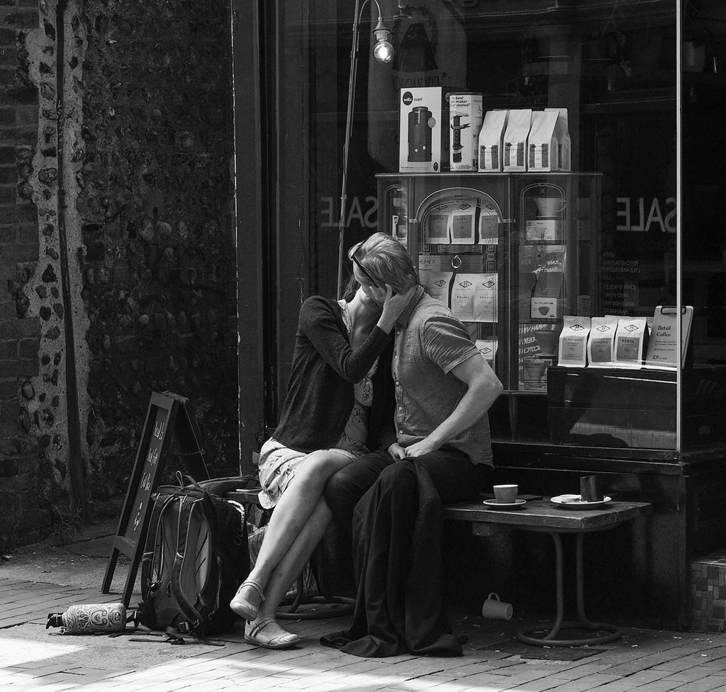 The Kiss