weekly Manxmaid's 52 in 2013 (Week 49 & 50: Colour & Fantasy added!)

Messages
5,433
Name
Andrea
Edit My Images
Yes
OK, having thought about this last year, I'm taking the plunge! Never done anything like this before but I'm looking forward to getting involved and being inspired to get out more often with my camera.

Week 01 - Sin
Week 02 - Season
Week 03 - Gravity
Week 04 - Wild
Week 05 - Space
Week 06 - Work
Week 07 - Gluttony
Week 08 - Time
Week 09 - Juxtaposition
Week 10 - Letter
Week 11 - Electric
Week 12 - Direction
Week 13 - Tacky
Week 14 - Value
Week 15 - Greed
Week 16 - Angles
Week 17 - Rustic
Week 18 - Kind
Week 19 - Vertical
Week 20 - Pattern
Week 21 - Movement
Week 22 - Below
Week 23 - Size
Week 24: Process
Week 25: Rock
Week 26: Pair
Week 27: Shape
Week 28: Plenty
Week 29: Speed
Week 30: Step(s)
Week 31: Mono
Week 32: Connection
Week 33: Beginning
Week 34: Still
Week 35: Whimsical
Week 36: Curve
Week 37: Power
Week 38: Solitude
Week 39: Sweet
Week 40: Cut
Week 41: Live
Week 42: Reflection
Week 43: Melt
Week 44: Left
Week 45: Food
Week 46: Art
Week 47: Friendship
Week 48: Sleek
Week 49: Colour
Week 50: Fantasy
Week 51: Fit
Week 52: Water
 
Last edited:
Hi Andrea....welcome aboard , tis a fun place to be :)

look forward to seeing your shots....hoping you get the chance to show off some wonderful images from the fantastic IOM (y)
 
It's never too late to catch up, good luck!

For example, I'm looking to join in on the 2009 52 next week. :D
 
FINALLY..... better late than never, and I wanted to make a start before it reached week 13 and the quarter mark! I've been noting down the themes and have taken some photos to suit, but week 1 and 'Sin' proved to be a mental block for me as I don't do indoor/still life images and I wasn't happy wth a couple of early attempts.

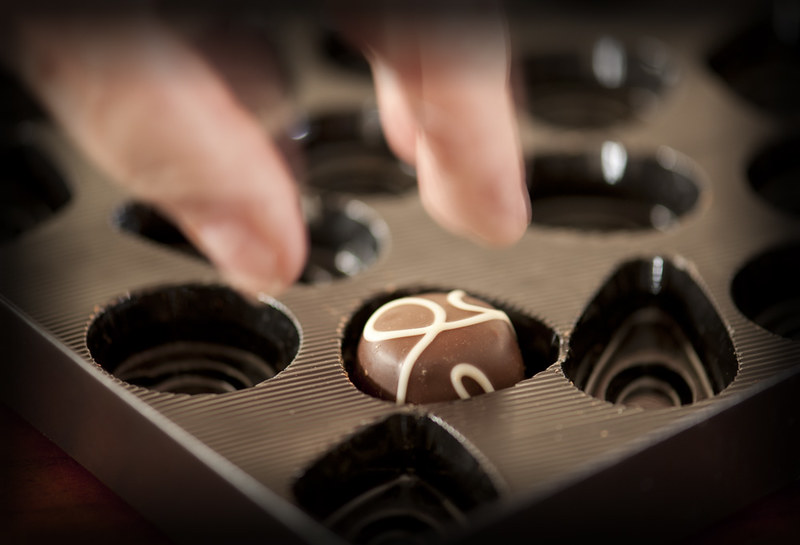
I've resorted to the sin of 'greed' and an image of someone about to take the last chocolate from an almost empty box, but I think I was influenced by seeing some similar images when reading the photos-only thread around New Year. For that reason, I haven't viewed that thread since week 2 and I'm planning not to until I get caught up, which I will aim to do as quickly as I can now that I'm underway. I've never done one of these challenges before, and it has already proved a challenge by taking me out of my comfort zone, so that must be a good thing!

So... Week 1: Sin


TP 52 Week 1: Sin by manxmaid2000, on Flickr

My thoughts: After several attempts, and some difficulty with reflections, this is closest to the image I had in my mind's eye. Best viewed on black, I tried to capture a feeling of dark guilt and haste as the last chocolate was plucked from the box. As I said, I've never done still life images before so I hope to learn during the course of this 52 and maybe revisit this theme again as I did enjoy the challenge :)
 
Week 2: Season

For me, this was a choice between an indoor shot featuring kitchen seasonings, or an outdoor scene summarising a season. I opted for the outdoor one, and hopefully the bare branches, brown foliage and cold sky in this one give a feel of winter.


TP 52 Week 2: Season by manxmaid2000, on Flickr

My thoughts: I'm not 100% happy with it, and wish I could have found a better grouping of trees and more attractive sky, but it does make me feel cold to look at it and reminds me of the cold evening it was taken with this theme in mind.
 
Last edited:
Welcome again Andrea... good to see you get a couple of pics up :)

Liking your Sin shot, the narrow DoF and the movement caught in the hand are really effective (y)

Look forward to seeing some more pics, I'll move you up the spreadsheet when you do - 2 more shots to get back into the main list :D
 
I like the perspective on Season. Good effort

Thank you for the feedback, Alan.

Welcome again Andrea... good to see you get a couple of pics up :)

Liking your Sin shot, the narrow DoF and the movement caught in the hand are really effective (y)

Look forward to seeing some more pics, I'll move you up the spreadsheet when you do - 2 more shots to get back into the main list :D

Thanks for the comment on 'Sin', DK. It took longer than I expected to get there, but I enjoyed the process. I'm working on the next two now and have a couple 'in the can' so I'll be on that main list before you know it :)
 
Hi Andrea, really tough if you get behind, and I know what you mean about doing crit when you're behind! I know as I'm always behind. I do try to leave some comments , but usually wait until I've taken at least some candidate shots, even if they are not always posted (especially if on film).

Anyway, your Sin picture... the chocolate is very nicely in focus, but I found it a little disturbing how much out of focus the fingers are... or maybe the hand was moving? (You can see the outline of one of little cup edges through the thumbnail, for instance).

I really liked the Season shot; quite a tricky one to make work, I should think, but the contrast between the sunlit trunks and the dark foliage mass works really well.

Do keep going and we look forward to some great Manx shots soon...

Hi Chris, thanks for commenting. I was tempted to dive in a couple of weeks ago and start with that week's theme, but having decided I would do this at the end of last year I'm jolly well going to catch up! I'd rather not look at other peoples' ideas until I've at least decided on mine, and although it will be tempting now I'm up and running I aim to be fully caught up within a fortnight and then join in with the commenting, too.

On Sin, the blur in the fingers is motion blur, meant to imply that the hand is darting in to take the last chocolate. It took a few attempts to try to get the right amount of movement - too much and the hand looked ghostly, and too little and it just looked like a focus error - but it is subjective, I know.

On Season, thank you. I would have preferred a few more branches in the top left corner and a better sky, but hopefully it implies winter.

I hope I can come up with a few nice Manx images during the year, and I'll look forward to visiting your thread.
 
Week 3: Gravity

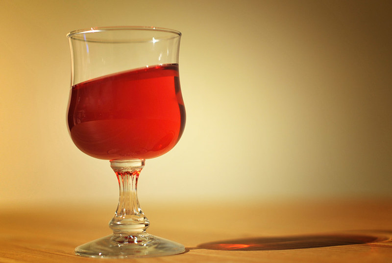
I had this shot in mind from the start, struggled with the technique (me and still life again!) and tried other things like footballers leaping in the air, dogs doing the same, water drips, but with the weather keeping me inside most of this week tried again and came up with this:


TP 52 Week 3: Gravity by manxmaid2000, on Flickr

My thoughts: Not 100% happy again (are we ever?) because of the reflections in the glass and the strange effect on the right side of the glass that looks like a smudge but isn't, but I have enjoyed the process and will definitely try this again some time. I processed a black and white version too but preferred the warm tones in this one.
 
Last edited:
Week 4: Wild

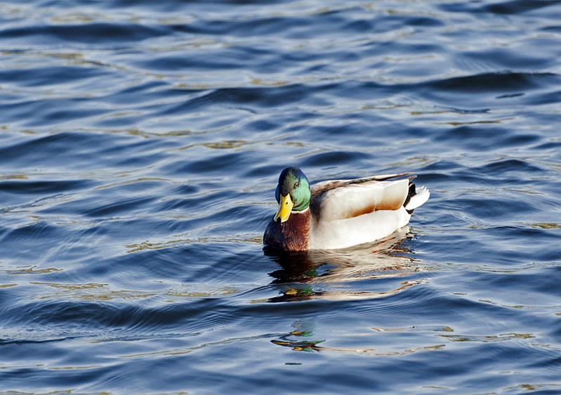
Being so far behind by mid-February, I was fortunate to find subjects suitable for weeks 4 and 5 on the same day. This chap caught my eye with his bright feathers picked out by some rare sunshine and the ripples on the lake reflected the blue sky and a flash of his head and beak too.


TP 52 Week 4: Wild by manxmaid2000, on Flickr
 
Look at you go Andrea !!!

Gravity - Nice clean image that, I like the tones of the whole shot, the reflection in the wood and a real nice background - Nice One (y)

Wild - Again a nice reflection, good detail on the water and a pleasing composition...

I see a catch up on it's way... so your correct - off the naughty list :(


:D
 
Last edited:
Look at you go Andrea !!!

Gravity - Nice clean image that, I like the tones of the whole shot, the reflection in the wood and a real nice background - Nice One (y)

Wild - Again a nice reflection, good detail on the water and a pleasing composition...

I see a catch up on it's way... so your correct - off the naughty list :(

:D

Thanks for the comments, DK. Much appreciated :)


Week 5: Space

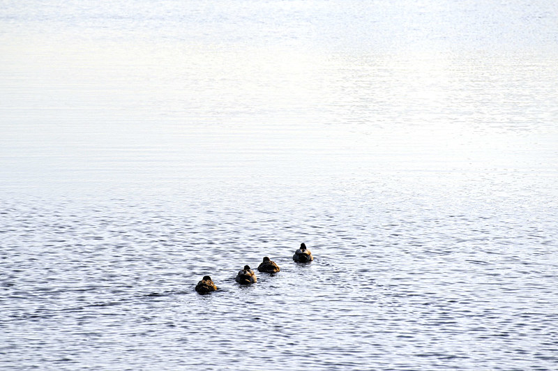
The second of the two themes killed in one day; this time I spotted the ducks swimming away from me and leaving a wake behind them, and as I raised the camera realised the sunlit space ahead of them would fit this theme.


TP 52 Week 5: Space by manxmaid2000, on Flickr

My thoughts: The quickest and most impulsive effort yet. I saw it unfolding in the viewfinder and realised with a little adjustment it might fit the theme, and hopefully others will agree. I considered cropping the darker ripples at the top of the frame, but thought that they add depth to the scene and show how much space was ahead of these ducks.
 
Last edited:
this is becoming quite an imnpressive catchup....

sin - seems ages ago now. :LOL: good all round, movement, focus, DOF, colours. Good start!
season - i love the POV and the perspective, all the tree branches reaching into the centre. Square crop with a heavy circular vignette maybe.......

Gravity - great idea, lovely colours and fade in the BG. Looks convincing too.

Wild - its a duck :LOL:

Space - really like this, great for the theme too. You were very right to leave the ripples at the top. Otherwise i think it would have looked faked or processed. Nice leading lines formed by the V of the wake.
 
Last edited:
this is becoming quite an imnpressive catchup....

sin - seems ages ago now. :LOL: good all round, movement, focus, DOF, colours. Good start!
season - i love the POV and the perspective, all the tree branches reaching into the centre. Square crop with a heavy circular vignette maybe.......

Gravity - great idea, lovely colours and fade in the BG. Looks convincing too.

Wild - its a duck :LOL:

Space - really like this, great for the theme too. You were very right to leave the ripples at the top. Otherwise i think it would have looked faked or processed. Nice leading lines formed by the V of the wake.

Thanks very much for looking through and for your comments, Graham. You're right about Season, I will go back and try that. And the duck was really wild and quite fierce, honest! ;-)
 
Week 6: Work

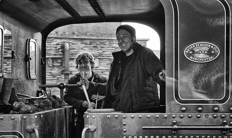
A Bank Holiday weekend isn't the best time to go out looking for people at work, but then a distant whistle reminded me that the Isle of Man Railways are all in operation this weekend... :)


TP 52 Week 6: Work by manxmaid2000, on Flickr

My thoughts: I had intended to process this in black and white anyway, but with the interior of the cab being slightly underexposed in the shot I chose I think black and white tones and a touch of grain add to the gritty look of their 'office' and their sooty faces at the end of their journey.
 
Last edited:
I like both work and space a lot Andrea (y)

Space, as Graham said has some great leading lines from the wake left by the birds, it draws the viewers eye in and through the scene.

Work, you've caught some great detail throughout the scene, the B&W conversion really suits the subject.

Good work on your catching up, keep it up, you're nearly there.
 
Thanks for looking in and commenting, Iain; I liked the little wake behind the birds too.

I hope to be caught up within the week as I have a couple of shots already 'in the can' and a chance to get out and about this weekend. Once I am, I'm looking forward to getting around everyone's threads and joining in properly.
 
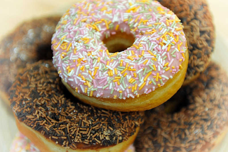
Week 7: Gluttony

A plate of fresh doughnuts, close-up focus on the top one and especially the light on the sprinkles and the icing.


TP Week 7: Gluttony by manxmaid2000, on Flickr

My thoughts: I'm certainly being challenged by 'still life' images in these early weeks! I was content with the final result, but wished there had been another pink doughnut further in the frame instead of four chocolate ones, but by the time I noticed that and returned to the kitchen to rearrange them, there was just one left as the rest of the family thought I had finished! :LOL: I faded out the corners a little to keep the focus on the top doughnut, but am not sure it was needed.
 
Last edited:
Wow, you've been working hard, Andrea! It's really tough when you get (or start) behind, but you're doing an amazing catch-up job. Keep at it.

Let's see... I think your Gravity shot works really well, lovely colour, and strange enough to be unsettling.

Wild, yes it's "just" a duck, but it's well lit and positioned in the frame, and the little waves have good colour and actully provide enough interest to lead my eye for a wander round the frame before settling back on the duck. Well pulled off.

Space: I like the idea and the leading line as said. But there's something odd about the big blank space in the top half. At first I thought it was sky or perhaps mist (there being no horizon), but then there are some waves above it. So it seems like it's blown out.

Work: that's a great shot, well composed, natural poses and very gritty. Perhaps a touch over-processed? There are halos around heads and that top right arm. Maybe it's just the contre-jour effect, but would it work better with a bit less.

Gluttony: again, lots to like here, although I don't think the fading effects at the edges work well, and I think it might have been better if more of the top doughnut was in focus.

But overall, a great job.
 
Thank you for your further feedback, Chris; much appreciated!

I did ponder over 'Space' because of those darker ripples at the top. It's all water and I left the different 'layers' in to give an idea of the extent of the space they were swimming into, but it's also direct sunlight reflecting off the waves so although there is detail throughout the layers I agree that there are a couple of patches where I think they have blown.

I also agree about the halos in Work. It's not the shot I had planned, but their expressions in their 'office' tempted me into a closer crop and the contrast between the dark interior of the cab and the white sky behind was just too much to deal with.

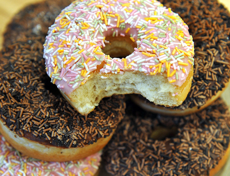
I wasn't 100% happy wth Gluttony and, as mentioned, I would have re-shot if the subject matter hadn't been eaten in the meantime :) However I have uploaded an alternative shot below without the faded corners, just to see.

Thank you again.


TP 52 Week 7: Gluttony (2) by manxmaid2000, on Flickr
 
Week 8: (The Hand of) Time

There are a few nice public timepieces over here that sprang to mind, but none so unusual as this one-handed 16th Century clock. Unfortunately time stands still at the moment as the ancient mechanism stopped working in 2011 and it is currently undergoing restoration, but the faded clock face clearly bears the three legs of Man on two corners and the date, and the Eliz. Reg. lettering reflects that the clock is said to have been presented by Queen Elizabeth I.


TP 52 Week 8: Time by manxmaid2000, on Flickr

My thoughts: Access to the clock is very limited at the moment as the Castle gardens are closed until later in the year, so I had no option but to climb a bank and shoot more or less straight on. I will probably revisit later in the year and try from some different angles and in different light.
 
Damn Andrea... I'm struggling to keep up now !!!

Gluttony - I would have liked to see the top do-nut un-clipped, but good detail center frame :)

Time - For me it looks a bit washed out, not so sure on the ventral placement either, it's a nice looking clock that's for sure, just think you got it wrong time of day

And the catch up continues with a pace - well done (y)
 
Hi Andrea

glad to see you're still hanging on in here...pretty impressive catch up hun :hug:

Work...l.ove the B&W..gives a more period feel to the image which fits with the steam trains..good expressions...oh to actually enjoy work :)

Gluttoony...prefer the edited version, good focus, great colors & nicely laid out (y)

Gravity...agree with your thought that the tones in this shot add an extra something to it...nice little slant going on there , like the shadow & the lighting (y)

Season...yup , like the upward angle with a hint of blue sky contrasting nicely with the brown autumnal colors of the tree's...good spot :)

Space.....very calming & certainly on theme :)
 
Damn Andrea... I'm struggling to keep up now !!!

Gluttony - I would have liked to see the top do-nut un-clipped, but good detail center frame :)

Time - For me it looks a bit washed out, not so sure on the ventral placement either, it's a nice looking clock that's for sure, just think you got it wrong time of day

And the catch up continues with a pace - well done (y)

I have the next two already taken, but nothing for Electric yet :) Thanks for your feedback. I'm disappointed with the result for Time because although the exposure is spot on (the clock face is faded and the wall is pale stone) today's direct sunlight doesn't do it any favours and I will go back at a few different times to see how it looks.

Hi Andrea

glad to see you're still hanging on in here...pretty impressive catch up hun :hug:

Work...l.ove the B&W..gives a more period feel to the image which fits with the steam trains..good expressions...oh to actually enjoy work :)

Gluttoony...prefer the edited version, good focus, great colors & nicely laid out (y)

Gravity...agree with your thought that the tones in this shot add an extra something to it...nice little slant going on there , like the shadow & the lighting (y)

Season...yup , like the upward angle with a hint of blue sky contrasting nicely with the brown autumnal colors of the tree's...good spot :)

Space.....very calming & certainly on theme :)

Wow, thanks for the big catch-up and all the comments. Glad you liked their expressions in Work; I did too. As soon as I'm up-to-date I'll be around everyone's threads to return the visits and get more involved, and I've already added a subscription to yours :)
 
Hi, Andrea, few quick comments until I've caught up then I'll subscribe (y)

Sin, nice motion blur and vignette. Not sure if the chocolate is slightly OOF?

Season, lovely light on be lower trees, great perspective and detail. Might have been tempted to crop in slightly.

Gravity nice idea and you've just about pulled it off. I'd like I see more of a na Nike in the fluid. WB looks a tad off.

Wild, well composed and good eye contact. Light looks very harsh.

Space, now this I like, has a real high key feel to it, of which I am a fan.

Work, another cracker and the pressing is spot on, nice and gritty. Pity thrive wasn't looking a you.

Gluttony, nice shallow DOF and lovely colours. Not keen on the clipped main doughnut. Good edit BTW.

Time, great clock the has real character. Again not keen in p the composition and harsh light.

Well caught up :clap:

Cheers.
 
Hi Andrea

Sorry but seem to have missed your posts, so will subscribe now but won't go thro them all as you have had some detailed comments. Suffice to say that i really like the ideas and comp in Gravity, Space and Work,. All good shots

Time - that is a very pleasant image - lovely detail in the warm coloured stonework and the faded blue and gold of the clock. Just a bit overexposed i think so that that the colours and textures just lose a little detail.
 
Hi Andrea :wave:

Gluttony: 2nd version is better but a little too tightly cropped in my opinion.

Time: That's a nice shot, focus, clarity & light is really good. Different colours of brickwork add to the background.
 
Still going strong Andrea - pretty impressive job!!

Do prefer the bitten into donut shot - seems o have more of a feel that someone's going to plough through them all./

time works well - the face on POV and the central composition compliment each other well - was just about to comment on the one hand - till I read back up to your descriptive text. Definately feel a different time of day would yield some more interesting shadows, both on the clock face and the brickwork as you said!
 
Hi, Andrea, few quick comments until I've caught up then I'll subscribe (y)

Sin, nice motion blur and vignette. Not sure if the chocolate is slightly OOF?

Season, lovely light on be lower trees, great perspective and detail. Might have been tempted to crop in slightly.

Gravity nice idea and you've just about pulled it off. I'd like I see more of a na Nike in the fluid. WB looks a tad off.

Wild, well composed and good eye contact. Light looks very harsh.

Space, now this I like, has a real high key feel to it, of which I am a fan.

Work, another cracker and the pressing is spot on, nice and gritty. Pity thrive wasn't looking a you.

Gluttony, nice shallow DOF and lovely colours. Not keen on the clipped main doughnut. Good edit BTW.

Time, great clock the has real character. Again not keen in p the composition and harsh light.

Well caught up :clap:

Thanks for looking and commenting on everything so far, Andy. I think/hope the chocolate in Sin is in focus as that was the main subject and I can pick out the little flecks in its surface, although I deliberately used a very narrow DOF and the back edge of the sweet is falling out of focus. Glad you liked the motion blur, which was a last minute idea, and the high key effect in Space :)

Agree with your comments on the light for Time too, and I will definitely re-visit that clock at a different time and when the access is open again.

Hi Andrea

Sorry but seem to have missed your posts, so will subscribe now but won't go thro them all as you have had some detailed comments. Suffice to say that i really like the ideas and comp in Gravity, Space and Work,. All good shots

Time - that is a very pleasant image - lovely detail in the warm coloured stonework and the faded blue and gold of the clock. Just a bit overexposed i think so that that the colours and textures just lose a little detail.

Thank you for commenting and subscribing, Alan. Glad you liked those other images, and I will definitely have another shot at that clock!

Time seems very very bright to me....some editing of the levels should get a nicet shot I think, but I find it quite interesting and actually like the fact its not square on

Thanks for looking in, Chris. I clearly picked the wrong 'time' of day for Time, with the sun shining directly at that wall of the castle, but I'm glad you found it interesting.

Hi Andrea :wave:

Gluttony: 2nd version is better but a little too tightly cropped in my opinion.

Time: That's a nice shot, focus, clarity & light is really good. Different colours of brickwork add to the background.

Thank you, Dave. Would you believe I went back to reposition those doughnuts after reviewing the initial photos and there was only one left as the family thought I'd finished with them! :) Glad you liked Time.

Still going strong Andrea - pretty impressive job!!

Do prefer the bitten into donut shot - seems o have more of a feel that someone's going to plough through them all./

time works well - the face on POV and the central composition compliment each other well - was just about to comment on the one hand - till I read back up to your descriptive text. Definately feel a different time of day would yield some more interesting shadows, both on the clock face and the brickwork as you said!

Thanks for commenting again, Graham. The doughnuts didn't hang around for long, and that clock is so going to get a re-shoot! :)
 
Last edited:
Week 9 - Juxtaposition

"Placing close together or side by side, especially for comparison or contrast". Having seen the snowdrops in this church yard a few days earlier, my idea was life and death, light and dark.


TP 52 Week 09 - Juxtaposition by manxmaid2000, on Flickr

My thoughts: I found the execution much harder than the idea, and after crawling around on the muddy ground in various different positions I still didn't really get the image I had in my head. I picked this one because I was attracted by the light picking out the fresh snowdrops and the base of the headstone beside them, which seemed to encapsulate the contrasts between life and death, and light and dark.
 
Back
Top