You are using an out of date browser. It may not display this or other websites correctly.
You should upgrade or use an alternative browser.
You should upgrade or use an alternative browser.
weekly Mr.Si's 52 Week Challenge - Final Photos Added
- Thread starter mr.si
- Start date
- Messages
- 8,398
- Name
- Lynne
- Edit My Images
- Yes
Hi Simon
I've obviously missed something here....who is/are the "we" & " our" you mention ?....doesn't take much to confuse me !
Mineral...what are they ? Nicely laid out & positioned in the frame ...maybe a little soft as others mentioned & ,not sure how , but diffusing the light a little may have lost the highlights ?
I've obviously missed something here....who is/are the "we" & " our" you mention ?....doesn't take much to confuse me !
Mineral...what are they ? Nicely laid out & positioned in the frame
- Messages
- 13,760
- Edit My Images
- Yes
Hi Simon 
Mineral - Some well stacked stones there, a bit more DoF would be nice, but a nice bright selection of colours there and well lit
Mineral - Some well stacked stones there, a bit more DoF would be nice, but a nice bright selection of colours there and well lit
- Messages
- 1,159
- Name
- Simon
- Edit My Images
- Yes
Thank you all for your comments.
Time for Week 7 - Sense!
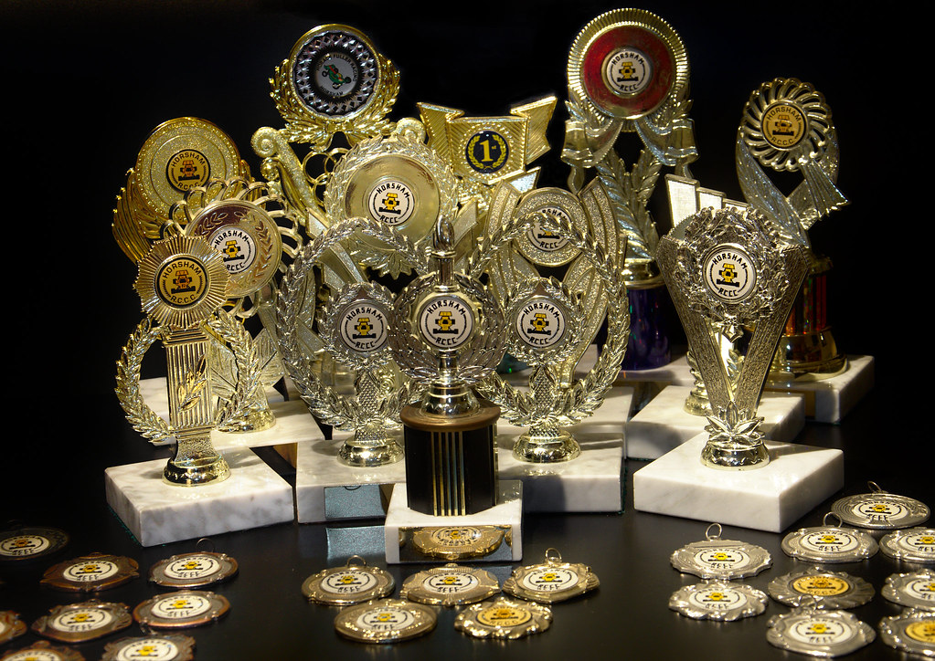
This photo is named "A Sense of Achievement"

A_Sense_of_Achievement by Mr_Si, on Flickr
Had some fun (or rather, not) with the lighting on this one!
Time for Week 7 - Sense!
This photo is named "A Sense of Achievement"

A_Sense_of_Achievement by Mr_Si, on Flickr
Had some fun (or rather, not) with the lighting on this one!
- Messages
- 4,345
- Name
- Martin
- Edit My Images
- Yes
Wow, are they all yours? I opresume you are awaiting a theme on 'cars' or some such, especially remote control ones.
Nothing bad to say about the photograph, it fits the theme well.
Nothing bad to say about the photograph, it fits the theme well.
- Messages
- 9,095
- Name
- Mandy
- Edit My Images
- Yes
Wow that's a nice collection of trophies and medals there. I like the image, another nice different take on the theme.
- Messages
- 338
- Name
- Simon
- Edit My Images
- No
Well on theme you've certainly achieved quite a lot there, I can imagine it was a nightmare to light though!
My friend used to do a lot of RC racing, he used to do the touring car nationals and something in europe as well?..
Well done mate
My friend used to do a lot of RC racing, he used to do the touring car nationals and something in europe as well?..
Well done mate
- Messages
- 6,502
- Name
- Peter
- Edit My Images
- Yes
Mineral - Lighting and sharpness is the main factor here. I like the boldness of the colours though
Sense - A bit closely cropped at the top but the lighting has been well handled and I like this as a take on the theme. Good thinking - and driving given the number of trophies.
Sense - A bit closely cropped at the top but the lighting has been well handled and I like this as a take on the theme. Good thinking - and driving given the number of trophies.
- Messages
- 868
- Name
- Jason
- Edit My Images
- Yes
Sense: Brialliant idea Si. photography talk aside now, you should be proud of these....too many people these days are couch potatoes and never have interests and hobbies outside of work. I always commend people who buck this trend as I strongly believe this keeps us 'young' and in good frame of mind.
Photography wise, you've done well with the lighting of a tricky subject and I dont feel its too busy. The wonky angel (to the left?) lets it down a touch
Photography wise, you've done well with the lighting of a tricky subject and I dont feel its too busy. The wonky angel (to the left?) lets it down a touch
- Messages
- 1,159
- Name
- Simon
- Edit My Images
- Yes
- Messages
- 4,345
- Name
- Martin
- Edit My Images
- Yes
Well that's three of us with buffers in their photos, glad I found a couple of alternatives too otherwise we'd accused of plagiarism.
I like the composition although that algular bit in the background is a bit distracting.
I like the composition although that algular bit in the background is a bit distracting.
- Messages
- 9,095
- Name
- Mandy
- Edit My Images
- Yes
Well i think this has got to be the best image with buffers in so far that i have seen. It fits the theme perfectly good composition crit wise i find the background distracting.
Happysnapper79
Suspended / Banned
- Messages
- 710
- Name
- John
- Edit My Images
- Yes
It conveys the theme but the composition as mentioned above needs a little tweak.
- Messages
- 8,398
- Name
- Lynne
- Edit My Images
- Yes
Hi Simon
Definitely a collection to be proud of there , well lit ( must have been a a nightmare with all those reflective surfaces ) Good black bg as well .
I do feel it's a little busy though , maybe just pick a few of them out ? & again , it may be the angle you shot at but it appears to be listing to the left a little ?
Ending , yup , on theme but lacking a little something....context or surrounds ?
Definitely a collection to be proud of there , well lit ( must have been a a nightmare with all those reflective surfaces )
I do feel it's a little busy though , maybe just pick a few of them out ? & again , it may be the angle you shot at but it appears to be listing to the left a little ?
Ending , yup , on theme but lacking a little something....context or surrounds ?


