weekly Nod's '23 52 - Week 21 - Near by.

That is weird, I presume your model has a real nose and that's why it isn't in the picture :D
 
Broken (several times, so vaguely straight) but real!!!
 
Liking the figs, I imagine they're quite small. I've a fig tree too and it seems hit and miss when it fruits - but when it does, they're great. Nice colour and detail on your shot.

Artificial is a simple easy take on the theme.
 
  • Like
Reactions: Nod
I can't draw the bleedin' curtains!!! :p
 
So many ideas, so little time to capture them!

However, I was able to get this week's done. While it appears to be just the moon, there's quite a lot of (very!) transparent stuff between me and it!

DSCF0608.JPG
 
Wondered how it fitted, very good
 
  • Like
Reactions: Nod
Just the one from me, culled from lots that worked even less well!

I've always loved the way ice forms on surfaces, from the hoar frost on branches to the sheets on puddles, especially the way it looks like the Zinc crystals on galvanized steel when it's on windscreens, so with the frost this morning, I tried to capture it and I think I just about managed! I added a little extra light (not much natural about at 07:30!) from a magnetic multi LED lamp on the roof (bonnet's Al so it wouldn't stick there!). Kept having to wipe the inside of the screen to get rid of the condensation that was freezing onto the screen. The Tech bit is the zig-zag wires that are just about visible which are the heating elements for the screen - hot and cold being the juxtaposition. (I do have a back-up plan for the tech - an author called Piers Anthony wrote a book titled Juxtaposition and I was going to shoehorn that into a shot somehow!)

DSCF6467.JPG
 
Artificial, good fun shot.
Transparent, nice to see a moon shot that isn't a full moon, love all that negative space, handy that it is transparent.
Snappers Choice, like the idea, difficult shot to pull off but I think you have done it.
 
  • Like
Reactions: Nod
Just about. It's a shame that the wires are all but invisible from the outside and that the "galvanized" effect doesn't show as well in photographs as it does in real life.

As for the Moon shot, IMO, the Moon is much more interesting (photographically) when it's 1/2 - 3/4 rather than full - it's the shadows along the "Sunrise" line that make it.
 
In the main thread, I saw this and thought, 'i hope there's a story to back this up'. Glad there is because the narrative not only explains the image, but the thinking behind it too.

The vertical of the elements did come through when we're looking for them, and the ice looks like clouds until we know what it is

Brave choice, works well
 
  • Like
Reactions: Nod
Definite points for effort and imagination.

I wish it had entered my befuddled brane that it would be cold inside the car - I'd have put on more layers!!!

Graham, the elements show up much better on the original but get a bit lost once shrunk to forum size. With hindsight, I should have cropped into the image rather than shrinking the whole frame but even then, they're fairly unobtrusive (which, given that they cover the whole screen, is probably a good thing!)
 
Running out of time so not my best work but it does fill the brief!

Tried taming the highlights with a dash of underexposure in the first one but it darkened it all too much so decided to let them blow slightly.

DSCF6472.JPG

DSCF6470.jpg

Annoyingly, I KNOW I have a big bag of knobs. Unfortunately, I don't know where it is!
 
Fits the bill, ticks the box.
It's annoying isn't it when you know you have something but you just can't find it.
 
  • Like
Reactions: Nod
Nice selection of Knobs you have there.
 
  • Like
Reactions: Nod
Fits the bill, ticks the box.
It's annoying isn't it when you know you have something but you just can't find it.

Luckily, I only wanted them rather than needing them. If I had NEEDED them, I'd have bought more then found the originals when I went to put any leftovers away... The quantity I have were bought to use as bun feet on a load of small Ottomans that Mrs Nod uses for seating and storage in her Yoga studio but she decided to just take the castors off and leave them low instead. Good job the knobs/feet were cheap as chips!
 
First does feel underexposed, highlights on the second feel natural.

I found a bit of black paper useful to tame highlights. Nice to have the contrast between the soft wood and the shiny metal of the knob
 
  • Like
Reactions: Nod
A couple from me this week, both close to home (the back of the car!) While I like the simplicity of the "XF", I think the splash of colour in the "S" adds enough to lift it over the other.

DSCF6476.JPGDSCF6477.JPG
 
So difficult to get into the gaps to clean, I have only once resorted to the cotton buds on mine but can feel another OCD outing with the cleaning kit coming on now !
 
  • Haha
Reactions: Nod
Nice take on the theme :)
 
  • Like
Reactions: Nod
Prefer the S too. nicely polished and the inclusion of the text from the lens adds I think.

It's amazing how the dirst and dust specks get magnified - would it have come cleaner with a gentle toothbrushing?? :)
 
  • Like
Reactions: Nod
I prefer the S, the colour definitely draws the eye.
 
  • Like
Reactions: Nod
Cleaning? Every time it gets washed, it gets taken to Mrs Nod's Mum's bungalow for another tip/charity shop run and that road is filthy! Most of the road grime seems to adhere to the boot of the car and is a bu99er to get off, especially (as noted) from the small gaps in the letters. Once the house is cleared and the weather is less dirtying, I'll get it valeted properly. Maybe!
 
Nicely done, the S would be my choice too, given the colour involved,. Good take on the theme too.
 
  • Like
Reactions: Nod
Agreed that the addition of colour lifts the image. Very polished ;)
 
  • Like
Reactions: Nod
2 of the same from different angles. Tiny kitchen restricted my choices a bit (without repeating shots that covered different themes!) so it had to be yesterday's tea - veggie chilli wrap filling.

DSCF6522.JPGDSCF6523.JPG

I think the second one looks tastier!
 
Mmmmm yum yum :)
 
  • Like
Reactions: Nod
I'll go for the second too. Be interesting if we can pinpoint why though as they are so similar.

Think for me it's the slightly less liquid, maybe that slice of pepper(?)or chilli being a bit of a focal point?
 
Last edited:
  • Like
Reactions: Nod
I reckon it's probably that the strip of pepper has the skin side facing the camera in the second shot - it's actually the same bit of pepper that's just below the centre of shot #1.

Dave/-Oy-, it was very yum yum - even for a meat eater!
 
Managing some comment catch-up!

Snappers Choice - It actually looks like a densely packed forest scene with sun light coming in at the top. I can still remember the impressive ice patterns forming on the inside of my bedroom window when I was a teenager.

Knob - The second one looks sharper, did you consider having them separate from each in a graduating scale?

Letters - I agree the colour in the second just adds a bit more.

Kitchen - The second one has greater variety and does look more appealing.
 
  • Like
Reactions: Nod
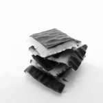
Having a small house, broken stuff doesn't tend to stay that way for long - it gets fixed or binned! I did consider breaking something just for the shot but decided to restrict myself to just snapping an After Eight into quarters, getting as much contrast as possible in the camera, upping the ISO to get some hint of "grain" and converting to B&W in camera as well to get the tech covered too. Evidence now disposed of (and the spare model went to Mrs Nod!) BG is an A3 sheet of white paper taped to a chopping board and the splashback in the kitchen to give an infinity curve but the +1 stop I threw in has blown the BG as intended so you can't see the curve! Lighting is the spots on the ceiling.

DSCF6540c.jpg
 
Back
Top