OP
-Oy-
Worzel Gummidge
- Messages
- 9,068
- Name
- Dave
- Edit My Images
- No
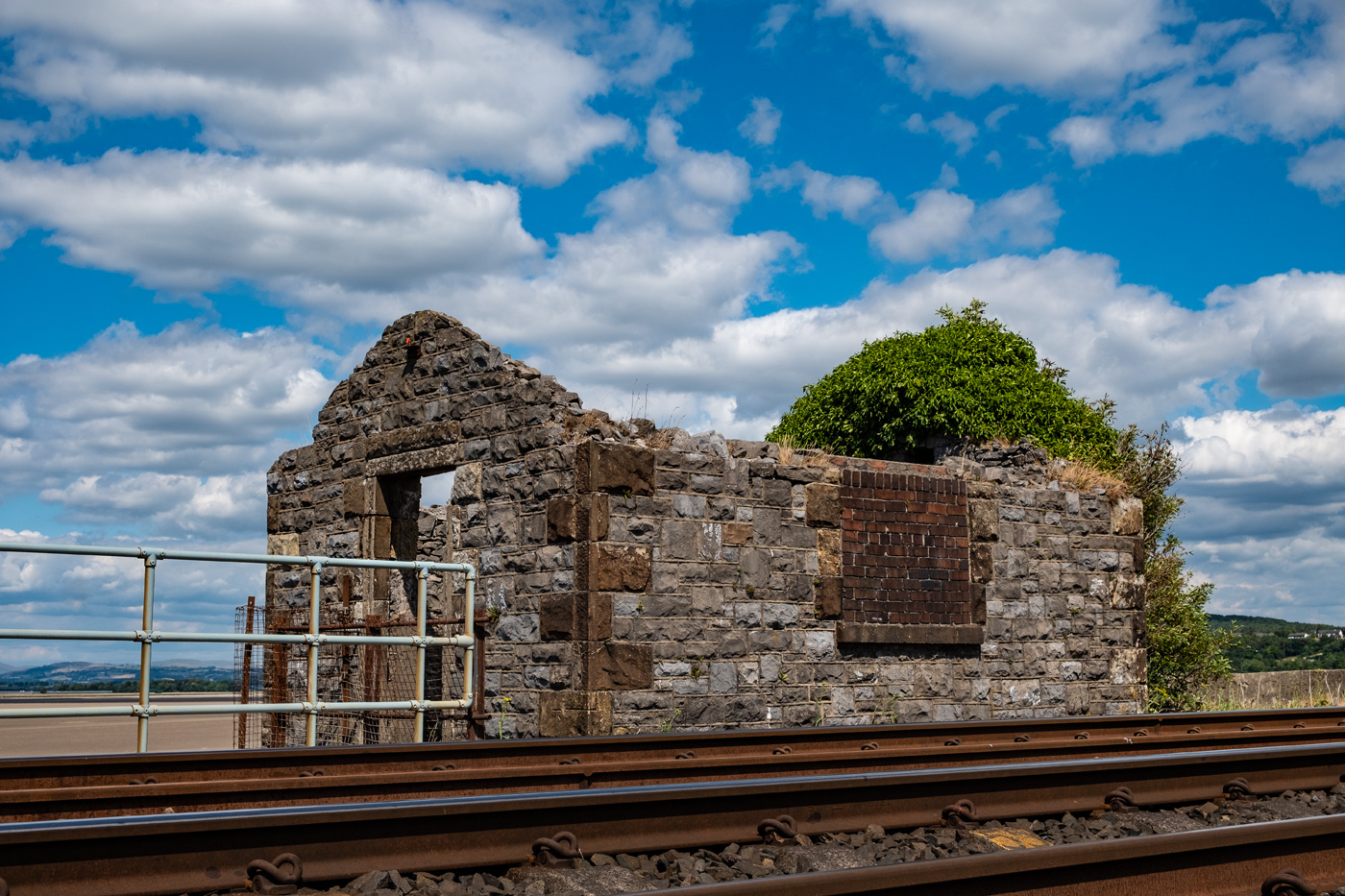
Bright
The first photo does the job for me. It's a good pov and I really like the colourful flowers at the bottom, with the clear blue sky above.
Thanks
")
Two good take, I think I prefer the Goldwing, lots of brightwork
Tanks - the starburst literally caught my eye as I walked past
Hi Dave.
Very starbursty, both of them.
I like the starburst and how the metal frame points at it in the first, the starburst reflection on the GL1500 shows how cared for the bike is.
One of the few bikes with a reverse gear that!
Cheers
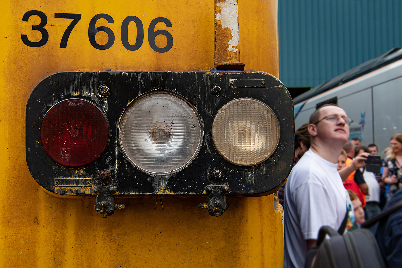
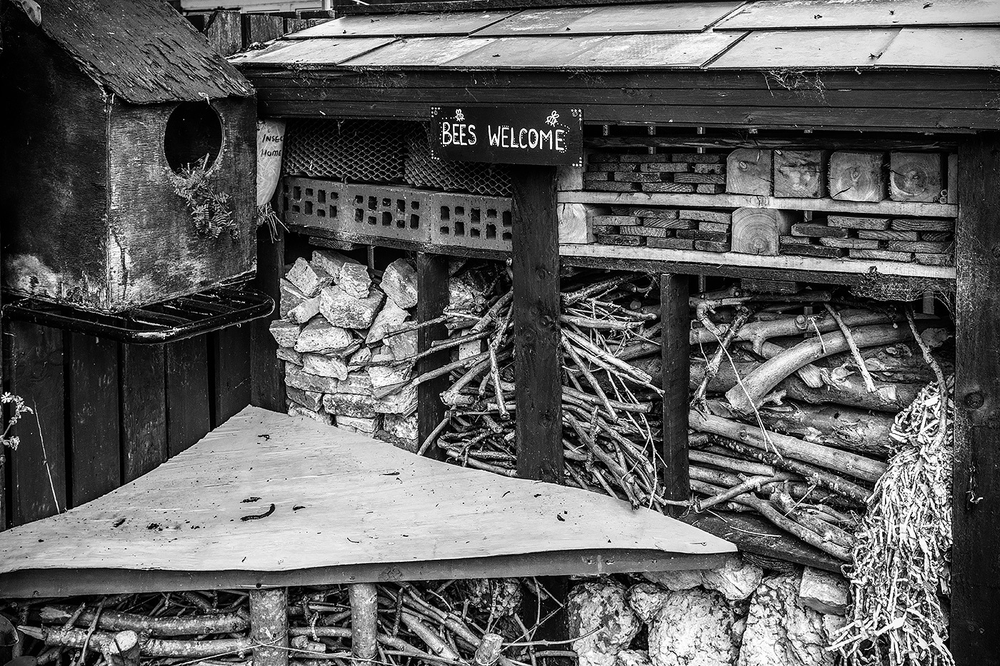 The Bug Hotel