You are using an out of date browser. It may not display this or other websites correctly.
You should upgrade or use an alternative browser.
You should upgrade or use an alternative browser.
weekly rpn's 2018 Project 52 - Week 52 SHOWCASE Added (Complete)
- Thread starter rpn
- Start date
- Messages
- 4,562
- Name
- Mark Gameson
- Edit My Images
- Yes
Thanks, Mark. The car is a Mini 50 Cooper S, my third Mini including a classic Mini in the early '80s. Love every one of them.
Very nice indeed. Our current fleet stands at 7! one MINI and 5 classics I think I have a problem!
- Messages
- 616
- Name
- Ross
- Edit My Images
- Yes
Oval - second one for me too. Great colour. And feels less busy than the first.
- Messages
- 9,716
- Name
- Stan
- Edit My Images
- Yes
Stan,
Juxaposition, good spot, nice colours in the stone and strong lines in the modern.
Oval, Prefer the red car just for the colour, but the white one is more oval.
Pete
Thanks, Pete. Agree, the red is a simpler and cleaner image but the Mini is a better shape for Oval.
Red here too Stan. There are less distractions and the blacks and silvers really stand out against the red bodywork.
Cheers, Tim.
- Messages
- 9,716
- Name
- Stan
- Edit My Images
- Yes
Oval - I quite like the white one but agree its a bit busy, so red pips it to the post
I’m with the red too Stan, definitely more eye catching.
Thanks, Alison and Susie. The red Porsche seems to be the preferred choice.
- Messages
- 9,716
- Name
- Stan
- Edit My Images
- Yes
Taken this morning at a level crossing. (No train service on Sundays) I have to shoot into the sun so I hold the camera at eye level and pointing down slightly to avoid any flares and also to include the timber planks as foreground interest.
Week 14 - Straight
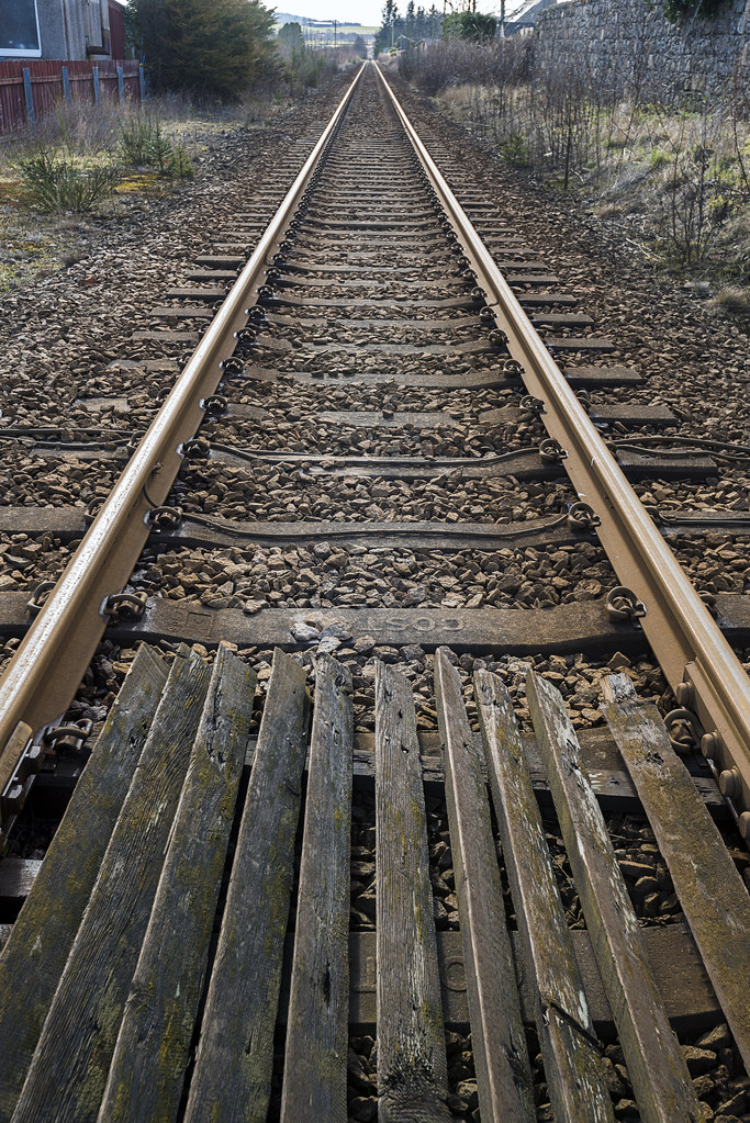 Straight Run by Stan, on Flickr
Week 14 - Straight
 Straight Run by Stan, on Flickr
- Messages
- 9,716
- Name
- Stan
- Edit My Images
- Yes
Another shot but not sure this fits the theme, just playing around in Photoshop with motion blur filter.
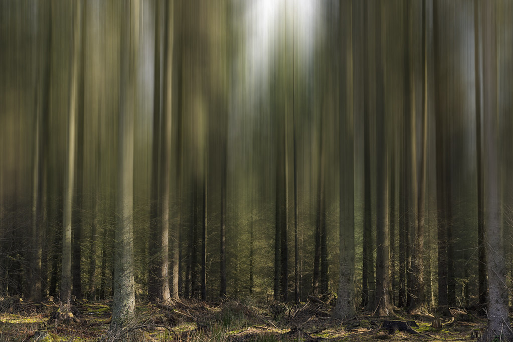 Straight Motion by Stan, on Flickr
 Straight Motion by Stan, on Flickr
- Messages
- 9,716
- Name
- Stan
- Edit My Images
- Yes
Your straight shot is exactly what I had in my head too Satn, but sadly me memory tricked me and the location I went to had curves in it....
Great take, I like it, and the forground interest as well.
Thanks, Mark. I had this in mind when the theme came out and although I crossed this level crossing many times I never paid any attention to the track layout. I used Google map to check there's a straight run of track before I headed out this morning.
- Messages
- 9,716
- Name
- Stan
- Edit My Images
- Yes
Doesn't come much straighter than the rails, I wonder if it would work in mono. I really like the trees, on theme or not it makes an interesting image
Thanks, Chris. Now, that's a thought and will have a go later.
- Messages
- 9,716
- Name
- Stan
- Edit My Images
- Yes
Railway lines is good for the theme, as has been said, you can`t get much straighter.
Thanks, Dave.
Railway lines is perfect but I too would like to see a mono version, the trees is an interesting effect not quite sure it works but certainly catches your eye
Thanks, Allan. Mono version on its way soon.
- Messages
- 9,716
- Name
- Stan
- Edit My Images
- Yes
By popular request, black and white conversion by Nik Silver Efex Pro 2
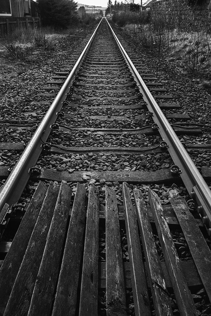 Straight Run by Stan, on Flickr
 Straight Run by Stan, on Flickr
- Messages
- 4,658
- Name
- Pete
- Edit My Images
- Yes
Hi Stan
B&W Straight image works very well. On the colour version the brown of the building distracts a bit. ICM is one thing, but the PS motion blur does not work at all for me.
Pete
B&W Straight image works very well. On the colour version the brown of the building distracts a bit. ICM is one thing, but the PS motion blur does not work at all for me.
Pete
- Messages
- 9,716
- Name
- Stan
- Edit My Images
- Yes
... makes me wonder if a bit of blur on the trackside might add.on second thoughts ... No
Nice and straight.
Love those trees.
Thanks, David.
Hi Stan
B&W Straight image works very well. On the colour version the brown of the building distracts a bit. ICM is one thing, but the PS motion blur does not work at all for me.
Pete
Thanks, Pete. Very good points about the building in the colour version. Appreciate that motion blur was never going to be for everyone, I just enjoyed playing around in Photoshop occasionally.
- Messages
- 9,716
- Name
- Stan
- Edit My Images
- Yes
The motion blur trees is superb!
Thanks, Dave.
I love them both Stan, I much prefer the colour one, I might be tempted to nip a bit off the top, but I really like colour and textures in it. Those treesnow they’re right up my street, love it.
Thanks, Susie. Excellent comments about cropping the top. Always open to suggestions.
- Messages
- 616
- Name
- Ross
- Edit My Images
- Yes
I like the railway lines and i like it better in mono but for me I don't like the foreground timber.
- Messages
- 1,075
- Name
- Georgina
- Edit My Images
- Yes
Hi Stan, Trying to have a big catch up again!
Wet - Very nice abstract, nice coloured bokeh spots
Juxtaposition - Second one for me as it really shows the contrast.
Oval - Red one for me, the red really pops
Straight - I like the wood and the rails and prefer them in colour but its a shame about the not very appealing buildings on each side but not much you can do about them.
- Messages
- 4,562
- Name
- Mark Gameson
- Edit My Images
- Yes
Hi Stan I like the B&W version of your take on straight best for me it adds a bit more depth I also like the trees image something a little different
- Messages
- 9,716
- Name
- Stan
- Edit My Images
- Yes
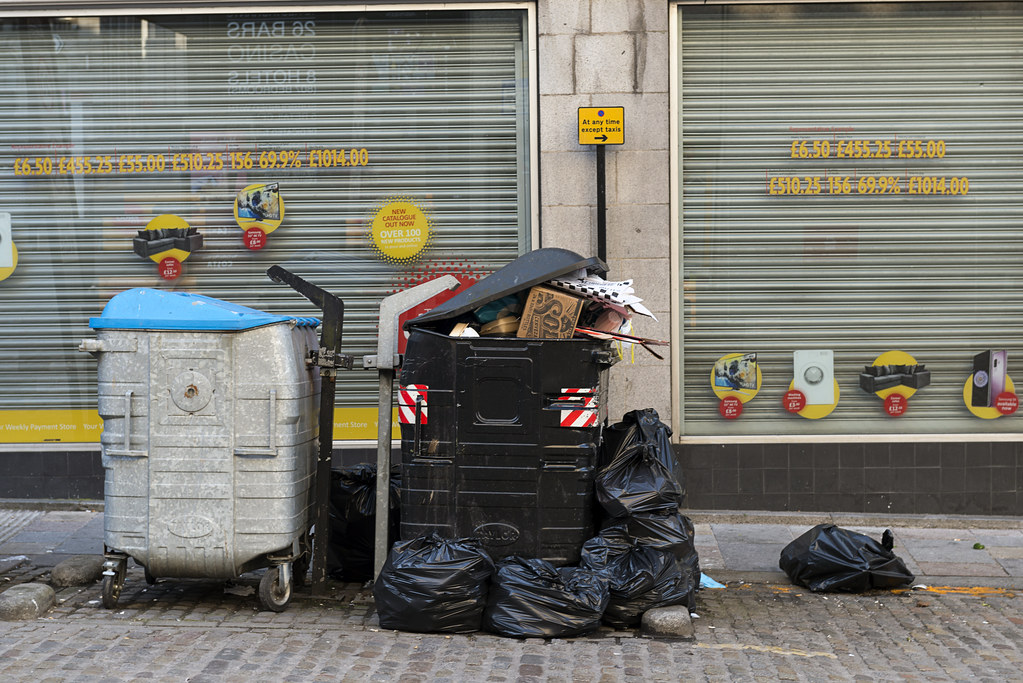
Up early on Sunday morning and head into town looking for some inspirations for the theme. Just as I turned into the city centre main thoroughfare I notice these mess from the night before.
Week 15 - Unattractive
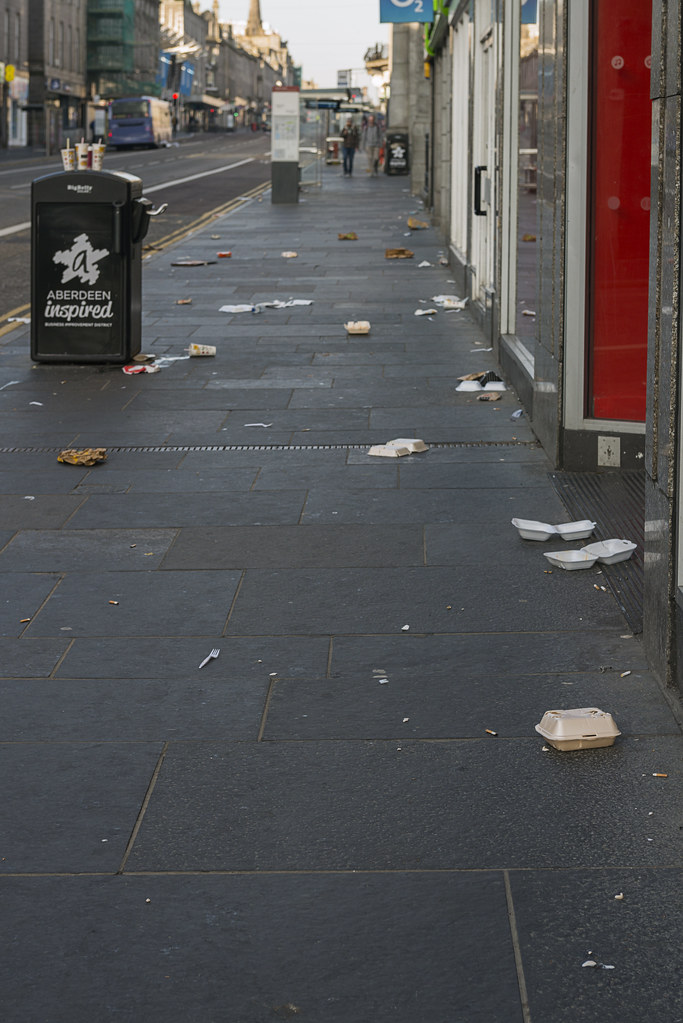 Unattractive Street by Stan, on Flickr
Week 15 - Unattractive
 Unattractive Street by Stan, on Flickr
- Messages
- 9,716
- Name
- Stan
- Edit My Images
- Yes
- Messages
- 4,562
- Name
- Mark Gameson
- Edit My Images
- Yes
Both work for the theme Stan but it's got to be the first one for me like Chris I like the bin in the middle of the image surrounded by the litter
- Messages
- 9,716
- Name
- Stan
- Edit My Images
- Yes
First one for me, I like the bin in the middle of the shot surrounded by litter
Thanks, Chris. People just can't be bothered to open the bin hatch, I guess.
Litter is very unattractive and you took the shoot well, like the first as nice DOF and love the 3 cups on the bin.
Cheers, Dave. Laziness or bin is full.
- Messages
- 9,716
- Name
- Stan
- Edit My Images
- Yes
Both work, always a nice sight. I used to work most Sunday mornings thats exactly what its like
Thanks, Allan.
Both work for the theme Stan but it's got to be the first one for me like Chris I like the bin in the middle of the image surrounded by the litter
Thanks, Mark.


 Unattractive Bins