You are using an out of date browser. It may not display this or other websites correctly.
You should upgrade or use an alternative browser.
You should upgrade or use an alternative browser.
weekly *sarah* 2015 52 challenge week 11,12 &13 added
- Thread starter *Sarah*
- Start date
*Sarah*
Peel Me!
- Messages
- 1,873
- Name
- Sarah
- Edit My Images
- Yes
Great photo for Elegant.
Lovely image, you have also managed not to lose the flower withing the BG
Like it. Nice high key feel. The perspective works well and nice detail.
Cheers.
Hi, very nice they look like they are melting into the white BG
Thank you for your comments!
*Sarah*
Peel Me!
- Messages
- 1,873
- Name
- Sarah
- Edit My Images
- Yes
Hi Sarah
Elegant & Companions.......no crit on either shot just a massiveto both & just for the Lilies

I also wanted to use Calla lilies for Elegant & like you couldn't find any but didn't have enough time to get some ordered .You really do have a wonderful eye for floral images
Loving Elegant, and you have retained so much detail in them against the white background
Very simple and very elegant. I never came across Calla Lilies before but they do look beautiful.
Elegant - nicely done Sarah. Part of me would like to see inside the flower a touch more, but even allowing for that it's a cracking image and really well taken & processed.
Companions - lovely shot, subject and lighting. 'nuff said!
Thank you all for your lovely comments!
*Sarah*
Peel Me!
- Messages
- 1,873
- Name
- Sarah
- Edit My Images
- Yes
Week 6 Watery
Playing catch up again!
As soon as I saw the theme I decided that I would like to take an abstract picture for it. I've struggled for time in the end but managed to have a play this week. I took this shot looking through a tank of water which I swished to make waves, I then edited on photoshop by cropping and then softening the colour.
#2 was taken looking down into the tank and this time was edited to clean up stray bubbles and to intensify the colours!
#1
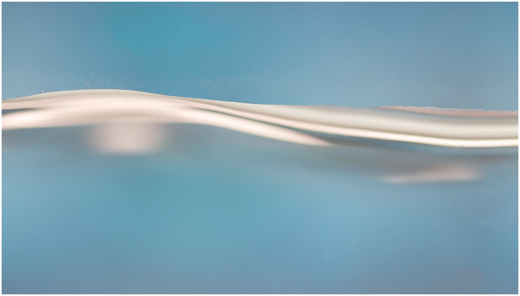 abstract water by *sarah*., on Flickr
#2
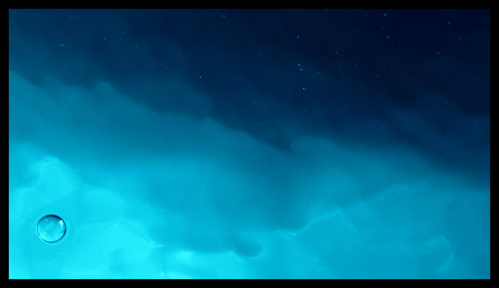 watery abstract by *sarah*., on Flickr
Playing catch up again!
As soon as I saw the theme I decided that I would like to take an abstract picture for it. I've struggled for time in the end but managed to have a play this week. I took this shot looking through a tank of water which I swished to make waves, I then edited on photoshop by cropping and then softening the colour.
#2 was taken looking down into the tank and this time was edited to clean up stray bubbles and to intensify the colours!
#1
 abstract water by *sarah*., on Flickr
#2
 watery abstract by *sarah*., on Flickr
- Messages
- 14,766
- Name
- Michael
- Edit My Images
- No
Nice abstracts Sarah.
#1 lovely pattern created there, I like the 2 little "blobs" of water on the left hand side. Only thing for me is, the pink area on the right, I would like to see that as smooth as the rest.
#2 Really like the colours in this one, and again the patterns. I would clone out the bubble though, or at least I think I would

- Messages
- 4,340
- Name
- Martin
- Edit My Images
- Yes
Number 1 for me. Smooth and rather relaxing, you could use it for this week's theme  .
.
- Messages
- 8,398
- Name
- Lynne
- Edit My Images
- Yes
Hi Sarah
#1 for me as well....lovely colors ,very minimal but very effective & , for me at least , very calming
Only 2 minor points from me...there's a couple of really small stray bubbles to the left of the frame just above the water line & there's something weird to the righthand side , just above the water line that almost looks like torn paper
#1 for me as well....lovely colors ,very minimal but very effective & , for me at least , very calming

Only 2 minor points from me...there's a couple of really small stray bubbles to the left of the frame just above the water line & there's something weird to the righthand side , just above the water line that almost looks like torn paper

- Messages
- 3,724
- Name
- Chris
- Edit My Images
- Yes
No.1 for me, I really like the simplicity. I would agree on the bubbles though.
At first glance I thought no 2 was a shot of the night sky.
At first glance I thought no 2 was a shot of the night sky.
*Sarah*
Peel Me!
- Messages
- 1,873
- Name
- Sarah
- Edit My Images
- Yes
Nice abstracts Sarah.
#1 lovely pattern created there, I like the 2 little "blobs" of water on the left hand side. Only thing for me is, the pink area on the right, I would like to see that as smooth as the rest.
#2 Really like the colours in this one, and again the patterns. I would clone out the bubble though, or at least I think I would
ooo I love these, could easily see them as art prints in someone's living room
Thank you for your comments, I've edited the first one to clean up a bit and remove the bubbles. I'll post it up shortly!Two lovely shots and what brilliant idea. 1; Love the wavy form and the colours I would inclined to clone out the two strayed bubbles at the left. 2; Lovely shades of blues and the wave patterns. The bubble just works perfectly to indicate water.
*Sarah*
Peel Me!
- Messages
- 1,873
- Name
- Sarah
- Edit My Images
- Yes
Hi two nice abstracts I would have maybe cloned out some of the flecks in the darker part of the second one, both have superb colours in
Hi Sarah, I love those. Great idea for the theme, the first is my favourite, I could easily hang that on my wall

Number 1 for me. Smooth and rather relaxing, you could use it for this week's theme.
Thank you! I wished I'd thought about that one for relax!!
I did think about cloning out the flecks but thought they looked a bit like stars in the night sky so left them in. I'll have an edit and post on flickr to compare in the next few days!
*Sarah*
Peel Me!
- Messages
- 1,873
- Name
- Sarah
- Edit My Images
- Yes
Hi Lynne, thank you for your comments! I've had another edit and removed the stray bubbles and also the 'frayed paper effect' (it was caused by the water splashing up the side of the tank) which I'm about to post!Hi Sarah
#1 for me as well....lovely colors ,very minimal but very effective & , for me at least , very calming
Only 2 minor points from me...there's a couple of really small stray bubbles to the left of the frame just above the water line & there's something weird to the righthand side , just above the water line that almost looks like torn paper
Thank you!No.1 for me, I really like the simplicity. I would agree on the bubbles though.
At first glance I thought no 2 was a shot of the night sky.
Thank you!#2 for me really nice as said worthy of a framed pic
Thank you!Watery
2 very nice photos that deserve to be in print. Both very calming images.
#1 Love the motion
#2 like the colours.
*Sarah*
Peel Me!
- Messages
- 1,873
- Name
- Sarah
- Edit My Images
- Yes
After reading a few of your comments I've had a go at editing the bubbles out and a little bit more of a clean up on the first shot which I think has improved it!
Thank you for all your comments!
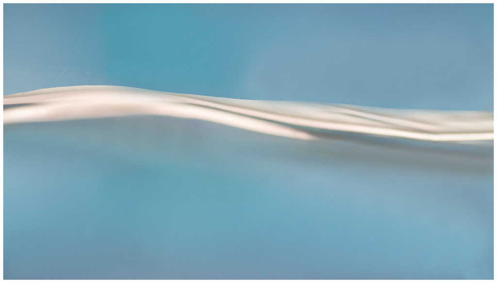 abstract water edited by *sarah*., on Flickr
Thank you for all your comments!
 abstract water edited by *sarah*., on Flickr
- Messages
- 8,311
- Name
- Ian
- Edit My Images
- No
I love them all. Beautiful abstracts, in particular the second one...
Hope to see more!?
Hope to see more!?
*Sarah*
Peel Me!
- Messages
- 1,873
- Name
- Sarah
- Edit My Images
- Yes
I do like the edit Sarah, looks better.
edit looks much better.
Thank you!I love them all. Beautiful abstracts, in particular the second one...
Hope to see more!?
*Sarah*
Peel Me!
- Messages
- 1,873
- Name
- Sarah
- Edit My Images
- Yes
Week 7 - Bold
I took this one last week but was really hoping to get a different shot but as I'm getting behind I decided to post this one up so I can get on with this weeks theme!
Bold colourful Skittles!
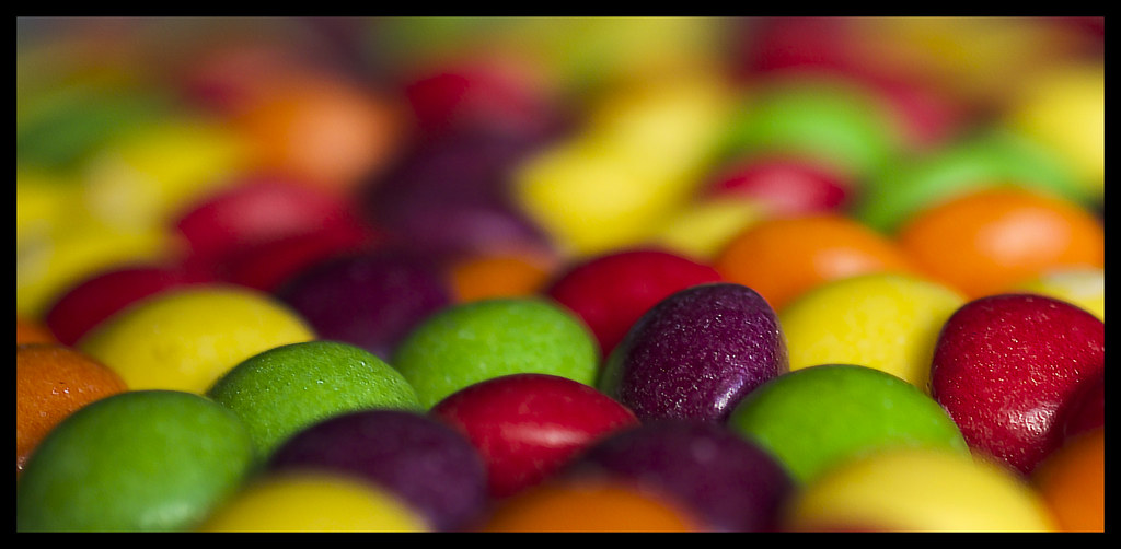 bold colours by *sarah*., on Flickr
It was taken using a shallow dof f2.8 using natural light from the window!
I took this one last week but was really hoping to get a different shot but as I'm getting behind I decided to post this one up so I can get on with this weeks theme!
Bold colourful Skittles!
 bold colours by *sarah*., on Flickr
It was taken using a shallow dof f2.8 using natural light from the window!
- Messages
- 704
- Name
- Sara
- Edit My Images
- Yes
Love the colours and DoF ... nice one. (Also, sweeties make great props ... when you're bored with them you can put them to other uses!!  )
)
- Messages
- 6,502
- Name
- Peter
- Edit My Images
- Yes
Elegant - The white flower against the white background brings some elegance to the shot. The subtle greens plus the curve of the stems also are a nice touch.
Watery - The more I’ve looked at these the more I am drawn towards #1 especially the edit of it. The blue tones are in and the whole image has very much an abstract and arty feel to it.
Bold - The minimal DoF lifts this from being just a shot of some sweets to a rather colourful and bold image. I like that only three sweets are in focus and have a sparkly almost metallic look to them
- Messages
- 908
- Name
- nathan
- Edit My Images
- Yes
watery - lovely edit, arty and subtle but still on theme, how did you light it if you don't mind my asking?
bold - certainly is that, i like a shallow dof normally but think a little more of them in focus would have made this better, just my opinion of course. colours are awesome
bold - certainly is that, i like a shallow dof normally but think a little more of them in focus would have made this better, just my opinion of course. colours are awesome
- Messages
- 8,311
- Name
- Ian
- Edit My Images
- No
Bold and colourful as you say. It's a really striking image which means it's spot on for the theme.
Looking forward to more
Looking forward to more
- Messages
- 9,095
- Name
- Mandy
- Edit My Images
- Yes
Watery - two good images and I think the edit of the first image works very well.
Bold - perfect shot love the colours, love the dof in the image.
Bold - perfect shot love the colours, love the dof in the image.
*Sarah*
Peel Me!
- Messages
- 1,873
- Name
- Sarah
- Edit My Images
- Yes
Bold colours indeed Sara
Nice DOF ... as they say.
I think I see just three of them in focus!
yep, that's bold alright Sara
Love the colours and DoF ... nice one. (Also, sweeties make great props ... when you're bored with them you can put them to other uses!!)
Thank you for your comments, though I'm not sure what other uses the props could be used for!!
*Sarah*
Peel Me!
- Messages
- 1,873
- Name
- Sarah
- Edit My Images
- Yes
Elegant - The white flower against the white background brings some elegance to the shot. The subtle greens plus the curve of the stems also are a nice touch.
Watery - The more I’ve looked at these the more I am drawn towards #1 especially the edit of it. The blue tones are in and the whole image has very much an abstract and arty feel to it.
Bold - The minimal DoF lifts this from being just a shot of some sweets to a rather colourful and bold image. I like that only three sweets are in focus and have a sparkly almost metallic look to them
watery - lovely edit, arty and subtle but still on theme, how did you light it if you don't mind my asking?
bold - certainly is that, i like a shallow dof normally but think a little more of them in focus would have made this better, just my opinion of course. colours are awesome
Bold - Very nicely shot, I do like DoF shots and this one is crystal. How many of the sweets were left after the shot?
Thank you for your comments. The water one was backlight, I put the tank in front of the tv which I'd paused showing a blueish screen.
*Sarah*
Peel Me!
- Messages
- 1,873
- Name
- Sarah
- Edit My Images
- Yes
Bold is a great image with awesome colours. It's very detailed too. Well done
Bold and colourful as you say. It's a really striking image which means it's spot on for the theme.
Looking forward to more
Watery - two good images and I think the edit of the first image works very well.
Bold - perfect shot love the colours, love the dof in the image.
bold - great pic, no complaints here lol
Thank you for all your lovely comments!
*Sarah*
Peel Me!
- Messages
- 1,873
- Name
- Sarah
- Edit My Images
- Yes
Week 8 - Relax
There's nothing better after a hard day than sitting down and enjoying a relaxing cup of tea. I added some lavender to help you to relax even more! Again taken with natural light and edited to try and give a vintage feel to it!
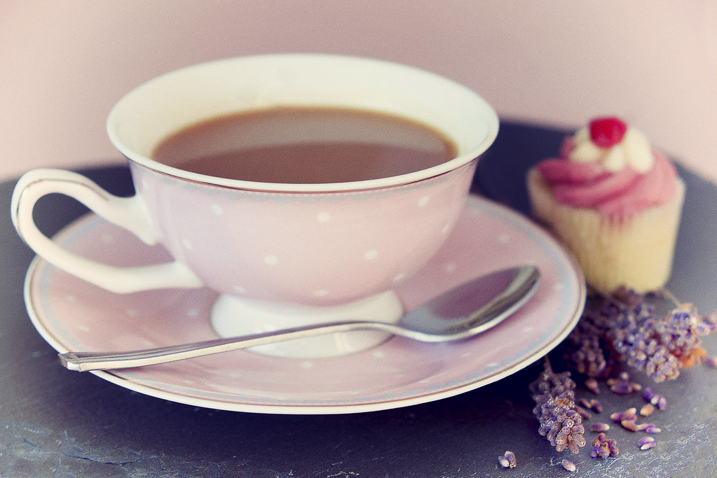 cup of tea by *sarah*., on Flickr
There's nothing better after a hard day than sitting down and enjoying a relaxing cup of tea. I added some lavender to help you to relax even more! Again taken with natural light and edited to try and give a vintage feel to it!
 cup of tea by *sarah*., on Flickr
*Sarah*
Peel Me!
- Messages
- 1,873
- Name
- Sarah
- Edit My Images
- Yes
Week 9 - Vertical
Catch up week this week!
We decided to take a trip to Whitby today, I originally planned to take a pic of the beach huts to get vertical colour stripes but on the way home stopped at this woodland and got this which I think I prefer!
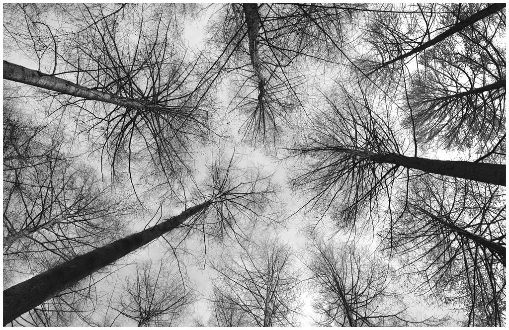 Vertical trees b by *sarah*., on Flickr
Catch up week this week!
We decided to take a trip to Whitby today, I originally planned to take a pic of the beach huts to get vertical colour stripes but on the way home stopped at this woodland and got this which I think I prefer!
 Vertical trees b by *sarah*., on Flickr
- Messages
- 3,724
- Name
- Chris
- Edit My Images
- Yes
You can't beat a nice cuppa  nice shot and really well lit
  . Only thing I would say is possibly a slightly larger depth of field

