
You are using an out of date browser. It may not display this or other websites correctly.
You should upgrade or use an alternative browser.
You should upgrade or use an alternative browser.
weekly Viv1969's Try at 52....The Sequel....2016 Week 50, 51 & 52.... And finished
- Thread starter viv1969
- Start date
- Messages
- 4,523
- Name
- Mark Gameson
- Edit My Images
- Yes
2 great images for Colourful Ruth
Really like No 1 very cleverly though out. The DOF on No 2 really makes the nibs of the pencils stand out
Really like No 1 very cleverly though out. The DOF on No 2 really makes the nibs of the pencils stand out
- Messages
- 4,155
- Name
- Paul
- Edit My Images
- Yes
Proper catch up for me Ruth... sorry for the delay!
The jeans shot for rough is interesting and I like your take here and processing. It works and as "street" is quite intriguing. Definitely on theme with both your interpretation and that wall behind.
I like the paint shot though - great textures and an interesting capture, with full on colour (but not nastily so in any way!)
Bluebells is a lovely, traditional image. Maybe more golden lighting would help but it's nice as is, at least for about 90% of the image... but I really don't like the TS/blur effect at the top & bottom (it's a pet peeve of mine, sorry!)
Colourful are two genuinely brilliant images. The imagination of the first is exceptional - I love it The technical and "pretty" capture of the second is wonderful in a completely different way. Both fab, fab shots and bring completely different things to the fore. Well done!
The jeans shot for rough is interesting and I like your take here and processing. It works and as "street" is quite intriguing. Definitely on theme with both your interpretation and that wall behind.
I like the paint shot though - great textures and an interesting capture, with full on colour (but not nastily so in any way!)
Bluebells is a lovely, traditional image. Maybe more golden lighting would help but it's nice as is, at least for about 90% of the image... but I really don't like the TS/blur effect at the top & bottom (it's a pet peeve of mine, sorry!)
Colourful are two genuinely brilliant images. The imagination of the first is exceptional - I love it
The technical and "pretty" capture of the second is wonderful in a completely different way. Both fab, fab shots and bring completely different things to the fore. Well done!
OP
- Messages
- 29,452
- Name
- Bat-Frog
- Edit My Images
- No
I'm plumping for #2 Ruth - more unusual angle and all those hexagonal and circular shapes crammed together and vying for space. Very Colourful.
These pencil zips are fun, but there's something I really like about the relative simplicity of #2
#1 for me, it's just more colourful
2 great images for Colourful Ruth
Really like No 1 very cleverly though out. The DOF on No 2 really makes the nibs of the pencils stand out
Proper catch up for me Ruth... sorry for the delay!
The jeans shot for rough is interesting and I like your take here and processing. It works and as "street" is quite intriguing. Definitely on theme with both your interpretation and that wall behind.
I like the paint shot though - great textures and an interesting capture, with full on colour (but not nastily so in any way!)
Bluebells is a lovely, traditional image. Maybe more golden lighting would help but it's nice as is, at least for about 90% of the image... but I really don't like the TS/blur effect at the top & bottom (it's a pet peeve of mine, sorry!)
Colourful are two genuinely brilliant images. The imagination of the first is exceptional - I love it
The obvious thing about the zip is its not straight but you know that the other thing I would have done it in portrait rather than landscape, that's just my opinion so please feel free to ignore a nice colourful image either way
#1 is very colourful, but the symmetry is slightly off and I notice these things more these days
#2 for me, nice simple, yet effective idea.
Cheers.
I can't choose between these two - the interlocking pencils is a really clever arrangement, but I do like the simplicity of the second.
Brilliant idea for Coloured Ruth, absolutely inspired
#2 is good too but the first one does it for me.
Thank you all for your comments, and for looking.
I am struggling to keep my head above water for a few reasons....and trying to keep up with shooting within the allotted week.
I SWEAR I will get back on track with commenting on all of your threads really soon!!
OP
- Messages
- 29,452
- Name
- Bat-Frog
- Edit My Images
- No
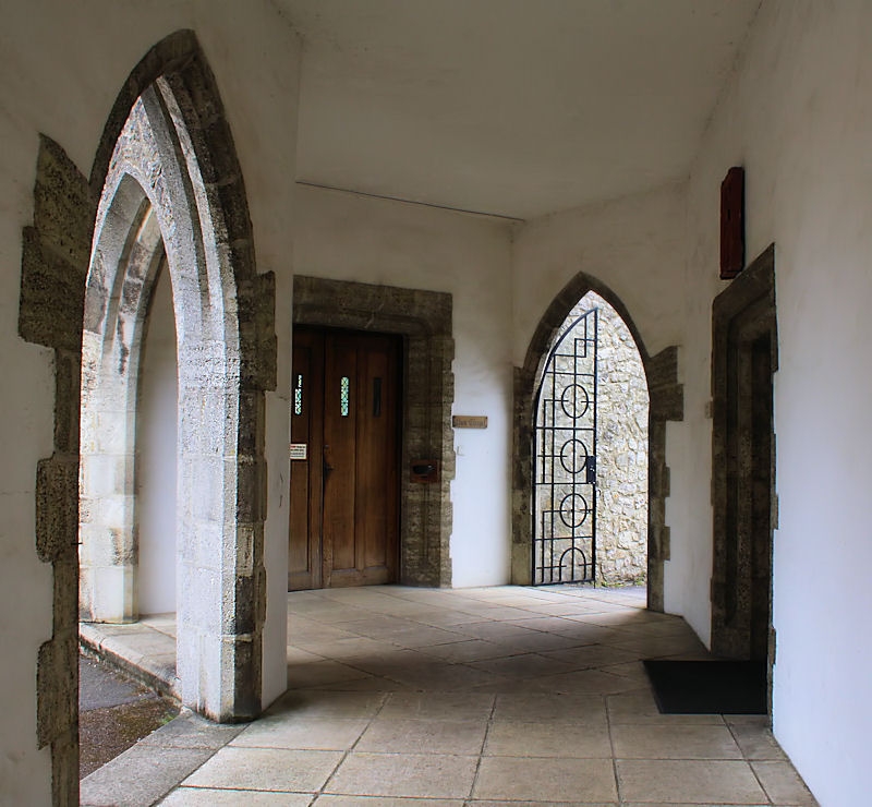
Week 20 - Entrance....But which one to choose in this shot!!
Then there's what WAS going to be my main submission, before @wallyboy beat me to it!! grrrrrrrrrr

And an Extra just because this place has SO MANY fab doors!

And a quick return to the property with the door I used for "Rough"

Then there's what WAS going to be my main submission, before @wallyboy beat me to it!! grrrrrrrrrr
And an Extra just because this place has SO MANY fab doors!
And a quick return to the property with the door I used for "Rough"
Last edited:
D
Deleted member 78683
Guest
Hi Ruth. Don't worry about the commenting just keep going with the TP52. Like all three and in order of submission really. Like #1 best because of the light and airy space, the multiple entranceways and beautiful arches.
OP
- Messages
- 29,452
- Name
- Bat-Frog
- Edit My Images
- No
Thanks Carl....Much appreciated.Hi Ruth. Don't worry about the commenting just keep going with the TP52. Like all three and in order of submission really. Like #1 best because of the light and airy space, the multiple entranceways and beautiful arches.
Added another now.
I could get obsessed with doors.
The place in the first three pictures is beautiful....A pleasure just to walk around.
D
Deleted member 78683
Guest
A "Door" project perhaps? Like the colour of the latest but #1 still rules.I could get obsessed with doors.
- Messages
- 4,523
- Name
- Mark Gameson
- Edit My Images
- Yes
Hi Ruth some lovely images for Entrance
No 1 is brilliant so many entrances in there I also like No4 because the greeny blue gate really stands out
No 1 is brilliant so many entrances in there I also like No4 because the greeny blue gate really stands out
OP
- Messages
- 29,452
- Name
- Bat-Frog
- Edit My Images
- No
I love doors too Ruth ...I like them all but I think #1 is an absolute smasher ...I love it
Thanks Susie, that's my favourite one too.
My personal favourite is the 'rough' re-shoot for Entrance, Ruth. Love the colour and simplicity of it and no idea what's on the other side of the door.
Thanks Ian.
There's a very nice 17th century grade 2 listed cottage within...though calling it a cottage is doing it a disservice!
Ruth
For me the green door is great, mind you it is my favourite colour. Fantastic place.
Chris
Cheers Chris....It's a colour I like too
")
Hi Ruth some lovely images for Entrance
No 1 is brilliant so many entrances in there I also like No4 because the greeny blue gate really stands out
Thank you Mark. The Priory is just awash with fantastic door, gates, and cloisters.
- Messages
- 114,434
- Name
- The real Chris
- Edit My Images
- No
Bloody show offWeek 20 - Entrance....But which one to choose in this shot!!

Nice set Ruth all of them

And remember what Dory said? just keep swimming, swimming, swimmingI am struggling to keep my head above water for a few reasons....


- Messages
- 13,393
- Edit My Images
- Yes
Hi Ruth
Colourful - Just love both of them images, although the crayon/zip image has instant appeal for me, the crayon tip image grows on me more and more the longer I look at it, not sure what it is, maybe the square crop and the unusual view, but for me it takes the prize - good couple
Entrance - Another good group of image, loving the look and age of all of them, but the one for me is the bright green gate, really like the wall running up to it from the LH side
Size - Colourful spoons are cool, but the simpler shot of the text is a winner for me, again two cracking entries
- Messages
- 4,155
- Name
- Paul
- Edit My Images
- Yes
Hi Ruth
As others have said, don't worry if you can't keep up with commenting - just drop in on a thread if you really want to say something! You've been very diligent on comments when you had time, which is appreciated
Entrance is a good collection - I personally prefer the first as the shadow and light is interesting.
Size - probably the first for me as it's so simply effective. Also, the colour reflection on the white paper takes away some of the impact for me on the cup shot... but that's probably just me!
Keep at it... we're nearly half way through
D
Deleted member 78683
Guest
The text for me too Ruth - nicely sharp where it matters and the fall-off either side is excellent.
- Messages
- 1,218
- Name
- Lee
- Edit My Images
- Yes
Just had a catchup on some of your Images, yours is always the first I go to when looking
Rough, prefer the second image, love the colour and textures in this
Covered, this is what I had thought of and have a shot but have not posted yet, I like the way the trees are leading you in and the colours are so vivid
Colourful, I prefer the second, there just something about pencils that I like!
Entrance, I think I like the last, its the turquoise again
Size, I think I prefer the first, depth of field is good and its a nice and simple black and white!
- Messages
- 4,523
- Name
- Mark Gameson
- Edit My Images
- Yes
Hi Ruth
I like both of your images for size both really work for me really like the DOF in the first one and the colours in the second
I like both of your images for size both really work for me really like the DOF in the first one and the colours in the second
Bruja
Los Cojones del Perro
- Messages
- 3,806
- Name
- Just call me Mad Madam Mim
- Edit My Images
- Yes
Another vote for the text from me Ruth. And don't worry about commenting as these are my first comments in a month  We can when we can and don't when we can't. After all, it's the personal challenge that's the focus of this challenge not how much feedbck we give/get.
We can when we can and don't when we can't. After all, it's the personal challenge that's the focus of this challenge not how much feedbck we give/get.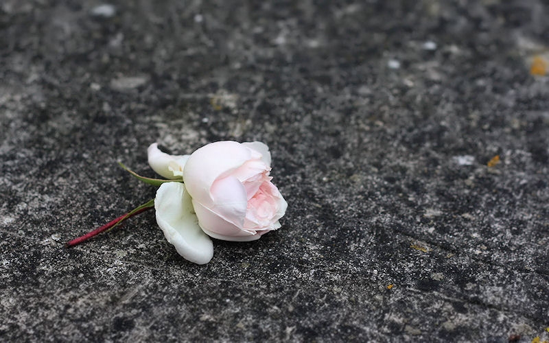
D
Deleted member 78683
Guest
That's a beautiful shot Ruth. Like the composition and both the colour & texture contrasts between the rose & bg.
OP
- Messages
- 29,452
- Name
- Bat-Frog
- Edit My Images
- No
That's a beautiful shot Ruth. Like the composition and both the colour & texture contrasts between the rose & bg.
Thank you Carl.
The climbing rose is intertwined through the huge Cherry tree at the bottom of the garden.
After the weather over the last 24 hours, there are many flowers on the ground and (in this case) stone table.
Every one of them looks utterly forgotten and forlorn.