weekly 2015 52's by Summer - week 25 silhouette

Messages
2,908
Name
Summer
Edit My Images
Yes
for now...watch this space :D

a bit of info - I really want to improve my lighting - with flash/lights/sunshine so I am using the challenge to try and achieve this so please please give me lots of advice about improvements :)

thanks guys
 
Last edited:
hello everyone, has been a while so hope I still remember how it all works

still waiting for my model to agree a date for week 1 so I shall have to start with week 2 - fragile


week 2 fragile
by moominmama, on Flickr
 
Last edited:
ok, how do I make it appear big? :confused:


heh - thanks Steve :) :)
 
Last edited:
Nice one summer. I had the same idea but became frustrated when I could not get the cards to stay together for long enough. Very fragile!
 
I never realised how difficult it was to make a house of cards!
 
Hi Summer - nice shot and a good idea for the theme - very fragile indeed - especially putting the last card on!
 
Good interpretation of the theme, it would been nice to see more court cards used but that's just me being picky.
 
ok, how do I make it appear big? :confused:
Hi Summer,

I take it you mean when you post an image you want large in the post... When you go to Flickr and click the "sharing link" that's the box with the arrow popping out of it along the bottom of the picture, then when the pop up comes up click the "grab the HTML / BBcode" at the bottom you'll see 3 radio buttons click the one that says BBcode and you'll see it gives you the option to select size from the drop down list select your size the limit here is 1024 the just click and copy the bit of code in the box above and past it into your post. Job done, hope this helps!

Fragile ..... Brilliant idea I'm struggling every time I think of an idea someone has done it already that my fault for not getting my finger out :( With Bliss! Love the concept here very well lit and because of the subject it contrasting colours work very well, interestingly one the bottom tier the arches starting with the first which is dark get progressively lighter, not a problem just interesting obviously to do with lighting, was just thinking about how you could neutralise that shadow.... Perhaps with another light from a different angle...
I'm looking at lighting this year... Want to master flash if I can ( as I never use one in landscape work):).

I see your in sunny Basingstoke too.... Weathers not up to much at the moment is it:(, was hoping for some snow:).
All the best with your 52!
Steve
 
wow thanks Steve, very helpful :)

anyway onto the picture. I tried my best to eliminate the shadows by using a 2nd flash lower and to the left, but it actually deepened some of the shadows and it was getting late so I stuck with this one :) Like you I am using this challenge to improve my so-far unused, and therefore useless, lighting skills :p
 
thank-you Mandy Mich and Nick :)

Nick I originally had more court cards as i thought they'd look better - but they didn't look good at all which surprised me. I think the reason it works now is because of the simplicity - court cards made it look busy and less 'clean' if that makes sense? :)
 
Welcome back. The cards are nicely lit but I'm finding due to the complete blackness all around they do appear to be floating. I even like what you've done on the top cards with them appearing to be about to topple which fits the theme nicely.
 
Nicely lit, although I'd probably try to get a bit more light onto that card bottom left which is in quite dark shadow. I agree the very black background makes it hard to ground the subject, but you've done well to keep it so black.

A good shot - keep it up!
 
thanks guys - any tips on how I could have got rid of the shadow? I was using a flash with a diffuser very close to the cards (at approx 90 degrees to the camera) just slightly above the cards :)

also the floating thing - how do you avoid that without having a different coloured 'floor' - which just looked daft when I tried it :p


will have to rethink my bliss shot so yes it will be late *sigh* and will have to wait until the weekend for scenic, unless I use an old one lol - just pray for sun or at least no rain! :)
 
Last edited:
week 3 - scenic - well I don't have much opportunity and I'm not a big fan of landscape pics. I did think of doing a funny sat nav related one (taking the 'scenic route') but in the end I did this - the edge of Watership Down


week 3 - scenic
by moominmama, on Flickr
 
Hi, certainly scenic, perhaps crop the fence out at the bottom it sort of takes your eye away from looking in the distance
 
Hi Summer,

Really like the composition, but, to my eye, could do with a little more depth in the detail - maybe bring out the shadows and mid-tones to emphasise the glowering clouds and define the tree lines and hedgerows. A little more vibrance in the colours would make the scene more powerful - the blue-black of the clouds and the greens of the fields (only a little though, as it is winter, it needs to stay 'real'). I know that one or two have criticised the fence in the foreground, but I quite like it as a counterpoint, or 'lead away' line - the area on your side of the fence could remain nice and light as a contrast. Just a thought.

Loved the cards, by the way. Delicious.

Karl
 
Take the fence away and you have a superb image. A very scenic shot.
 
nice shot for scenic. I like the hazy feel to it, but I do think the fence at the bottom is a bit distracting :)
 
thanks for the comments everyone :) just about to go and do my companions shot...

I thought about taking the fence out but I left it in because it adds perspective, I like to have people in my shots to add context so I suppose fence posts are 'almost' people lol

not sure about the processing thing though, not very good at it (apart from cloning and basic stuff) but I will try and get the sky more defined. Although it was a very sunny day so the haze is probably from the sun rather than clouds, I dunno, never really been a fan of landscapes.

anyway I'm falling behind so must dash (will try and get time to comment on some others too *ashamed* )
 
Hi Summer...good to see you back again :wave:

fragile.......never tried to make a card house but can imagine how tricky it is...fits the theme perfectly & I love the lighting ,makes the image really pop :)

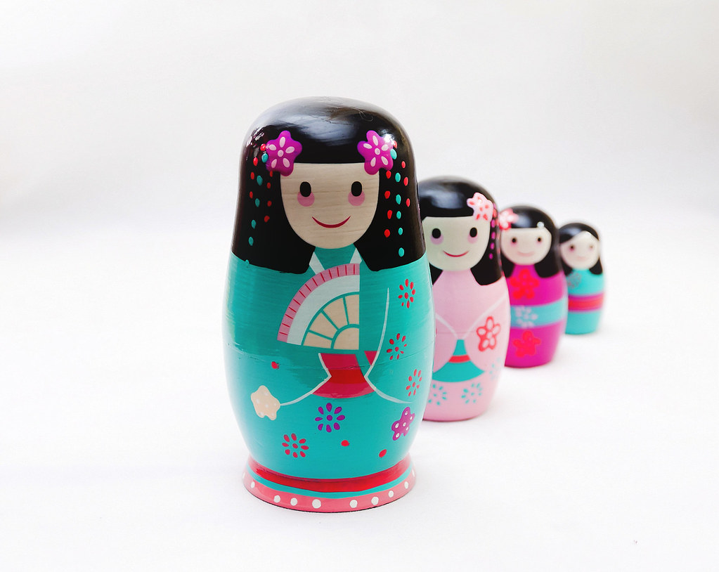
Companions..............love the colors on those dolls & your choice of arrangement combined with DOF (y) crit....lighting looks good enough to me on the dolls but it has created a slightly darker area , more noticeable to the lh side of the frame , possibly using a reflector may help ( I'm sure Paul- pjm- will able to offer better advice though ) I like the square crop but think it could stand a smidge off the lhs to decentralise the front doll a bit more ?
 
hi Lynne, nice to be back :) I can see the dark area and it was caused by the fold in the background/floor. I could have straightened it out a bit and got rid of it if I'd seen it before lol. I could also have set up my flashes with proper diffusers and stands but I rushed it and just balanced stuff on the table. The RHS flash had a table cloth draped over it to act as a diffuser. The LHS was pointing at the ceiling with a bit of card to the side to stop glare. If I'd taken my time it would have worked better. Still, I am pleased with my progress so far. Lighting has always been something I've never bothered with so my 52s are a way of learning :) Which is why I welcome help and advice :banana:
 
Last edited:
Hi, i really like it, the subject matter, composition, colour and DoF but I think Lynne has it right with the crit she has given

But I do like it :clap:
 
Hi Summer.

Scenic
I like the shot, as some of the others have pointed out - the fence is a little distracting.
I also wonder if a panoramic crop would suit better.

Companions
Spotted this on flickr yesterday.
Fits the theme perfect. I do like the coulours or the figures, lighting works well as does the BG.
I hadn't noticed the darker area to the left until Lynne mentioned it... my eyes are not the good.

nice work and look forward to seeing more
 
Companions - a great idea and I love the colourful dolls, can't add any more to what's already been said crit wise. Good interpretation :clap:
 
Hi Summer... Scenic is looking slightly flat for me, but that's more to do with the light you had than your camera work. Having more of a foreground subject could well help though.

Companions - well shot. Reminds me of some of my earlier works with a background / card! I think you've done really well here, good DOF choice and composition. Main thing to tweak a bit is the lighting: you need (IMO) a much bigger single lightsource which will automatically be softer and help with some of your background lighting issues. Bounce your flash off the ceiling if you don't have light stands and a softbox. The bigger you can make your lightsource, the more "gentle" it will appear and give you loads more leeway to worry less about shadows and positioning of the light itself. If you don't have modifiers don't worry, just bounce off the ceiling - it's harder to control the direction but the important thing is you'll get the huge area of lighting that is a good starting point to create some great base product shots.

If your flash doesn't swivel still don't worry - you should be able to use your on-camera flash as controller and take your flash off camera and point it where you want (upwards!) Sometimes you need to shield/snoot the flash a bit so its doesn't directly light the subject... basically just avoid small light sources until you know you want them and where you want to point them!
 
Fragile - Good lighting here and great idea, really like it! It would be interesting to see what it would look like if you disturbed a few of the top cards to highlight how fragile the structure is.

Scenic - Lots of layers here which work very well for me. I think it needs a little contrast boost and either more of the bottom fence or none at all.
 
sorry about being a bit quiet, have been a bit ikky this week :( ugh some kind of stomach flu going round

but thanks for your very helpful comments :) keep them coming

and onto week 5 - elegant. I have done two because I couldn't decide between them - again my set-up is very basic but I think I've got the technique right, just need more material and stands :p


week 5 - elegant (2)
by moominmama, on Flickr


week 5 - elegant
by moominmama, on Flickr
 
and because I've been ill I'm going to cheat a little and use an old one for watery - this is a subway near us half full of flood water!


Runway Subway Flood
by moominmama, on Flickr
 
Companions - I really like this. Super use of DoF, nice colours (without being over saturated) and good composition. Nice one

Elegant - My preference is for the round perfume bottle. The shape brings more interest - maybe also says feminine for some reason - and the touch of blue light really lifts the silhouette nicely. It could make a really arty product shot in my book.

Watery - Took a while to work out the connection but as soon as I did I feel it hits the theme. Nice vibrant colours and I feel the exposure is just right - any more and the main thrust of colours and light would be too much.
 
Watery - Took a while to work out the connection but as soon as I did I feel it hits the theme. Nice vibrant colours and I feel the exposure is just right - any more and the main thrust of colours and light would be too much.

I'd agree...I was thinking, "eh?" then I got it. Like this one a lot, because it takes thought to 'see it'.

Cheers.
 
Hi Summer...sorry to hear you've been feeling poorly. Tummy bugs are rotten :(

Ok, so.....

Elegant. Both shots are lovely. Great light, clear detail and perfect for the theme.

Watery. A real eye catcher that one. Love the colours and refkection
 
Back
Top