Hi Jenny... welcome!
Now, I was all ready to be very "warm & friendly" about your first shot as you're new to this challenge and we all like to be supportive to anyone joining
")
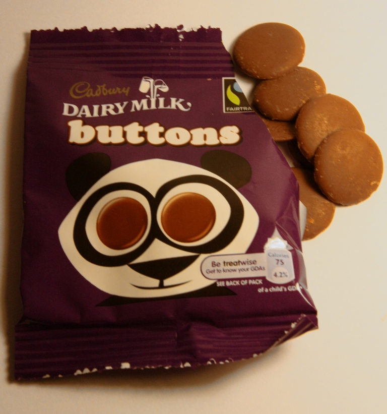
But then I saw your second photo and thought, "wow, she can take brilliant photos!" So I'm going to be a bit more direct on the first one, because you're clearly very capable as a photographer. Starting with the positive, bliss is on theme... but... I find the buttons and some of the text on the packet slightly out of focus (could be my eyes!) or perhaps camera shake and it all feels a bit flat, perhaps because you've placed them on a surface, pointed the camera down towards them and taken a shot. The lighting also doesn't, in my opinion, really help the image, especially how the bottom left of the packet is a lot darker.
So, a few opportunities to tweak this first shot to make it stronger: (i) perhaps create more of an angled composition, using distance from the camera as a visible dimension (so you could have the buttons further away than the packet, or nearer, which gives you depth of field as a tool to play with); (ii) nail the focus and eliminate camera shake: use back button focusing on the former and perhaps a faster shutter (or tripod) to eliminate the latter; and (iii) use softer lighting - window lighting on an overcast day is a great natural softbox which you can "position" for these sorts of shots by moving the subject and camera relative to the fixed window (rather than trying to move the window!)
But enough about image #1. Image #2 is absolutely super for Fragile! I love your composition, processing/conversion and it is genuinely a top quality shot for me. With maybe a tiny crop off the top, I'd happily hang this on my wall and I don't say that about many shots. Your lighting works really, really well for me: you've captured some great texture on the nearest dominoes, I like the shadows falling towards camera from those yet the rear dominos are a lot softer in terms of shadow, which works well. Your depth of field choice works really well here. Even the proximity of the far dominoes to the wall is inspired: I'd have defaulted to pull it back and try to lose the edge between surface and wall but it actually adds something to the photo and because you've handled the shadows so well, there are no distracting shadows falling on the wall, despite the closeness (there are some light shadows but works for me).
I love shot 2 and think it's absolutely top drawer, wall hanging material