weekly Raptor Mike's TP52 challange 2015 - CATCH UP!! Weeks 14, 15, 16 & 17 added

Very inventive. How many goes did you have at stacking the blocks?

My personal preference is for the second shot, the added blocks at the bottom really add to the composition.
 
Very inventive. How many goes did you have at stacking the blocks?

My personal preference is for the second shot, the added blocks at the bottom really add to the composition.
Thanks. I think it was three. But I nearly knocked them down by putting my camera on the table, its a fold up dinning table and its not the most sturdy table in the world and the putting the camera on it made it vibrate lol.
 
Hi, definitely second one here to, the blocks at the bottom do add something nicely lit too
 
Hi, #2 for me. Nice lighting, well composed and nice colours.

Cheers.

Hi, definitely second one here to, the blocks at the bottom do add something nicely lit too
Thanks guys (y)
The black background is two bit of mount board, one flat on the table the other stood up against the wall. I had a lot of trouble with light on the back piece so had to adjust in the LR5 trial. I didn't have this problem with the Lego patterns but that was shot at night whereas this was shot during the day so although I pulled the curtains light was coming through from the kitchen. Apart from the umbrella being on the left instead of the right that was the only difference and fiddling with flash and camera setting weren't helping. I could've just closed the door, if I hadn't taken it off (its a small room and we didn't ever close that door anyway) .
 
Last edited:
Week 3 - Scenic
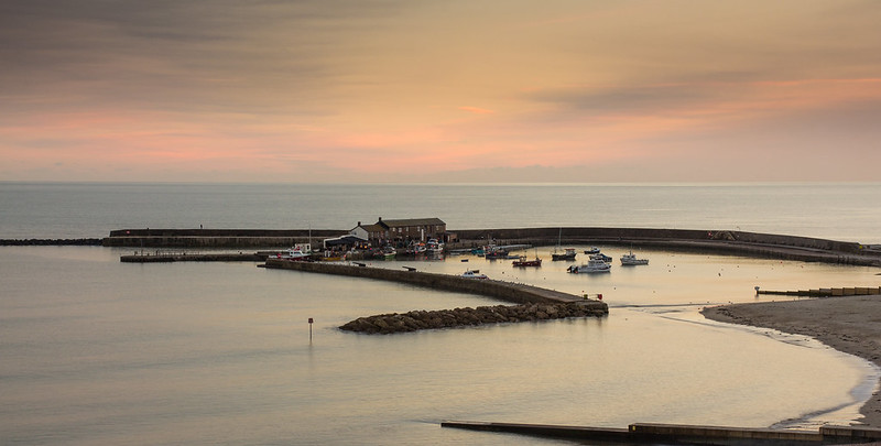
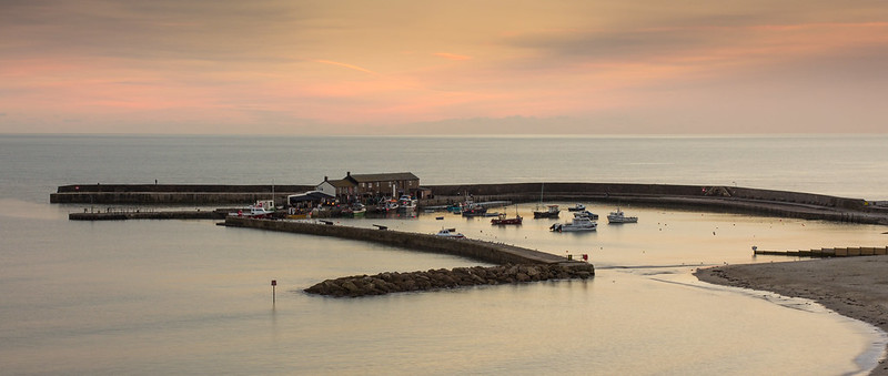
Any excuse for me to do some landscapes is a good one. Today I'd planned to do some shots of some of the rocks on the beach the other side of the Cobb but earlier today I thought 'well The Cobb is a famous landmark so comes under scenic' so my plan was to do big stopper images of the sea over the rocks then tog the Cobb on the way back up the hill to the car park. However, numpty here got down to the beach to find the tide was in and the rocks coverd so I spent the afternoon working with the Cobb and a few on Golden Cap.

I tried some big stopper images that looked really good except for the blury boats so I went for this one which was the second to last shot. I used a hard 0.6 ND grad. Most of the editing was done in the 30 day trial of LR5 I've got, which I'm still not sure about... it's a lot different to Elements9 and not all in good ways. So please let me know what you think of the edit.


The Cobb at Lyme Regis
by Raptor Mike, on Flickr

Thanks for looking, Mike :)
 
Last edited:
Very nice Mike, plenty to see there and nice pastel colours in the sky too :)
 
As has been said, the colours in the sky are beautiful, along with the stillness of the water it makes for a very tranquil view, my only negative and I'm being really picky is that the sides look a little clipped, what I mean is I would maybe like to see the end of the breakwater. Break shot nonetheless (y)
 
As has been said, the colours in the sky are beautiful, along with the stillness of the water it makes for a very tranquil view, my only negative and I'm being really picky is that the sides look a little clipped, what I mean is I would maybe like to see the end of the breakwater. Break shot nonetheless (y)
Thanks Chris. I know what you mean about the crop but it would have to ahve been a very narrow letterbox to cut out the things at the bottom of the frame. I didnt want the Cobb to look too lost. I'll do one a mo and see how it come out.
 
That's a great image and captured the theme spot on. :clap: I was going to mention about the breakwater too when I saw the first shot. The edited version is way better. Very pleasing and warm colour. I also like the still and calmness.
Thanks Stan. Do you mean you prefer the first one or the second one? It was a beautiful afternoon with next to no wind. It was still pretty cold though.
 
Yes a great scene you've captured here. I too thought the clipped shoreline was a shame but on seeing the 2nd version you chose right. Seems a pity it can't be pp somehow ?

Gaz
 
Hi, have to say I prefer the second one with all the breakwater, quite like the rather muted colours
 
Loving the colours in this Mike :clap::clap::clap:

I swapped over to LR and now I wouldn't go back. Just takes some getting used to.....
Thanks. I can't decide whether to buy it out right or subscribe, mainly because it seems LR doiesnt seem to work as I thought it would with Elements because vif the 16/8biut thing.
 
Nice image Mike ... difficult to know how much to crop, I like to zoom in to the house & boat detail, think I'd like to see #1 cropped even some more.
 
Your fragile pic was really good the edit scenic pic is also bang on (y)
 
The second i dont really like because you have lost that soft pastle sky. Personally i'd like the sky from shot one in edit 2 and maybe if the frame allows as Peter says loose the bottom breakwater. ( I only say that because the tip of the breakwater is missing in shot 1, this would have been spot on for me if the end of the breakwater was present).
I would be tempted in LR to drop in yet another grad and give the sky a bit more colour as in Edit 1.
Lovely place isnt it, crazy as a mate of mine lives there and i have never been down to take Photographs!
Nice work Mike
PS never understood why Adobe have these anomalies i have a minor issue with LR 5 and my version of PS. LR Once you set it up correctly is great but its not a replacement for PS (An addition too).
 
Thanks again all. As you probably have guessed, but in case you haven't, the second one is a different shot which is why the soy is different. I have to admit I'm torn between the two images. The Cobb with the breakwater is so long, from where I was anway, its difficult to get a close shot. I will try cropping a bit more off both images as suggested and add a grad too, which will give me an excuse to play with lr a bit more. Thanks again peeps :)
 
Hiya Mike, that's a very peaceful shot. I'm rather frustratingly going to agree with Steve (@69Bonni ) once again - it seems like I'm just copying him and not doing any thinking for myself! - but I agree with his points re: colours of the first and crop of the second, perhaps cloning out the breakwater.

Good job and getting closer to next week's theme now!!
 
Thanks all. When you say bottom breakwater are you on about the concrete groin that starts in the bottom right corner?
 
Last edited:
Hi Mike.... I love Lyme Regis, such a beautiful little place. As said the sky is gorgeous. I actually like definite break across the frame created by the breakwater, I think maybe removing that groyne from the bottom right would strengthen the overall look to this particular crop. Really nice submission [emoji4]
 
Some gorgeous colours in the sky and subtle reflections in the sea :clap: Purely a personal point of view, but I'm wondering why you've gone for the wide panoramic format? I would have liked to see a lot more zoom to focus more on the harbour and the zigzag lines of the jetty/breakwater.
 
Thanks Elaine. One of the reasons I zoomed in more in the first shot was to show more detail in the actual Cobb, which is why I say it looks a little lost wider out. Going in closer again is a good idea. I will try lots of different edits suggested by people and post them up a some point this weekend
 
So I had to start again on the second edit but here we are

Edit from first image. Cropped and removed breakwater (which looks very wierd to me as I'm used to seeing it)
_MG_5898 crop by Raptor Mike, on Flickr

Edit from second image. Cropped, LR grad filter used and adjusted wb, vibrance, saturation (from the RAW)
_MG_5864 crop, grad by Raptor Mike, on Flickr

Thanks again for all your comments :D
 
Uuurrrmmm No 2 Mike cos I said I'd like the bottom breakwater removed perhaps I should have said groyne;)
Quite like No 2 mate(y)
 
Week 1 -Bliss

So there are many things that I would consider bliss like spending time with my family, riding my motorbike, photography, a really good training session at judo. But I went for having a beer and maltesers while watching a film with my wife on the weekend once the kids are in bed.

Hi Mike :)

Sorry somehow not visited your thread yet...

Bliss - Nice bright image, for me the cushion needed to go as my eyes keep getting drawn towards it rather than the lovely beer & maltesers, they are both nice and bright, good colours and relatively well lit too, nice idea for the theme :)

Fragile - For me it is definitely the second shot, I really like the idea opfd this one, and the inclusion of the loose blocks around the base make it appear more appealing to me, nice colours again and a good black background :)

Scenic - Well a good few edits here, must agree with previous comments, I like the second shot with the unclipped breakwater, I like your PoV you took this from, and the shot has a nice level horizon and beautiful colours in the sky, real nice image (y)
 
Back
Top