7th time down avenue 52 COMPLETED

Hi Michael,

Graceful - I like the purples against the blacks and the composition works nicely :)
Agriculture - Nice tranquil shot. I may have tried to pull back the sky, as it looks to have the makings of a dramatic cloudy sky.
Vehicle - Lots of drama used in the processing of this one. Quite fun to crush the blacks losing the detail. I like it.
Fruit - I think I can see what you're aiming for here, use of the branches to frame the fruit. It almost works (sorry), but I think personally that the apples need to be more of a red colour for it to work. Just my opinion though, and I'm normally wrong.
Piece - Haha, Tetris yes very good. I'm with Allan on the angle, it feels as if it's tilting towards you rather than the usual perspective effect of away from you.

Hi Tim, thanks for the comments, the building was very annoying, spent ages messing around to get the perspective right,. Had been to sea life with the family so didn't get chance to do it justice.

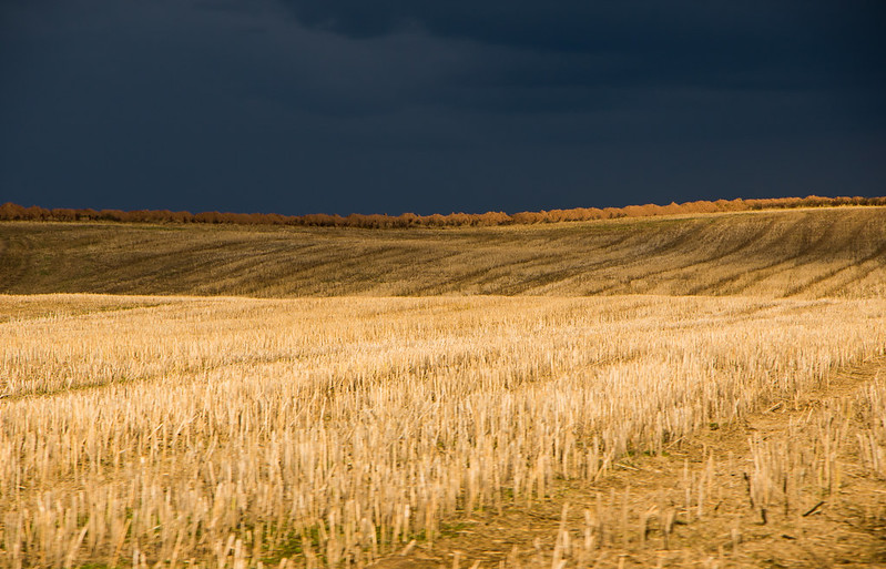
On to contrast, an indecisive week this time round. A couple I like,taken from the car whilst moving,

landscape 2 by Michael Johnson, on Flickr

landscape by Michael Johnson, on Flickr

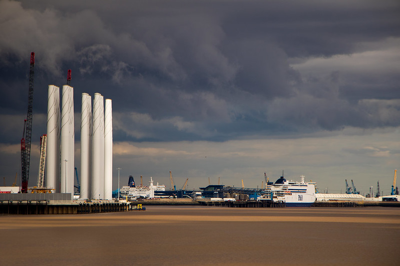
Then I like this one too, taken in hull after visiting the deep.

Hull dock yard by Michael Johnson, on Flickr
 
Good, contrast-y light in all, for the theme I'd pick #1 for its strong demonstration of contrasting light but I do like #2 as well.
 
I like the moody skies that each shot has, and as Chris says, it's certainly contrasty lighting.
#2 makes interesting use of putting the horizon well below the third, and works because of the prominence of the wind turbines.
But I think #3 for me, as it has much more to look at.
 
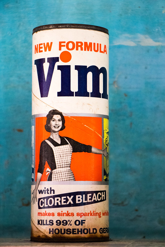
Clean, real blast from the past there, well spotted, good background and the rusty container adds a nice foil to the clean theme.
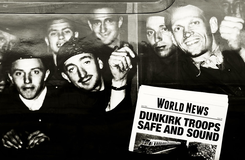
Curves, I'm unsure if the background is chosen for the curves theme or not but either way I find it a tad distracting, the soldiers on there own would do the job I think
 
Hi Michael,

Clean - Wow, that looks old, where did you find that? Background could do with some of it (if it hasn't solidified).
Curves - I'm with Chris, the background doesn't do it any favours. A simple background, or perhaps something war related would work (or possibly something from a nursey).
 
Hi Michael,

Contrast - they all fit the theme well; my favourite is #1 for the strong contrasting light and colours, but I like the second one too.

Clean - yes, that's an old one and it definitely illustrates the theme in a very simple and effective image.

Curves - I can see curves in both the wallpaper and soldiers. which may have been your intention, but I agree that the soldiers would look better against a more plain background as they are lovely bright and colourful subjects in their own right. A good find (y)
 
Clean, real blast from the past there, well spotted, good background and the rusty container adds a nice foil to the clean theme.
Curves, I'm unsure if the background is chosen for the curves theme or not but either way I find it a tad distracting, the soldiers on there own would do the job I think

Hi Michael,

Clean - Wow, that looks old, where did you find that? Background could do with some of it (if it hasn't solidified).
Curves - I'm with Chris, the background doesn't do it any favours. A simple background, or perhaps something war related would work (or possibly something from a nursey).

Hi Michael,

Contrast - they all fit the theme well; my favourite is #1 for the strong contrasting light and colours, but I like the second one too.

Clean - yes, that's an old one and it definitely illustrates the theme in a very simple and effective image.

Curves - I can see curves in both the wallpaper and soldiers. which may have been your intention, but I agree that the soldiers would look better against a more plain background as they are lovely bright and colourful subjects in their own right. A good find (y)

Thanks very much for the comments, clean came from a room in southwell workhouse, a national trust property. As for curves, this was in another national trust properrty, in a nursery bedroom, I could have actually moved them, but it didn't even cross my mind to do so. Plus we were walking through with our 2 children, so not 100% thinking about it, I might see if anything turns up for another shot at curves.
 
Hi Micheal,

Contrast - Think I like 2 the best. Its very dramatic with the low horizon and the very menacing clouds
Clean - Good one. Well spotted and it stands out well against the blue wall. Looks like it would kill 99% of everything lol
Curves - Like others, I think the would have been better against a plain bg & my OCD wants to straighten them all up, but they don't really like you to move things in museums :D They are lovely soldiers and very curvy, well spotted again :)
 
Curves
I like the arrangement of these, the fact that they're not all looking the same way, adds a little something.
 
Thank you for the comments and thoughts everyone :)

Occupation, I attended the old oak common railway depot open day in london, here we have one of great westerns carriages with a different livery, I liked how it tied in with occupations, from the past and someone today doing there job whilst remembering people from the past.

old oak common gwr 180 #6 by Michael Johnson, on Flickr

You, wasn't sure how to do this one, a self portrait or another person, I opted for a self portrait, someone with a desire to travel and explore...you know what you want.

you by Michael Johnson, on Flickr

Thanks everyone for looking
 
I feel that occupation could do with a bit more context and find the bright reflection top left a bit distracting, sorry.

You, I'd be tempted to reduce the brightness of the light, top left but I do like the image and the processing, personally I don't mind the reflection of the globe.
 
HI Michael. I like the idea for occupation but it might work better if it was s little wider - I was a bit confused as to what I was looking at until I read your commentary! I like the globe shot, great idea to put yourself in the background. Haven;t been about for a while, looking back through your stuff I like the retro Vim and the contrasty landscapes (I think the first is most apt for the theme). The backlit moth for Minimalistic is very cool.
 
The Occupation image is full of impact and doubly interesting when you realise it's on the outside of a railway carriage (I think). I would love to see a wider shot. The addition of the globe to your selfie and the selective focus does tell the story you intended; putting the eye straight on the globe before moving back to you and your camera in the background. Nice idea, and it works well (y)
 
Occupation is a nice shot Michael and on theme.
You I like it but my eye is drawn to the globe reflection.

Cheers Dave, I tried lowering my position, but it made me look odd in the mirror :)

I feel that occupation could do with a bit more context and find the bright reflection top left a bit distracting, sorry.

You, I'd be tempted to reduce the brightness of the light, top left but I do like the image and the processing, personally I don't mind the reflection of the globe.

Thanks Chris, the reflection was a tad annoying, hoping to see it out on the mainline at some point, See what you mean about the light, missed that bit.

HI Michael. I like the idea for occupation but it might work better if it was s little wider - I was a bit confused as to what I was looking at until I read your commentary! I like the globe shot, great idea to put yourself in the background. Haven;t been about for a while, looking back through your stuff I like the retro Vim and the contrasty landscapes (I think the first is most apt for the theme). The backlit moth for Minimalistic is very cool.

I would have liked a wider shot of it, but it wasn't in the best of positions for that, so decided to go for a close up. I quite like the globe shot myself.

I am liking the self portrait Michael, it is nice and different having the globe in the shot and being the point of focus :)

Thanks for looking in Dean, much appreciated.

The Occupation image is full of impact and doubly interesting when you realise it's on the outside of a railway carriage (I think). I would love to see a wider shot. The addition of the globe to your selfie and the selective focus does tell the story you intended; putting the eye straight on the globe before moving back to you and your camera in the background. Nice idea, and it works well (y)

Thanks Andrea

Liking the OOF self portrait and the idea behind it .... clever.

Thanks David.
 
You, I like it but could you have lowered the camera a bit to lose the globe reflection?
Occupation that's a good shot for the theme.
Curvy soldiers, I like the colours but would prefer a more subtle background.
Clean , ignore what I said about the background for Curvy, the strong background shows the Vim off really well.
Contrast I think number 2 for me. That stormy sky with the sun on the wind farm look really good.
 
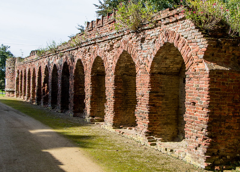
That's a good series of arches in the first, Michael, with some great colours and textures in the old brick. Display is an interesting one; warm colours and textures and the old figures stand out so well they look almost superimposed onto the wall. The frame works well for this one too.
 
Hi Micheal,

Occupation - Interesting, you have to look at the image properly to realise it is the side of a carriage. An odd choice for the side of a carriage, though I suppose it's for the GWR Railcar.
Nicely captured, controlling reflections in the important parts and avoiding people walking through the shot.

You - Works for the theme but it doesn't really work for me. Can't put my finger on why.

Arch - That has seen better days... Good detail in the shadows without over exposing the brickwork in the light.
I would perhaps have liked a bluer sky, as it seems a pretty bright day, but that may not have been achievable.

Display - Plenty of detail and texture, especially when enlarged on flickr :)

Thanks Tim, re the sky in arch, it was a very bright day not much blue though iirc, certainly couldn't pull any colour back in pp.

Now to post wood and bent, got these both done to make sure i'm all up to date. Off to the isles of scilly for 3 weeks, so hopefully the following themes will suit the holiday well.

Bent

hanbury hall #8 by Michael Johnson, on Flickr

Wood

This one I like the textures in it and how it lends itself to a stark b+w conversion.

hanbury hall #21 by Michael Johnson, on Flickr

Or this one, cant make my mind up, I like it for the shapes in there

hanbury hall #20 by Michael Johnson, on Flickr
 
Enjoy your holiday Michael, hopefully lots of photo opportunities and some good weather.

I wonder how that trough became so Bent, maybe a herd of cows ran over it! Nice find for the theme.
I think it's #2 for me too, I like the starkness of the first one but there's some lovely colours in the wood on the second, I like the tangle of branches against the grey sky.
 
Bent - lucky you missed the stampede !

Wood - for me the gritty B&W wins but the shapes are good too.
 
Wall / walled

Here we have an image of Restormel Castle in Cornwall, quite a lovely place if you ever get the chance to visit.

restormel castle #4 by Michael Johnson, on Flickr

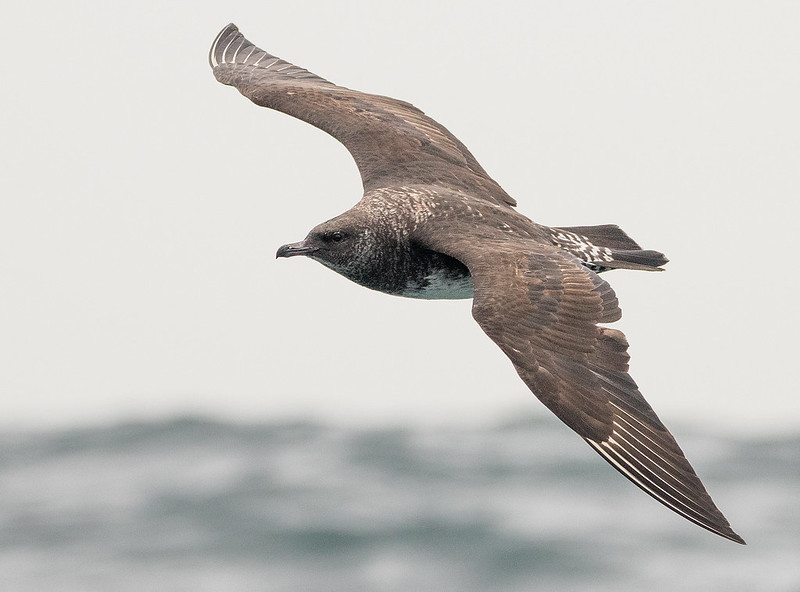
Symmetrical

A birds plumage, in this case A Pomarine Skua, photograph taken at sea from a boat, the day after hurricane ophelia passed the isles of scilly where i was on holiday.

Pom Skua #9 by Michael Johnson, on Flickr

Worn, Happened to bust and break my wide lens whilst on holiday, only about 3 days in! So settling for an instagram hone picture

 
Last edited:
Back
Top