weekly Adamcski 52 for 2022 Week 52 (new to photography) 2022 52 complete

Messages
1,869
Name
Adam
Edit My Images
No
Sorry for the delay, real life came calling.

Anyway, this is my thread for the 52 for 2022 challenge and I will do my best to complete each week.

Worth mentioning that I am really new to photography and finished a basic photography course in December last year (but I now know what the letters mean on the dials).

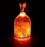
Week 1 - NEW and I submitted the below. It was taken in a completely dark room and is a bottle of my wife's gin that has gold flakes in it and some LEDs you can switch on. I thought it was nice as it gave a warm glow and when you shake the bottle and switch the LEDs on it glows an orange colour.
Wk 1 - New.jpg


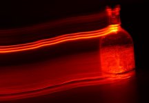
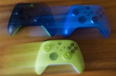
I did also play around with the technique (ICM) and a couple of those pictures can be seen below. Having only just learned about A / Tv / ISO and such, it was an odd feeling deliberately moving the camera, but I can see how it may be useful to show movement perhaps?
P1001527.JPG


P1001445 v2 crop.jpg
 
Last edited:
Thank you.

I must also add that I am trying to learn about the editing side of things (by watching YTube) and I think I have settled on Affinity Photo as it appears to have everything I need. I do appreciate however that we all see things through different eyes and have our own tastes etc.

The ICM pictures were really just me trying to play with the settings on the camera and get some blur.
 
Really like the shot of the bottle. It has a great glow to it, and is very striking.

I also have Affinity Photo, though I only use it when I have more complicated edits to do (panoramas, focus stacking, HDR etc) , but it has a nice easy and basic RAW development persona so as your editing skills develop you can grow into the software. It does FAR more than I’ll ever need.
 
Like Tim, I had gone looking for your thread as I thought it was a great image, so I'm so glad you have given us the chance to comment.

You've nailed the exposure which can't have been easy and I love that you've got a reflection underneath so the bottle is not floating in the darkness. Great start.
 
I like your first image Adam. I think that it was the right choice for the challenge.
 
The right choice for me too. Lovely colour and light in there.
 
Nice. I would have cropped tight on the bottle.
 
I like the colours you have captured and it's good to see you giving ICM a go, you just need to incorporate it with a theme.
You have made a good start.
 
Cheers folks, all feedback taken onboard.

I have the first class of my intermediate level photography course tonight, it's called playing with light. Some of these techniques may be covered over the next 10 weeks of lessons which would help.
 
Okay so week 2 is OLD.

I only have today to sort this out and had planned a nice afternoon out with wife, daughter and son where I could grab some photos. Son decided to ruin it (I am livid with him) and that cut the whole thing short, so back home in under an hour.


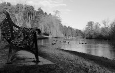
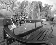
I think these are my best two so far (Camera JPEGS no Affinity, etc just cropped and B&W via windows). Had to crop them a bit to get them the right size.

Any preferences?

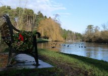
Number 1: Old bench with Old wreath next to an Old Pond.

P1001596 crop.jpg

Number 2: Old flowers left on an Old bench.

P1001614 (2) B&W.jpg
 
Was a close one to pick. I could have spent sometime playing around with them and trying to perhaps make the first one lighter, but my son angered me so I haven't been in the correct mood LOL.

Not sure if we need to state what they are taken with but these are just with the S5 and the kit 20-60 mm lens, which I believe to be pretty good (in my limited experience). What I want to learn about in Affinity next is how to colour just a section of a B&W photo, as I could have used that with these images.
 
I like them both (personally was leaning towards the top one) wife liked the second one - so went with that one.

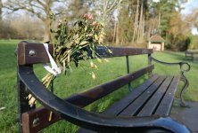
I can add the colour ones to the thread if you want to see them?

P1001596 crop lighter.jpg

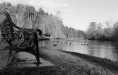
On this one I have just altered the brightness (windows) and it looks a little better (to me).
 
Last edited:
The ICM pictures were really just me trying to play with the settings on the camera and get some blur.
Playing is one of the main ways to learn! Practise on stuff around the house then when a real life opportunity comes along, it's in your toolbox and you're not fumbling with settings. Well done for taking on a 52 as a newbie to photography.

As for old, I prefer the second. It's a stronger composition for me with a clear subject. The arm of the bench in the foreground is a bit of a niggle, but short of vandalism, I suspect other options were few & far between.
 
P1001614 (2).JPG


#
P1001596.JPG


Something like that...may not match 100% as had to crop them (windows) to fit...

I like the little bit of red on the second picture and that brings me back to my self learning this week on Affinity. I do like B&W shots, but love them when they have that spot of colour in them, which I think may have worked well with picture 2 (just don't know how to do it yet).
 
Last edited:
I think I prefer the lightened #2 to be honest, but can't really put my finger on why.
Not sure if we need to state what they are taken with but these are just with the S5 and the kit 20-60 mm lens
There is no need to state what was used and what settings, but it can help other posters understand how the shot was taken and offer suggestions.
If you do the bbcode link from flick, the Exif info is normally still there anyway :)
 
I like the second and chosen shot. A little more interest in it for me.
 
I think that I like the first one Adam. I'd just boost the shadows a bit to give the bench a bit more punch.
 
Interesting isn't it, how some people prefer one image to the other. Just comes to show me that in reality there isn't really a right answer to photography.....

I suppose it is like art. Some paintings sell for millions and I look at them and just see a mess...all in the eye of the individual I guess.
 
I do like the one you’ve chosen the best although I would have just changed position to lose the structure at the end of the bench.
 
Sorry for the delay, real life came calling.

Anyway, this is my thread for the 52 for 2022 challenge and I will do my best to complete each week.

Worth mentioning that I am really new to photography and finished a basic photography course in December last year (but I now know what the letters mean on the dials).

Week 1 - NEW and I submitted the below. It was taken in a completely dark room and is a bottle of my wife's gin that has gold flakes in it and some LEDs you can switch on. I thought it was nice as it gave a warm glow and when you shake the bottle and switch the LEDs on it glows an orange colour.

View attachment 340377


I did also play around with the technique (ICM) and a couple of those pictures can be seen below. Having only just learned about A / Tv / ISO and such, it was an odd feeling deliberately moving the camera, but I can see how it may be useful to show movement perhaps?

View attachment 340378


View attachment 340379
Like no 1 quite a bit. I'm not sure the tag at the top is helping. Maybe I'd remove or re-position it. Nonetheless it's a nice pic.
 
The 1st Bench has a more interesting background but it's hard to make out the flowers, the 2nd shot is clearer but a plain background.

On the coloured shot I think perhaps a tiny bit more contrast would help.

Pete
 
I would go with your chosen shot - it makes a pleasing image in mono. The colour version I find a little distracting.
 
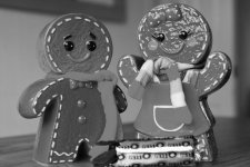
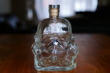
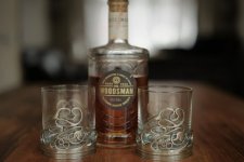
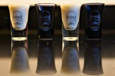
So week 3 is here and the task is receptacle. So, I do not have unlimited time, nor a studio but I have got my old Red Snapper tripod out to have a go with. I am just playing around with some ideas and what do you think? I will add a few more images tomorrow and see what I can come up with for my post before Thursday.

Again, I haven't edited these from RAW they are Jpeg files and I have only quickly edited them with windows (can have more time to play around with Affinity tomorrow hopefully).

Biscuit tins.jpg

Receptable Star wars.JPG


Windows edited Whisky glasses crop.jpg
 
I like the last. Nice neat arrangement.
 
That last one, the Star Wars one, is the best of the bunch for me. I really like the light and shade. Personally I would try and give it more space top and bottom and try and even up the foreground objects on the dark background (I hope that makes sense).
 
Cheers, I think it's because I've had to crop it to fit it on the forum.

I enjoyed spending an hour earlier just taking photos of random things if I'm honest. I don't expect to win any awards lol but it's all learning for me.
 
Last edited:
Back
Top