- Messages
- 3,145
- Name
- bill
- Edit My Images
- Yes
I learned about coprolites while working at the UBC Museum of Anthropology and it's interesting but, as an image, I think that I agree with Tim's assessment above.
Very good! Nice idea and well executed, well done!
That's very nicely done. I spent a few seconds wondering what the strange foamy drink was. Then I realised!
Great image Bebop, though it looks like your tea is a little choppy...
Brilliant idea, Beb and very well executed.
Very nice although I suspect the tea is a bit watery and salty.
Thank you all for the kind reception of my receptacleThat's a WOW shot for sure!
Thanks Simon. Perhaps that's the reason composites occur to me now more so than before? I'll blame the 52Lovely shot! Would have worked well for last year's composite too!
Storm in a teacup! I like it!
Thank you bothSurfs up lol
Great job done.
Many thanks Stuart. I had decided I was not going to show more than one pic per theme (which is what we used to do here - you had to choose one), but I did think the fossil was a bit lack lustre, so I have failed in my mission again for a single pic ha ha! I think perhaps my lighting wasn't ideal for the fossil either.New - I like how only a portion of it is sharp, personally I wouldn't know where to look if it was all in focus, nice touch with the brush too.
Old - I do prefer the interesting elements of the second paint image, the fossil looks like it could benefit from increased contrast to show more detail
Receptacle - I immediately worked out your concept which looks great, although I think it would benefit from higher waves as the cup rim doesn't work as well (imo) at the left side (10 o clock area)
Many thanks Kell. I know it could be improved but I did enjoy putting it togetherGreat Idea. Nicely executed.
Thanks - with the 52 you could end up trying anything!Ooooh.... Clever!
I can't really offer much, I wouldn't know where to start with that kind of thing, but its a fun image.

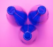
Like that, there’s something ‘chemistry lab’ about it!
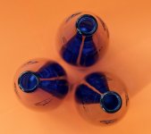
lovely colour contrast and different than many.
If you had used yellow and black this would be radioactive!
Like it. The symmetry is fine.
Good idea ... works well
That's come out rather well!
Bizarre what playing around with WB can do for colours!
Thank you so much for the positive comments - it also made me think of a radioactive symbol or lab experiment.That's a very 'acidic' looking image (the colours I mean). I like it, a good take on the theme and worth the adjustment to WB i'd say.

Thank youReally like your shot and the final edit. Very striking.
Yes I think this is why I disregarded the second posted (but earlier) image - because the bottles weren't close enough together. The devil is in the detail!! Nice to see you popping in here - your comments are always welcomeReally well crafted Be. Prefer the arrangement of the pink one and the colours of the orange one. It does have a radioactive feel and the almost "opposite" colours (on the colour wheel) make a more dramatic image (IMO)
Thanks Paul. I'm not usually a pink fan, butI quite liked it in this instance.Very striking, and I prefer the colours of your chosen shot.
Thanks Scott - you'll see I gave up on the idea of flash and gelsThat is a cracking a very creative shot, love it
Thank you. The teacup is not perfectly edited, but it was a bit of funLove the teacup and impressed with the editing skills to achieve the picture. Very clever.
Also love the pink bottles : the colour and shapes are really striking.
Cheers DaveNice that - clever shot
Wow.. that's a great shot.. it really pops. I'm with you on the blue/pink colour combo.
Thank you both kindlyThat's both different and terrific. I prefer the blue/pink version.
