You are using an out of date browser. It may not display this or other websites correctly.
You should upgrade or use an alternative browser.
You should upgrade or use an alternative browser.
weekly Blush's 52s for 2015; Weeks 50, 51 and 52: Christmas
- Thread starter Blush
- Start date
- Messages
- 115,214
- Name
- The real Chris
- Edit My Images
- No
No problem, besides, it'll ease you in to the 2016Hi, guys, sorry for joining in in such a late stage, but anyway, I hope I can keep up
Here's to taking pictures for fun
- Messages
- 177
- Name
- Nora
- Edit My Images
- No
Hi there ....I'm sure you'll love the thread ....good luck
Thank you, Susie, and nice to meet you

- Messages
- 177
- Name
- Nora
- Edit My Images
- No
My take on "Covered"
Cover (verb): To put something over, on top of or in front of (something else) especially in order to protect, hide or close it
In Asian families, parents play a huge role in their children's lives since birth and they are very protective towards them. Asian children rarely move out of their houses except for educational purposes or marriage.
Edited in Lightroom... Just got it so I'm not sure what I am doing hopefully it turns out okay
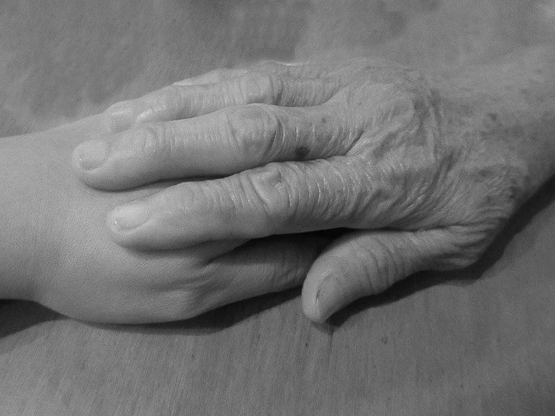 Covered (B&W) by Nora P., on Flickr
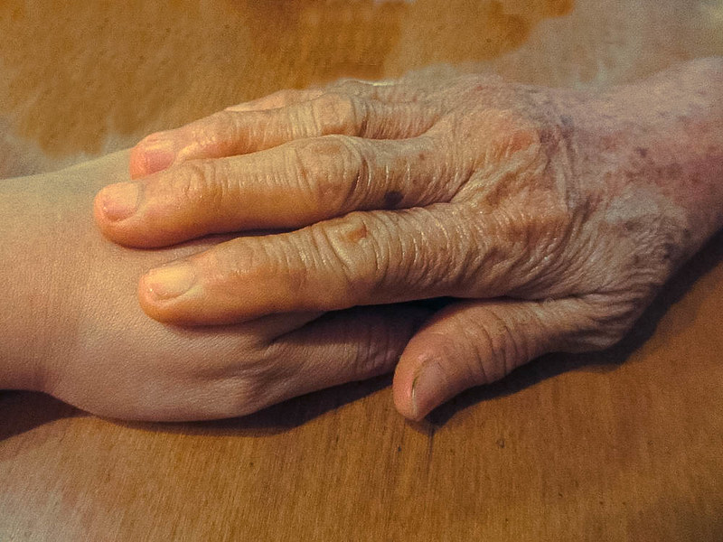 Covered (Colored) by Nora P., on Flickr
Cover (verb): To put something over, on top of or in front of (something else) especially in order to protect, hide or close it
In Asian families, parents play a huge role in their children's lives since birth and they are very protective towards them. Asian children rarely move out of their houses except for educational purposes or marriage.
Edited in Lightroom... Just got it so I'm not sure what I am doing
 Covered (B&W) by Nora P., on Flickr
 Covered (Colored) by Nora P., on Flickr
Last edited:
- Messages
- 104,475
- Name
- The other Chris
- Edit My Images
- Yes
Like the sentiment behind this and prefer the B&W version but perhaps it may benefit from a slight increase of contrast? I'm sure you'll pick up lightroom quickly, I've been using it for about 6 months and find it quite easy to use although a bit daunting at first.
Brian_of_Bozeat
Jeff
- Messages
- 3,235
- Name
- Brian (not Jeff)
- Edit My Images
- No
Hi Nora. Welcome.
You're one of us now (oh yes you are) great to have you on board.
I love the narrative in this image, the accompanying explanation was unnecessary but added to the overall submission which I applaud, especially for your first submission. The b&w is the better I feel, a little more contrast would lift this to the next level as others have already said.
Last edited:
- Messages
- 177
- Name
- Nora
- Edit My Images
- No
Like the sentiment behind this and prefer the B&W version but perhaps it may benefit from a slight increase of contrast? I'm sure you'll pick up lightroom quickly, I've been using it for about 6 months and find it quite easy to use although a bit daunting at first.
Hi, Chris... Thank you for the comment... Lightroom is indeed a bit daunting
 but yes, I will try to practice using it more... I hope I will be as good as all of you are...
Good start Nora
I'm in the B&W camp too, and as T'other Chris said, a little more contrast would probably help as well
Thank you so much! I will try to tweak it a bit...
Hi Nora, nice sentiments indeed both could do with a little work in PP but as you have only just got Lightroom i am sure you will get used to it soon
Hi, Allan, thank you for the comment
Hi, B&W for me. Yup, wonderful sentiment and really make me think of care and protection.
Yeah, a little more contract maybe, but still works really well.
Cheers.
Hi, Andy... Thank you for your comment... So glad you like it

Hi Nora. Welcome.
You're one of us now (oh yes you are) great to have you on board.
I love the narrative in this image, the accompanying explanation was unnecessary but added to the overall submission which I applaud, especially for your first submission. The b&w is the better I feel, a little more contrast would lift this to the next level as others have already said.
Hi, Brian... Thank you so much for the warm welcome
 I am proud to be part of such a wonderful group... I will pay attention to the explanation next time
 - Messages
- 3,925
- Name
- Carl
- Edit My Images
- Yes
Hi again Nora. Thank you for joining our little community - enjoy. Lovely first image Nora - look forward to more and a catch up of some back numbers if you feel so inclined. I prefer the b&w version but it could perhaps do with a little contrast boost to give a bit more "grit".
- Messages
- 177
- Name
- Nora
- Edit My Images
- No
Hi again Nora. Thank you for joining our little community - enjoy. Lovely first image Nora - look forward to more and a catch up of some back numbers if you feel so inclined. I prefer the b&w version but it could perhaps do with a little contrast boost to give a bit more "grit".
Hi again, Carl
 Definitely going to catch up with past themes... Indeed, I feel it has a really soft filter on this picture, not sure whether it's from the camera or the filter though... Will definitely give more tweaks...
B+w version for me, colour doesn't really suit it. A good image to practice pp skills on.
Thank you for your comment, Michael
Hello Nora
Really nice idea and cute sentiment. I think the B&W works best, but, whether B&W or colour a contrasting BG would add boost. Not always easily arranged I know.
Hello, David... Thank you for the comment... I agree on the B&W there
- Messages
- 7,548
- Name
- susie
- Edit My Images
- Yes
Hi Nora ...what a great idea for your first submission ....smashing interpretation of the theme. I'll go against the flow in my choice, I prefer the colour version, it shows much more detail in the hand and I think it tells much more of a story. An excellent start 
Last edited:
- Messages
- 177
- Name
- Nora
- Edit My Images
- No
lovely detail in those hands. agree with others, B&W and contrast boost would really make it 'pop'. Great idea though, nice job
Thank you, Nathan, both for dropping by and leaving a comment
Hi Nora ...what a great idea for your first submission ....smashing interpretation of the theme. I'll go against the flow in my choice, I prefer the colour version, it shows much more detail in the hand and I think it tells much more of a story. An excellent start
Thank you for your kind words, Susie... I got the idea from the name of your personal project by the way... Thanks again for dropping by
Thanks a lot for dropping by, Tim

- Messages
- 3,925
- Name
- Carl
- Edit My Images
- Yes
Lovely seasonal and colourful shot Nora. Gold & red are very festive colours. Excellent focus and like that you have included the sleigh in the bg to show that we are looking at the back end of a reindeer. 

- Messages
- 177
- Name
- Nora
- Edit My Images
- No
BUGGER! I'll try that again in the right thread this time
Very nice colours and textures there Nora
Lovely seasonal and colourful shot Nora. Gold & red are very festive colours. Excellent focus and like that you have included the sleigh in the bg to show that we are looking at the back end of a reindeer.
Whoo hoo

 purpose attained! I was hoping someone would notice that. Thank you so much for dropping by and leaving a comment, Carl
 Cheers!
- Messages
- 115,214
- Name
- The real Chris
- Edit My Images
- No
Just about everyone tweaks their images, one way or anotherI now understand why sometimes editing is necessary to enhance stuffs.
There is no shame in it whatsoever
- Messages
- 177
- Name
- Nora
- Edit My Images
- No
Just about everyone tweaks their images, one way or another
There is no shame in it whatsoever

Hi, a very seasonal submission. The vivid colours work well.
It's amazing what you see when you have the TP themes on your mind
Cheers.
Hi, Andy.. Does this mean this shot also covered the "seasonal" theme?

- Messages
- 177
- Name
- Nora
- Edit My Images
- No
Hi Nora, nice and unusual perspective works really well for the theme and indeed very festive
Hello, Allan... Thank you so much for dropping by and commenting. Much appreciated...

Nice use of DoF there. I hadn't realised it was the rear of a reindeer until Carl mentioned it but it's obvious now.
Hi, Tim... Thank you
 It wasn't so obvious because I had to cut the tip of the tail
 Nice strong connection there!
Thank you, Chris

Hi Nora ....bang on for the theme and excellent focus on the 'connection'I'd be tempted to nip the top off to just the bottom of the 'white' bit, but well done with spotting that one.
Good to see you enjoying the challenge
Hello, Susie... Thank you
 I see what you mean...
  I am so excited to wait for another theme
Brian_of_Bozeat
Jeff
- Messages
- 3,235
- Name
- Brian (not Jeff)
- Edit My Images
- No
Good example of a leading line. The eye is nicely walked in by the rope to see the sleigh at the back.
Top Marks!
Top Marks!
- Messages
- 177
- Name
- Nora
- Edit My Images
- No
Sharp in the right places, glorious colour too.
Thank you so much, David

Quite like that Nora, very apt for the theme. Like to viewpoint and nice handy work too.
Thank you so much for dropping by and commenting, Stan
 I appreciate it...
Good example of a leading line. The eye is nicely walked in by the rope to see the sleigh at the back.
Top Marks!
Hi, Brian... Thank you for the compliment.. It was accidental actually but now I know about the theory of a leading line
 for dropping by
- Messages
- 177
- Name
- Nora
- Edit My Images
- No
Hi Nora
What a great start
Lovely idea for Covered, so emotive, and now you have LR you can have a play to try different effects
Connected, it certainly is. Good use of DoF and both sharp and colourful
Thank you so much
 I am playing around with LR now
  Thank you for dropping by and commenting... I really appreciated it, Madam
- Messages
- 332
- Name
- Richard Miller
- Edit My Images
- Yes
Hi Nora!
Loving your work! Especially liked the sentiment in covered - protectively covered. The "connected" is a nicely composed shot. Nicely detailed and great perspective.
Loving your work! Especially liked the sentiment in covered - protectively covered. The "connected" is a nicely composed shot. Nicely detailed and great perspective.
- Messages
- 177
- Name
- Nora
- Edit My Images
- No
Hi Nora!
Loving your work! Especially liked the sentiment in covered - protectively covered. The "connected" is a nicely composed shot. Nicely detailed and great perspective.
Thank you, Richard, I am so happy you like them


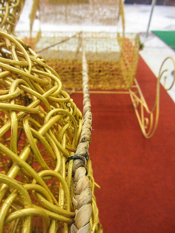 Connected