weekly DK's 52 of 2015 - wk 52 'Christmas' added - FINISHED

Hey Dean!.... 2 weeks of your shots to catch up on - brace yourself [emoji23]

Watery: First one wins hands down for me - maybe it's the funny shaped boat thingy. Stupid weather - bet it would be a cracking shot on a sunny afternoon. Like the edit more although, call me award, but I feel it would be better if it was in the right hand 3rd of the frame with the wake line becoming a trail in - if the original shot has enough left hand content for that sort of crop[emoji6]

Bold: ooh I love a bit of selective colour![emoji15] as placeholders go it fits the theme well, and sharp where it needs to be[emoji5]️
 
OK, for Bold, I prefer the colour version, but would prefer it more if the White Balance was a bit more "white". That yellow caste is nice for portraits & things but it's really strong in this for some reason. I think it's because the B&W version is white and I can compare them 'cos they're next to each other. The colour pop doesn't do it for me though.

I'd also like a bit more contrast to emphasise the light/dark "boldness". Cripes, I'm a fussy bugger...
 
Watery - nice take on the theme I like the second image best, the first image is a bit to tight in the frame at the top. And the birds on the third image I find very distracting.

Bold - second image for me composition works better, and the red pops more than in the first image.
 
Watery - really like the oof gulls, I think they add to the wateriness of the shot.

Bold - Prefer the selective colour, makes the red look bolder and somehow gives it a bit of a vintage 50's feel (y)
 
I actually like the watery image that has the OOF gulls in. They are not so far out of focus that you cant distinguish what they are and they suit the surroundings of the image.

I'm not a fan the colour pop of the bold image I'm afraid. The full colour version looks much better :)
Thanks Rob :)

I like the one with the gulls in too :)

I prefer the colour version of the Bold shots but would like all three tins in focus though.
Now thats just being picky Stan lol :LOL

To be honest, I didn't even try all three in focus, it didn't even cross my mind :)

I like watery #2 best out of the three for the very reasons you've put. Shame about the sky but sometimes these things can't be helped.
Cheers Mike :)

Yeah they don't hang about for long either so can't even wait long top get a better sky :(

I also prefer the colour Bold. I think it fits within the theme, which is a really hard one this month. I like the dof you've used to make tea stand out being the bolder text.
Cheers again Mike :)

Head room is a bit better Dean, and I can see why you wanted to leave the wake in.
Thanks Chris :)
Personally I'd have reduced the negative space further (about half of what it is now)
to put the sail smack on a vertical 1/3rd. That still leaves quite a bit of wake too.
But maybe its just me?
No mate, not just you that sounds okay to me too... I may (read not very likely to get the time but hey) have a go at another edit :D

Place holder, I prefer the second, for the processing and wider crop,
but would have also preferred the coffee to be highlighted, as tea is 'orrible :D
LOL :LOL:

Nice shots DK - I like the watery one you chose - like the line of the reeds on the bank. Like the bold one too - either for me - on both the 'bold' stands out. Nice that it's the red one too :)
Thanks a lot Mich :)

I'm liking the edit of the odd looking boat DK. The added room at the top makes all the difference IMO.
Thank you Ruth :)

Your shots for BOLD....Well, though I know selective colouring is frowned on these days by the purists, I think it's the one that most fits the theme here. :)
Ahhhh good, I like to push the purists :D

Hey David :)

Watery ... #2 for me ... better focus, colour, symmetry!
Thans David :)

I liked this one as it appeared to show move movement with the sails and the the boat leaning a bit more, the wind was quote light so they were doing well to capture some !!

Bold ... not a bad idea! But for me all colour and all in focus.
I wish lol :D
 
(y) Crop works far better for me, but pretty much agree with Chris on taking a little more from the LHS.
Thanks Sarah :)

Yeah I guess it is still a tad central and does need to go across a bit :)

I have to say though, that I'm strangely drawn to the one with the OOF gulls and the boat peeking through the gap.
Lots of reasons why that shouldn't work and why the gulls should be a distraction but <shrug> I just rather like it :D
YAY !!!! :D
In fact, I think that one would stand up to a crop from the top to remove the bright patch of sky. I know that you'd lose the tip of the sail and a couple of gulls that way . . . but that whole feel of peeking through the flock of birds to see the boat lends itself to being a bit looser with what you keep in frame.
Ahhhhhh now that idea I like too... I'm going to make a note on that one - Thanks (y)

Hi Dean

watery - three good shots for the theme. The gulls are a bit of a distraction though, shame there was so many of them. I do like the first with more sky in though.
Thanks Lorraine, goes to show the vast differences with likes on this one :)

Bold - again, fits the theme. Oddly enough, I think the selective colour one works best as it pulls the eye away from the out of focus tins. :)
Hmmmm very true :)

Maybe as suggested by others I should have let the Boldness of the text work on it's own with them all in focus... not so sure it would be that obvious then :thinking:

Hi, I like Watery 3, not to some folk's taste but I like the OOF birds in the FG.
Cheers Andy (y)

Bold, on theme and I like how it's cropped nice and tight. Yeah, SC is frowned upon by some but I like this applicant, especially because the SC is red.

Cheers.
Thanks again Andy, me too, I feel any selective colour shot works better with Red, no idea why, but phone boxes, telephone boxes etc all seem to work :thinking:

Hi DK it's the birds for me too :)
Thank you Susie :)

Quite surprised how many others like it, I had a feeling it was just going to be me :LOL:

Bold ....I'd be tempted to put them in a straight row and do a full on shot of them ....emphasising the bold writing....just a thought o_O
Thanks again... again a good suggestion :)

Hi DK, like the watery image with the birds they are a bit distracting but in a good way for me
Cheers Allan :)

I quite like the B+W of the tins but find the BG distracting maybe as Susie says above tighter together and straight on :thinking:
Oooo okay... I may have to try that too then with both you guys suggesting - Thanks :)

Watery: Yes, strange hull. When I first saw it I thought his boat had broken in half.
LOL :D

Bold: I like the second picture with the red tin and everything else in B&W; definitely makes it stand out boldly.
Cheers Martin :)
 
Watery - weather never flipping cooperates does it :(
No Jill it doesn't :bat:

I'm liking the edit more than the original but for me you could still lose a chunk off the LHS and I like the quirkiness of the boat - looks like it's melting in the middle :p
Ha Haaa yeah guess it does :)

Thanks for the suggestion... with 3 of you now suggesting that I will add that to my list of edits - Cheers (y)

Bold - well, from someone who got her kit off for the challenge you could have been a bit bolder than that :exit:it doesn't say bold to me, but, that's life sometimes. I don't care what the purists think, I like the selective colouring one :clap:
Ha Haaaa yes mine is a tad less daring... and a finger to the purists too :D

Watery

The cropped image for me... i thought he was sinking rather than a funny shaped hull
Thanks Darren :)

Yes an odd looking hull to say the least... I have no idea how it is staying afloat :thinking:

Bold

the SC for me all the way... i just love SC.
No there is a rarity - Thanks again Darren :)

Watery for me has to be the strange hull one too, looks like he has seconds to spare!
Thanks Hazel :)

I'm wondering if he has a bucket on standby for bailing the water out :D
Bold is definitely the full colour version, I like the dof and wouldn't change a thing!
Cool - Thanks again hazel :cool:

Bold - Prefer the selective colour, makes the red look bolder and somehow gives it a bit of a vintage 50's feel (y)[/QUOTE]
 
Hey Dean!.... 2 weeks of your shots to catch up on - brace yourself [emoji23]
Ha Haaaa bracing :D

Watery: First one wins hands down for me - maybe it's the funny shaped boat thingy. Stupid weather - bet it would be a cracking shot on a sunny afternoon. Like the edit more although, call me award, but I feel it would be better if it was in the right hand 3rd of the frame with the wake line becoming a trail in - if the original shot has enough left hand content for that sort of crop[emoji6]
Hmmmm not so certain if it does mate :thinking: but thanks anyway for the compliment :)

Bold: ooh I love a bit of selective colour![emoji15] as placeholders go it fits the theme well, and sharp where it needs to be[emoji5]️
Ahhh another one, thanks again :cool:

OK, for Bold, I prefer the colour version, but would prefer it more if the White Balance was a bit more "white". That yellow caste is nice for portraits & things but it's really strong in this for some reason.
Oooo Ian, hadn't spotted that... goes back for a quick look... Ahhhhh infact the CB is correct, the tins are an off white, but I can see why it appears too yellow :)

[/quote]I think it's because the B&W version is white and I can compare them 'cos they're next to each other. The colour pop doesn't do it for me though.[/quote]No worries mate, really appreciate the honest crit Ian (y)

I'd also like a bit more contrast to emphasise the light/dark "boldness". Cripes, I'm a fussy bugger...
lol... nowt wrong with that :LOL:

Watery - nice take on the theme I like the second image best, the first image is a bit to tight in the frame at the top. And the birds on the third image I find very distracting.
Thanks Mandy :)

Bold - second image for me composition works better, and the red pops more than in the first image.
Thanks again Mandy :)

Watery - really like the oof gulls, I think they add to the wateriness of the shot.
Super job - Thanks Elaine :)

Bold - Prefer the selective colour, makes the red look bolder and somehow gives it a bit of a vintage 50's feel (y)
Thanks again Elaine... Just looked back at it and yes, I see where you are coming from :)
 
Hi Dean, sorry not managed many comments.
No worries mate... we have both been in the 52 long enough to know how comments and peoples time comes in fits and starts, appreciate you finding the time to pop in :)

Watery, The crop of the 1st one for me, perhaps a little more dead space could be taken off from the right.
Yeah I know lol... sorry not sure if you had time to read all the comments, but that is a common suggestion, and a very good one at that (y)
Bold, The 1st one I find the oof coffee in yellow distracting. 2nd version for me, the wider crop suits and I like the sc.
Nice thinking mate, thanks :)
 
No worries mate... we have both been in the 52 long enough to know how comments and peoples time comes in fits and starts, appreciate you finding the time to pop in :)

Yeah I know lol... sorry not sure if you had time to read all the comments, but that is a common suggestion, and a very good one at that (y)
Nice thinking mate, thanks :)

Didn't read the other comments :D
 
Right here we go then yet ANOTHER catch up from me (only One week behind thank goodness :))... not unexpected though, it's going to be a bit like this for the next few months with both work and home moves on top of the normal busy workload :)

Had a trip to the seaside, this time a trip to Great Yarmouth rather than my local beach... hoping to capture both a relax and Vertical.

The weather again was not in my favour, the wind was very strong, and rather cold, so my hope of catching somebody sitting on a bench with an ice Cream was NOT going to happen :D

So I went on the lookout for anything remotely relaxing :)

Here I found several dog walkers, all wrapped up for the weather, but these walkers stood out for me, I think it's the dog on the long lead and that they were walking just on the brow before the dip down to the water, this enabled me to get the couple on the left third and the dog on the right third :)

For me, yet again I would have preferred a better sky, I got what I could out of it but still feel it needs a bit more :)

Wk 8 - Relax

Wk 8 - Relax by TP DK, on Flickr
 
I think more detail in the sky would have distracted from the walkers/dog. I like how the sky is quite empty and this compliments the barren sand/pebbles.

Has a slight tilt shift look to it, which I like.

Cheers.
 
I think more detail in the sky would have distracted from the walkers/dog. I like how the sky is quite empty and this compliments the barren sand/pebbles.

Has a slight tilt shift look to it, which I like.

Cheers.
Good point... Thanks Andy :)

Hopefully this time next week the beach should be a tad warmer :woot:
 
Timing, framing, subject, spot on. Bit of vignetting? background bokeh. All comes together so that I can hear the crump of feet over sand, shells and pebbles - the waves rushing and the seagulls squawking...

All good, very good.

Karl
 
Nope, there is nothing to change; the sky is irrelevant as the eye is drawn immediatley to the dog and the people.

Long lead? You haven't seen the ones I use with my dog (who likes to chase sheep given the chance); one of them is 100 feet long!

Good picture, I like it.
 
Timing, framing, subject, spot on. Bit of vignetting? background bokeh. All comes together so that I can hear the crump of feet over sand, shells and pebbles - the waves rushing and the seagulls squawking...

All good, very good.

Karl
Thank you very much indeed Karl :)

Nope, there is nothing to change; the sky is irrelevant as the eye is drawn immediatley to the dog and the people.
Annnnd thank you too Martin :)

Long lead? You haven't seen the ones I use with my dog (who likes to chase sheep given the chance); one of them is 100 feet long!

Good picture, I like it.
Really LOL I bet that is a giggle :D
 
[QUOTE="Dark Knight, post: 6747812, member: 10305"
Really LOL I bet that is a giggle :D[/QUOTE]

No, it's not. Especially when the little bugger goes into the gorse on the moors, takes a different route out then gets stuck...he can't get out and I can't get in. Then it's a reall giggle...at least for them as have cameras and are videoing me and the dog!!!
 
And onto this weeks...

Lots of wondering about this morning , found several vertical things and narrowed my shots down to these three... Best seen LARGE on Flickr as always :)

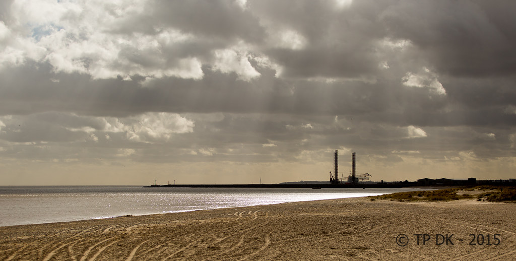
First up, the cranes on the outer harbour, so the cranes are not that prominent, I like this one because of the atmosphere and the stormy sky, I think the vertical structures are still prominent enough to make it on theme :)

Wk 9 - Vertical by TP DK, on Flickr

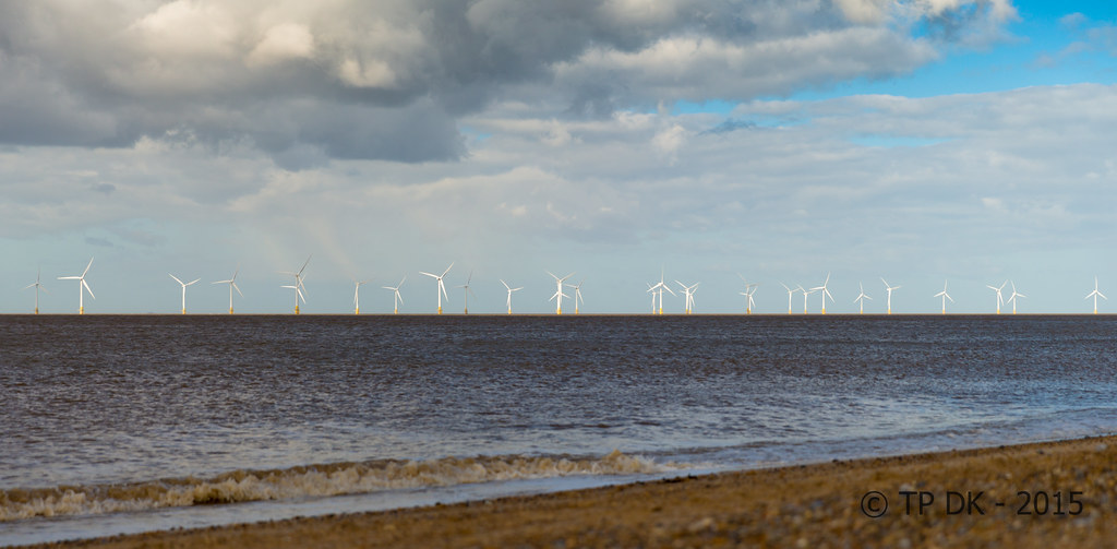
Next up is my old favorite the offshore wind turbines, again although not that prominent when zoomed out this far, I wanted the diagonal shoreline to help lead into the picture and show the turbines in context with the seascape :)

Wk 9 - Vertical 2 by TP DK, on Flickr

And last up, Great Yarmouth's 'Nelson's Column' I chose this because it is pure vertical, liked the sky behind it, not so sure now that is striking enough or has enough viewer interest, but it IS on theme... so into last place it goes :)

Wk 9 - Vertical 3 by TP DK, on Flickr
 
Relax - I spotted this on Flickr, I very nice shot, after all you can't beat a good walk :). For me the colours and DOF make this shot with the grad effect creating an almost letterbox (y)

Vertical - No 1 for me, very nice colours with the sun rays just visible. The wheel tracks in the sand lead the eye in nicely too :)
 
Also spotted Relax through Flickr. A stand-out shot. Excellent choice of depth of field and the lighting is amazing from that dark broody sky to the bright sand. That's a corker of a shot.

Vertical... Well its a difficult one. My first thought was to say "#2 if you ditch the shoreline" but then I read your reasoning and tbh, if you've made the decision to keep it, that works just as well. However I prefer #1 to "look at". The colours go together better, the sunlight through the clouds is a lovely effect and gives it that atmosphere that you mentioned. A harsher critic might mention that the theme isn't overly clear in the image, but we're generally our own harshest critics and you said it's ok, so it must be.

Relax though... What a shot.
 
Relax, I think that it does need "anything else" TBH Dean, it works really well as is.
nothing to critique there :) ( I bet you're pleased :D)

Vertical OK no need to show off, :p
I'm kinda torn between the cranes and Nelson TBH,
But I think Nelson just wins (y)
 
Hi Dean,
Nice shot for Relax [emoji4] - this is how I imagine my walks with the dog going.....then I remember I own a furry version of Satan [emoji23] As said, the emptiness in the sky and general beech really add focus on the subject, like it!
Vertical: someone's been busy?![emoji16] liking the sky in the last one - almost looks superimposed! The first one definitely has the edge out of the three for me - love the faint sun streaks coming through
 
Really love number 1 ... Great composition, lovely sky with nice sun shining through. Best of the three by far for me.
 
Relax image is fab love the long/wide vista :) You chose correctly for vertical 1st is bestest for me too.

Gaz
 
Hi DK, relax is a really nice image, sky is fine by me little off the bottom would be my only crit
Vertical can't choose between 1 and 3 both good in there own right love the light in the first but the column is so vertical fits the theme well, but I think number 1 just swings it maybe
 
Hi Dean major wind back to Watery on an epic catch up... Can you remember that far back:eek:

Watery... Yep I like the cropped version but I'm with that Hissing Sid;) About loosing some of that space on the right think it would be bang on if the dingy was on the RH third line. The hull gives a good anchor:D Interesting angle on the hull gives it unusual shape almost like sailing a open ended corner bath:rolleyes:. Nice sharp focus on the dingy think the bank of reeds give a nice defining line between the water and the trees.

Bold.... It's the colour version for me. Like the tight crop, and the pin sharp TEA text! I also like those little reflected highlights in the work surface from the tins. Nice take on Bold fits a treat.

Relax..... Love the lead in:D..... Looked like a touch of the Labradoodles there! Love the layered effect of the sky and clouds, the sea, then the shingle. Nice light and nice sharp focus on the walkers. The theme works great here!

Vertical.... For me it's No 3 here, the column! Great perspective and great colour in the sky. Nice texture in the stonework and nice detail without a s***ehawk, pigeon or scaffolding sight! Great detail in the cloud makes it really stand out. Nice punchy image.....

Nice work Dean!
Now I know I'm gonna regret asking this! What are the green triangles in the corner of some the avatars? Is it the bad boys that haven't posted there theme for the last two weeks or just earmarking those that are about to get kicked off :eek::coat:

Cheers
Steve
 
Hi,

relax - that's a cracking shot, it looks very understated, but there's a great balance between the sky the sea and the beach

Veritcal - #1 for me. I like the broody sky and the almost mono quality of the subdued tones, and those rays finish it all off nicely :clap:
 
Hi DK I'm also playing catch up - like your relax pic - how the couple and the dog and in really sharp focus and a softer background. Of the vertical ones my fav is no. 1 - like the colour of it and the stormy sky and I think I can see some downward rays from the sky too and the verticals at the left add to the theme too. :)
 
Relax ... top shot .... dog, long lead and walkers on the horizon (as it were) like that. All nicely focused.

Vertical ... too many but all good. Favourite: #1 ... it's those light rays.
 
Hi Dean,
Relax, it's all been said as I am a little late to the party ;) but perfect, just perfect for me.
The letterbox crop with the layers of beach, sea and sky only serves to concentrate the viewers eye on the subject.
Great work, well seen and delivered (y)

#1 for vertical gets my vote too,
It's the overall lighting and tones which set this just ahead of your other submissions.
Subtley on theme, the cranes don't dominate, just provide an anchor or focus point so to speak.
Again good work Dean
 
Relax - I spotted this on Flickr, I very nice shot, after all you can't beat a good walk :). For me the colours and DOF make this shot with the grad effect creating an almost letterbox (y)
Cool... Thanks Chris :)

Vertical - No 1 for me, very nice colours with the sun rays just visible. The wheel tracks in the sand lead the eye in nicely too :)
Thanks again Chris... I did wonder if anybody would pick up on the tracks, there were a couple on the beach too but I cloned them out, as although they looked good I felt they distracted from the theme even more :)

Relax, I love it!

Vertical #11 for me too.

(y)
Thanks Brian :)

Also spotted Relax through Flickr. A stand-out shot. Excellent choice of depth of field and the lighting is amazing from that dark broody sky to the bright sand. That's a corker of a shot.
Thank you very much Ian :)

Vertical... Well its a difficult one. My first thought was to say "#2 if you ditch the shoreline" but then I read your reasoning and tbh, if you've made the decision to keep it, that works just as well. However I prefer #1 to "look at". The colours go together better, the sunlight through the clouds is a lovely effect and gives it that atmosphere that you mentioned. A harsher critic might mention that the theme isn't overly clear in the image, but we're generally our own harshest critics and you said it's ok, so it must be.
Thanks again for the in depth comment, really appreciated (y)

Relax though... What a shot.
:cool: :blush:

Relax, I think that it does need "anything else" TBH Dean, it works really well as is.
OOo thanks Chris :)
nothing to critique there :) ( I bet you're pleased :D)
OMG ::jawdrop:: thanks :D

Vertical OK no need to show off, :p
Ha Haaaaaaa :D
I'm kinda torn between the cranes and Nelson TBH,
But I think Nelson just wins (y)
Thanks again Chris, nice to see Nelson get at least one vote :)
 
Now then Matey.....giddy or what :woot:

Sorry for my absence in your thread :(

Relax...reat shot, perfectly sharp, some lovely light on the walkers who do indeed look very relaxed ,enough detail in the sky not to be bland but not to overpower the rest of the image :clap:

Vertical......1st shot me ,lovely muted tones, beautiful stormy skies & some great lead in lines in the sandy foreground :clap: I might have been tempted to crop from the bottom to allow the strong lines in the sand on the rhs to lead in from the bottom corner....if that makes sense :thinking:

See ya soon :wave:
 
Hi Dean,
Nice shot for Relax [emoji4] - this is how I imagine my walks with the dog going.....
Cheers Ferg :)

then I remember I own a furry version of Satan [emoji23]
LOL :LOL:

As said, the emptiness in the sky and general beech really add focus on the subject, like it!
Cheers again :)
Vertical: someone's been busy?![emoji16] liking the sky in the last one - almost looks superimposed! The first one definitely has the edge out of the three for me - love the faint sun streaks coming through
I did have a real good 2 or 3 hours wandering about, had a great time thanks :)

Really love number 1 ... Great composition, lovely sky with nice sun shining through. Best of the three by far for me.
Thanks a lot Sara :)

Relax image is fab love the long/wide vista :) You chose correctly for vertical 1st is bestest for me too.

Gaz
Thank You Gaz (y)

Hi DK, relax is a really nice image, sky is fine by me little off the bottom would be my only crit
Thanks Alan :)

Would that be with the same width mate ??

Vertical can't choose between 1 and 3 both good in there own right love the light in the first but the column is so vertical fits the theme well, but I think number 1 just swings it maybe
OOo thanks Allan... thought 3 was going to get it's second vote then :)

Hi Dean major wind back to Watery on an epic catch up... Can you remember that far back:eek:
Well... can't remember that far back and just as far behind myself with many threads... hope to catch up soon for sure :)

Watery... Yep I like the cropped version but I'm with that Hissing Sid;) About loosing some of that space on the right think it would be bang on if the dingy was on the RH third line. The hull gives a good anchor:D Interesting angle on the hull gives it unusual shape almost like sailing a open ended corner bath:rolleyes:. Nice sharp focus on the dingy think the bank of reeds give a nice defining line between the water and the trees.
Cheers Steve :)

Bold.... It's the colour version for me. Like the tight crop, and the pin sharp TEA text! I also like those little reflected highlights in the work surface from the tins. Nice take on Bold fits a treat.
Ahhhh thanks, first to spot mention the reflections :)

Relax..... Love the lead in:D.....
LOL :LOL:

Looked like a touch of the Labradoodles there! Love the layered effect of the sky and clouds, the sea, then the shingle. Nice light and nice sharp focus on the walkers. The theme works great here!
Thanks again :)

Vertical.... For me it's No 3 here, the column! Great perspective and great colour in the sky. Nice texture in the stonework and nice detail without a s***ehawk, pigeon or scaffolding sight! Great detail in the cloud makes it really stand out. Nice punchy image.....
Ha Haaaaa yeah no damn birds on it :)

I did clone out a couple of lamp posts from the bottom of the shot, other than that yes pretty clutter free from that height upwards :)

Nice work Dean!
Cheers :)
Now I know I'm gonna regret asking this! What are the green triangles in the corner of some the avatars? Is it the bad boys that haven't posted there theme for the last two weeks or just earmarking those that are about to get kicked off :eek::coat:

Cheers
Steve
Well... to be honest I have NO idea :D

In XL it means the formula/calculation is incomplete I think, but google docs :thinking:
 
Hi Dean

Relax
Great capture, like the letterbox crop... i think the split between sky and the beach is spot on.
Have to ask did you clone something out about 3/4 down the lead?
Thanks Darren :)

And in answer to your question... nope, not a sausage, I think it is just a twisted lead :)

Vertical
#1 for me all day long.
Vertical cranes, the rays of light.
Cheers Darren :)

Hi,

relax - that's a cracking shot, it looks very understated, but there's a great balance between the sky the sea and the beach
Hi Elaine - Thank You :)

Vertical - #1 for me. I like the broody sky and the almost mono quality of the subdued tones, and those rays finish it all off nicely :clap:
Cool - Thanks :cool:

Hi DK I'm also playing catch up - like your relax pic - how the couple and the dog and in really sharp focus and a softer background. Of the vertical ones my fav is no. 1 - like the colour of it and the stormy sky and I think I can see some downward rays from the sky too and the verticals at the left add to the theme too. :)
Thanks for popping back and commenting again :)

Relax ... top shot .... dog, long lead and walkers on the horizon (as it were) like that. All nicely focused.
Thanks David :)

Vertical ... too many but all good. Favourite: #1 ... it's those light rays.
Oooooo NO... you can never have Too many :D

Hi Dean,
Relax, it's all been said as I am a little late to the party ;) but perfect, just perfect for me.
The letterbox crop with the layers of beach, sea and sky only serves to concentrate the viewers eye on the subject.
Great work, well seen and delivered (y)
Thank You Iain... coming from you that is great to hear :)

#1 for vertical gets my vote too,
It's the overall lighting and tones which set this just ahead of your other submissions.
Subtley on theme, the cranes don't dominate, just provide an anchor or focus point so to speak.
Again good work Dean
Thanks again mate :)

To be honest I was not certain the light was going to show as much as it did on the camera screen, I took a few just in case, and only a couple of them had the light rays... I'm really glad it did :)

Vertical; of the three I prefer 1. I like the rather dramatic sky with the shafts of sunlight. The man-made vertical structures against the natural surroundings.
Thanks Stan :)
Now then Matey.....giddy or what :woot:
Oooooooo very giddy :banana:

Sorry for my absence in your thread :(
No worries misses... we both know how busy we both are :)

Relax...reat shot, perfectly sharp, some lovely light on the walkers who do indeed look very relaxed ,enough detail in the sky not to be bland but not to overpower the rest of the image :clap:
Thanks Lynne :)

Vertical......1st shot me ,lovely muted tones, beautiful stormy skies & some great lead in lines in the sandy foreground :clap:
Thanks again Lynne :)

I'm tempted to cut your comment there while I am ahead :D

I might have been tempted to crop from the bottom to allow the strong lines in the sand on the rhs to lead in from the bottom corner....if that makes sense :thinking:
Oooooo let me go look :) Do you mean from the RH side the lines ??? :thinking:

See ya soon :wave:
oooo Yes... see you in a couple of days :) it seems such a loooooooong time ago that we last met up !!!!
 
yeah...you have what appear to be tyre type tracks curving out of frame then back in on the rhs... I'd crop from the bottom to just where they go out of frame so they come start at the bottom of the frame....not really sure that's any clearer ;)
 
Back
Top