weekly LC2's 52 for 2015 Thread - Week 52 : Christmas

I feel dizzy.
 
I agree....pushing your own boundaries is a good thing. Pretty much what this challenge is all about for me :)
Your machine shot doesn't really work for me though, merely because my eyes don't know which part of the image to anchor on. I can completely see what you are going for though!
Alphabet...Loving the innocent flash cards, and the old phrase. Works well
 
Handy props there Tim, and clever idea doing the quick brown fox instead of abc .... nice job.

Hi, very colourful not sure on the BG but its certainly eyecatching

I feel dizzy.

great idea for alphabet shot Tim :)

I agree....pushing your own boundaries is a good thing. Pretty much what this challenge is all about for me :)
Your machine shot doesn't really work for me though, merely because my eyes don't know which part of the image to anchor on. I can completely see what you are going for though!
Alphabet...Loving the innocent flash cards, and the old phrase. Works well

Thanks for all the comments, generally the Alphabet was well received then. :)
Ruth, I'd never thought of "the quick brown fox..." being an old phrase, but when showing a 30something at work, he didn't have a clue that it was a touch typing tool.
 
Superb interpretation of the "alphabet" theme. Picture worthy of being made into a poster for a childs bedroom.
 
Superb interpretation of the "alphabet" theme. Picture worthy of being made into a poster for a childs bedroom.
Feel free to do just that if you like. All sizes are available on flickr and the licence is "attribution - non commercial - share alike", so if you have a use for it, it's fine by me.
I doubt it could be used in any commercial sense due to use use of Innocent's fridge magnets (mind you, it might me okay).


No use for me my children have long grown up and fled the nest. Not a hint of a grandchild on the horizon. I take that as a plus for now I can spend on me and camera stuff.
 
is that a train horn :) :) I am wanting to see the bigger picture but the theme is sound so it needs the crop :clap:
 
Never going to be easy to photograph from that angle but you've done a decent job with the BG. I can decide if there is a closer crop in there somewhere. A bit more saturation and brightness would work also.

Cheers.
 
Hi Tim

Alphabet...most strange ,could've sworn I'd commented :confused: Bright , punchy & a seriously lairy bg :D

Sound...yup , works for me, beautifully sharp & good focus (y) possibly boost the colors a smidge :thinking:
 
:plus1: ... possibly boost the colours a smidge.

Who'd have guessed that's a train?

Like it very much (y)
 
Hi Tim, experiment - it's nicely set up and it's a great fit for the theme, nice and sharp too :)
 
Hi Tim

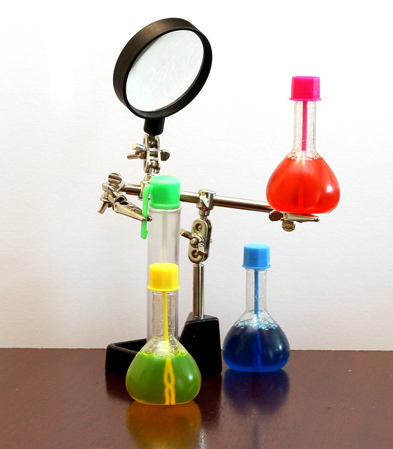
Experiment ... an interesting display of experimenting equipment ... with colour. (y)

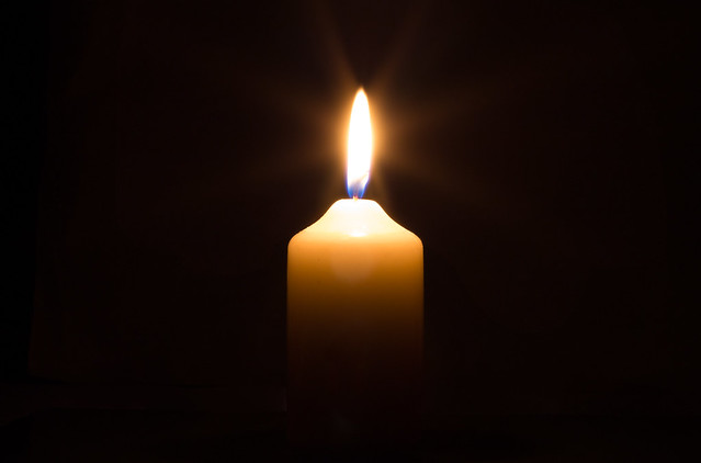
Heat ... simple but effective. Nice glow and I like the way it fades out at the bottom. (y)
 
Hi Tim


Experiment.....looks like fun being at your house :D Nicely set up, good n sharp & I like that you've used primary colors-nice n bold :clap:

Heat....really well shot , love that it fade out at the bottom, flames looks well exposed & a super black bg :clap: ...wonder if a square crop would work :thinking:
 
Hi Tim

Experiment ... an interesting display of experimenting equipment ... with colour. (y)

Heat ... simple but effective. Nice glow and I like the way it fades out at the bottom. (y)
Thanks David. I did really struggle with Experiment, but I'm very pleased with Heat.
The final image did take a bit of PP to come up with the final result, but it was prety good SOOC

Hi Tim,

Heat - lovely shot, you've really captured the glow, well done :clap:
Thanks Lorraine. I tried seeral different apeture settings, but finally settled on this shot as I prefered the flame at f16 over the larger apetures. I thought it would be the other way around, but I guess the longer exposures helped with the glow.

Hi Tim

Experiment.....looks like fun being at your house :D Nicely set up, good n sharp & I like that you've used primary colors-nice n bold :clap:

Heat....really well shot , love that it fade out at the bottom, flames looks well exposed & a super black bg :clap: ...wonder if a square crop would work :thinking:
Hi Lynne. Experiment - Having kids around certainly helps with the props :)
Heat - The background didn't need much in the way of work, I used black card, late in the evening with all the lights out (working by candle light!). I did need a bit of healing brush at the bottom of the shot to remove edges. I agreem the fade out works nicely.
I did try a square crop, but to my eyes it lost impact. Feel free to grab the file off of flickr and have a play though.
 
Week 18 - Figures
Catch Up complete :) Just in time for Friday!

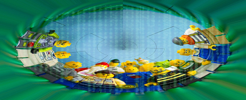
A little experimentation with the Polar Co-ordinates filter.

Week 18 : Figures
by timz2011, on Flickr

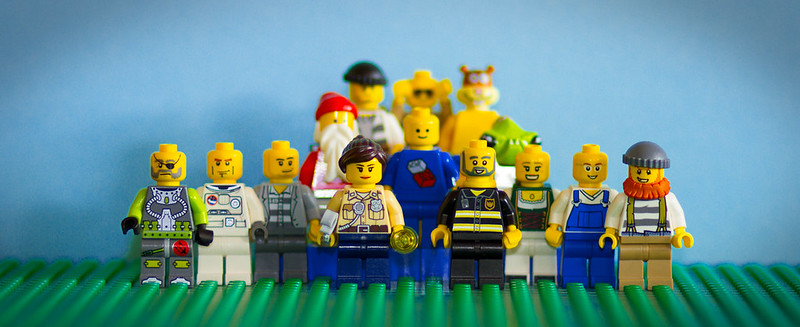
The original was supposed to reflect a Wedding group shot in Lego, which I think I kind of pulled off, but I preferred the image as messed around with in PS.

Week 18 : Figures Original
by timz2011, on Flickr
 
Hi Tim, thanks for visiting my thread, and here I am to return the compliment :) I've read the whole thread and you have an interesting variety of images and some good ideas. I particularly liked the light in your Scenic image, the very clear and well processed Close Up image, and the clever montage for Machine, which worked really well.

Your last five images are all very bold and/or bright, and bang on theme. I like the bright and bold letters for Alphabet, the Deltic horn is a good one for Sound, I like Experiment both for the striking colours and also the subject, while your shot for Heat is lovely, very simple but really effective and well processed. Of your two images for Figures, the edited one makes me feel dizzy to look at it and I prefer the original, which is bold and sharp and works very well for the theme.

I will be following your thread :)
 
Hi Tim ....some smashing shots for the last few themes, nicely set up Experiment, smashing bright colours in there. I agree with d00d about Heat ...simple but effective, it's a really nice shot. Well done with your experimenet for Figures, the first one is certainly different, I'm not quite sure what to make of it, it makes a very unique image. The original makes a great fun shot :)
 
Hi Tim, I really like the set up for Experiment! That red bottle looks extremely precarious and I love how the magnifying glass and arms make the frame look like a little robo-scientist.

Heat - smashing image really well captured and processed.

Figures - original for me too!
 
Hi Tim,

Figures - I prefer the second shot too - although you have some scary looking guests at the wedding!. I don't think this is a shot that works well with the polar co-ordinates edit
 
Hi Tim, thanks for visiting my thread, and here I am to return the compliment :) I've read the whole thread and you have an interesting variety of images and some good ideas. I particularly liked the light in your Scenic image, the very clear and well processed Close Up image, and the clever montage for Machine, which worked really well.

Your last five images are all very bold and/or bright, and bang on theme. I like the bright and bold letters for Alphabet, the Deltic horn is a good one for Sound, I like Experiment both for the striking colours and also the subject, while your shot for Heat is lovely, very simple but really effective and well processed. Of your two images for Figures, the edited one makes me feel dizzy to look at it and I prefer the original, which is bold and sharp and works very well for the theme.

I will be following your thread :)

Hi Tim ....some smashing shots for the last few themes, nicely set up Experiment, smashing bright colours in there. I agree with d00d about Heat ...simple but effective, it's a really nice shot. Well done with your experimenet for Figures, the first one is certainly different, I'm not quite sure what to make of it, it makes a very unique image. The original makes a great fun shot :)

Hi Tim, I really like the set up for Experiment! That red bottle looks extremely precarious and I love how the magnifying glass and arms make the frame look like a little robo-scientist.

Heat - smashing image really well captured and processed.

Figures - original for me too!

Hi Tim,

Figures - I prefer the second shot too - although you have some scary looking guests at the wedding!. I don't think this is a shot that works well with the polar co-ordinates edit

Thanks for the comments.

I thought that the "figures" shot would be quite a Marmite shot, hence including the original. I think it may have worked a bit better if I had removed the vignette layer before applying the filter, to avoid the vertical edges / lines in the final image. I thought that the processing changed the shot from a wedding pose to one of a group of Lego figures staring into an abyss. Perhaps the image would have been better submitted for "Experiment"

That said, as Elaine spotted, the stand I used in Experiment looks like a robotic figure, so perhaps that could have fitted as the "Figures" image instead.

Anyway. I'm leaving them as is in the hope that someone will like the processing ;)

Oh, by the way, did anyone spot that the 'Bride' in the original figures shot is hold a pair of handcuffs?
 
Last edited:
I like the concept behind your figures shot but have to say the lines are a little distracting due to where they fall on some of the figures. Not sure whether this a stupid suggestion but I will say it any way:eek:. Would a fish eye effect work?
 
:agree: ... wot he said about DoF. Figures Original ... good idea tho.
 
Hi Tim. Love the lego in Figures and the DoF is superb - prefer the original version. Very nicely taken. Like Heat too, especially as you've managed to get a star-burst halo effect - I've been trying and failing miserably so hats off to you.
 
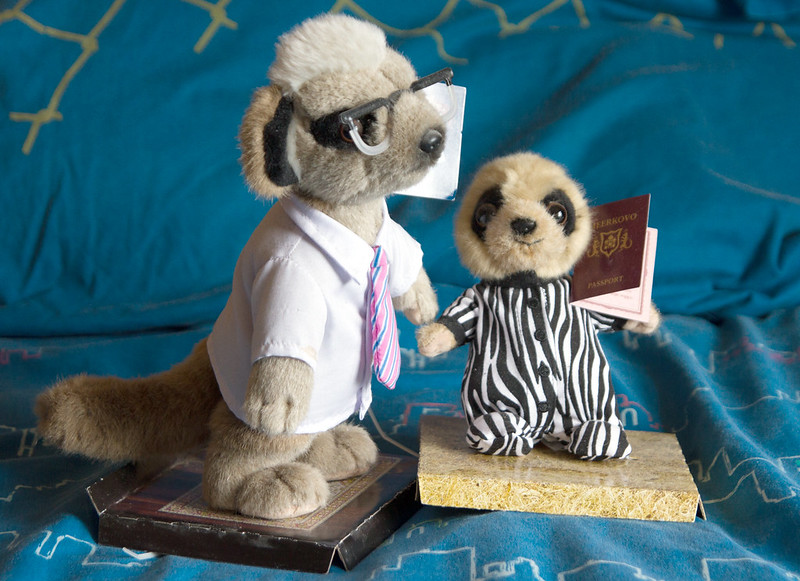
Household - BG looks a bit messy, but the fact that it's meerkats more than makes up for it for me! Love how you've given Baby Oleg a passport all ready to go on his safari :D
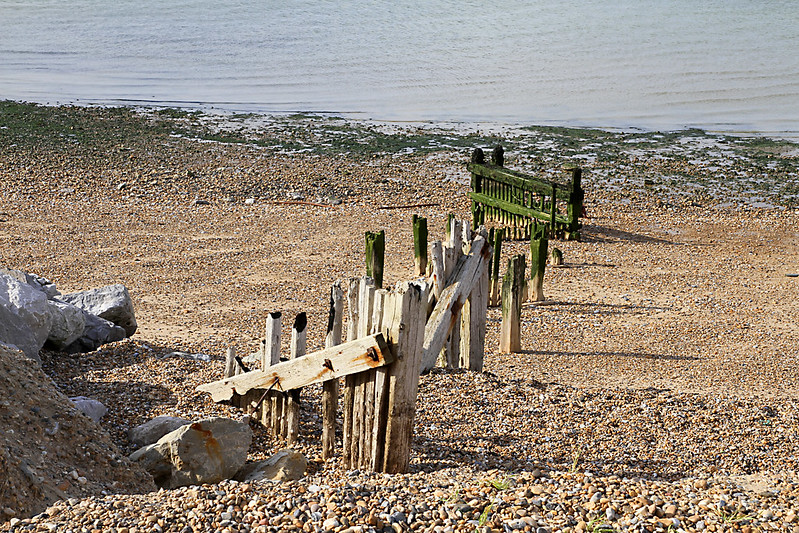
Broken - That definitely fits the theme and I like the inclusion of the rocks to give a bit of a lead-in, but maybe would have gone for a slightly lower pov to include a bit of horizon?
 
Hi Tim. Love the lego in Figures and the DoF is superb - prefer the original version. Very nicely taken. Like Heat too, especially as you've managed to get a star-burst halo effect - I've been trying and failing miserably so hats off to you.

Thanks Carl. I liked the DoF on the lego shot, but it's a good job it wasn't a real wedding as DK & d00d are right, the bride would probably not been too impressed with all her guests OOF ;)
The starburst was obtained by stopping the aperture down to f16 (I think) and extending the exposure.

Household - BG looks a bit messy, but the fact that it's meerkats more than makes up for it for me! Love how you've given Baby Oleg a passport all ready to go on his safari :D
Broken - That definitely fits the theme and I like the inclusion of the rocks to give a bit of a lead-in, but maybe would have gone for a slightly lower pov to include a bit of horizon?

Hi Elaine. The Household shot does have a messy background, I tried to get it OOF, but couldn't get one I liked with a shallow DoF, so gave up.
Broken - I think I was sitting on the sea wall / path to get the shot, I didn't really want to clamber down onto the beach (!) with the camera.
Not having a horizon means I can't get the horizon wrong ;)
 
Week 20 : Limit

Another catch up shot.
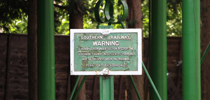
I prefer the first with it's weathered appearance. it was slightly easier to shoot too, as I could get directly opposite it, albeit from the other platform.

A Couple for this one, I prefer the first one from years gone by.

Week 20 : Limit
by Tim White, on Flickr

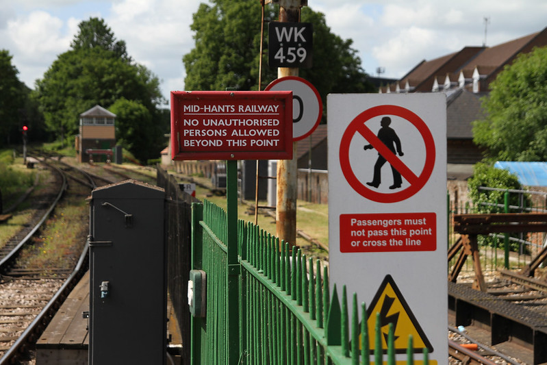
This shows both the Mid Hants and the Network Rail signs at the far end of the country end of Alton station.
Neither of which have the look of permenance of the older Southern Railway notice.


Week 20 : Limit (2)
by Tim White, on Flickr
 
Both good Tim. The first is quaint and has greater historical value. However, I prefer the second - it has colour and interest but most importantly to my mind, showing the environment "grounds" the image which adds to it. Nice work.
 
Gonna have to pick my favourite as time is against me.

Broken, we spotted and decent angle, I'd have been tempted to get close and fill the frame more.

Cheers.
 
Hi Tim :wave:

Household - I understand your frustration with trying to get an unobtrusive background while keeping the subjects in focus. I invested in a couple of cheap single bed sheets, 1 black, 1 white, which give me a plain bg when I want one.

Broken - not only is it a breakwater but the fence is all broken up too :) but you are such a wuss :whistle: not wanting to get down and dirty. I have had a facefull of sand on more than one occasion for these challenges :LOL:

Limit - like the quaintness of the first shot but it's a bit too central for me. The second shot is much more interesting and I like the perspective too (y)
 
Back
Top