You are using an out of date browser. It may not display this or other websites correctly.
You should upgrade or use an alternative browser.
You should upgrade or use an alternative browser.
LC2's Many Many (More) Fine Shoehorns in 2018 : Week 52 - Showcase [2018 Complete]
- Thread starter LC2
- Start date
LC2
Negan
- Messages
- 10,448
- Name
- Tim
- Edit My Images
- Yes
Thanks Andrea. I'm still not loving the food shot, but hey... I do like the filter for Heavy, but perhaps having all three panes sharp would have helped. An interesting place to visit in amongst all the gentrification going on in Sarf London these days. Wet could have done with the (I assume) child on shoulders not being in the shot, but very hard to get uncluttered shots at these places (and hence the use of large apertures). I do wonder what effect a faster prime would have, but then I would start losing the advantages of the smaller camera.I think you were too hard on yourself about your image for Abundance, Tim. Not only is there an abundance of food, but also colours, textures and different ingredients, and the hint of steam makes it look very appealing.
Heavy is an interesting scene, full of interest, and the filter seem to have the effect of making you look more deeply at each section rather than just scanning the image for the most eye-catching details.
I don't find the background distracting in your image for Wet as my eye was drawn straight to their faces and colourful costumes, then the finer details of what they are carrying and only then did I take in the rest of the scene, which I think adds interest and context
That's a very different take on the Wet theme. Image-wise it's a good focus shot. I don't mind the busy background.
Cheers Stan & Brrnd. As per my reply to Andrea, it's the child's head that I like least. having some characters in the background does actually give it context.Great DoF, well separated from the background! And very interesting characters
Yes. Doing shows like this really helps make you more comfortable with thinking about doing street too. Cosplayers much prefer it if you talk to them, they (we) enjoy getting photos taken. It gets you used to talking to people so going out and doing street becomes a less daunting idea.Wet
I quite like it, there's good engagement with the couple.
LC2
Negan
- Messages
- 10,448
- Name
- Tim
- Edit My Images
- Yes
Week 12 - Juxtaposition
A couple of days late, however I needed to find time to get to the location (and wait until it wasn't raining). Blue skies would have been better, but I don't think I was going to get that...
Here we have the bombed out remains of St Alphege's Church and as a counterpoint, the brand new St Alphege's highwalk (which links up with one of the original 1960's highwalks, Bassishaw).
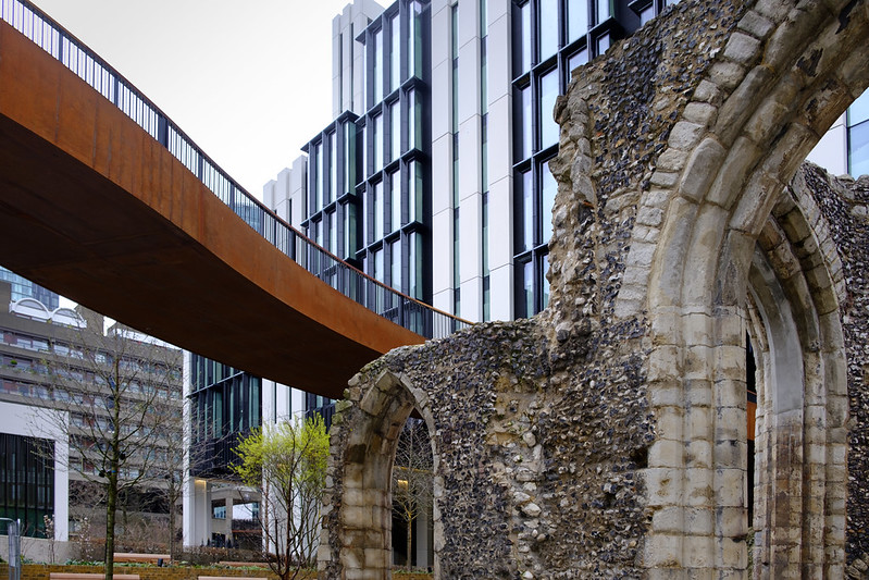
TP 52 for 2018 - Week 12 : Juxtaposition by Tim White, on Flickr
A couple of days late, however I needed to find time to get to the location (and wait until it wasn't raining). Blue skies would have been better, but I don't think I was going to get that...
Here we have the bombed out remains of St Alphege's Church and as a counterpoint, the brand new St Alphege's highwalk (which links up with one of the original 1960's highwalks, Bassishaw).

TP 52 for 2018 - Week 12 : Juxtaposition by Tim White, on Flickr
Last edited:
LC2
Negan
- Messages
- 10,448
- Name
- Tim
- Edit My Images
- Yes
Week 13 - Oval
Slightly surreal, I assume these are part of 88 Wood Street's climate control.
Either that or we've had an invasion of oversized Red & Blue Submarines.
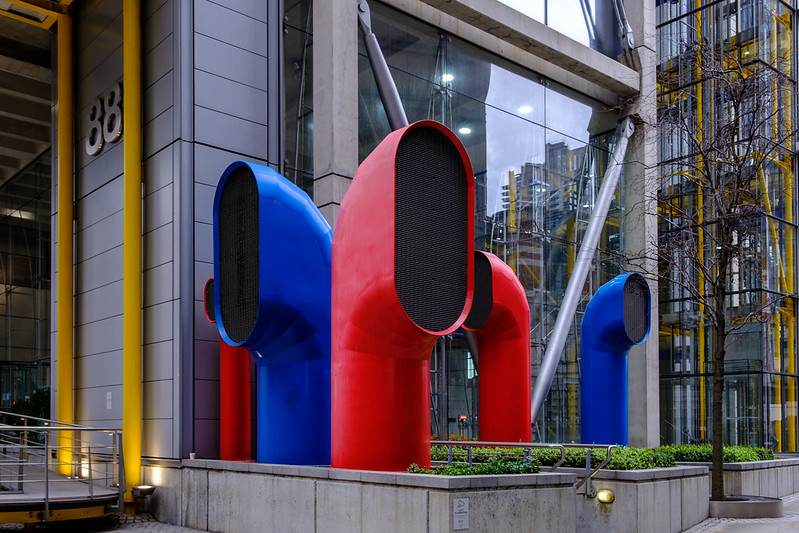
TP 52 for 2018 - Week 13 : Oval by Tim White, on Flickr
Slightly surreal, I assume these are part of 88 Wood Street's climate control.
Either that or we've had an invasion of oversized Red & Blue Submarines.

TP 52 for 2018 - Week 13 : Oval by Tim White, on Flickr
LC2
Negan
- Messages
- 10,448
- Name
- Tim
- Edit My Images
- Yes
Cheers Allan. I spent quite some time looking at and trying various angles for the old church and new walkway, I felt this was the strongest with the walkway coming in like that.Two good pics for the theme the clash of the old and new work well the bridge/walkway cutting into the frame is very well placed
The air vents/submarines stand out well and a perfect spot for the theme, excellent.
The air vents, well... considering how many times I've been for meetings in that building, I'm surprised I've not noticed them before. That was the best angle too (everything else was cluttered with street furniture).
- Messages
- 2,625
- Name
- Bernd
- Edit My Images
- Yes
The great shots, both right on theme. The highwalk is quite rusty but I guess they went for the distressed look... is it already open? I like the composition!
I stood in front of the other red and blue submarines at the Cheesegrater / Leadenhall Building for another photography project, but I didn't make the connection to oval... Great colours and composition!
I stood in front of the other red and blue submarines at the Cheesegrater / Leadenhall Building for another photography project, but I didn't make the connection to oval... Great colours and composition!
- Messages
- 4,562
- Name
- Mark Gameson
- Edit My Images
- Yes
Wet - Nice take on the theme something a little different
Juxtaposition I really like that Tim nice use for leading lines with the walk way some great details in the stone work
Oval - A good the on the theme I love the colours of the vents? and pipes
Juxtaposition I really like that Tim nice use for leading lines with the walk way some great details in the stone work
Oval - A good the on the theme I love the colours of the vents? and pipes
- Messages
- 4,640
- Name
- Pete
- Edit My Images
- Yes
Tim
Juxaposition - I like the conjtrast of the rusty walkway with the colour of the other buildings and the old and new feel to the Image. Nice and sharp and plenty of details.
Oval, I love the colours in this image. Nice contrast and sharp details. Nice.
Pete
Juxaposition - I like the conjtrast of the rusty walkway with the colour of the other buildings and the old and new feel to the Image. Nice and sharp and plenty of details.
Oval, I love the colours in this image. Nice contrast and sharp details. Nice.
Pete
- Messages
- 7,548
- Name
- susie
- Edit My Images
- Yes
Hi Tim, the difference the old and new for juxtaposition is striking, very well spotted.
Love those bright Ovals, all the better for those yellow vertical lines either side, and with the reflection too, it all makes a really nice effective composition.
Love those bright Ovals, all the better for those yellow vertical lines either side, and with the reflection too, it all makes a really nice effective composition.
- Messages
- 9,095
- Name
- Mandy
- Edit My Images
- Yes
Juxta - great image for the theme, like the tones and textures of the remains of the church.
Oval - liking those ovals with the bright red and blue, nice find.
Oval - liking those ovals with the bright red and blue, nice find.
- Messages
- 1,075
- Name
- Georgina
- Edit My Images
- Yes
Hi Tim,
Wet - It is quite annoying when you get someones head sticking out over a shoulder but very tricky to not have that happen in that situation. I don't mind the busy bg but might have cropped it on the right just to make both characters an equal distance from the edge. Great eye contact too
Juxtaposition - Great shot. I like that you have both bridge and arch coming from opposite corners and meeting in the middle. Have to say that bridge looks like its rusted through and going to fall down though
Oval - Nice colours and comp. Nice that they are making a feature of these thing nowadays
- Messages
- 5,432
- Name
- Andrea
- Edit My Images
- Yes
These are two really interesting scenes, Tim, and well composed. The church and walkway are perfect for Juxtaposition and I can imagine you spending some time picking the right angle as it doesn't look an easy scene to take photographs despite all the great details and textures. I think you've done a good job to balance it with the great lines meeting in the middle.
Likewise Oval is fascinating and colourful and I think you've included just enough either side to set the scene while making those great tubes the focal point
Likewise Oval is fascinating and colourful and I think you've included just enough either side to set the scene while making those great tubes the focal point

LC2
Negan
- Messages
- 10,448
- Name
- Tim
- Edit My Images
- Yes
Cheers Dave. I was quite pleased with these two.Juxta is a very nice shot even without blue skies ( which will come back in a month or so ) like the rusty looking part of the walkway.
Oval is a good colourful shot too, bang on theme plus even the 88 part is oval.
The do pop out well don't they.Love the colour on OVAL - fab shot
Ta David, It's amazing what you can see in town if you look around isn't it.Juxtaposition .... A juncture of contrasting architectural bits & pieces, works a treat.
Oval .... wacky red & blue (teletubbies) vents surrounded by yellow structural pipings, love it.
Ta ChrisOval is a good colourful take on the theme, well seen
Yes, I assume the distressed look was intentional. It opened under a week before I took the shot. Good to know these aren't the only wacky pipes dotted around.The great shots, both right on theme. The highwalk is quite rusty but I guess they went for the distressed look... is it already open? I like the composition!
I stood in front of the other red and blue submarines at the Cheesegrater / Leadenhall Building for another photography project, but I didn't make the connection to oval... Great colours and composition!
Wet - You know by now that I try to be different quite oftenWet - Nice take on the theme something a little different
Juxtaposition I really like that Tim nice use for leading lines with the walk way some great details in the stone work
Oval - A good the on the theme I love the colours of the vents? and pipes
Thanks Pete. Contrasting the new with the old was exactly the look I was going for in Juxtaposition and when I saw the colours of the tubes, I knew I was going to use them.Tim
Juxaposition - I like the conjtrast of the rusty walkway with the colour of the other buildings and the old and new feel to the Image. Nice and sharp and plenty of details.
Oval, I love the colours in this image. Nice contrast and sharp details. Nice.
Pete
Cheers Dominic.Juxtaposition
Certainly not two things I thought I would see together.
Oval
Great vivid colours and I like the composing.
Thanks Susie. I did feel juxtaposition worked really well. There is so much new and old in town, but this really exaggerates it.Hi Tim, the difference the old and new for juxtaposition is striking, very well spotted.
Love those bright Ovals, all the better for those yellow vertical lines either side, and with the reflection too, it all makes a really nice effective composition.
Oddly I've been in 88 Wood St quite often, but I don't think I'd ever walked round the corner and towards London Wall before, so the pipes were quite a surprise to me.Two nice shots. Like the Juxtaposition of modern and ancient architecture shot.
Well spotted for the Oval shot. Unusual looking things and very colourful.
Ta Mandy.Juxta - great image for the theme, like the tones and textures of the remains of the church.
Oval - liking those ovals with the bright red and blue, nice find.
Cheers Georgina. With Wet, the off centre compo was deliberate to try to add a dynamic to the image, that and I wanted to include the cat/nurse from Dr Who in the backgroundHi Tim,
Wet - It is quite annoying when you get someones head sticking out over a shoulder but very tricky to not have that happen in that situation. I don't mind the busy bg but might have cropped it on the right just to make both characters an equal distance from the edge. Great eye contact too
Juxtaposition - Great shot. I like that you have both bridge and arch coming from opposite corners and meeting in the middle. Have to say that bridge looks like its rusted through and going to fall down though
Oval - Nice colours and comp. Nice that they are making a feature of these thing nowadays

Ta Andrea. Spot on about the time taken finding the right angle for the church and walkway. It wasn't easy, I ended up sitting on a wall halfway up some steps and leaning back to get what I wanted. Oval was much easier, though it did still need thinking about. IIRC there is a phone booth directly behind me.These are two really interesting scenes, Tim, and well composed. The church and walkway are perfect for Juxtaposition and I can imagine you spending some time picking the right angle as it doesn't look an easy scene to take photographs despite all the great details and textures. I think you've done a good job to balance it with the great lines meeting in the middle.
Likewise Oval is fascinating and colourful and I think you've included just enough either side to set the scene while making those great tubes the focal point
LC2
Negan
- Messages
- 10,448
- Name
- Tim
- Edit My Images
- Yes
Week 14 - Straight
Been really busy over the past 2 weeks, and my mojo had done a bunk.
I think the nice weather may have helped restore it so I popped out at lunchtime with the Fuji to see what I could find.
This is my offering for straight. Every slot in this Boris Bike Rack was filled.
Composed to view down the line of bikes to the info stand at the far end. The billboard rear and centre advertising the gentrification of the area which means that we are being turfed out of our offices later this year...
Focus point about 1/3rd of the way through the image, which at f/4.5 keeps everything reasonably in focus

TP 52 for 2018 - Week 14 : Straight by Tim White, on Flickr
Been really busy over the past 2 weeks, and my mojo had done a bunk.
I think the nice weather may have helped restore it so I popped out at lunchtime with the Fuji to see what I could find.
This is my offering for straight. Every slot in this Boris Bike Rack was filled.
Composed to view down the line of bikes to the info stand at the far end. The billboard rear and centre advertising the gentrification of the area which means that we are being turfed out of our offices later this year...
Focus point about 1/3rd of the way through the image, which at f/4.5 keeps everything reasonably in focus

TP 52 for 2018 - Week 14 : Straight by Tim White, on Flickr
LC2
Negan
- Messages
- 10,448
- Name
- Tim
- Edit My Images
- Yes
Cheers Stan. I've not looked at any other images for straight yet. Been slacking a bit with my commenting due to being busy. Pleased you got the idea of the shot straight away.I like it a lot, different from the 'norm' but very effective; straight along the centre. Good composition and focus point too.
- Messages
- 9,711
- Name
- Stan
- Edit My Images
- Yes
Cheers Stan. I've not looked at any other images for straight yet. Been slacking a bit with my commenting due to being busy. Pleased you got the idea of the shot straight away.
Great minds think alike.
LC2
Negan
- Messages
- 10,448
- Name
- Tim
- Edit My Images
- Yes
Oddly moreso than you think (considering your image for Straight).Great minds think alike.

LC2
Negan
- Messages
- 10,448
- Name
- Tim
- Edit My Images
- Yes
Cheers Allan. Yes, there is a reason... I'm an old git and couldn't get down much furtherGreat perspective, excellent idea, one small point the wheels, would have liked to see all of them but maybe there was a reason for that
Seriously though, stepping back to get the wheels would have been difficult, I would have been blocking a busy crossing. It would have changed the angle a bit too so I felt the compromise was okay.
LC2
Negan
- Messages
- 10,448
- Name
- Tim
- Edit My Images
- Yes
Week 15 - Unattractive
Not actually the shot I wanted, but some council vandal has painted over the graffiti I was planning to use.
It's a shame the didn't spend their clearing up the waste from the shops / restaurants instead. Still I guess it's all bagged up and not spread all over the place.
It's Southwark. 5 Scooby points to whoever can identify where I was
What I was trying for here was some street, so capturing the lady walking behind the rubbish was intentional. I've given her space to move into. I've also deliberately tried for both light and dark in the shot, with the rubbish bags adding colour.
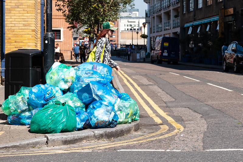
TP 52 for 2018 - Week 15 : Unattractive by Tim White, on Flickr
Not actually the shot I wanted, but some council vandal has painted over the graffiti I was planning to use.
It's a shame the didn't spend their clearing up the waste from the shops / restaurants instead. Still I guess it's all bagged up and not spread all over the place.
It's Southwark. 5 Scooby points to whoever can identify where I was
What I was trying for here was some street, so capturing the lady walking behind the rubbish was intentional. I've given her space to move into. I've also deliberately tried for both light and dark in the shot, with the rubbish bags adding colour.

TP 52 for 2018 - Week 15 : Unattractive by Tim White, on Flickr
Last edited:
LC2
Negan
- Messages
- 10,448
- Name
- Tim
- Edit My Images
- Yes
Week 16 - Shadow
This was actually my banker shot, as I had other plans.
The shell of the building caught my eye (it's really just 2 walls remaining, presumably it will be flats behind a façade.
Whilst looking at the building, the shadows struck me as being a strong element of the scene.

TP 52 for 2018 - Week 16 : Shadow by Tim White, on Flickr
This was what I was planning to take for the theme. But the sun is too high in the sky, I need a strong winter sun to pull this off well. I thought I'd post it anyway...
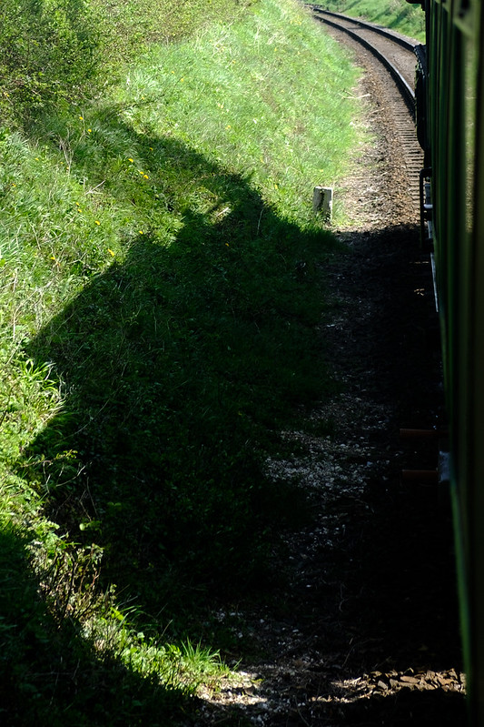
TP 52 for 2018 - Week 16 : Shadow 2 by Tim White, on Flickr
This was actually my banker shot, as I had other plans.
The shell of the building caught my eye (it's really just 2 walls remaining, presumably it will be flats behind a façade.
Whilst looking at the building, the shadows struck me as being a strong element of the scene.

TP 52 for 2018 - Week 16 : Shadow by Tim White, on Flickr
This was what I was planning to take for the theme. But the sun is too high in the sky, I need a strong winter sun to pull this off well. I thought I'd post it anyway...

TP 52 for 2018 - Week 16 : Shadow 2 by Tim White, on Flickr
LC2
Negan
- Messages
- 10,448
- Name
- Tim
- Edit My Images
- Yes
The daft thing about Boris Bikes is that it was actually Ken that started the scheme, but the actually introduction was during Boris' tenure, so he got the credit. It's really funny to think that something raved about by the capitalist gentrifiers was actually a socialist idea.Straight is a good shot, we have them bikes here but don`t call them boris bikes. Unattractive a good shot that`s on theme.
Nope, that would be too far southNice colourful bin bags as you say the good thing about it is its bagged up ready to go, as to where you took it outside Southwark tube station is my guess
- Messages
- 104,465
- Name
- The other Chris
- Edit My Images
- Yes
Unattractive, certainly a good fit for the theme, not that I am any kind of street expert but I think it would be good a frame later with her stepping out from the pile of bags.
Shadow, shame the engine shot didn't work, that would have been good, plenty of shadows in the steel work but I find it a bit busy.
Shadow, shame the engine shot didn't work, that would have been good, plenty of shadows in the steel work but I find it a bit busy.
- Messages
- 2,625
- Name
- Bernd
- Edit My Images
- Yes
straight - great photo, great PoV! The are all lined up straight, shame you didn't take the time to line the saddles all up at the same height and bring the pedals all into the same position 
unattractive - another well composed photo, like the colours. Shame there's that pile of rubbish in front of that lady
shadow - good idea, but maybe a bit too busy...
unattractive - another well composed photo, like the colours. Shame there's that pile of rubbish in front of that lady

shadow - good idea, but maybe a bit too busy...
- Messages
- 9,071
- Name
- David
- Edit My Images
- Yes
Straight ... I like that.  ... but you could have put all the saddles at the same level
Unattractive .... yeah would have been better with the girl striding in the road. But, nice find, I guess.
Shadow ... #1 ... full of interest. Looks like the job has been put on hold.

Unattractive .... yeah would have been better with the girl striding in the road. But, nice find, I guess.
Shadow ... #1 ... full of interest. Looks like the job has been put on hold.
- Messages
- 992
- Name
- Tilly
- Edit My Images
- Yes
Nice idea for straight Tim, I really like the shot. Nice composition for unattractive and colourful too. It's a shame you couldn't pull off the shot you wanted to for shadow as that would have looked cool. I'm not sure about the shadows on the building, there's something about it that just doesn't feel right. That could just be me being picky though 
- Messages
- 7,548
- Name
- susie
- Edit My Images
- Yes
Hi Tim , I really like that choice for Straight, very well spotted, perfect for the theme and that bit different too.
Unattractive ....we do make a lot of rubbish don't we at least its tidy, the lady adds that extra bit of interest too in her bright clothing.
Shadow, I definitely prefer the first one, lots of lovely angles there.
Unattractive ....we do make a lot of rubbish don't we
Shadow, I definitely prefer the first one, lots of lovely angles there.
- Messages
- 5,919
- Name
- Dominic
- Edit My Images
- Yes
I some how seem to have missed your last three entries.
Straight
I like it, the red really stands out against the dark bike frames.
Unattractive
This works well for the theme. Don't they have bins, I know it's all bagged up, but Surely a solid bin would be better.
Shadow
The first one for me. There's lots of shapes and textures in the shot.
Straight
I like it, the red really stands out against the dark bike frames.
Unattractive
This works well for the theme. Don't they have bins, I know it's all bagged up, but Surely a solid bin would be better.
Shadow
The first one for me. There's lots of shapes and textures in the shot.

