You are using an out of date browser. It may not display this or other websites correctly.
You should upgrade or use an alternative browser.
You should upgrade or use an alternative browser.
weekly Mat0tam's 2015 - 52 Challenge - FASHION Added
- Thread starter Mat0tam
- Start date
- Messages
- 3,925
- Name
- Carl
- Edit My Images
- Yes
Hi Matthew. Welcome to the forum - great start.
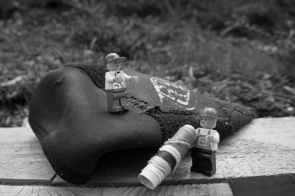
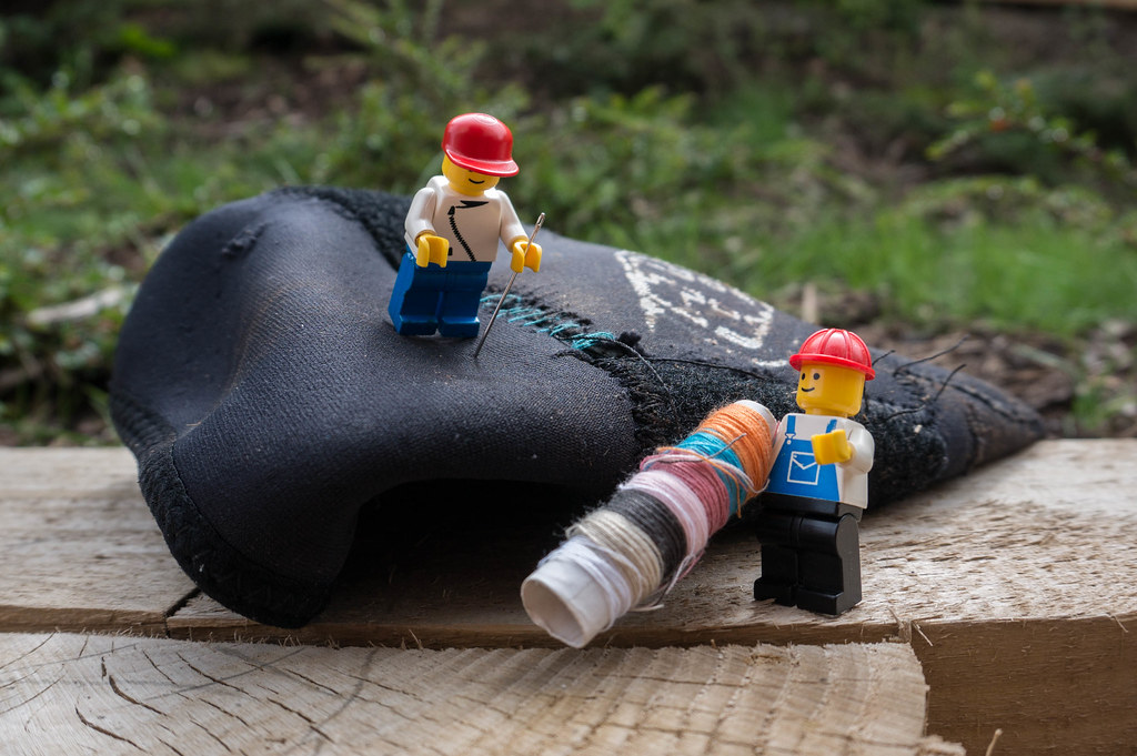
Tear: Those guys are really useful. The image could almost double for Medical too as they seem to be rendering First Aid. Prefer the colour version for the added clarity of detail. DoF is good.
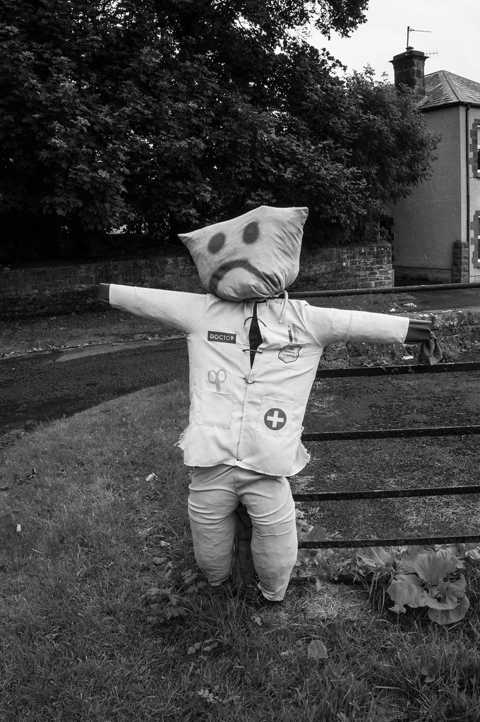
Medical: Nicely themed and very topical. Has an uncanny resemblance to my locum ... facially at least. A bit lost against the dark bg, especially the right hand so maybe a shallower DoF or colour ?!?!
Words: Like the olde worlde impression and the pano crop.
PS: Don't think these have been posted on the main "TP52 for 2015 ..." page - https://www.talkphotography.co.uk/t...your-photographs-here-but-no-comments.569924/
Last edited:
- Messages
- 13,760
- Edit My Images
- Yes
Welcome to the 52 Matthew
A good start, but although I do also really like the words, I'd prefer to see whole letters rather than clipped at both ends - so I'm picking/liking the colour tear pic of the three as my pic of the opening bunch, a nice fun shot, bang on theme and well set up
A good start, but although I do also really like the words, I'd prefer to see whole letters rather than clipped at both ends - so I'm picking/liking the colour tear pic of the three as my pic of the opening bunch, a nice fun shot, bang on theme and well set up
- Messages
- 7,548
- Name
- susie
- Edit My Images
- Yes
Hi Matthew ...and welcome.
Words look a bit lost on my PC and I can't enlarge the image to have a good look.
Medical... I like the use of B&W I think it emphasizes the reason for him being there, great for the theme.
Colour Tear pic is a great fun shot ...excellent idea to add in the figures to give it some action.
Looking forward to following your thread ....good luck.
- Messages
- 3,925
- Name
- Carl
- Edit My Images
- Yes
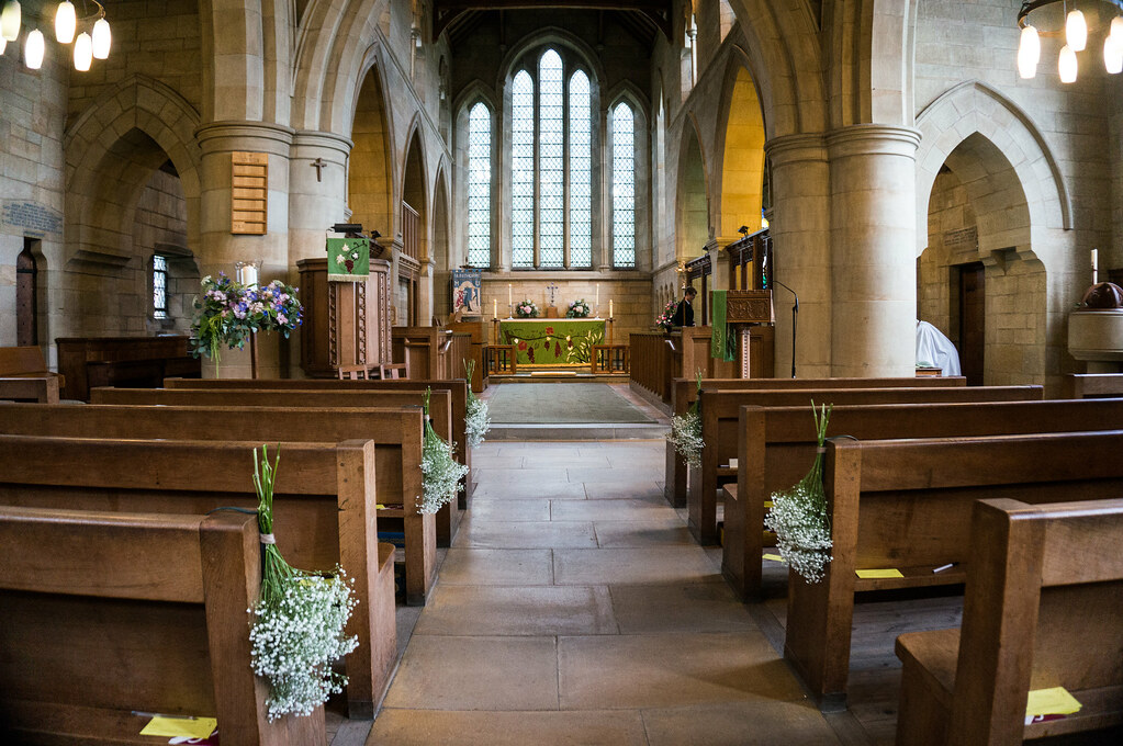
Hi Matthew. #1 for me - great indoor shot of a happy event, light, airy, colourful. Everything spot on with the others too and quite like the simplicity of #2 and natural framing in #3. All good. 

- Messages
- 213
- Name
- Laura
- Edit My Images
- Yes
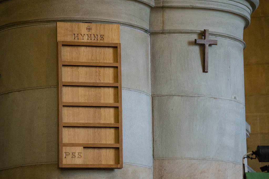
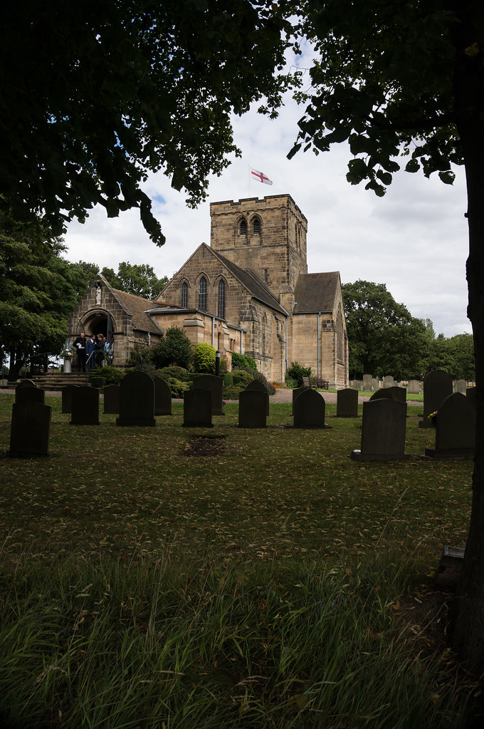
Ok I'm a huge fan of these three shots. Although they are an obvious choice but to me there is no more beautiful architecture than that or religious institutions. I'm not religious but you can't ignore the craftsman ship and creativity that has been applied to the structures. I also really like how you've made the first two shots feel light and warm.
- Messages
- 7,548
- Name
- susie
- Edit My Images
- Yes
Hi Matthew ...super indoor shot, composition looks just right, good that you caught a wedding, the flowers add that extra touch. The second one I'd be tempted to clone out that bit on the bottom right, but I really like the simplicity of that one. The last one ....smashing light on the church in the dark frame, all excellent for the topic.
- Messages
- 552
- Name
- Matt
- Edit My Images
- Yes
Thanks @Lauraloo83 - shots 1 and 2 were helped by the church having huge stain glass windows letting all the light in!
@susiejb - Great advice on the cloning; would make the shot better i think.
@posiview - Thanks Andy. I agree maybe taking 1/4th of the foreground away would centralise the church.
@susiejb - Great advice on the cloning; would make the shot better i think.
@posiview - Thanks Andy. I agree maybe taking 1/4th of the foreground away would centralise the church.
Brian_of_Bozeat
Jeff
- Messages
- 3,235
- Name
- Brian (not Jeff)
- Edit My Images
- No
I thought no 1 was a "tasteful" example of HDR, you did a great job to get the exposure perfectly on that!
#3 the scene would work on it's own, but having the wedding party at the door tells the story and make this a realLy special. Bravo!
#3 the scene would work on it's own, but having the wedding party at the door tells the story and make this a realLy special. Bravo!
- Messages
- 7,548
- Name
- susie
- Edit My Images
- Yes
Hi Matthew I saw your support shot on the main thread but it's not here  anyway I thought it was a brilliant find for the theme, absolutely spot on.
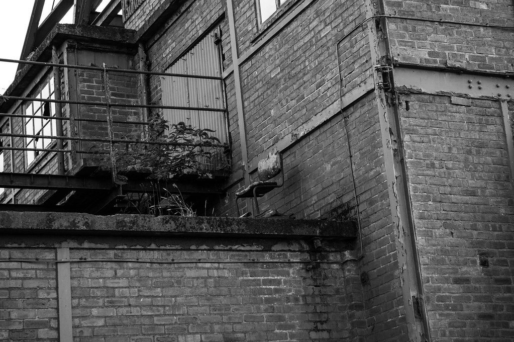
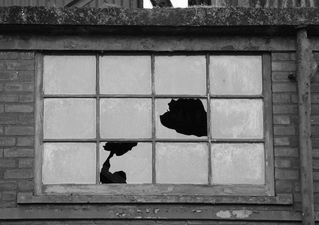
That's an interesting one for Geometric, perfectly suited to the b&w, but I would have to nip that bit off at the top.
That's an interesting one for Geometric, perfectly suited to the b&w, but I would have to nip that bit off at the top.
- Messages
- 3,925
- Name
- Carl
- Edit My Images
- Yes
Hi Matthew.
Support: What a fabulous find! nice "gritty" shot which that suits the b&w treatment.
Geometric: As above really/ I like the dereliction and decay. I particularly like the way that the irregularity of the smashed panes contrasts with the stark geometry of the window panes.
Support: What a fabulous find! nice "gritty" shot which that suits the b&w treatment.

Geometric: As above really/ I like the dereliction and decay. I particularly like the way that the irregularity of the smashed panes contrasts with the stark geometry of the window panes.
- Messages
- 19,461
- Name
- Andy
- Edit My Images
- Yes
Hi, support, well spotted. I'd like it a little closer but the gritty processing works well.
Religion #1 for me, looks a little soft and I always prefer symmetry in such photographs.
Geometry, works for me, especially with the inclusion of the broken glass.
Cheers.
Religion #1 for me, looks a little soft and I always prefer symmetry in such photographs.
Geometry, works for me, especially with the inclusion of the broken glass.
Cheers.
- Messages
- 3,925
- Name
- Carl
- Edit My Images
- Yes
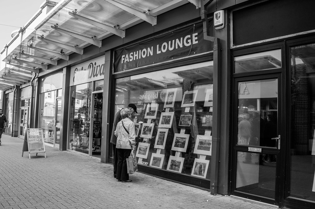
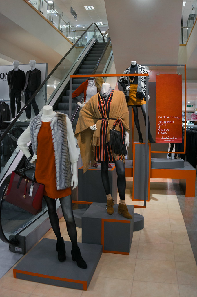
Hi Matthew. Both good but #2 for me because of colour and composition. 

- Messages
- 552
- Name
- Matt
- Edit My Images
- Yes
Hi Matthew. Both good but #2 for me because of colour and composition.
Definitely #2 for me. In #1 I find the guy just coming into shot a little distracting as the reflection in the window kind of draws me to him.
Thanks guys. I tried to PP #2 into a B&W with just the vibrant colors left but it didnt work too well.
As for #1 I agree about the reflection, should of cropped his body out at least. I was walking through town thinking about the FASHION topic and looked up to see the shop infront of me.
- Messages
- 7,548
- Name
- susie
- Edit My Images
- Yes
Hi Matthew, two interesting shots, with the first one I would have been tempted to crop it to just that shop.
#2 is much more on theme for me, bright, up to the minute fashion, lots of seasonal colour and an excellent angle with the escalator in the background.
#2 is much more on theme for me, bright, up to the minute fashion, lots of seasonal colour and an excellent angle with the escalator in the background.
- Messages
- 9,075
- Name
- David
- Edit My Images
- Yes
Hi Matthew ... I thought I'd commented on some of yours already but no.
Tear ... a bit of fun ... I prefer the colour.
Medical ... great fun, thanks for sharing.
Words ... is just great, but more context is needed.
Support ... more wackiness, but not sure B&W helps.
Religion ... I like all those. Things Religion make good subjects.
Fashion ... street I like and it includes the Fashion word ...
Fashion #2 ... I don't know how you pulled this off but mannequins in shops and challenging to the extreme. This looks good.


