You are using an out of date browser. It may not display this or other websites correctly.
You should upgrade or use an alternative browser.
You should upgrade or use an alternative browser.
weekly Minx 52 for 2017
- Thread starter Minx
- Start date
Minx
Papillon
- Messages
- 2,513
- Edit My Images
- Yes
I'm not too sure about the line running from the top to the bottom, under the arch.
I believe it is a cable and is probably a very important part of the roller coasters structure.
LC2
Negan
- Messages
- 10,447
- Name
- Tim
- Edit My Images
- Yes
Hey Alison
Bent - Works really well, especially like the use you've made of the setting sun.
Wooden - Really good clear sharp shot of that distressed signage on the building.
I'm torn between agreeing with the comments about a closer crop emphasising the wood, vs keeping it how you have it to provide the context.
Minx
Papillon
- Messages
- 2,513
- Edit My Images
- Yes
Minx
Papillon
- Messages
- 2,513
- Edit My Images
- Yes
Colouful
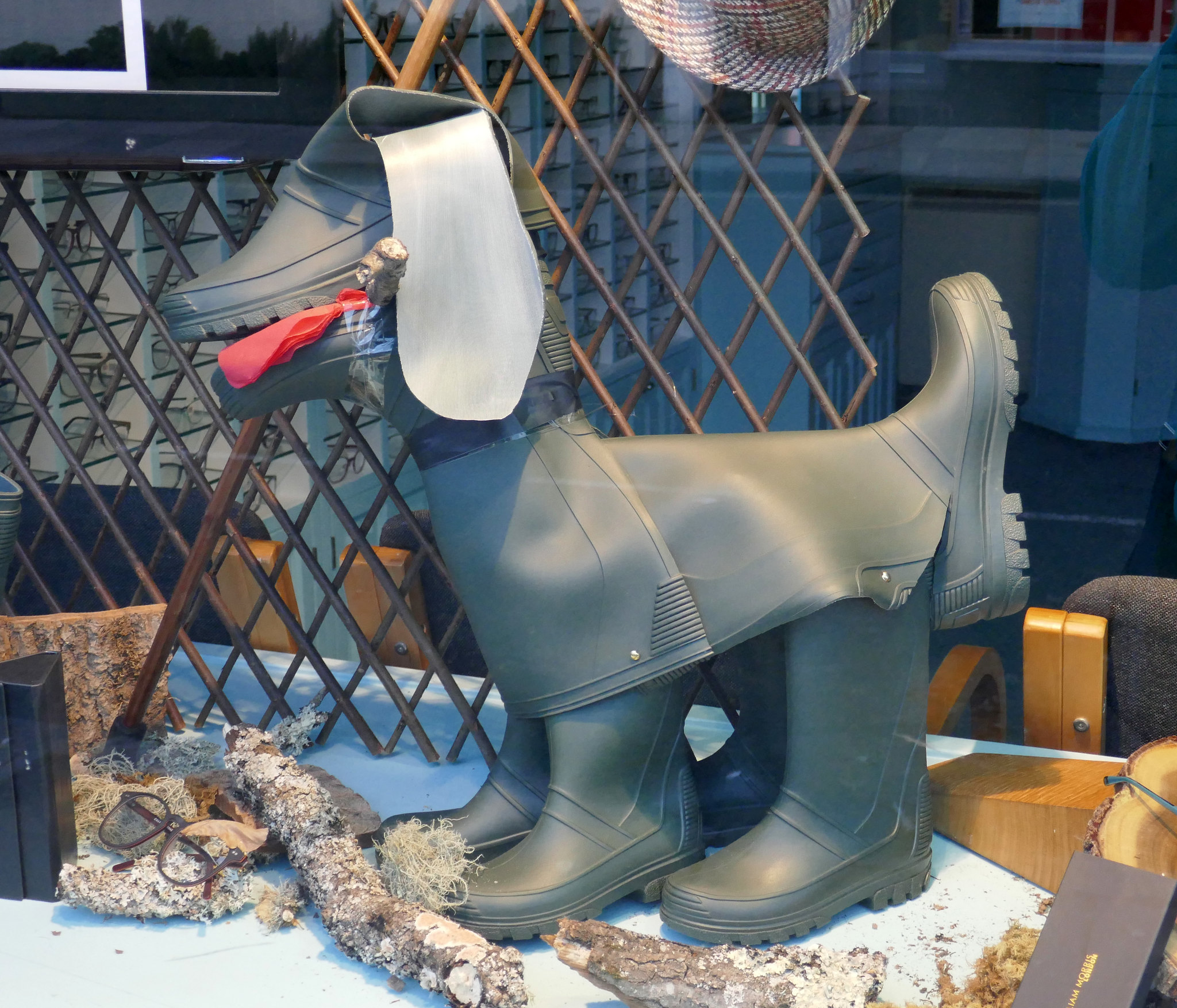
This one was going be my entry for display but then I found they Welly Doggy in the window
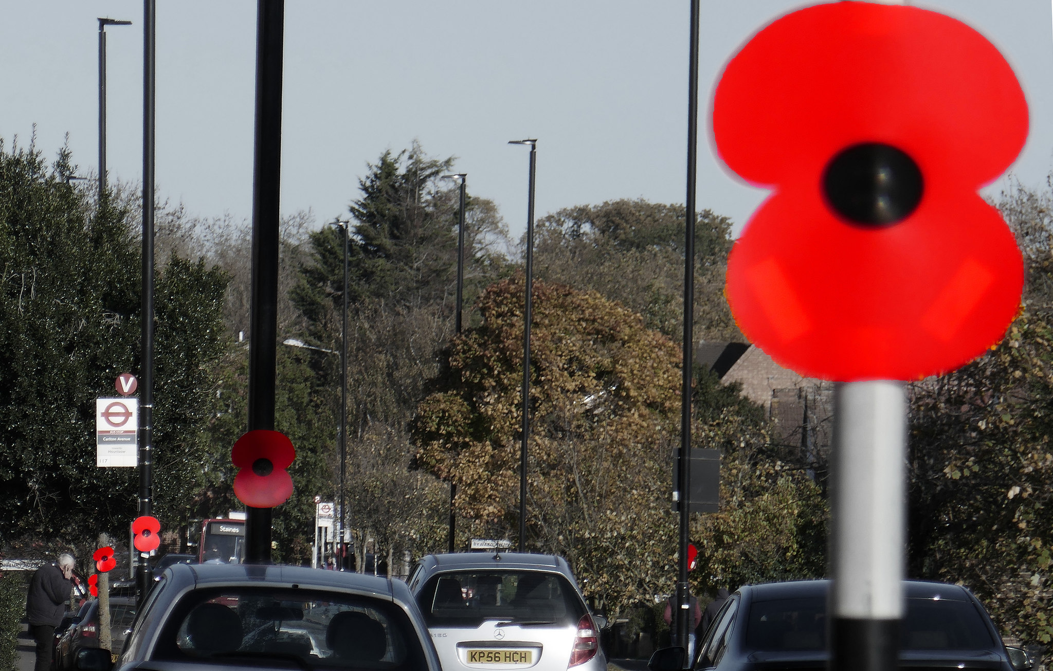
poppies by Alison White, on Flickr
This one was going be my entry for display but then I found they Welly Doggy in the window

poppies by Alison White, on Flickr
LC2
Negan
- Messages
- 10,447
- Name
- Tim
- Edit My Images
- Yes
Hi Alison
Display - Welly Doggy is a thing of beauty.
Almost no evidence of reflections from the shop window and just so much to look at.

Colourful - Didn't turn out quite so well I'm afraid.
The closest Poppy is too close to the edge really, and OOF whereas the rest of the shot is in focus and thus it doesn't look like a deliberate shallow DoF shot. There is also some weird fringing which makes it look superimposed.
Display - Welly Doggy is a thing of beauty.
Almost no evidence of reflections from the shop window and just so much to look at.

Colourful - Didn't turn out quite so well I'm afraid.
The closest Poppy is too close to the edge really, and OOF whereas the rest of the shot is in focus and thus it doesn't look like a deliberate shallow DoF shot. There is also some weird fringing which makes it look superimposed.
Last edited:
- Messages
- 662
- Name
- John
- Edit My Images
- Yes
Clever idea for the colourful Alison. I agree it didn't quite come off - but who am I to speak!!  I find the second poppy very distracting caught in the shadow and yes, that first one dominates in an OOF, overbright way.
The wellies are wonderful They obviously had a few to spare. Well spotted and well taken
The wellies are wonderful
- Messages
- 13,760
- Edit My Images
- Yes
Display is very cool, like that who ever thought of it 
Colourful, to be honest not too sure what to make of it, some of the poppies look very false and one very dark, guessing some PP has been missed on one or one was in the shade ??
Colourful, to be honest not too sure what to make of it, some of the poppies look very false and one very dark, guessing some PP has been missed on one or one was in the shade ??
- Messages
- 13,760
- Edit My Images
- Yes
You still with us Alison 

Minx
Papillon
- Messages
- 2,513
- Edit My Images
- Yes
Clever idea for the colourful Alison. I agree it didn't quite come off - but who am I to speak!!I find the second poppy very distracting caught in the shadow and yes, that first one dominates in an OOF, overbright way.
The wellies are wonderfulThey obviously had a few to spare. Well spotted and well taken
Display is very cool, like that who ever thought of it
Colourful, to be honest not too sure what to make of it, some of the poppies look very false and one very dark, guessing some PP has been missed on one or one was in the shade ??
Display ... most unusual.
Colourful ... nice idea, think you should have focused on the nearest poppy.
Thanks for the comments everyone. Colourful did not come out as hoped, the darker poppy is darker in the original, but I should have brought it up a bit to match the others. I had hoped to get a better photo for a redo but they were taken down before I had the chance.
Minx
Papillon
- Messages
- 2,513
- Edit My Images
- Yes
Just aboutYou still with us Alison
Minx
Papillon
- Messages
- 2,513
- Edit My Images
- Yes
Had this one in mind for wall since it cam up but only recently got over to take it
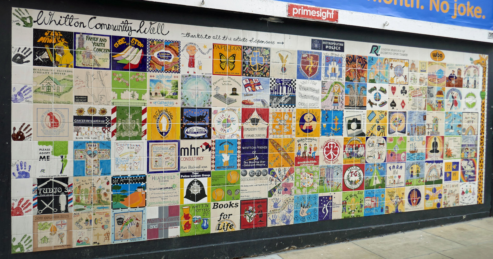
Wall by Alison White, on Flickr

Wall by Alison White, on Flickr
- Messages
- 662
- Name
- John
- Edit My Images
- Yes
Well spotted Alison; perfect for the theme.
Minx
Papillon
- Messages
- 2,513
- Edit My Images
- Yes
Broad
bit a shoehorn these are disappearing from our streets due to fibre optic Broadband
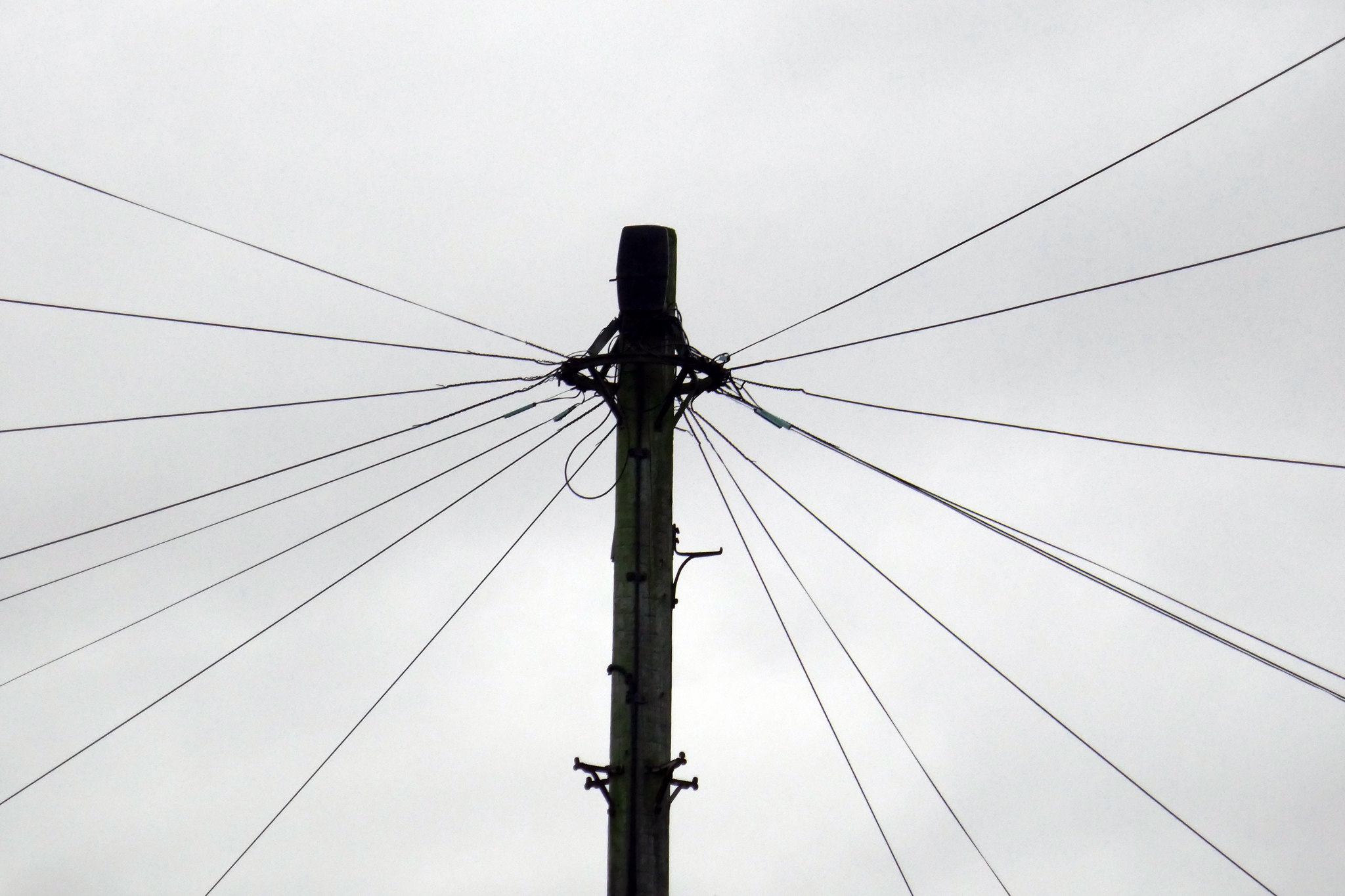
broad by Alison White, on Flickr
bit a shoehorn these are disappearing from our streets due to fibre optic Broadband

broad by Alison White, on Flickr
Minx
Papillon
- Messages
- 2,513
- Edit My Images
- Yes
Minx
Papillon
- Messages
- 2,513
- Edit My Images
- Yes
- Messages
- 7,130
- Edit My Images
- No
Me too!got a few to catch up still must try harder next year
I guessed it was 'broadband' for the theme, so not too much of a shoehorn
LC2
Negan
- Messages
- 10,447
- Name
- Tim
- Edit My Images
- Yes
Hi Alison,
Broad - I agree with @Bebop, not too much of a shoehorn. Quite artistic to go for almost a silhouette against the grey sky.
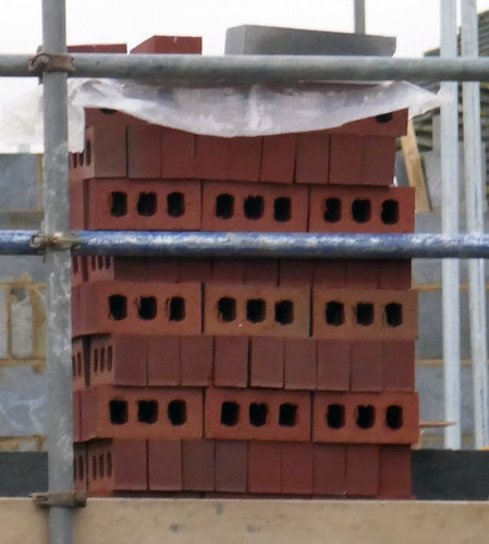
Build - I agree, it's not quite sharp. Maybe the ISO that was needed? Definitely on theme though
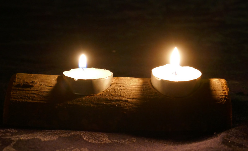
Rustic - Again I agree with the other comments, this is the shot of the three. I really like that. Nicely exposed and well shot.
Minx
Papillon
- Messages
- 2,513
- Edit My Images
- Yes
Minx
Papillon
- Messages
- 2,513
- Edit My Images
- Yes
Build fits the theme. It looks a little blurry to me,
I agree, it's not quite sharp.
I agree it is not quite sharp a bit grainy, I think I zoomed in too much and then cropping brings you in closer so it highlights it if you look at the original on flicker it doesn't seem so bad till you get in closer
SamuelSlade007
RENEGADE!!!!!!
- Messages
- 7,802
- Name
- Frank
- Edit My Images
- No
Hi minx. Broad is an excellent image. A single bold upright and the lines radiating off. Well composed  festive is too busy for me but it's fitting for the theme
Minx
Papillon
- Messages
- 2,513
- Edit My Images
- Yes
Ok here goes my final catch up
This one has been outstanding the longest to be honest I have been avoiding it
You(me)

You (Me) by Alison White, on Flickr
This one has been outstanding the longest to be honest I have been avoiding it
You(me)

You (Me) by Alison White, on Flickr
Minx
Papillon
- Messages
- 2,513
- Edit My Images
- Yes


