

You are using an out of date browser. It may not display this or other websites correctly.
You should upgrade or use an alternative browser.
You should upgrade or use an alternative browser.
weekly NCF15 52 for 2021 Week 52 Showcase
- Thread starter ncf15
- Start date
OP
- Messages
- 651
- Name
- Nick
- Edit My Images
- Yes
Week 0 Near
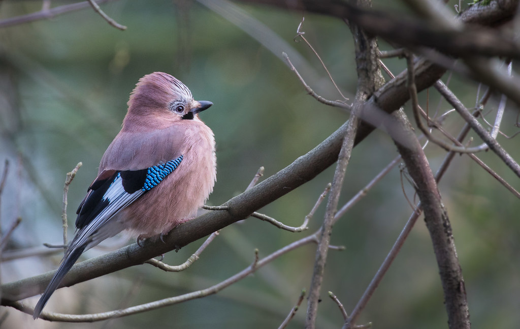 Jay by Nick Dallimore, on Flickr
Everything counts as Near these days as we aren't allowed to travel so I thought this rather cold Jay from yesterdays dog walk would do. Shame it wouldn't turn it's head round a bit more.
Jay by Nick Dallimore, on FlickrEverything counts as Near these days as we aren't allowed to travel so I thought this rather cold Jay from yesterdays dog walk would do. Shame it wouldn't turn it's head round a bit more.
LC2
Negan
- Messages
- 10,454
- Name
- Tim
- Edit My Images
- Yes
You have an eye ")
And it's not as if these small feathered things listen to requests from togs (I hear they just tend to fly away). People photography is so much easier
Nicely composed, it has space to look into, it's on a third and the blue on the wing pops nicely.
And it's not as if these small feathered things listen to requests from togs (I hear they just tend to fly away). People photography is so much easier
Nicely composed, it has space to look into, it's on a third and the blue on the wing pops nicely.
- Messages
- 4,340
- Name
- Martin
- Edit My Images
- Yes
Can't knock that, lovely picture.
- Messages
- 8,311
- Name
- Ian
- Edit My Images
- No
I really enjoy photos of things I so rarely see. Made me smile. Thanks.
OP
- Messages
- 651
- Name
- Nick
- Edit My Images
- Yes
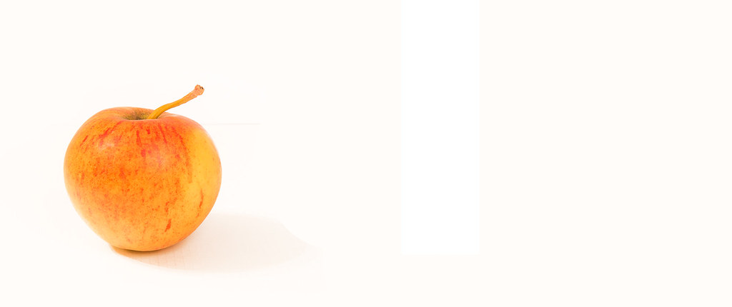 Apple
Apple- Messages
- 790
- Name
- David
- Edit My Images
- Yes
Like the fact the colours don't scream Apple, more peachy. Nice sharp pic.
- Messages
- 2,166
- Name
- Nick
- Edit My Images
- Yes
There seems to be a feint line extending from the top right of the apple when viewed large. Nice colours though, and a hint of colour in the shadow which works for me. While the crop looked odd to me at first, the longer I look, the more I like it.
- Messages
- 7,548
- Name
- susie
- Edit My Images
- Yes
White backgrounds aren’t easy (well not for me anyway) you’ve done really well, I think maybe a crop to the left of that mark would really focus the eye on the apple because now its been mentioned I do keep seeing it, the apple is really nicely focused, lots of good detail in there.
- Messages
- 8,311
- Name
- Ian
- Edit My Images
- No
Clean bright image that is screaming for a headline in all that dead space
A bit too much space for me, but as Allan said - there may be a reason for it. It's unusual and catches the eye for sure.
A bit too much space for me, but as Allan said - there may be a reason for it. It's unusual and catches the eye for sure.
For me I don't like it.
-ve
1 the white bar (I assumed it was the forum and edge of pic but now. Perhaps a processing mistake and not cropped where you wanted it (ie edge of the white box would be good)
2 there is a gray line near the top of the apple
3 Perhaps its a light coloured apple, or white balance is off ?
+ve
it's in focus
With the crop at the box, would site on the rule of thirds
You got a pic up fast
Saying this I still have to take a pic... and I'm not sure yet what....
Scots_quine
In memoriam
- Messages
- 1,753
- Name
- Joan
- Edit My Images
- Yes
My screen does not show up any issues with your background either! I think it is a lovely image with excellent lighting. Well done.Yes my post processing needs to improve. I hadn't seen the background issues on my screen.
- Messages
- 2,835
- Name
- Pete
- Edit My Images
- No
I like the colours and some of the negative space but I would have cropped on the left edge of the white rectangle.
- Messages
- 1,927
- Edit My Images
- Yes
The colours are lovely, but for me there's a bit too much space on the RHS, and the bottom right of the apple has lost too much detail. The background doesn't bother me at all, but overall, it doesn't do it for me I'm afraid Sorry!
Like Alison said - a simple looking photo is rarely simple to achieve.
Sorry!Like Alison said - a simple looking photo is rarely simple to achieve.
- Messages
- 1,293
- Name
- Stuart
- Edit My Images
- Yes
Interesting use of negative space, can see the vertical bar referred to by many when viewed on an iPad. A crop from the right to the edge of the bar would help, personally I would like a darker shadow too
OP
- Messages
- 651
- Name
- Nick
- Edit My Images
- Yes
 20210117-IMG_1682
Last edited: