weekly rpn's 2015 Project 52 - Week 52 CHRISTMAS Added

Hi Stan :)

Bold - Now that is a bold architectural statement in that area !!! yes it is a tad wonky but it is nicely placed in the frame and bang on theme :)

Relax - Now I initially thought of doing something like this, but knew I was going to be on my own so dropped the idea, nice straight horizon and a good DoF... nice idea (y)


Thanks Dean for the kind words.
 
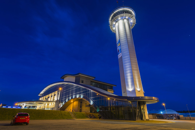
I've tried a few different takes for this week's theme but they all didn't turn out the way I like. Ended up with this one, Aberdeen Exhibition and Conference Centre (AECC) with a not that tall viewing tower. Taken during the blue hour with a 16-35mm wide angle lens. Distort correction during post processing to emphasis the vertical tower.

Week 09 - Vertical


and here's the SOOC version

800_9988 by syf22, on Flickr
 
A good interpretation of theme. You've captured the lighting of the building well. Can just see a little movement in tbe clouds.
 
Nice processing Stan :)
I prefer #1 without the car and the least distortion in the tower (y)
 
Hi Not sure about the distortion in the first one the second one i understand, wide angle lens,
but no idea how you have made the top of the building bulge so much in the first one looks a little odd to me
 
Amazing colour and light in both of them. But the distortion of the first, and removal of the car, makes for a kind of space age look. (y)
 
wow you've done a really good job with fixing the distortion, was this a special tool in pp? great picture though, really like it :)
 
lovely shot - I really like the deep blue sky. It does have a bit of the Thunderbirds/space station about it (nothing wrong with that though). It looks as though getting the verticals to behave was a bit of a nightmare, but I think you've done a good job
 
Hi Not sure about the distortion in the first one the second one i understand, wide angle lens,
but no idea how you have made the top of the building bulge so much in the first one looks a little odd to me

Thanks Allan, like you I'm not sure about the distortion either as mentioned before. I used the Filter/Lens Correction option in Photoshop CS6.


Amazing colour and light in both of them. But the distortion of the first, and removal of the car, makes for a kind of space age look. (y)

Thanks David.
 
wow you've done a really good job with fixing the distortion, was this a special tool in pp? great picture though, really like it :)

Thanks Summer; nothing special there just a standard tool in PS CS6. Filter/Lens Correction/Custom/Transform/Vertical Perspective


lovely shot - I really like the deep blue sky. It does have a bit of the Thunderbirds/space station about it (nothing wrong with that though). It looks as though getting the verticals to behave was a bit of a nightmare, but I think you've done a good job

Thanks Lorraine for the kind words.

A very well lit image, nice colours. No 1 for me though without the car. It kind of reminds me of something from the Jetsons :)

Thanks Chris, glad you like the shot.
 
Hi Stan,
I really love these shots! Both of them have a slightly different feel about them.
No1 I love the beautiful deep blue sky it is a fantastic backdrop for the tower, I like the orange starbursts from the streetlights and under the circumference of the tower, looks great and the whole thing looks very modern and futuristic. Nice curved lines of the roof sweeping down to that semi circular porch type entrance. I like the clear view minus the car, and I imagine you could play with different distortion correction till the cows come home (I probably would:rolleyes:).
No2 gives a whole different perspective, and I like the closer shot, I think the top of the tower looks less distorted in this shot (maybe its what Cobra meant he likes this minus the car?). I think this one looks a little more natural if you can accept that the tower is leaning back. (Purist Alert!:eek:) I think the car give some perspective to the image in some ways, but as its a bit prominent I find it draws the eye away from the main subject a little. Both great shots and I'm a bit divided as to which I like best.
None the less cracking shots Stan!

@sturisoma PS if you use Lightroom the distortion correction tool is right down the bottom of the develop tool normally on the RH side of the screen,. Steve
 
Last edited:
That's pretty amazing. I can't reconcile the final version with the SOOC image. Ok, there's a different distortion there, maybe a little cartoonish, but deliberate looking. Lovely blues in the sky, and the starring on the lights in nice.
 
Bold - that is one bold bit of architecture works for the theme for me.

Relax - works for the theme.

Vertical - I really like this lovely colours, good composition

Thanks Mandy, very much appreciated your comments.


Hi Stan,
I really love these shots! Both of them have a slightly different feel about them.
No1 I love the beautiful deep blue sky it is a fantastic backdrop for the tower, I like the orange starbursts from the streetlights and under the circumference of the tower, looks great and the whole thing looks very modern and futuristic. Nice curved lines of the roof sweeping down to that semi circular porch type entrance. I like the clear view minus the car, and I imagine you could play with different distortion correction till the cows come home (I probably would:rolleyes:).
No2 gives a whole different perspective, and I like the closer shot, I think the top of the tower looks less distorted in this shot (maybe its what Cobra meant he likes this minus the car?). I think this one looks a little more natural if you can accept that the tower is leaning back. (Purist Alert!:eek:) I think the car give some perspective to the image in some ways, but as its a bit prominent I find it draws the eye away from the main subject a little. Both great shots and I'm a bit divided as to which I like best.
None the less cracking shots Stan!

@sturisoma PS if you use Lightroom the distortion correction tool is right down the bottom of the develop tool normally on the RH side of the screen,. Steve

Cheers Steve, as you said I can play with 'Free Transform' trying to correct the distortions but sometime you just have to let the camera to presents the image as-is. Very much appreciated you in-depth comments. (y)
 
That's pretty amazing. I can't reconcile the final version with the SOOC image. Ok, there's a different distortion there, maybe a little cartoonish, but deliberate looking. Lovely blues in the sky, and the starring on the lights in nice.

Thanks Nick, I thought fellow toggers would appreciate the edited, but rather distorted, version better if I post up the SOOC image too.


Beautiful composition, Stan - subject, framing, light, colour. Lovely.

Karl

Cheers Karl glad you like the shot.
 
Amazing colours and even more amazing straightening work :)

Gaz
 
Some super colour in the vertical shot think i actually prefer the soc shot and i really like the angle of it
 
Hi, I really like the unedited version of your vertical image, great colours, the edited one just looks a little odd.

John
 
great shot out of the camera, and much preferred to the edited one although on theme wise the first is smack on. I would clone the car out of the 2nd image and be extremely happy with the shot, nicely done!
 
I’m not too happy with this submission. My original idea for this week theme is a few thousand mile away back home in Scotland as I’m currently in Cyprus for a two weeks break. I feel the shot is too point-and-shoot type basic image with lack of interests but fit the theme, I hope.


Week 10 – Tunnel Mouth

 
Def fits the theme - if you had risked life and limb to go to the central reserve could have looked like a face as it has a look of that now (to me anyway) :)
 
Def fits the theme - if you had risked life and limb to go to the central reserve could have looked like a face as it has a look of that now (to me anyway) :)

Thanks Michalene, like you idea but don't really want to take that chance here the drivers in Cyprus are a bit mad.


Cracking image and take on the theme Stan.

Phil

Thanks Phil.
 
there's a tunnel like this up on the road back to the A1 from Royston, mouth of a tunnel and it looks like a mouth :) just needs a lil straighten :clap:
 
Yep, fits the theme, good idea. I know that tunnel.
 
Great idea works well as said slight straighten for me but nice (y)
 
Relax - I like the idea for the theme. The sunlight has caught the feet nicely to separate them from background

Vertical - What a great building. It a very blue picture because of the sky but that compliments some of the blue tones in the building

Mouth - Hit the theme. The shutter speed used to blur the car has helped give it a feeling of motion.
 
Thank you everyone for all the great comments and apologise for the lack of activities here the last few weeks.

My laptop decided to call it a day and gave up on me, after many many years of faithful service, while I was in Cyprus not long after I posted the Mouth theme. As most of you know the first week back at work after two weeks away is always a bit of nightmare. Anyway settle down back to routine now with a couple of theme to catch up.
 
Hi Stan,

Nice shot. That guy on the right even looks as if he's telling guy no 3 to move along! :)
 
Nice image Stan, and curiously I was thing the same as Lorraine, two's company and all that ;)
 
Back
Top