weekly LC2's 52 for 2015 Thread - Week 52 : Christmas

Hello and :welcome: from an 'old-timer' I did this back in 2009 just after I joined TP and got absolutely loads out of it. I find it works best if you say why you shot what you did, what you learned from it and what you might do differently (if anything) if you shot it again. It certainly makes you think more about what you are doing, what you wanted to achieve and whether or not you think you have. We are a pretty kind bunch on here and love supporting people who want to improve. AND, be prepared to fail! I did - loads of times, but I learned a lot more from those times and the comments people made to help me improve. :wave:
 
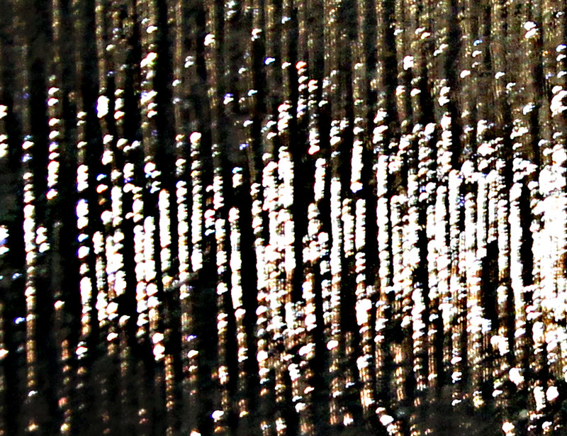
Nice abstract image, if I tilt my head right I'm seeing a sunset reflection on waves.
 
Welcome aboard Tim - good to have you here and you're in exactly the right place to try new things and improve week on week.

I too have absolutely no idea what that is, but it definitely interests me.
If I was looking at this from a purely technical perspective, then it would be easy to pick up on the blur and the overexposed areas . . . but in patterns week, it messes with my head slightly and I'm not sure whether it's by accident or design - and I don't know whether it really matters to the end result, because you've ended up with something very abstract and quite interesting.

For some reason I want to picture this as an underwater scene with bubbles floating up, but I'm also getting the sunset reflection on waves that Colin mentioned.
 
I know it's not this but it reminds me of something I contemplated doing, my chandelier, of the cheap kind, letting in very little light looked a lot like your pic.

It's interesting to look at and I like it :)
 
Well this has certainly had me guessing as to what it is. I've thought maybe one of those door hanging thingies :p. i have also thought the fibres of a carpet. Lets be honest I haven't got a clue. Well done for keeping us guessing.
 
HI Tim & welcome to the 52's madhouse :wave:

not a scooby what it is but it's very sparkly & abstract :)
 
nice abstract Good Luck for your 2015 52 challenge.
 
Hi. Thanks' everyone for the comments. I hadn't thought to explain what the shot was, so here goes :)
Yes, it was deliberately OOF, as I thought it worked best.
It wasn't tinsel, waves, or a door hanging thingamabob.
The closest guess was the (I think) chandelier.

It is actually one of my neighbours outside lights, as diffracted through the frosted glass in my Loo !!! Which I have always thought of as making an interesting pattern, and therefore jumped out at me as ideal for this shot.
Being effectively a shot of a light (halogen I think) at night, it was always going to be a combination of blown highlights and shadows.

So 1 down, 52 to go. I wonder how many subjects I can bend to my favourite subject of transport.
 
Welcome to 2015 52s, a nice sparkly image to start :clap: With 68 starters for the year, I don’t think any of us have a chance of commenting on every entry every week, but I hope to keep popping in to each thread at least once in a while. Good luck with the rest of the year.
 
welcome Tim

pattern ... interesting stuff
 
Week 1 : Bliss


Bliss
by timz2011, on Flickr

Probably an obvious subject to take for this. Bliss at the bottom of a bottle.
Taken using my 1100d and 85mm at f1.8 & ISO 100, bouncing flash off of the ceiling to ensure even lighting.
Concept was for the shot glass to be in focus, with the surroundings OOF.
Only very minor tweeking of the highlights, shadows and light balance in PSE.
 
Hi Tim ... nice idea for the theme good composition .... not a criticism but personally I might have tried focusing on the label leaving the rest OOF o_O
 
Hi, a few alcohol related takes on this weeks theme :)

On theme, but I'd like a tad off the bottom and a bit of oomph adding. Nice DOF, though.

Cheers.
 
Thanks for the comments. I wanted the glass in focus and the bottle blured, but that's just personal preference.
I see what you mean about removing some of the dead space at the bottom of the photo. I don't think that bliss at the bottom of a bottle warrents vibrant saturation though ;)
 
Week 2 : Fragile

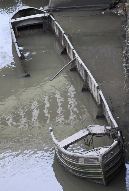
The sunken barge that sits almost underneath the Railway Bridge over the Thames at Twickenham counterpoints the Fragility of Human Endeavour against the Strength of Nature.


Fragile
by timz2011, on Flickr

Unfortunately the light wasn't good by the time that the tide was low enough to expose the sunken barge, however I think that the de-saturated look suits the grimness of the subject.
The image has had some minor tweeking. A little noise reduction and a traffic cone cloned out.

I think that when the tide is completely out, you can get down to the bank here, which would make for an interesting re-shoot on a day when low tide & good light co-incide.
 
Last edited:
HI, bliss nice even light and nice focus on the glass just something not quite right compositionally can't put my finger on it though
fragile, as you say not particularly good light but the muted tones work well and it sits nicely in the frame
as you say would be well worth going back when the tide is fully out
 
Fragile - certainly looks a little fragile that barge, despite the poor lighting conditions. I rather like the grey and murky feel to the image, would be worth seeing the same shot again in better conditions.
 
Hi, Fragile, on theme and good show for spotting it. I suspect a better angle wasn't a possibility, but some better light might lift it a little.

Cheers.
 
This is one of those landmarks that you can revisit again and again. This sort of thing was what I wanted to do. Pick something that's strong and show how that given a long enough timeline, nature will show that everything is fragile.

I feel as though your subject is quite "tight" in the frame and could do with a bit more space. Whether that's a different angle, or just a shorter focal length I don't know. The drab colours work well to enhance the grim mood of the image and my initial "make it B&W" thought isn't so prominent now. I quite like it as is.
 
I love Fragile I always think its a shame to see thing like this left to decay. They form a big part of our industrial and cultral history
 
Last edited by a moderator:
Hi Ian. I did have a play with desaturating the shot, but felt it didn't need it, it is almost monochrome anyway.
I did toy with changing lens to allow more space in around teh subject, but I don't think it would have helped as it would have added distractions. I was marginal on light too, so going from f1.8 to f2.8 would have meant higher iso. I'm pretty sure this will be re-shot later in the year with better light.

Mark, the barge has been slowly rotting away in this spot since at least 2008, it's been something I've looked out at from the train most days since I started commuting on the train, rather than by m/bike. Back in 2008, it was still floating, and didn't have the large hole in the side, it has certainly deteriorated over quite a short time. I wonder how much longer it will remain, it must surely be a hazard as it is invisible at high tide (other than I guess the mooring ropes).
 
Week 3 : Scenic
I sense the beginnings of a pattern emerging.
I wanted to skip the obvious scenic locations in LB Hounslow, such as Osterley & Syon Parks / Houses as surely these will have been done to death.

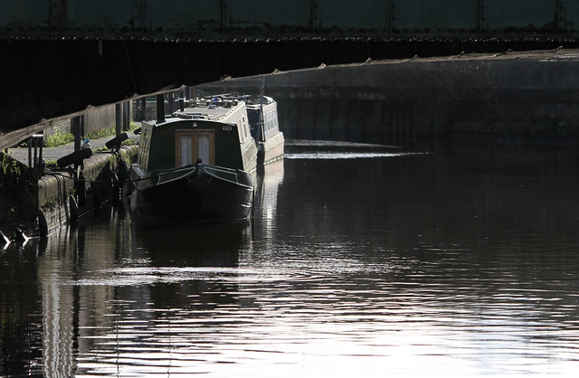
The Grand Union Canal becomes the River Brent at Brentford, before joining the Thames. has recently been developed and has become moorings for a large number of narrow boats.

This shot was an attempt to frame a couple of the narrow boats through the bridge carrying the A315 (Brentford High Street) as a kind of urban chocolate box scene.
I'm not sure that it works though.


Scenic
by timz2011, on Flickr

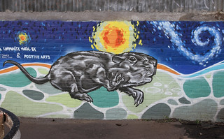
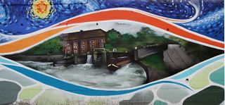
Whilst wandering along the tow path, looking for better views, I came across a couple of murals (in fact a whole wall of them) which may be interesting to some.
Here are a couple:

River Brent Murals
by timz2011, on Flickr

River Brent Murals
by timz2011, on Flickr
 
Hi Tim.
I like the idea of a canal image for the scenic theme. I like the way you've thought about framing the boats with the bridge.

However, I think there are too many dark areas. You could try playing with levels and highlights/shadows to bring out some of the detail in the bridge and the wall on the opposite side of the canal. Also I think a tighter crop by taking a little off the top, bottom and right.
 
Hi Tim,

Scenic - the renault sprang to my mind as well, but I thought that would be too easy :)

I really like tth shot, it doesn't look too dark to me, I think the subdued tones work well given what you were aiming for (the urban image) but I'm not an expert, but I agree with Mike about taking a bit off the top.
 
Last edited:
Hi, Tim, good that you are trying different composition techniques, but I'm not keen on how the boats are placed in the photograph. They look a little squished.

Cheers.
 
Hi Tim.
I like the idea of a canal image for the scenic theme. I like the way you've thought about framing the boats with the bridge.

However, I think there are too many dark areas. You could try playing with levels and highlights/shadows to bring out some of the detail in the bridge and the wall on the opposite side of the canal. Also I think a tighter crop by taking a little off the top, bottom and right.

Hi Mike. The lighting was quite difficult, the bridge in shadow and the boats/water blown. This was the best of the bunch, and even then I've had to selectively lighten the bridge and muck about with the levels for the boat and water.
I know what you mean about not being 100% on the composition, but I felt cropping any more would centralise the boats too much in the shot.
Please feel free to have a play and post your editsback though, I am still learning :)

Hi Tim,

Scenic - the renault sprang to my mind as well, but I thought that would be too easy :)

I really like tth shot, it doesn't look too dark to me, I think the subdued tones work well given what you were aiming for (the urban image) but I'm not an expert, but I agree with Mike about taking a bit off the top.

Hi Lorraine, I could lose the ironwork on the bridge (I agree it doesn't add much), but would it remove too much of the framing?
As I posted to Mike, please feel free to edit the shot and post back your thoughts :)

Hi, Tim, good that you are trying different composition techniques, but I'm not keen on how the boats are placed in the photograph. They look a little squished.

Cheers.

Hi Andy, I guess the angle I was shooting from squashes the boats together, but the angles were restricted. Maybe I should have walked down and moored teh second boat a bit further back ;). Seriously though, trying to get both the boats and bridge in was quite hard, the angles were wrong if I moved closer, not so much horizontally, but vertically, as the tow path was about 6 foot above the waterline (I was lying on the ground to get the shot).

Like your thinking behind the shot, Tim. But can't really make out the bridge. The shot could just do with a wee bit more details in particularly the narrow boats since they are the main subjects.

Hi Stan,
If the boats had been a bit closer to the bridge, I could have perhaps zoomed out a bit, but to be fair, the bridge isn't that interesting (maybe silhouetting the bridge would have worked), I was just trying to use it as a frame. It's quite interesting how the views you get with the mk1 eyeball often don't translate as well onto the screen.

Thanks everyone for the comments.
Note to self - Must try harder next time :)
 
Hi Tim, have to agree with the above comments regarding the darkness of the image, but I can see there is quite a lot of light in the bottom of the frame and on the side of the barges.

I think the only way round that would be to take it at a different time or in a different light, compositionally I think we need to see a little more of the barges
 
Back
Top