- Messages
- 3,145
- Name
- bill
- Edit My Images
- Yes
I quite like it Bebop, for some reason it makes me think of an Andy Warhol painting...
Thanks Simon. Maybe I'll call it Nuclear Pink!Lovely shot and agree with the other comment about the radioactive symbol. That was the first thing I thought too
Thanks Stuart. On the pink version, I tweaked the luminance of the blues and it almost felt like it was adding light (that sounds really obvious reading it back ha ha!} - in Photolab. I have never used the edge detect filter in Affinity, so thank you for mentioning that. I can have a playIt's always worth adjusting the sliders just to see the effect, I always like to see how an image changes with the edge detect filter in Affinity Photo. The pink is certainly striking, the glass and reflections on the non WB adjusted looks almost metallic.
Thanks Bill. I know what you mean. It did occur to me I could do 4 versions with different colours.I quite like it Bebop, for some reason it makes me think of an Andy Warhol painting...
Thanks PeteWeek 3 Clever processing Bebop, works really well
Week4 again another clever trick to make a difference, and so simple as well.
Cheers DavePinky shot for me on the bottles, clever.

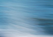
I'm not a fan of ICM, but I really like this as it has a fantastic abstract feel with no real 'subject' (that you can't see because of the ICM!). Good job and lovely colours.
Certainly does tick a box. I like it a lot.
That works ... a nice image
It works. Nice subtle colours.
That's good, you can just about tell what it is, and its very abstract.
A nice abstract OCM with some good colours.
That looks very nice ... a very pleasing image.
As many of the above comments - a nice abstract shot and tick for ICM!
Thank you all so much. You are very kind. I wanted a bit of beach or a sunset really, but then I would have go t behind, It is a crashing wave in case you can't tell ha ha!The play of white with the blue works well for me Bebop. I think that sometimes it's better not to prepare, just use what you have to hand.
Interestingly that's exactly what i thought it was.It is a crashing wave in case you can't tell ha ha!
Thanks DaveAgree with Jim on not being a fan of the tech, I do like the shot too and agree on it being like an abstract.
Thanks Tim and well spotted. Always a bit hit and miss just trying to get things in a straight line, so I wasn't sure how a wave would turn out.Interestingly that's exactly what i thought it was.
I like that
Thank you Pete. That's very kind. I thought it was the best of a not terribly exciting selectionThat’s very nice Bebob and one of my favourite ICM pics that I’ve seen in this challenge. I like the lines and the limited colour palette.


Thanks David. I think they're all a little bit off really, but I'm not sure if it's snapseed, my phone, or my lack of skill. Actually looking on my phone, the focus looks better throughout, so I think it's the processing/downsizing somewhere along the way.Can't really pick a favourite, all three are very good.
#3 seems to have a sharper focus and more depth of field, but that might be me.
I have had the same issue in the past, downsizing and uploading to websites always has its challenges.Thanks David. I think they're all a little bit off really, but I'm not sure if it's snapseed, my phone, or my lack of skill. Actually looking on my phone, the focus looks better throughout, so I think it's the processing/downsizing somewhere along the way.
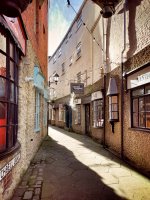
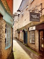
A good set Bebop, I definitely like the second one best. The first seems flat to me. I haven't used my phone much would probably have gotten much poorer results than you did.
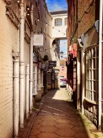
All three are good, and I like the overhead passageway in the 3rd one. The 2nd one is probably my preferred I use Snapseed occasionally. A decent set of tools.
A sunny alley!
First for me. The second has a bit more impact but looks blurry on my screen.
All well composed.
I think I prefer the second one too.
Just seems a bit punchier.
A good set - personally I prefer the second one, the first has a couple of words chopped off in the middle.
Second image for me, I found the steam/smoke in the first image distracting
I like No1 but wish you'd got the full nameplate in.
My favourite is the middle one. I find the thing in the top right corner distracting in the first one and the 3rd one isn't as nice a view as the other 2.
Hi Bebop, I prefer the last one best, the light seems better, folloed by the first one.
A nice set Bebop. I prefer the 1st as the lighting suits it.
First for me too but with the full street sign...
