weekly Ferg's 52 for 2015

Messages
284
Name
Ferg
Edit My Images
Yes
Ok, well here goes!
Apart from the usual phone picture taking, I've never owned a DLSR until October. Photography has alway been one of those things that I've oo'ed and ah'd over other people's amazing photos and wanted to try but never got round to until now and I'm loving it! Don't know why it's taken me so long but there you go.

So what better way to learn than just jump in at the deep end with a challenge like this?!

Hopefully, there will be a noticeable improvement between week 1 and 52 and thanks in advance for all your valuable feedback and comments.

...... Let the fun begin![emoji16][emoji16]
 
Last edited:
Hi Ferg & welcome aboard ...deep-end it is but fun as well :wave:
 
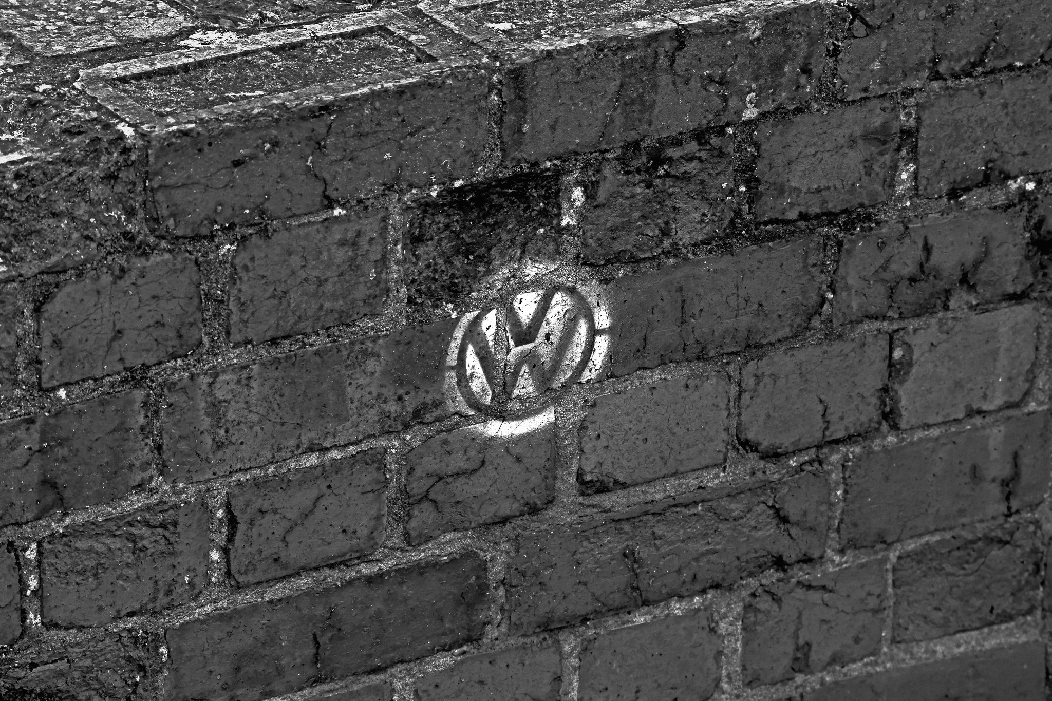
Here goes then......Practice round - Patterns
It was the VW graffiti that caught my eye when I was out with the dog the other day. Decided on B&W in the end to enhance the VW as the focal point more. Hope you like it!;)

brick_008 by fergusinglis, on Flickr
 
Nice pratice image Fergus. I wonder if cropping out the top of the wall will make a stronger image?
Hadn't thought about that but yeah, it would I think.... I always forget about things like cropping to fine tune things[emoji16]
 
Nice image. I quite like the idea of a crop but think it works well as it is too. Seeing the top of the wall helps place it if that makes sense (I think I know what I mean :thinking: ).
 
Well spotted and (y) for getting the link to work.

Just to add, the first few weeks of the TP52 can be mental, trying to comment on 80+ submissions can be very taxing. What I intend to do is for the first few weeks comment on what I consider to be the best submission for the previous month. Once numbers dwindle, which they unfortunately will, I'll comment on more. Of course, I would not expect you to comment on all my submissions (y)

Cheers.
 
Nice contrasts in the brickwork Ferg.
Actually I like the top of the wall, being there it gives the image a certain "depth" too. :)
 
Hi Ferg

Welcome and well done on the first image. I'm with Cobra that the brick tops help give the image much more depth and interest. It pushes the composition out perhaps, and certainly you could have got away with a flat brick wall given the theme, but the angle is definitely a step up for me. Plenty of contrast and the VW sign is well placed and a good size... basically a good job all round :)
 
Very nicely spotted.

FWIW I'm with the crop the top of the wall brigade because I prefer the more abstract nature of that composition - but we seem to be split down the middle on that and it's obviously a matter of personal preference.
Well done on getting up and running - looking forward to seeing week 1.
 
Mono was a great decision but as others have said the top of the wall being cropped would make a more appealing image for me. Great spot though and a nice take on the theme.
 
I like it as is! Apart from giving it more perspective I like the pattern of the bricks too which the b&w conversion emphasises.....Lovely textures there too. Just a slight niggle for me is the centralising of the logo, if it were further to the left of the frame it would draw the eye around the picture more perhaps :thinking:. Enjoy the next 52 and welcome :welcome:
 
Thanks for all the comments and feedback everyone! Really looking forward to the rest of the challenge.... Is it Friday yet??[emoji16]
 
Off to a good start Ferg (y)

Contrary to what a lot have said about cropping the top of the wall, I would actually like to see more of the top. Obviously I don't know how deep the wall is but if it allowed to show greater depth on the top you could lose a little bit from below the symbol. That would enhance what I'm seeing which is a VW grill and bonnet made of bricks.
 
Welcome ferg.

"... VW graffiti that caught my eye"

You're a natural ... keep it up. (y)
 
good shot. nothing else i can say from what has been said already.
 
Nice simple yet effective start (y)
Good Luck for your 2015 52 challenge.
 
Welcome to 2015 52s - a good start with very effective use of b/w! With 68 starters for the year, I don’t think any of us have a chance of commenting on every entry every week, but I hope to keep popping in to each thread at least once in a while. Good luck with the rest of the year.
 
WEEK 1 : BLISS
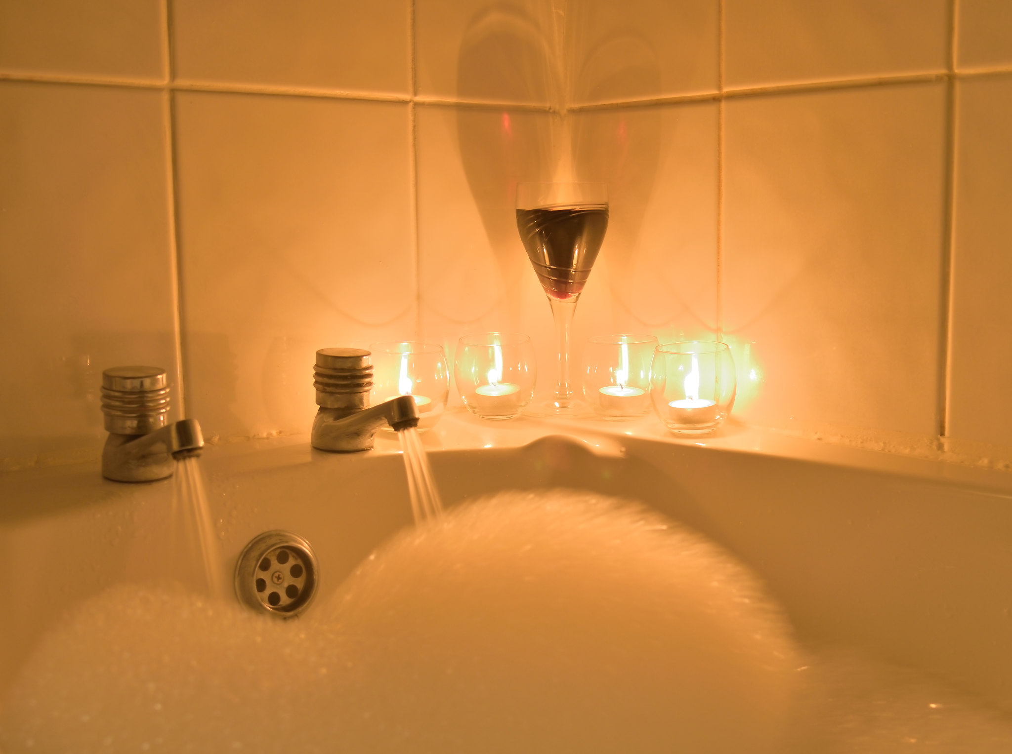
So here comes bliss! A nice soak in the bath with a glass of wine.

A little bit of PP on this one. Some exposure and contrast work on the RAW and the some healing in pixelmator to get rid of some "less than white" grouting (not been keeping up with the DIY, naughty boy) and a small crop
The Long Soak by fergusinglis, on Flickr
 
Off to a great start, I like the slight hint of movement in the bubbles and the wine glass reflections.
 
Very nice photo. I really like the lighting from the candles and the reflection from the glass on the tiles. Having the taps running is a nice touch. Good stuff!!
 
Nice idea ... love the light given by the candles against the tiles. Good work.
 
Nice idea and set up. Love the wine reflecting I think you would have got away with just 2 candles the one behind the tap seems a bit lost. but still a good picture
 
White balance is an issue.

I can see it now I've slept and gone back to it..... Still a bit rubbish with PP so I try not to do too much as they usually turn out blue or pink [emoji23] - will have another tinker with it during the week if I get a chance
 
Great idea Ferg.
And probably most peoples idea of bliss to.

I agree about the WB issue but its actually very easily sorted especially if you have ACR.
Just a slide to the left with the WB and a tweak with the fill light :)
 
Bliss: usually fraught with difficulties that kind of subject .... you've done well.
 
Back
Top