weekly Ferg's 52 for 2015

I would have preferred the bubbles to be sharp rather than with the movement but overall a good shot, well-executed.
 
Thanks for the tip @Cobra I'll give it a go [emoji4]

@Manc Man - I'm still a bit erm over protective with the camera so it was a pretty cold bath - no nasty steam in the bathroom allowed![emoji23][emoji23]
 
Hiya Ferg... that's a cracking idea for bliss. Good composition and arrangement... everything in scene is there for good reason and it doesn't feel as if it could be improved by addition or removal (y)

WB has been mentioned (easy fix) but for me the slight distractions are the double shadow behind the wine glass (which others seem to like, mind!) and the blurring of the bubbles because of the long exposure. All three could be fixed by using just enough off camera flash to light the scene rather than the ambient from the candles. You could still have a longish exposure (1sec?) to incorporate some of the candlelight as well...

Good job though!
 
I like the concept. very blissful after being at work. Some good advice given. useful tip to know. Now will i remember when my WB is out as it will be... Well doe for being so quick off the mark.
 
:LOL: Unfortunately this is the sort of shot that everyone's going to have slightly different opinions on, I think.

For me, I love the double shadow/reflection from the wineglass and actually quite like the warmer WB - I'd tone it down a touch but not so much as to lose that candleglow feel altogether.
The only thing that bothers me really is the motion blur in the bubbles from the slow shutter speed.
Personally, I think I might have done away with the bubbles altogether and gone for an even slower shutter speed instead to get that luxuriant feel from silky, milky water and create some starbursts on the candle flames.

All a bit subjective though, and it really is a great idea and bang on theme.
 
Hi Ferg :)

Sorry but a bit late in commenting...

Pattern - What a great spot, really like the angle and the light/detail is excellent !!!

Bliss - Again really like your chosen point of view, the WB has been mentioned, other than that I think it's a great idea.

A couple of cracking images to start your 52, look forward to seeing what you come up with next week :thumb:
 
I like this shot - the shadows from the candles cast interesting shadows and the running water adds movement to what is essentially a still life shot. My only minor gripe is the colour balance which is just a touch warm for my liking - having said that you definitely wouldn't want a neutral colour balance either.
 
I like the warm feel from the white balance :p and my only crit is the movement from the bubbles, the blur seems to draw my eyes to it. I also love the reflections from the glass (y)
 
Hi
Bliss
Like your idea. must have been frought with difficulties with all those reflections, glare, steam etc
nice job
(thought about something similar but grouting let me down :))
 
Week 2: Fragile

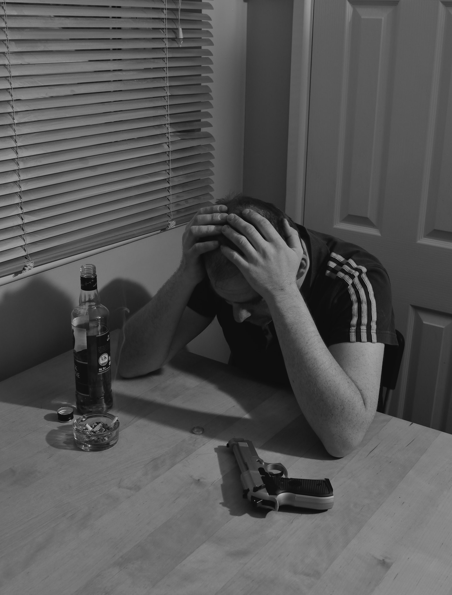
Inspired by @Bruja Jill's dark twist on Bliss, I wanted to try something with a bit more drama this week. Lighting is still a bit of a challenge for me and even more so with this week's attempt. I wanted strong shadows but without lighting the back wall too much - I settled for a lower power flash off to the right on the floor. I struggled a bit with the overall contrast/exposure but in the end I'm fairly happy with it for a first attempt at this kind of shoot. Thanks as always for all your helpful advice!

So, here it is...... Mental Fragility - "The Decision"

fragile by fergusinglis, on Flickr
 
Last edited:
HI Ferg

Ooohh , that's very dark....the sentiment not the photo.....I can't crit the lighting as carp with it but what you've done is ,to me , very effective , could possibly stand going a bit grittier /contrastier ?

Bliss....like the warm tones though maybe just turn it down a little ,looks very inviting ( until I read that it's cool water :eek:) , good low POV & I like the almost milky water coming out of the taps :) the double reflection of the wine glass doesn't bother me too much BUT if you could lose it ,it would lift the shot to another level....I have no idea how you'd do that though :thinking:
 
Quite a powerful take on Fragile. I'l like a little more light, but the shadows adds to the grittiness.

Slight crop off top and bottom also works well.

Cheers.
 
Hi Freg,

Bliss
......Well it's all subjective isn't it I'm with Sarah here... Quite like the warmer WB, it's no big deal ether way it's easy to change to taste. Personally I like the double reflection of the glass, with the little red spot in the middle. The bubbles on the LH side look sharper than those one the right would have been nice to get them pin sharp.
Nice shot.

Fragile..... Quite visually impacting, poignant. A tad on the dark side in both respects and I know how that feels.
Wish the pistol was facing away from him and other way up so I could see if the safety was on! I would say that depicts fragile quite well!
 
Hi Ferg... I'm liking the lighting, sure says fragile for me with the placement of the gun, the shadows work fine too, I'd also consider a landscape type crop to bring you (or your model) more in the the main element with the gun and full shadows (if you know what I mean) like it (y)
 
Fragile - i like the idea, well thought out, good understory to imagine, my only crit is a personal thing about the gun. if the guy decides to end it he's going to have to mess about with gun first as its not in the natural position it would be put down in if you get my meaning. saying that it's just my twisted minds way of looking at it, well done
 
I really like your take on fragile. I like the lighting and the composition. One crit I will make it that the wedding ring is in the shadow of the arm. I didn't spot it right away because of this, on my tablet anyway, and had to zoom in to see what it was. At first I thought it was a coin... heads you do it, tales you don't.

Overall, well done (y)
 
Hi, very dark image there, when I saw it I thought another hangover pic until I saw the gun :wideyed:
The lighting works with the image the only thing I would have maybe done differently is to lower the angle of the camera, a bit more face level if you see what I mean

nice but slightly disturbing image, works for me (y)
 
Hi Ferg, that's a very dramatic shot, an excellent fit for the theme. The only thing that seems a bit off to me is the way you've placed the gun - I think it might have looked more natural if it was pointing away from you
 
Thanks for the feedback guys!

I hadn't even thought about the gun position until it was mentioned..... I've just sat at the table and tried it, and it is a bit awkward to put it down that way so a good thing I've learned from this is to let your model hold the props and put them down where they naturally fall instead of arranging it from the camera viewpoint!

@69Bonni I thought that maybe the emotion behind the scene would be something most people could relate to - likewise, I've visited this place albeit as a fleeting thought many years ago. And don't worry - as much as he annoys me sometimes, the gun was very much empty before it made it onto the table [emoji23]
 
Noting to add other than bang on theme ;)
Dark is good in my book. Great picture.
 
Well shot! As I'm right handed I'd like to see the gun that way round but that's just being picky :p Great interpretation and just hope Despair is not a theme or you may just shoot yourself ;)
 
Hi Ferg, that's a cracker! Love the understory there... is he off to kill someone else? Or just himself? If the latter, I think the gun placement works well - it probably should be pointing towards him!

Re: lighting, I'm no expert but I'd mention the following as a bit of a guide:
1. hard shadows (with a fairly definite outline and very little "blending" from shadow to non-shadow - always made with a small light source, e.g. uncovered flash) in simple scenes can work well and can often become part of the composition. In more complex scenes, they have to be used carefully otherwise they can start to compete with the actual subject for attention.
2. hard shadows can be used to tell a useful story themselves: backlit scenes with hard shadows coming towards the camera give a sense of imposition, light source at the camera with hard shadows falling away into the background often say the opposite.
3. soft shadows, on the other hand, can be used simply to provide clues as to form and 3D nature of the scene: they're always from a large light source (e.g. big softbox or by bouncing a bare flash off a wall/ceiling - one of my favourite tricks) but are usually a lot smaller than hard shadows and their edges always blend away smoothly. For this reason they're usually not distracting at all and can be used on the most complex scenes without distraction

I find with lighting the trick is to position the light(s) so that you get the right areas lit but then also the right type, size and position of shadows. It's a balance between choosing where you want your highlights to be as well as where and how you want the shadows to fall. I think in your image, hard shadows could work well but I might be tempted to throw the shadow more towards the camera (and therefore gun) - so flash behind subject, either high or low - which would almost certainly require a little fill lighting from pretty much on axis (i.e. from the camera).

Great shot though and the lighting chat above is just because you asked!
 
@pjm1 hey Paul, thanks for taking the time to give the lighting tips..... Really appreciate it!![emoji4]
 
Week 3: Scenic

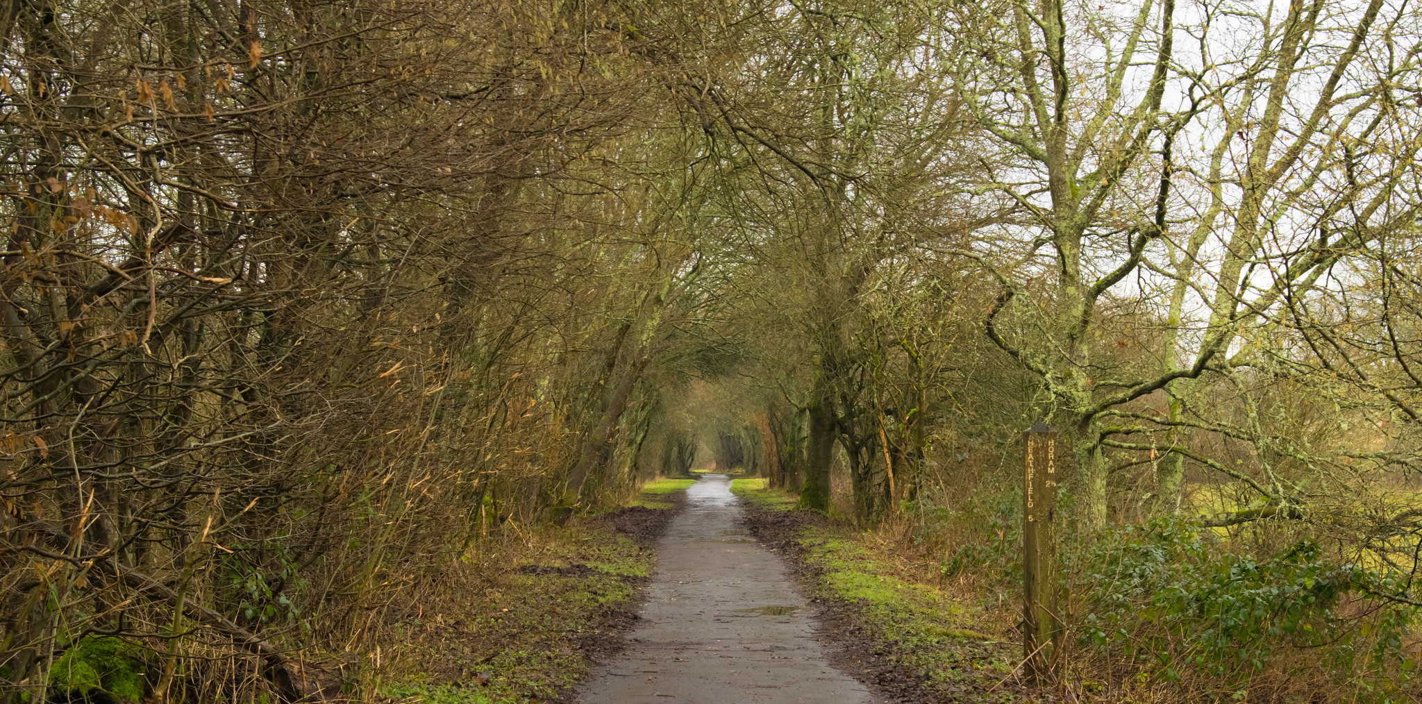
Well..... Not really had much play time this week, but one rule I set myself for this was to take a photo for the theme in the week it was announced and use it no matter how it turned out. So here it is! Its part of the Cuckoo Trail in Sussex on a rather uninspiring, wet Sunday - the only day I've looked at me lovely camera this week :(
I've taken a few mounds of mud out and cropped a little. Not amazing, not horrendous......just scenery (of sorts!);)

scenic by fergusinglis, on Flickr
 
Hi, first of all well done for taking a picture which is more than a lot of people did this week.

As for the pic I would have been tempted to crop it to portrait style its a nice path, very good exposure wise, but the Left and right hand sides are really not needed
 
Nice image. Sat here wandering where the path leads..... Must go lots more commenting to do.
 
Back
Top