weekly Go on then, 5th go at the 52, finished!

Hi,

Companions - some great fun shots there.

Elegant - I'm sorry but for me it doesn't quite fit the theme (though it couldn't have been easy getting the shot inside the museum).
 
Companions - #2 for me but I like them all :)

Elegant - A bit of a crowbar but very topical and I like the alternative you added more as it looks like a very Elegant train (y)
 
Companions - I think the second shot works best for me.

Elegant - nice image of a train, I can imagine it must be tricky to get a good shot at a museum.

Hi,

Companions - some great fun shots there.

Elegant - I'm sorry but for me it doesn't quite fit the theme (though it couldn't have been easy getting the shot inside the museum).

Companions - #2 for me but I like them all :)

Elegant - A bit of a crowbar but very topical and I like the alternative you added more as it looks like a very Elegant train (y)

Thanks all for the comments, much appreciated.

Now for a catch up

watery

watery by scilly puffin, on Flickr

2nd option

watery #2 by scilly puffin, on Flickr

relax

Relax by scilly puffin, on Flickr
 
Last edited:
Hi, Michael, I'm not sure if you are going on the NMA meet next week, if you are you can give me the 'Bird' then.

You can do much better that this. Both are on theme but they don't work for me. #1 is very grey and the small highlight on the lower third really stands out. Nice greens on #2 and I like the soft edges.

#3, I'm not really getting the connection. The flames are quite well exposed but the darks are too dark. I feel a much better composition is in there.

Honest crit from me (y)

Cheers.

That's much better. Bold and very sinister. Sight crop works to emphasise the sinisterness ::

Thanks Andy for the critique, totally missed that highlight, grey must be down to the lighting, need to play with that sort thing a bit more. It's looking fairly positive for the nma meet,
 
Hi, Michael, I'm not sure if you are going on the NMA meet next week, if you are you can give me the 'Bird' then.

You can do much better that this. Both are on theme but they don't work for me. #1 is very grey and the small highlight on the lower third really stands out. Nice greens on #2 and I like the soft edges.

#3, I'm not really getting the connection. The flames are quite well exposed but the darks are too dark. I feel a much better composition is in there.

Honest crit from me (y)

Cheers.

Hi Michael, can only agree with what Andy @posiview said, they seem a little rushed, sorry :sorry:
 
Good catch up Michael
The "bold" is the best of the bunch (y)
 
Hi Michael


Sorry to say but I'm with Andy on this one.....you're capable of way better in relation to the Relax & Watery images ,sorry :(

Bold however is right on the money love he lighting, the menacing look on the face just a smidge off centre....really really like that :clap:
 
Hi Michael


Sorry to say but I'm with Andy on this one.....you're capable of way better in relation to the Relax & Watery images ,sorry :(

Bold however is right on the money love he lighting, the menacing look on the face just a smidge off centre....really really like that :clap:

Thanks Lynne, I think I shall be doing relax and watery again, pleased you like the nose! It certainly is the best of the 3, hopefully I can get something better to replace the other 2.
 
Michael ... I like the idea of your WATERY cucumber and #2 is glistening oozing watery juices.
 
I really like Bold. Don't know what it is, but the lighting you've chosen and "it's" expression are great.

As others have said, I don't think the candle pic is doing it for me for relax. It's nicely exposed and composed, but it just doesn't have any interest.
 
Michael ... I like the idea of your WATERY cucumber and #2 is glistening oozing watery juices.

I really like Bold. Don't know what it is, but the lighting you've chosen and "it's" expression are great.

As others have said, I don't think the candle pic is doing it for me for relax. It's nicely exposed and composed, but it just doesn't have any interest.

I have to agree with the others regarding your watery, bold and relax images.

The lighting really works well for Bold, it portrays the theme very well.

Thanks all for the comments, watery and relax are on the list for a re-shoot, though I do quite like the 2nd watery version myself.

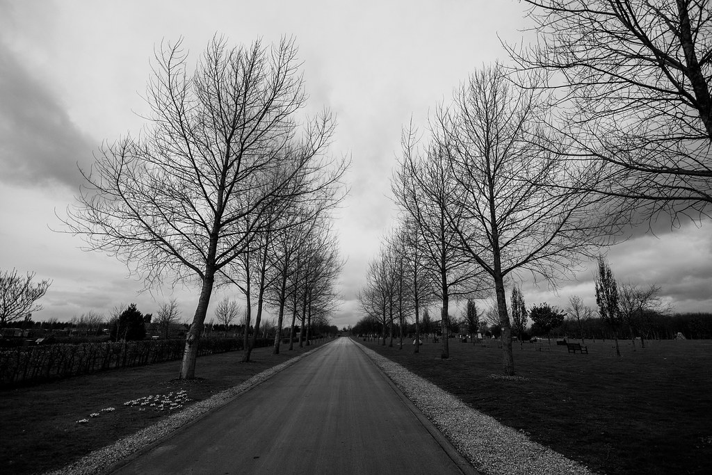
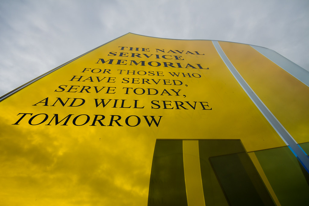
Now on to vertical, I have a couple of pics, both of which I like, the 1st looks really good on my desktop bg.

nma 2015 #14 by scilly puffin, on Flickr

nma 2015 #12 by scilly puffin, on Flickr
 
Now on to vertical, I have a couple of pics, both of which I like, the 1st looks really good on my desktop

I smiled when I saw that comment. Always a sign of a great shot if you'll have it on your desktop. I love trees and I love landscapes like this. The memorial shot is good, but it's not in the same league as far as I'm concerned. You've got a really harsh range of tones (lots of lights and darks, not much middle ground) which is difficult to pull off, but the road is middle ground which makes it a brill shot. It's one of the first I've looked at this week and already I think it's "shot of the week" for me... Don't tell anyone else...
 
The second vertical is the one for me....Very striking.
 
I smiled when I saw that comment. Always a sign of a great shot if you'll have it on your desktop. I love trees and I love landscapes like this. The memorial shot is good, but it's not in the same league as far as I'm concerned. You've got a really harsh range of tones (lots of lights and darks, not much middle ground) which is difficult to pull off, but the road is middle ground which makes it a brill shot. It's one of the first I've looked at this week and already I think it's "shot of the week" for me... Don't tell anyone else...

Oooh, thank you Ian, much appreciated!

The second vertical is the one for me....Very striking.

Thanks Viv.

Hi, Michael, I like the perspective of #2, the bright yellow and the clouds visible though the memorial.

Cheers.

Thank you Andy
 
Second one for me too Michael as already said very striking, it stands out far more than the trees IMO :)
 
I prefer the second shot too, because of the bright colours and contrast. The first one comes across a little dark for my taste.
 
Hi Michael, the second one for me too the first looks a little dark and I feel the road needs to be bang on centre

Took some of the second monument myself nothing that works as well as that though
 
I am liking both vertical images and both fit the theme well. I can see the cloud reflecting in the second shot. not able to decide between the two. looks like an interesting poignant place to visit.
 
Second one for me too Michael as already said very striking, it stands out far more than the trees IMO :)

Thanks Chris.

I prefer the second shot too, because of the bright colours and contrast. The first one comes across a little dark for my taste.

Thank you sara, it is a little dark on here for some reason, viewed as my desktop bg it is lighter, esp in the bottom corners. Thanks for taking a look.

Hi Michael, the second one for me too the first looks a little dark and I feel the road needs to be bang on centre

Took some of the second monument myself nothing that works as well as that though

Hi Allan, it was a bit awkward wasn't it,but pleased I found something that worked. thanks for taking a look.

Hi Michael, I prefer the second shot too - very striking

Thank you Lorraine,much appreciated.

I am liking both vertical images and both fit the theme well. I can see the cloud reflecting in the second shot. not able to decide between the two. looks like an interesting poignant place to visit.

Thank you Mandy, it is certainly an interesting place, quite a lot to think about there on many different levels.
 
Hi Michael

good to put a face to the name after all these years in the 52 :wave:

Of the 2 shots posted my preference is the 2nd one..love the angle & the bright color against the grey sky (y) Maybe boost the Yellow a touch :thinking:

Thank you Lynne, as you say, good to pit a face to a name.. Might take a look at the yellow, a good point,
 
I agree wif posiview andy re. the memorial shot. I still like the trees but I am distracted by the first one on the left which is leaning over a lil too much. The road looks great though :)
 
Hi Michael

I'm with @Harlequin565 ... Vertical #1 is a beautifully bleak shot.

I agree wif posiview andy re. the memorial shot. I still like the trees but I am distracted by the first one on the left which is leaning over a lil too much. The road looks great though :)

I like the low viewpoint of vertical #2. The sky reflection is a bonus too.

Vertical - the first image I like, but I do find the wonky tree on the left distracting.
The second image nails it for me, the transparency of the image works well.

Hi Michael ...it's hard to choose between Vertical as they are such different images, I love the perspective in #1, but I think the reflection of the clouds in #2 gives it the edge ....it's a really striking shot.

Thanks all for the comments, much appreciated. Sorry for not getting round, my son has had scarlet fever and things have been pretty hectic.

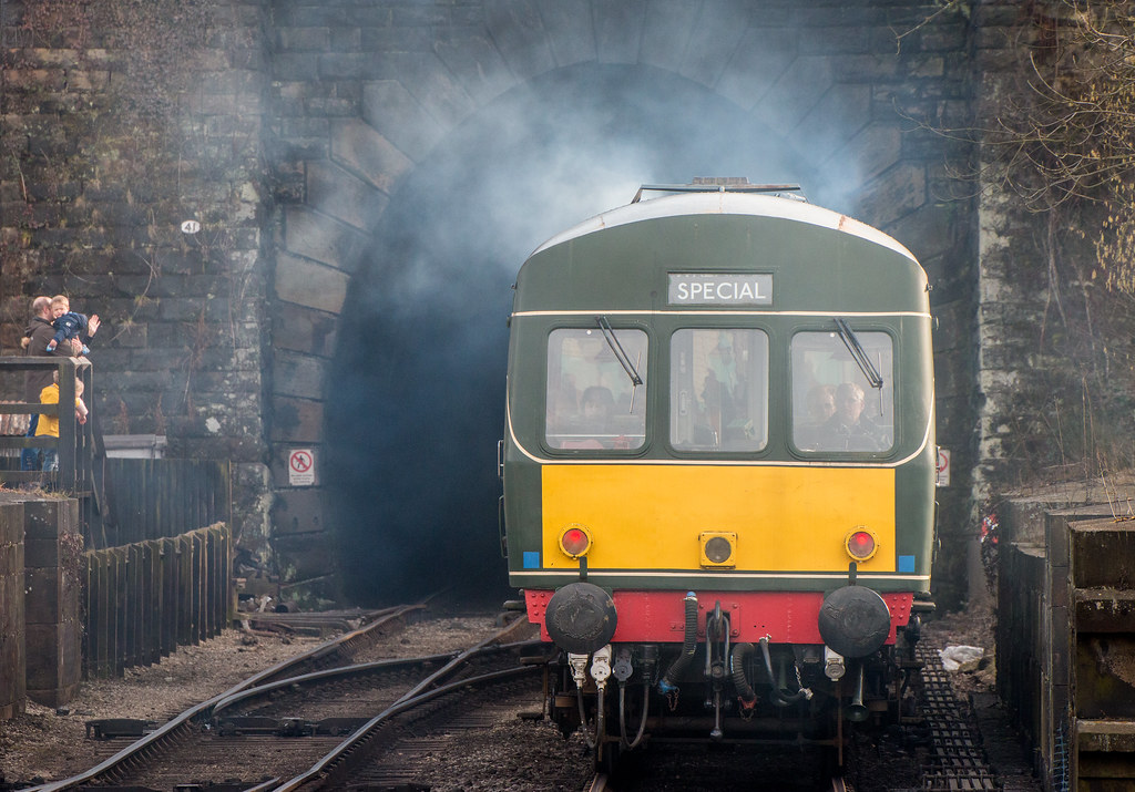
Now for mouth (entering the mouth of a tunnel)

dmu 3 by scilly puffin, on Flickr
 
Good idea. Almost looks like a steam engine with all that smoke around. Not exactly environmentally friendly are they? If my car did that it would fail an MOT.
 
Another big tick for the idea on what is a tough week.
Great shot and I hope you got out off the way because your positioning there looks like the train is going to win.
 
Back
Top