Granddad John's 52 in 2018

Week 2 People. First bit of sunshine for a week and the birders and walkers were out at RSPB Minsmere yesterday. These two were busy photographing the birds on the feeders outside the visitor centre and looking distinctly cold in the bitter wind.
Shot in bright sunlight/deep shadow so a real test of the Lumix's DR. Tried reducing the highlights in LR but a bit too blown on his face i think.:)


tp_52-2018 people-1020251
by granddad john on Talk Photography
 
Nice photo, like how the bird table is in the reflection shame no bird on it but can't offer much in the way of advice as im too new for that.

:)
 
I like the shot :) wondering how it would look if the feeders were in view directly. It’s cool that you need to look at the reflection to see what is going on.
 
Very Clever, talking photos of photographers, not like they could complain.
Reflections very good, I might have cropped the left hand side a bit and straightened the verticals myself.

Pete
 
Big wusses wrapped up like that. I'm still walking to work in tee-shirt and light fleece.
You're right, it may be a little blown on his face, but it does emphasise what a bright day it was when you were taking the shot. It doesn't jump out at you.
I think it works as a good environmental shot.
 
Well spotted, great light and I like the composition!
 
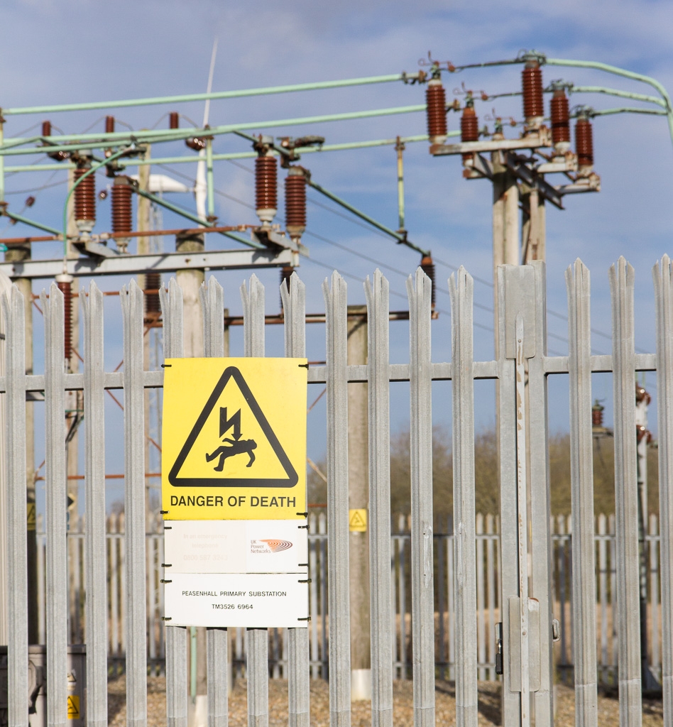
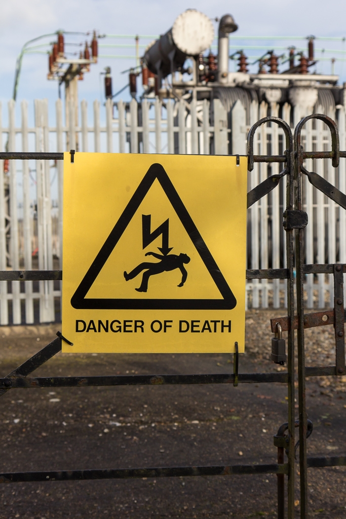
Nice choice of image for Strak I like them bot but prefer the second as the waring is more in your face and strak and the use of DoF works really well in hte second one too
 
#2 for me too: better DoF, more to see and the warning is also starker!
 
#2 ... "Danger of Death" I took a shot of one of those yesterday too. Certainly a stark warning.
 
Bang on for the theme.
I think I prefer #1, but actually would like to have seen a bit more in sharp focus, rather than the slight OOF effect you have there.
Obviously that's just personal preference though, and you've evidently got the effect you were going for.
 
I had very similar ideas to thi, but the weather stopped me from going out...I think the secoond shot is the better one.
 
Week 3 - Stark - The greater area of the sign makes a bigger impact in the second shot and there is still enough detail in the background to flesh out the story.

I’m using a rota to make sure I spread my comments round. Will be doing about 1 in 7 each week.
 
People - good idea to turn the camera on the photographers I like it
Stark - Its the first one for me too the back ground gives it more context
 
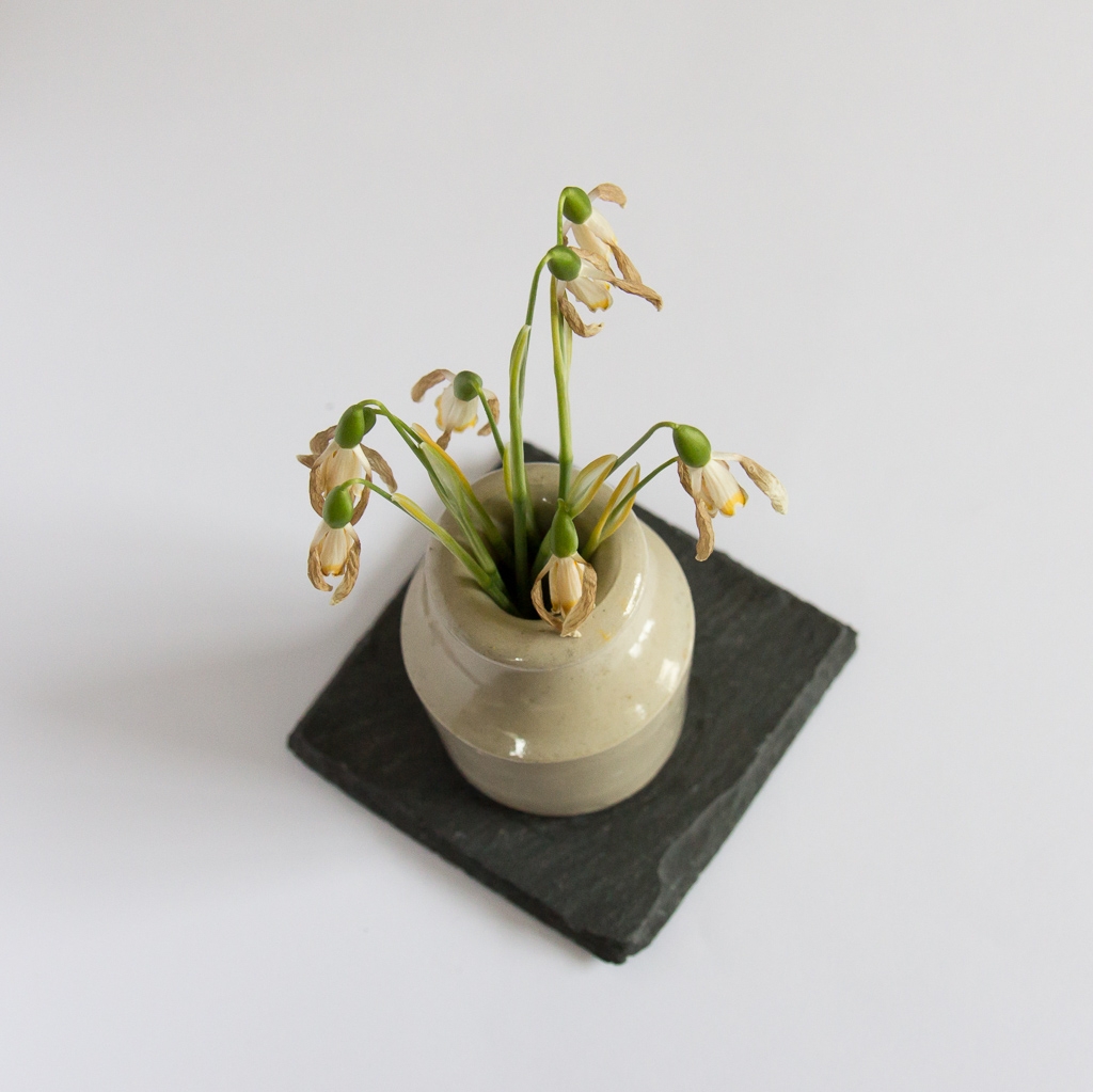
I like that a lot John love the angle you've taken the image at and the position of the vase/coaster if I'm being really picky the highlights are slightly distracting .
 
That's certainly a different angle on the theme but I have to say its one that works very well. Very inventive :)
 
Simple maybe but effective and right on theme good thinking
 
Is this the only piece of still life we've had for the theme? I think so.
well composed, having the slate on the diagonal certainly gives more interest to the shot.
Colours have come out nicely (y)
 
I have a "thing" for shots of dead flowers John, I love the antethesis of beauty they offer, and your shot nails that.....
 
Nice idea for the theme and it stands out well against the background
 
Yes, these flowers are well past their prime... very interesting perspective, and nice colours. I'd have chosen a deeper DoF, no reason why the slate at the bottom shouldn't be in focus too.
 
I like it -I like the muted colours and the angle. Losing the highlights would be my only wish for improvement.
 
Why did you want the tile out of focus, there seems to be plenty of texture in it.?
 
Really like the depth to the image, and the colour work really well :)
 
Back
Top