You are using an out of date browser. It may not display this or other websites correctly.
You should upgrade or use an alternative browser.
You should upgrade or use an alternative browser.
weekly hoochys 52 er
- Thread starter hoochy1
- Start date
- Messages
- 1,237
- Name
- rab
- Edit My Images
- No
Companions, I agree fits the theme well.
Nice old car in the background too, it looks a bit like a VX 4/90 Ventora?
its a Vauxhall viscount, it is a sweet looking car
- Messages
- 1,344
- Name
- Philip
- Edit My Images
- No
Nice image Rab.
Phil
Phil
- Messages
- 115,214
- Name
- The real Chris
- Edit My Images
- No
I'm not normally a fan of colour popping,
and yet that seems to work very well indeed
The only minor niggle, I think it would work even better without the draw handles.
ie a tight crop below the surface.
and yet that seems to work very well indeed
The only minor niggle, I think it would work even better without the draw handles.
ie a tight crop below the surface.
Last edited:
- Messages
- 170
- Edit My Images
- No
Love this image and the idea.
As above a tighter crop would make it even better.
As above a tighter crop would make it even better.
- Messages
- 1,237
- Name
- rab
- Edit My Images
- No
- Messages
- 8,309
- Name
- Ian
- Edit My Images
- No
I think I prefer the crop.
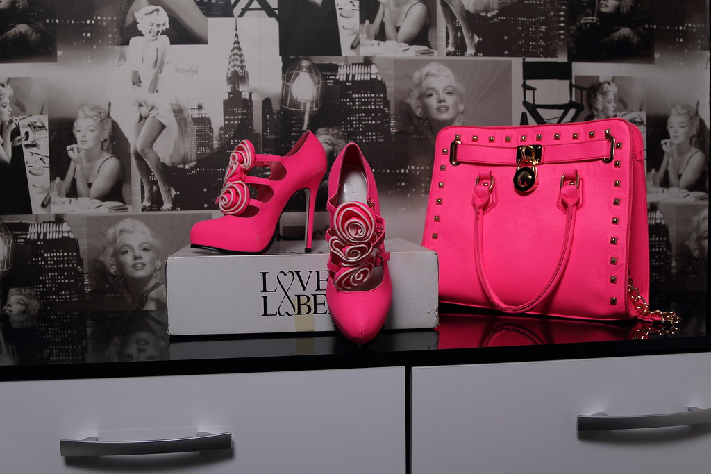
Subject is good and it's along the lines of what I was after this week except I couldn't get hold of my wife's legs. Wait... That came out wrong...
Aaanyway, shoes without feet in them are tough to present without them looking like a product shot and you've done really well using the box to represent them. I like the way you've chosen a background that compliments the image. Good stuff!
- Messages
- 9,095
- Name
- Mandy
- Edit My Images
- Yes
Elegant - I like it looks very elegant indeed, like the use of selective colour I think it works for the image. The crop works well.
- Messages
- 8,398
- Name
- Lynne
- Edit My Images
- Yes
Hi Rab
Elegant.....for me , that's your best shot so far.....crop works much better , I'm partial to SC anyway but it really works in this image....I love your choice of BG images
The only minor niggle is the shoe box (& I think it's the tape on it that causes the problem)....it might have worked with just the shoes ..... BUT , it's still a great shot
Elegant.....for me , that's your best shot so far.....crop works much better , I'm partial to SC anyway but it really works in this image....I love your choice of BG images

The only minor niggle is the shoe box (& I think it's the tape on it that causes the problem)....it might have worked with just the shoes ..... BUT , it's still a great shot

- Messages
- 1,237
- Name
- rab
- Edit My Images
- No
cheers guys&girls ok next one i havent been out much this week as im loaded with the cold and on a bit of a downer as i droped my lens on sunday before i even started taking photos of a football match so had to use my 24-105L dont know if its on theme but if you look you can see the sweat flying off his head
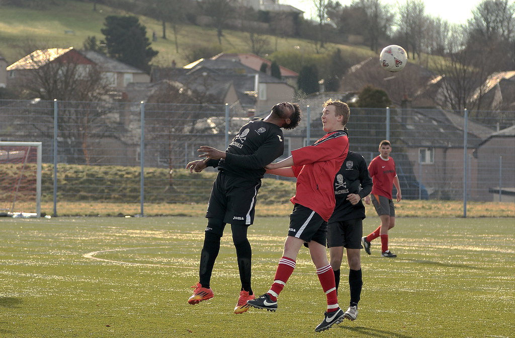 ugfc player by hoochy1, on Flickr
 ugfc player by hoochy1, on Flickr
- Messages
- 29,465
- Name
- Bat-Frog
- Edit My Images
- No
I see the sweat rab....and sweat is watery!
Oddly, with those two players off the ground, it has the effect of making the shoot look almost 3D, especially if I focus on a point right between the two of them.
It also reminds me of one of the old "Spot the Ball" competitions that used to accompany the Pools
Oddly, with those two players off the ground, it has the effect of making the shoot look almost 3D, especially if I focus on a point right between the two of them.
It also reminds me of one of the old "Spot the Ball" competitions that used to accompany the Pools
SarahLee
TPer Emerita
- Messages
- 13,060
- Name
- Sarah
- Edit My Images
- No
Definitely a bit of crowbar usage there to squeeze the shot into the theme . . . and I almost wish you hadn't drawn my attention to the sweat 
I know next to nothing about sports photography, but I think you've done a great job of freezing the motion.
Like Ruth said, almost a 3D feel to it.
I wonder if a bit of a crop from the LHS and top would work to remove that patch of bright white sky.
I'm finding it's grabbing my attention a bit too much, but not sure whether cropping would leave the ball too close to the edge of the frame.
- Messages
- 4,182
- Name
- Paul
- Edit My Images
- Yes
Hi Rab... well I have to say, for your first attempt with a softbox your Elegant shot is great! You've got a great reflection from the handbag and no harsh shadows, as you'd expect from that sort of modifier. How big is it and how far away from the scene was it? The only reason for asking and a tiny thought for your next shot: softboxes are great a throwing a lot of very even light onto subjects, but sometimes for matte materials (like the shoes, by the look of it) this soft even light can leave them looking less shapely and a bit formless... almost flat. This can sometimes be managed by throwing a little directional light (e.g. bare flash with snoot) onto that single object to try to bring out some of the surface texture (works with suede and more textured leather).
Still a cracking shot and well done you (and the crop is better still!)
Watery - another belter. Great expressions and superb capture of that sweat!
Still a cracking shot and well done you
 (and the crop is better still!)
Watery - another belter. Great expressions and superb capture of that sweat!
- Messages
- 9,095
- Name
- Mandy
- Edit My Images
- Yes
Watery - bit of a shoehorn used ( not to worry, we all do it ) a good action shot well done. And I can just about make the sweat out falling off the guys head.
- Messages
- 9,075
- Name
- David
- Edit My Images
- Yes
... exactly what @sturisoma said.
- Messages
- 1,237
- Name
- rab
- Edit My Images
- No
cheers guys and girls ok here is two fast crops
 IMG_2495oooooooo by hoochy1, on Flickr
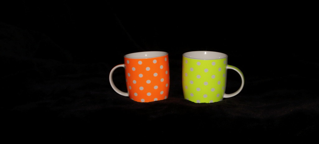 IMG_2495oooooooo1 by hoochy1, on Flickr
 IMG_2495oooooooo by hoochy1, on Flickr
 IMG_2495oooooooo1 by hoochy1, on Flickr
Last edited:


 IMG_0935
 IMG_09350000000000000-crop
 IMG_2495
 IMG_2663