weekly LC2's 52 for 2015 Thread - Week 52 : Christmas

Figures - I like both shots, can't help but think that the first would fir the Bizarre theme quite well

Household - nicelŷ composed and fits the theme, only thing is that it looks a little soft (could be my screen although the others look ok)

Broken - nice use of the fence as a lead in. (y)
 
Both good Tim. The first is quaint and has greater historical value. However, I prefer the second - it has colour and interest but most importantly to my mind, showing the environment "grounds" the image which adds to it. Nice work.
Cheers Carl. Photo 2 has a nicer DoF, I agree, but the subject matter isn't as good IMO.

Gonna have to pick my favourite as time is against me.

Broken, we spotted and decent angle, I'd have been tempted to get close and fill the frame more.

Cheers.

Hi Tim :wave:

Household - I understand your frustration with trying to get an unobtrusive background while keeping the subjects in focus. I invested in a couple of cheap single bed sheets, 1 black, 1 white, which give me a plain bg when I want one.

Broken - not only is it a breakwater but the fence is all broken up too :) but you are such a wuss :whistle: not wanting to get down and dirty. I have had a facefull of sand on more than one occasion for these challenges :LOL:

Limit - like the quaintness of the first shot but it's a bit too central for me. The second shot is much more interesting and I like the perspective too (y)
Jill, Andy, Perhaps I should have made more of an effort to clamber back down onto the beach, but that would mean exercise ;)
Jill, You and Carl prefer the 2nd of my Limit shots. I do understand what you both mean and technically it probably is the better one, but... Perhaps I'm just too used to the signs in it.

Figures - I like both shots, can't help but think that the first would fir the Bizarre theme quite well

Household - nicelŷ composed and fits the theme, only thing is that it looks a little soft (could be my screen although the others look ok)

Broken - nice use of the fence as a lead in. (y)
Cheers Chris. I guess the edit in Figures could be bizarre, I do have a shot in mind (aiming to take it tomorrow in Calais on my way to Le Mans)
Household - The focus is on Sergey, Oleg is a bit soft even though the appeture was f3.2.
 
Hi Tim :)

Household - I agree with Elaine & Jill about the background - I'm no stranger to background issues myself - :oops: :$, but love the meercats

Broken - I really like this one, and well done on getting more than one broken into tthe same sht!

Limit - another vote for the second shot - it says so much more than the first (y)
 
broken - love this shot altho on my screen it looks a teeny bit bright
limit - they both have merit; the 1st one is a better sign but I like the wider angle of the 2nd, bringing more of the station into it gives it interest and perspective

both equally good tho :)
 
Thanks for all the comments.
Broken - I take on board the comments about the point of view and angles, but I'm pretty happy with it. I could crop in order to make it appear I was closer, but I think it would lose context.

LImit - I agree with the comments, the second shot is more interesting with the background, whereas the first has teh more interesting subject. It's a shame I couldn't combine both ;)
 
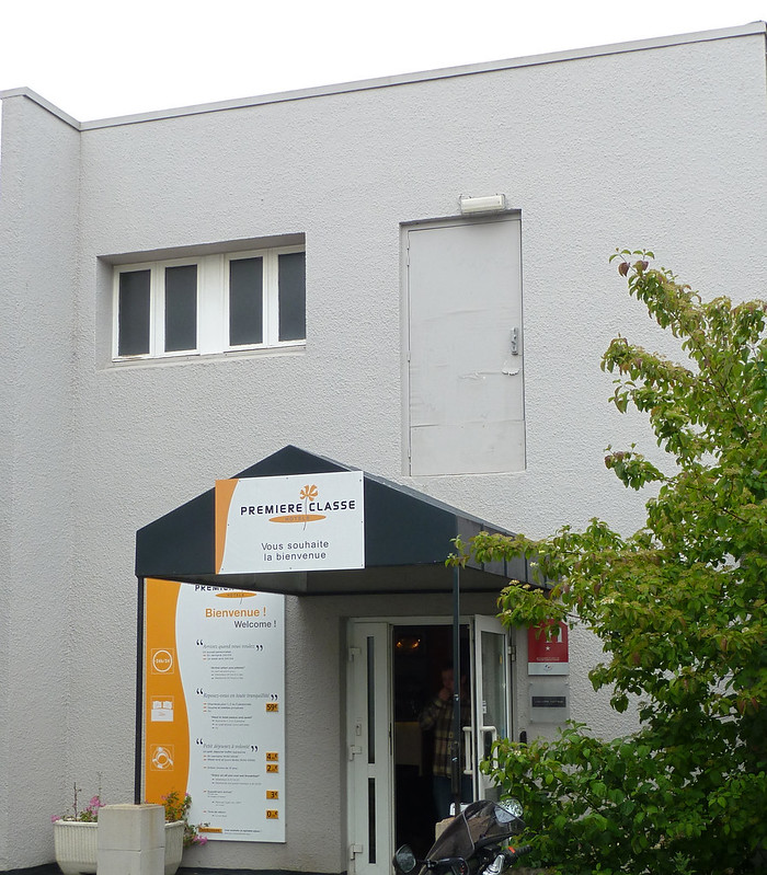
Hi, the French and their weird ideas:thinking: looks a classy place and certainly bizarre, I would have cut the sky out all together
nicely spotted
 
That is very bizarre. Agree with Allan about the crop but nice shot nevertheless.
 
Bizarre: Well spotted does good to look up sometimes. Took me a moment or too to get the bizarreness but I did when I looked up. For me looks better with the sky included
 
Thanks everyone.
It is a classé place Allan, especially at €39 per night for a twin room. Still, it's not too bad for a single night on the way down to Le Mans.
I did crop most of the sky from my original shot, but felt keeping it in gave context to the doorway / building
 
Hi, fits the theme, the biggest distraction for me is the sign right of the microphone, not worried about the supposed slight softness, (what is this obsession with sharpness :thinking:)

What on earth is MFA or am I just being stupid, anyhow works well for the theme (y)
 
Hi Alan, MFA - Micro Focus Adjustment, i.e dialing the lens in to the body.
There was a power circuit box to the left of the good lady singing, which was removed in PS, Whilst I could have had a go at removing the sign, I would probably have messed it up. There was no way to re-position so it was out of shot as there is only so much width to a train platform and while using the 50mm prime I had to keep a certain distance.
 
Week 25 : Silhouette
Finally... Caught up :)


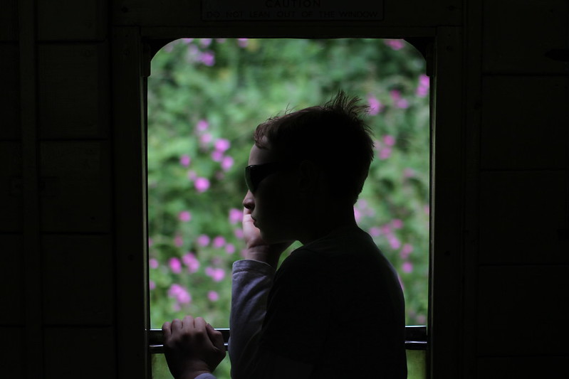
Week 25 : Silhouette
by Tim White, on Flickr

Not a perfect silhouette, but I felt this was a pretty good shot of my young lad looking out of the window of a speeding train.

Week 24 : Spiral (Catchup)


Week 24 : Spiral
by Tim White, on Flickr

Two for the price of one in this shot.
Which did you spot first, the lamp post or the snail shell topiary?
 
Hi Tim

Love the colour a clarity of Limit #2

And Silhouette is a cracker ... best Silhouette so far even if it's only a partial one. An excellent portrait.
 
Last edited:
Hi Tim,

Entertain - Nice taken image - nothing wrong with soft. Suits the subject I think. Wonder what it would be like in sepia to suit the era?
Silhouette - Works for me. Looks great. :clap:
Spiral - Not a terribly interesting shot really but fits the theme.
 
Hi Tim

Love the colour a clarity of Limit #2

And Silhouette is a cracker ... best Silhouette so far even if it's only a partial one. An excellent portrait.

Thanks d00d. The lad does photograph well (I may be biased) and hasn't gotten to the age (yet) of hating having his photo taken (unlike his sister). It wasn't the easiest shot to get right, as with the train moving, the back light was constantly changing.

Hi Tim,

Entertain - Nice taken image - nothing wrong with soft. Suits the subject I think. Wonder what it would be like in sepia to suit the era?
Silhouette - Works for me. Looks great. :clap:
Spiral - Not a terribly interesting shot really but fits the theme.

Cheers Carl.
I looked at Sepia for Entertain, I don't think it really adds anything (but I was just using the default in Picassa for a quick look).
I think that Sihouette works really well too. Pondering printing it (or having it printed).
Spiral - so which did you spot first then?
 
ah I was meant to go to the war event, totally forgot about it though :(

love your shot :)

silhouette I love this one, and still on the train theme - you're doing well :clap:

spiral, well yes, it is a spiral, but it's a bit lost with all the foliage (should have stuck to a train shot ha ha) :p
 
ah I was meant to go to the war event, totally forgot about it though :(

love your shot :)

silhouette I love this one, and still on the train theme - you're doing well :clap:

spiral, well yes, it is a spiral, but it's a bit lost with all the foliage (should have stuck to a train shot ha ha) :p
Cheers Summer.
I was there both days, spent the Saturday running the bar on the RAT stock, and the Sunday with my young lad who loves all the military stuff as well as the trains.
Spiral was still a train shot. That's Medstead & Four Marks station :)
 
Silhouette, he looks deep in thought. The hand looks a little odd, i.e. chopped off and I might have liked portrait orientation, but the light on his face and the flowers in the BG work well.

Cheers.
 
Cheers Andy.
I know what you mean about the hand, a case of looking but not seeing it when taking the shot.
I guess he was hanging onto the door as we were moving.
I think I was probably concentrating on getting the shot to silhouette rather than triple checking the content.

One for the next re-shoot, the next time he comes along to the railway with me (and it's sunny).
 
Hi Tim,

Entertain - I really like this, well on theme. It is a bit of a shame about the box thing on the rhs, but I can see that it would have been a nightmare to clone and as you say, you've got very little room to play with on a railway platform so I think you've done very well :)

Silhouette - I think it works well for the theme and it is a good shot :)

Spiral - this one isn't working for me - I'm sorry, I think the snail's shell is just too hidden to come across strongly enough :)
 
Week 26 - Animal

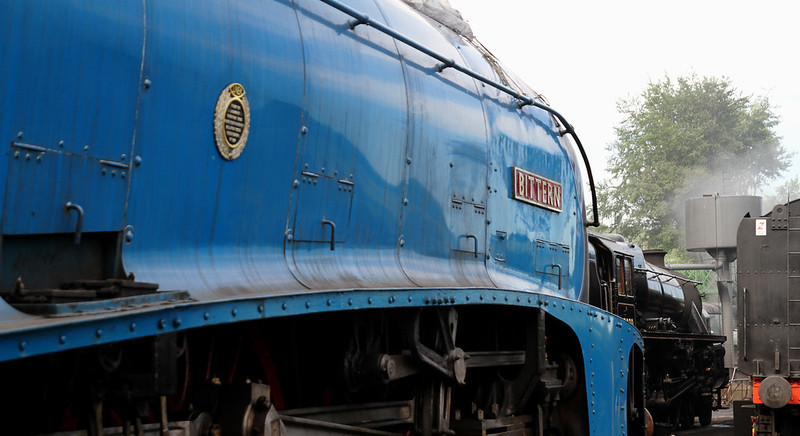
bittern

noun
1. any wading bird of the genera Ixobrychus and Botaurus, related and similar to the herons but with shorter legs and neck, a stouter body, and a booming call: family Ardeidae, order Ciconiiformes


Bittern
by Tim White, on Flickr

Doing my best to take a completely non obvious shot for this week.
(It was this or fluffy kittens, and the interweb has enough of those already)
 
Last edited:
Hi, good to see a different take on the theme, not sure that's the best angle of the train, but then I don't take pictures of trains, I am sure there are limitations to where you can get pics from?

I would like to see something a little different from trains, I understand it's what you enjoy though and it's your 52 feel free to ignore me
 
Cheers Carl & David :)

I just had a look back through the 26 Allan, and yes, there does seem to be quite a lot that are railway related. I have managed some (maybe 50%) that aren't, and I've not managed to fi my other passion, motorsport, in at all - I guess it's harder to fit motorsport into a weekly subject, whereas it's asy to get down to the line. Rest assured, I have something different planned for Medicine.

Angle, there may have been a better angle, but head on 3/4 shots are pretty much de-rigour and I wanted something different.
I had to try to avoid both the sun and a stack of abandoned pallets, so this was probably the best angle whilst showing the name plate prominently.
 
Hi Tim, a bit of a catch-up for me as I've been away.

Bizarre - made me laugh out loud. Well spotted, and as someone else says, it pays to look up!
Entertain - fits the theme well and although the sign in the background is slightly distracting we all know that sometimes there's nothing you can do about it.
Silhouette - this is a cracker! I love his thoughtful pose, the partially lit edges of his hair and face, and the pretty background. Nicely done.
Spiral - fits the theme, and well done on getting two spirals in the frame :) but it's a little too cluttered for me. I would like to see a closer view of either on its own as the main subject though, especially the snail.
Animal - that's a different take on the theme, and it's an impressive 'beast'. My Dad had a massive soft spot for the A4 class so it's a (y) from me :)
 
Nice one Tim. Again a slightly off-beat take. Not sure of the difference, perhaps more sugar, but prefer #2. Could try a full top down shot with a few grains scattered around !?!?
 
Interesting, different idea Tim (not a train in sight). I prefer #2 ... the bowl of the spoon looks distorted in #1.
 
Hi, #2 for me, I prefer the look of the sugar. Pity the rhs of the spoon is slightly OOF.

I think there are better composition to be had with the one.

Cheers.
 
Hi, agree with Andy not the best composition, maybe a view from above might have been better :thinking:
 
Back
Top