weekly Mandy's 2015 52 challenge Week 11 Crowd added

Scenic: I am liking the golden glow feel to the photo.

Companions. For me I am liking the way the lighting has worked on this shot. Shame the second duck didn't play ball and face the camera.

Elegant. Swans very elegant indeed. For me its your second picture, nothing more elegant than a swan being in water. Also like the letterbox style. Must try this one day:thinking:

great that you are trying new editing> it's certainly a new learning curve for me.

Hi Mandy quick catch up.
Scenic - yes its a tad dark but a nice shot I like it.
Companions - No comment ;)
Elegant - Shot 2 for me and pos my favorite of all the swan pics this week.

Elegant 2 for me Mandy, nice one.

Phil

Thanks for taking the time to look and comment.
 
Elegant 2 for me Mandy.
Swans look so effortless on the water.
 
Hi Mandy,

#2 is much more 'elegant' for me, bang on theme, I do feel the crop is a little tight though. Colours are great and overall I like the image, good job!
 
Hi Mandy,

Elegant 2 for me. Swans out of water are anything but elegant, in water they are much more graceful/ elegant. Although I agree with others that the crop is too tight and it needs a levels tweak :)

Elegant 2 for me Mandy.
Swans look so effortless on the water.

Hi Mandy,

#2 is much more 'elegant' for me, bang on theme, I do feel the crop is a little tight though. Colours are great and overall I like the image, good job!

Thanks all for dropping by.
 
Well where has the time flown to we are in MARCH already :eek:, as mentioned in another post I made. I took some time away from this site, to focus on finding work which I am glad I did. As it has all finally paid off for me, so come the 16th of march I go on my induction day for my new position and I am all excited :banana::banana:.

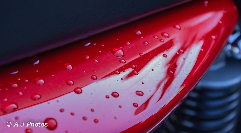
Week 6 theme watery I did have another image in mind, but when I looked at this image I new that this was the image for me. It's of the back of my bike after it had a good wash and several coats of polish to protect it. After all that nasty horrible winter weather and salt on the roads from the gritter, I picked this image simply because I liked the water droplets that had formed on the bike after being bombarded by hailstones earlier on.

watery
watery by pinkbikerbabe 1, on Flickr

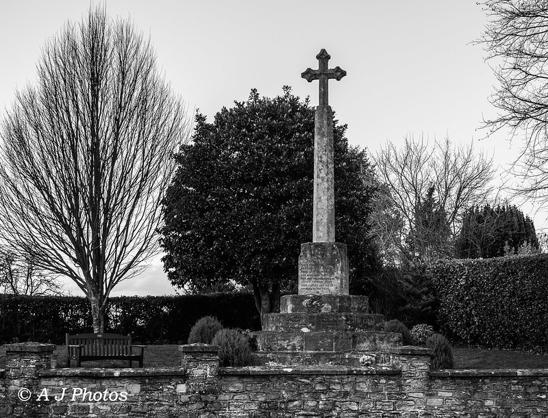
For the " BOLD " Theme that has given me nothing but a headache, thought of a product shot. Though I decided that would be the obvious choice for the theme, so I went back to the drawing board and came up with something else. This image may need some liberal use of the crowbar but I thought of a war memorial, which symbolises the BOLD brave soldiers who went and fought in the war. But sadly didn't make it back home safely as a result of loosing theirs life's fighting for our country.

Bold
Bold by pinkbikerbabe 1, on Flickr

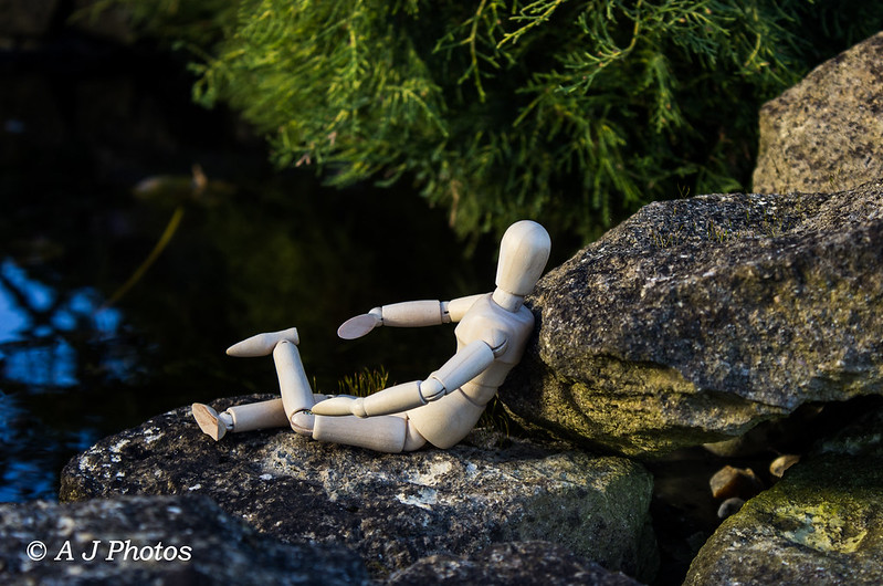
Moving swiftly on to week 8 I really wanted to have a go at doing something a little fun and creative, just before Christmas I ordered my own little wooden mannequin. so I felt this was the perfect them to bring him out to play with. A simple idea of Mr Woody RELAXING by the pond, enjoying a little bit of rare sunshine.

Relax
Relax by pinkbikerbabe 1, on Flickr
 
Hi Mandy

Watery ... good interpretation, like the water droplets on the shiny red paintwork, and the OOF suspension (I think).

Bold ... top interpretation, would rather see this in colour but do understand your reason for B&W.

Relax ... haha wooden mannequin eh! they can say a lot.
 
Hi Mandy glad you have managed to find a job. Always good news. Looks like we have both had a bit of a catch up to do.

Watery, I really like the abstract nature of this shot, great idea and well executed.

Bold
Well great minds think alike, definately fits the theme for me and no crowbar needed. I like the gritty b&w , adds to the nature of the shot.

Relax
Looks like fun, I should get one of those little wooden models they look useful. Like it, nice and relaxing by the water.
 
Hi Mandy

Watery ... good interpretation, like the water droplets on the shiny red paintwork, and the OOF suspension (I think).

Bold ... top interpretation, would rather see this in colour but do understand your reason for B&W.

Relax ... haha wooden mannequin eh! they can say a lot.

Thanks for stopping by and commenting.

Hi Mandy glad you have managed to find a job. Always good news. Looks like we have both had a bit of a catch up to do.

Watery, I really like the abstract nature of this shot, great idea and well executed.

Bold
Well great minds think alike, definately fits the theme for me and no crowbar needed. I like the gritty b&w , adds to the nature of the shot.

Relax
Looks like fun, I should get one of those little wooden models they look useful. Like it, nice and relaxing by the water.

Thanks for taking the time to look and comment much appreaciated.
 
Hi Mandy, congratulations on your job :banana: "watery" some nice drops there, maybe you could have got a bit closer but works for the theme

"Bold" i get it with your explanation,
"Relax" not sure if woody looks like he has fallen from a great height and landed awkwardly (only Joking) it's a nicely exposed image, a little central would like to see what he is looking at

Well done for the catch up (y)
 
Hey Mandy... Congratulations on the new job![emoji6]
Watery - shiny shiny! Nice rich colour - all works for me.

Bold - good interpretation for the theme and the B&W adds a certain gravity to the pic, works great as is, possibly just a close up of the memorial inscriptions would have been good too?

Relax - imaginative! Love it
 
Watery: a nice abstract shot. Love how it fills the frame and the way you've cropped.

Bold: a good gritty image. Works well in b&w

Relax: a typical male relaxed pose. Love the quirkiness of the photo. Off to google Mr Woody now. More space to make ready for his iminent arrival.
 
Nice catch up Mandy, I like all three, nice interpretations (y)
 
Good to hear about your new job.

Watery; I like that, nice colour of red, good composition and the right amount of dof.

Bold; just the mention of war memorial said it all about the brave and boldness of those young men.

Relax; again I like the composition of this one too.

Hi Mandy, congratulations on your job :banana: "watery" some nice drops there, maybe you could have got a bit closer but works for the theme

"Bold" i get it with your explanation,
"Relax" not sure if woody looks like he has fallen from a great height and landed awkwardly (only Joking) it's a nicely exposed image, a little central would like to see what he is looking at

Well done for the catch up (y)

Hey Mandy... Congratulations on the new job![emoji6]
Watery - shiny shiny! Nice rich colour - all works for me.

Bold - good interpretation for the theme and the B&W adds a certain gravity to the pic, works great as is, possibly just a close up of the memorial inscriptions would have been good too?

Relax - imaginative! Love it

Hi Mandy, good new about your new job.

Watery.
Love it, nice DoF. fit the theme like a glove.

Bold
Nice image and the B+W fits the image.

Relax
looks like woody is have a good old knap. Great idea, think we should all order a Woody.

Watery: a nice abstract shot. Love how it fills the frame and the way you've cropped.

Bold: a good gritty image. Works well in b&w

Relax: a typical male relaxed pose. Love the quirkiness of the photo. Off to google Mr Woody now. More space to make ready for his iminent arrival.

Nice catch up Mandy, I like all three, nice interpretations (y)

Thanks everyone for taking the time to view and comment on my images, and I am pleased that they are getting some good comments and feed back so thanks very much.
 
Really nice shots for watery, bold and relax. So sharp! I love the relax one with the little figure! The vertical one does fit the theme very nicely. :)
 
Congratulations on the new job Mandy, that's got to feel pretty good :)
Great job on catching up.

Watery: I love seeing water droplets on clean paint; there's something so ...fresh...about it.

Bold: Your explanation is great, but a war memorial would fit the theme for me even without it. Bold men / boys indeed.

Relax: The only thing not working for me on this is the lower left leg, but I realise these little fellas aren't as pliable as the real thing ;)

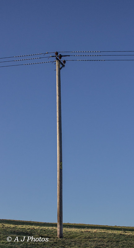
And finally Vertical: This I really do like. Simple, and in a way, stark.
The slope of the horizon makes this.

Good to see you back!
 
Vertical, clean and simple, I like it (y)
 
yep, I also love the simplicity of vertical :) I often take ppics of pylons and poles cos they attract me ha ha (weirdo)
 
Really nice shots for watery, bold and relax. So sharp! I love the relax one with the little figure! The vertical one does fit the theme very nicely. :)

Congratulations on the new job Mandy, that's got to feel pretty good :)
Great job on catching up.

Watery: I love seeing water droplets on clean paint; there's something so ...fresh...about it.

Bold: Your explanation is great, but a war memorial would fit the theme for me even without it. Bold men / boys indeed.

Relax: The only thing not working for me on this is the lower left leg, but I realise these little fellas aren't as pliable as the real thing ;)

And finally Vertical: This I really do like. Simple, and in a way, stark.
The slope of the horizon makes this.

Good to see you back!

Vertical, clean and simple, I like it (y)

yep, I also love the simplicity of vertical :) I often take ppics of pylons and poles cos they attract me ha ha (weirdo)

Thanks for taking the time to look and comment.
 
Hi Mandy,

Congrats on your new job :)!

watery - yes, a good fit for the theme and I like it that you've kept it fairly simple.

bold - good choice for the theme and the mono works well

relax - this one made me smile - nice shot:)

and vertical - I agree with the others, a nice clean shot, very fitting for the theme
 
Congrats on the job Mandy :)

Really like watery, nice sharp droplets on a super shiny finish :D

Relax- well exposed with a nice DOF, the legs look a little awkward to me though (y)

Bold - totally on theme and nicely done too, I think it would lend itself to a nice bit of selective colour in the form of some nice Poppy's (had there been any around)

Vertical- simple but very well done (y)
 
Last edited:
Hi Mandy,

Congrats on your new job :)!

watery - yes, a good fit for the theme and I like it that you've kept it fairly simple.

bold - good choice for the theme and the mono works well

relax - this one made me smile - nice shot:)

and vertical - I agree with the others, a nice clean shot, very fitting for the theme

Congrats on the job Mandy :)

Really like watery, nice sharp droplets on a super shiny finish :D

Relax- well exposed with a nice DOF, the legs look a little awkward to me though (y)

Bold - totally on theme and nicely done too, I think it would lend itself to a nice bit of selective colour in the form of some nice Poppy's (had there been any around)

Vertical- simple but very well done (y)

Thanks for dropping by
 
Hi Mandy, some great images, I love the watery image, definitely fits the theme, relax is a great fun image and vertical is simple but effective.

All work for me.
 
I'm a big fan of telegraph poles (no idea why), I often find it difficult to get a new take on the theme, but I really like this. With the framing it almost shouldn't work, but it certainly does. I really like it.

Karl
 
Yep, simplicity ... very effective. One of my favourite verticals of the week.

Hi Mandy, some great images, I love the watery image, definitely fits the theme, relax is a great fun image and vertical is simple but effective.

All work for me.

I'm a big fan of telegraph poles (no idea why), I often find it difficult to get a new take on the theme, but I really like this. With the framing it almost shouldn't work, but it certainly does. I really like it.

Karl

Vertical; it says exactly what it says in the image, simple and I like it. :clap:

Thanks all for the comments and for taking the time to look.
 
Catch up from me

Watery - Brilliant. Its simple but so effective
Bold - Works well and better for being B&W no doubt
Relax - Nice idea although Woody looks a little uncomfortable to me.
Vertical - again simple but effective
 
Well the weeks are flying bye so it seems, onto week 10 :jawdrop:. With time going past so quickly I did not want to fall to far behind, as my start day in my new job is looming closer and closer. So today I made the most of the sunshine and went for a walk to see, what I could find for the theme.
Nothing much inspired me for the theme I have to say, so this is more a good old PABD of a ducks bill " MOUTH " . Nothing much done in the way of pp work other than a colour boost, bit of clarity and a close crop.

Mouth
Mouth by pinkbikerbabe 1, on Flickr
 
And so we get the joke:

How do you turn a duck into a 1970's soul singer? Put him in the microwave until his bill withers.

You had to be there.

Nice duck.
 
Back
Top