weekly Marks' TP52 2018 Will He Actually Complete It??? Weeks 18 - 20 Added

I too like the first Wet, the spray sort of blends in with the clouds. :)

Jux .............. Honestly, the things we get up to in the name of art! :confused::D

Thanks David tell me about it I'm sure my friends all think I'm going mad!

Definitely the first Wet image for me, Mark. The monochrome brings the out the details of the rain drops much better and adds to the sense of dismal grey weather (y)

Well done on thinking for something for Juxtaposition; it's a tricky theme and you've provided two clearly contrasting subjects in the frame.

Thank you Andrea

Hi Mark,

Wet - The B&W one for me, it kind of has an ageless feel to it (apart from the dash) which the colour one doesn't. I think the openness of the image helps too.

Juxtaposition - On theme and you've done a good job of not blowing out the fire whilst keeping blacks in the image nicely too.
What is the purple dotted line? An editing artifact?

Thanks Tim I hadn't noticed the purple line! The only editing I did was to crop the original image so no idea what it is will have a look at the original file and see if it there :confused:

Wet - first image for me, simple and fits the theme.
Juxtaposition - I get the hot and cold connection, I am wondering what the purple dotted line is? and i think the image could use a little straighten the wood burner looks wonky to me.

Thanks Mandy I have a feeling the wood burner has move round slightly (I need to straighten it up when its cold!)
 
Your B&W shot for wet is great, nothing to criticise!

And I like the idea of fire and ice for juxtaposition too, good thinking!
 
Wet - I think the first one is better maybe the framing is better not really sure.
Juxtaposition - Fire and Ice good choice for the theme
 
Your B&W shot for wet is great, nothing to criticise!

And I like the idea of fire and ice for juxtaposition too, good thinking!

Thanks Bernd

Wet - I think the first one is better maybe the framing is better not really sure.
Juxtaposition - Fire and Ice good choice for the theme

Thanks Minx appreciate your comments

Juxtaposition, on theme and done with. Yes, I get that PABD feeling sometimes too.

Thanks Stan I seem to be getting the PABD feeling a lot more recently
 
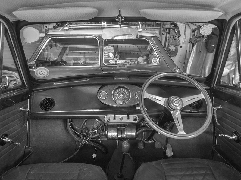
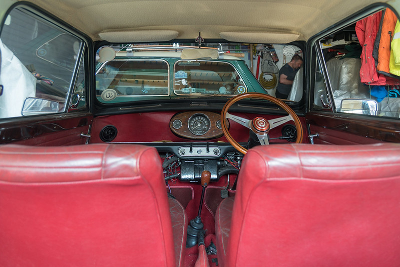
So on to Week 13 and Oval it's taken me ages to get this shot due to the weather. 2 of the Mins in the garage are from the 60's and have the center clocks so perfect for the theme

Not perfect as I would have liked to get the car out of the garage but the weather and time have both been against me!

WEEK 13 OVAL (1 of 4)BW by Mark Gameson, on Flickr

WEEK 13 OVAL (1 of 4) by Mark Gameson, on Flickr

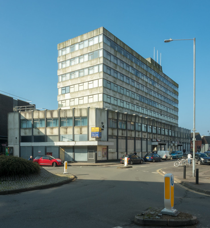
WEEK 13 OVAL (2 of 4) by Mark Gameson, on Flickr

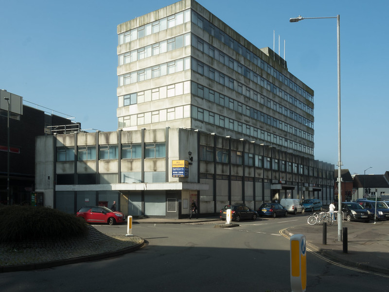
WEEK 13 OVAL (3 of 4) by Mark Gameson, on Flickr

WEEK 13 OVAL (4 of 4) by Mark Gameson, on Flickr
 
The second one for oval, I like the deep red!

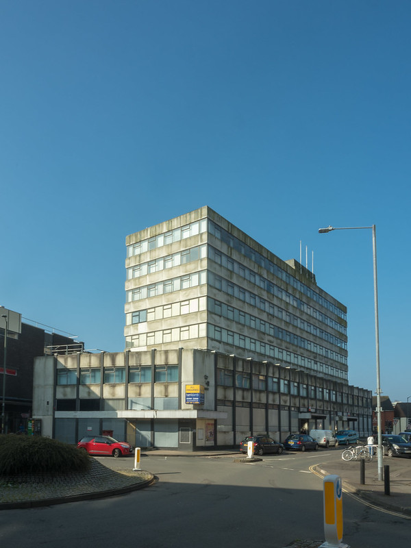
And the first one, where you don't cut off the top of the building, for unattractive!
 
I need to get Straight sorted trying to come up with a few ideas that haven't already appeared.
 
Oval, may be a closer shot of the instrument panel, assuming that's the oval you were going for?

Unattractive, certainly fits the bill but what's all that blue, shouldn't the sky be uniformly grey :), it always is here
 
Oval, may be a closer shot of the instrument panel, assuming that's the oval you were going for?

Unattractive, certainly fits the bill but what's all that blue, shouldn't the sky be uniformly grey :), it always is here

Thanks Chris I wanted to get a closer shot but I was having to shoot handheld as I couldn't fit a tripod and myself on the backseat! I wanted to shoot it out side as it would have been easier with the light but sadly it wasn't to be.

Ha ha o=on of the rear days of blue sky I had to be quick in case i scared it off by getting the camera out!!:LOL:

Oval good shots so all on theme, thought you might use a Mini.
Unattractive is very ugly indeed so well done.

Thanks Dave it had to be done I was going to use our MINI but as I was beaten to both the Mirror and headlight shot I decided to go old school!
 
Oval ... I like colour but fine the coats RHS distracting ... so #2 for me.

Kidderminster eyesore ... certainly is! Stands out well against that sky but there's some nasty shadows there ... wondering what it would look like with the FG cropped?
 
Oval ... I like colour but fine the coats RHS distracting ... so #2 for me.

Kidderminster eyesore ... certainly is! Stands out well against that sky but there's some nasty shadows there ... wondering what it would look like with the FG cropped?

Thanks David I did look at cropping the foreground but wasn't sure I'll have an other look at it.
 
Good ideas for the last two themes, Mark. I do really like the warm colours in Oval #2 but I find the background a bit distracting. The B&W version is less distracting and helps to draw attention to the shapes rather than the colours, but it's not so appealing. I would love to see a reshoot when the weather is better and you can get the car outside as the colours are fab (y)

For Unattractive, either #1 or the final cropped version are the best for me. They both show off the brutal architecture and #1 also shows the general unattractiveness of a built-up town centre.
 
No2 oval for me Mark, I just prefer the processing....
That is not a pretty building for sure either.....
 
Oval - Oval 2 of 4 for me Mark. The processing looks vintage which suits the BL Mini whilst retaining colour.
Unattractive - I like the cropped version, but somehow prefer the colours in the 3rd original. Some people are never satisfied eh? ;)
 
Oval - I like the first colour one best
Unattractive - an ugly old tower block indeed I think the last one is the better image
 
Oval; would be better to isolate just the dashboard but you've done well to get the shot in considering you are limited with time.

Unattractive; the final cropped version is the best pick. How about a mono version to enhance the unattractiveness fo the building!

Thanks Stan I am planning to reshoot the dash now the car is back on the road (well it will be if it passes its MOT on Wednesday!)

I did think of a mono conversion but got side tracked and forgot to do one!

Hi Mark, we've got some like that in town and I hate the things, crop works best, and Stan's mono idea is good, perfect for the theme for me.

Thanks Susie :) I'm sure that the building will still be thee in years to come unfortunately

Yes, I think your crop is a good idea, only because I don't like that shadow. (y)

Thanks David :)
 
Good ideas for the last two themes, Mark. I do really like the warm colours in Oval #2 but I find the background a bit distracting. The B&W version is less distracting and helps to draw attention to the shapes rather than the colours, but it's not so appealing. I would love to see a reshoot when the weather is better and you can get the car outside as the colours are fab (y)

For Unattractive, either #1 or the final cropped version are the best for me. They both show off the brutal architecture and #1 also shows the general unattractiveness of a built-up town centre.

Thanks Andrea a re shoot is planned very soon :D

Oval - Oval 2 of 4 for me Mark. The processing looks vintage which suits the BL Mini whilst retaining colour.
Unattractive - I like the cropped version, but somehow prefer the colours in the 3rd original. Some people are never satisfied eh? ;)

Cheers Tim although this one was made a bit before BL's time its a 1968 Worlsey Hornet!

Oval - I like the first colour one best
Unattractive - an ugly old tower block indeed I think the last one is the better image

Thank you Minx
 
Right so I've had a rubbish few weeks but I'm now back too it so first up I best catch up with straight

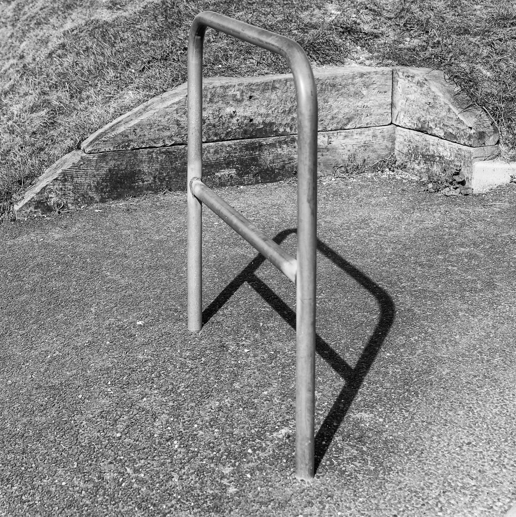
I took this last weekend and only when looking back at the images thought well the bars are nice and straight and it probably works better then my original idea

WEEK 14 STRIAGHT (1 of 1) by Mark Gameson, on Flickr

And here are 2 from images I originally intended take whilst on holiday on a visit to Poole because of the straight lines but I couldn't really get the angel I wanted so it would have been a shoehorn

WEEK 14 STRIAGHT (1 of 2) by Mark Gameson, on Flickr

WEEK 14 STRIAGHT (1 of 2) by Mark Gameson, on Flickr
 
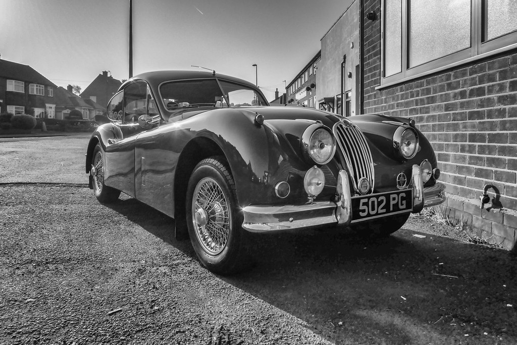
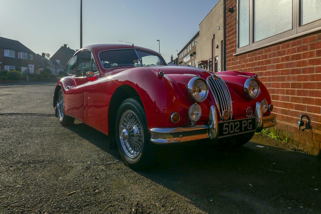
So on to Beautiful many people cite the E-type as the most Beautiful car ever made but I much prefer this

WEEK 17 Beautiful (1 of 1)B&W by Mark Gameson, on Flickr

This is dads 1955 XK140 FHC he's owned it for years (my brother and myself used to be able to get in the back!) he's recently got it back on the road and decided to bring it to work today as it was a nice morning I will try and get a better image with a better background later!

And here it is in colour

WEEK 17 Beautiful (1 of 1) by Mark Gameson, on Flickr
 
Sorry to hear about your loss and good to see you back posting
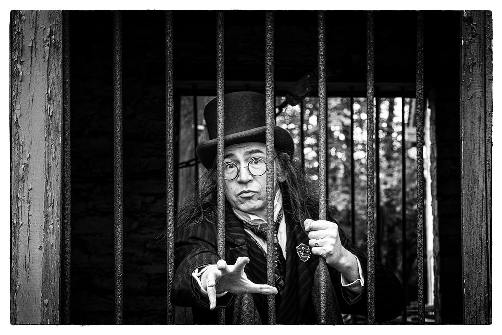
“straight” the guy behind bars works really well
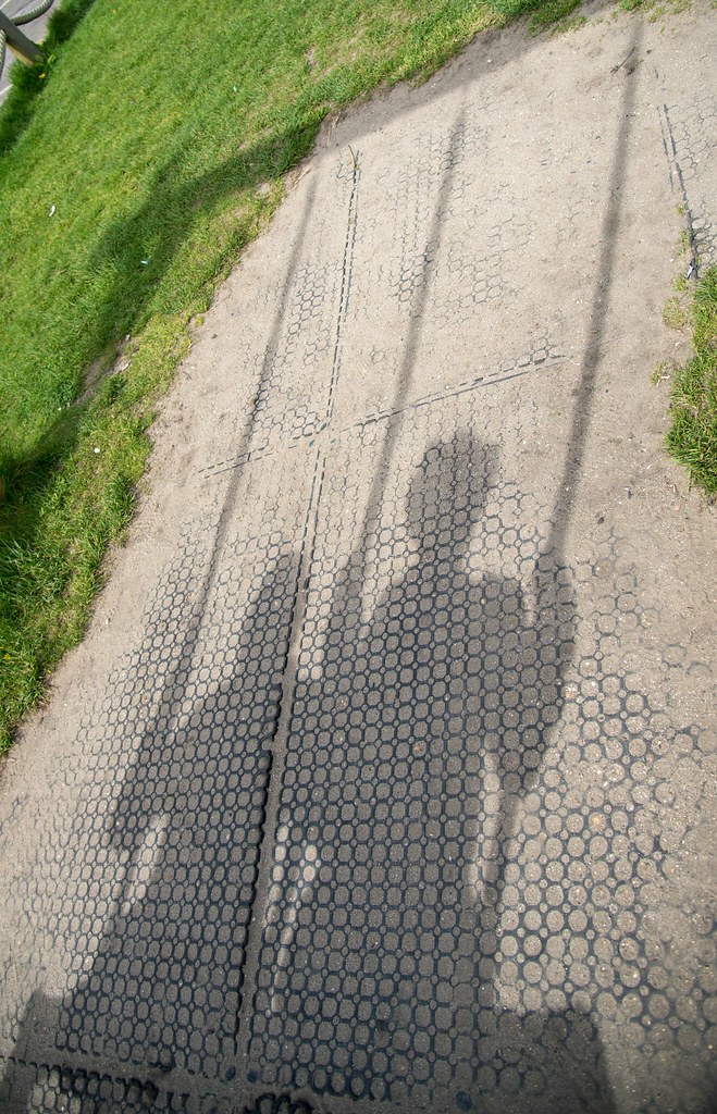
“Shadow” the couple on the swing would work better maybe if it was rotated anti clockwise
“Beautiful” lovely car indeed don’t mind either one but as you say better BG
 
Sorry to hear about your loss and good to see you back posting
“straight” the guy behind bars works really well
“Shadow” the couple on the swing would work better maybe if it was rotated anti clockwise
“Beautiful” lovely car indeed don’t mind either one but as you say better BG

Thank you Allan.

I never though of rotating the image! It's actually my friend and her mom we had a great time on the swings etc in the park (acting our shoe size rather then our age :))

WEEK 16 SHADOW (5 of 7) by Mark Gameson, on Flickr

These were taken at West Bay just after a few of us had walked up the hill formthe beech to the top of the cliff in the process I slipped and fell on the camera! Luckily there was no lasting damage apart form a crack lens hood.
 
Good to have you back Mark, and sorry for your loss.
A great catch up from you, straight is a great shot and goes very well in mono. Colour beautiful for me too, and shadows is on theme.

Thank you Dave I wasn't sure between the colour and the mono for Beautiful
 
Good to see you back again, Mark, and so sorry to read about your doggy. We went through the same thing at the start of the year and they leave a massive hole :(

Good catch up; I really like your image for Straight - it's unusual with the hand reaching towards the camera and the strong eye contact, and suits black and white very well. That's a good selection of shadow images too, and the edit to rotate the one of the pair on the swing is the pick of the bunch; a nice image as well as spot on for the theme :clap: Hard to choose between your Beautiful images; I think the colour version shows off the rich reds but the B&W version makes the most of the smooth lines and curves and helps to minimise the background distractions. I would definitely like to see a reshoot, maybe against a contrasting green background :)
 
Straight - the guy behind the bars for me, really nice mono, plenty of interest.
Last shadow is my pick, good dark shadow and I like the angle
The mono Jag is a real beauty
 
Straight - the guy behind the bars for me, really nice mono, plenty of interest.
Last shadow is my pick, good dark shadow and I like the angle
The mono Jag is a real beauty

Same here, the guy reminds me of the Childcatcher in Chitty Chitty bang bang
The Jag deserves a much nicer BG tho....
Shadow edit nails it...
 
Welcome back Mark.

Straight - Loving the image of the chap behind bars. Great expression, great pose, mono soooo suits it :clap:

Shadow - I'm with you on your choice for the main main thread post. the simplicity of it combined with the contrast directs you to the shadow.

Beautiful - Old jags are lovely. I really like the S Type, but perhaps that's due to it's Gangster heritage. that old XK140 is lovely. I tend to agree with your choice of mono, to remove other distracting colours in the background. (Not that there's much).
 
I like the bloke behind bars, nice find :thinking::runaway:

and the shadow of the two figures. (y)

and the Jag .... irresistible. (y)
 
Back
Top