You are using an out of date browser. It may not display this or other websites correctly.
You should upgrade or use an alternative browser.
You should upgrade or use an alternative browser.
weekly Posiview's TP52 2015. Week 52 Christmas added and FINISHED :)
- Thread starter posiview
- Start date
Brian_of_Bozeat
Jeff
- Messages
- 3,235
- Name
- Brian (not Jeff)
- Edit My Images
- No
HI Andy, I'm a great believer that a family who eats together stays together and even beyond that, many bonds are formed around the sharing of a meal.
I prefer the processing on the first one and I like the way the light falls off to a dark background returning the eye to the family and the table of food. Is Jackie's forehead a bit blown out? minor point, good work.
B.
I prefer the processing on the first one and I like the way the light falls off to a dark background returning the eye to the family and the table of food. Is Jackie's forehead a bit blown out? minor point, good work.
B.
- Messages
- 13,760
- Edit My Images
- Yes
With my eyes again tonight I am struggling to see the difference between the two shots... I prefer the proverb of the second, but in both cases well lit, nice bright eyes and good to catch all of them open... like it 
- Messages
- 19,461
- Name
- Andy
- Edit My Images
- Yes
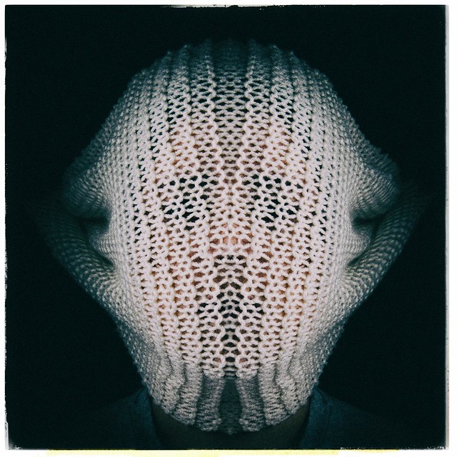
I've been after producing this idea for ages. Saved the material in a.....safe place, went to find it, bl**dy gone.
I had to settle for this material which didn't produce what I was after. Inspired by this Magritte photograph.
Anyways, this will be a reshoot, once I find the bl**dy material
Cheers.
 Week 29 Pale by aNdy sHeader, on Flickr
I had to settle for this material which didn't produce what I was after. Inspired by this Magritte photograph.
Anyways, this will be a reshoot, once I find the bl**dy material
Cheers.
 Week 29 Pale by aNdy sHeader, on Flickr
Last edited:
Brian_of_Bozeat
Jeff
- Messages
- 3,235
- Name
- Brian (not Jeff)
- Edit My Images
- No
Hi Andy. I liked this on Flickr only to see that you had posted it 45 seconds before! Love the symmetry, has it been mirrored? Anyway, super image and better than the one you got inspiration from.
Btw Poor Izzy, how much did this cost you?
Btw Poor Izzy, how much did this cost you?
- Messages
- 2,031
- Name
- Lee
- Edit My Images
- No
Hi Andy,
I'm playing catch up (as usual!)...
Animals: I like both photos but Animals 1 has it for me for the BG image and 2 for the little origami rabbit. Nice touch adding the shadows too.
Medical: What a sinister shot. Great fit to the theme. Just gone overboard with the red eyes IMHO.
Proverb: Good fun shots and good proverbs to go with them. Love the facial expressions
Pale: Interesting photo. I'd not seen the original before. It doesn't sit right with me though. The skin under the material feels like it's a touch too colourful for Pale though if that makes sense or the feel of the photo feels more dark than pale to me - sorry.
- Messages
- 9,075
- Name
- David
- Edit My Images
- Yes
OMG .. yet more horror ... more Hannibal Lecter than Magritte tho my first thoughts were Goats Head Soup.
Your best selfie yet Andy .. regulation full frontal, the material is just perfect: grandma's knitting meets medieval armour.
I don't know about lighting a shot like this but it looks spot on to me.
Your best selfie yet Andy .. regulation full frontal, the material is just perfect: grandma's knitting meets medieval armour.
I don't know about lighting a shot like this but it looks spot on to me.
- Messages
- 19,461
- Name
- Andy
- Edit My Images
- Yes
Hi Andy. I liked this on Flickr only to see that you had posted it 45 seconds before! Love the symmetry, has it been mirrored? Anyway, super image and better than the one you got inspiration from.
Btw Poor Izzy, how much did this cost you?
@Brian_of_Bozeat cheers, mate, you are too kind.
I had two assistants, Isabelle and Hazel...cost me £20.00
Hi Andy,
I'm playing catch up (as usual!)...
Animals: I like both photos but Animals 1 has it for me for the BG image and 2 for the little origami rabbit. Nice touch adding the shadows too.
Medical: What a sinister shot. Great fit to the theme. Just gone overboard with the red eyes IMHO.
Proverb: Good fun shots and good proverbs to go with them. Love the facial expressions
Pale: Interesting photo. I'd not seen the original before. It doesn't sit right with me though. The skin under the material feels like it's a touch too colourful for Pale though if that makes sense or the feel of the photo feels more dark than pale to me - sorry.
@Leebert hi, thanks for the feedback Totally agree with you on Pale, the original material was much finer and would not have shown any skin at all. One for a reshoot
Cheers.
OMG .. yet more horror ... more Hannibal Lecter than Magritte tho my first thoughts were Goats Head Soup.
Your best selfie yet Andy .. regulation full frontal, the material is just perfect: grandma's knitting meets medieval armour.
I don't know about lighting a shot like this but it looks spot on to me.
@d00d Goats Head Soup, thanks for the heads up, never seen that before.
No selfie this week, though, this is my middle daughter
Cheers all.
- Messages
- 13,760
- Edit My Images
- Yes
Now that certainly inst what I was expecting to see, love the symmetry and the lighting Andy, and I don't mind seeing the flesh trough the fabric either, my first thought when I saw it was Doctor Who 

- Messages
- 3,925
- Name
- Carl
- Edit My Images
- Yes
Hi Andy. A very interesting and thought-provoking, mystery, image. Nice texture and lighting. Love it.

- Messages
- 19,461
- Name
- Andy
- Edit My Images
- Yes
Now that certainly inst what I was expecting to see, love the symmetry and the lighting Andy, and I don't mind seeing the flesh trough the fabric either, my first thought when I saw it was Doctor Who
Cheers, Dean @Dark Knight....EXTERMINATE....EXTERMINATE
Hi Andy, very interesting take on the theme, its all been said above about the symmetry, a little disturbing maybe, kind of Japanese horror movie
pity you couldn't find the original material, but it works as it is, very good indeed
Cheers, Allan, @alsjazzera, I was after disturbing
Hi Andy. A very interesting and thought-provoking, mystery, image. Nice texture and lighting. Love it.
Cheers, Carl, @Carl Ayling appreciate the feedback
- Messages
- 19,461
- Name
- Andy
- Edit My Images
- Yes
Great a little sinister but great all the same. For me I'd prefer if the neckline wasn't visible.
No worries. I left some neckline in because I didn't want a floating head
- Messages
- 19,461
- Name
- Andy
- Edit My Images
- Yes
Hi Andy ....not sure about this one, the knitted material just doesn't sit right for me, but I can see what d00d means it does look a bit medieval armourish. I actually think it looks better in the smaller image in you avatar.
No worries, Susie, it wasn't what I was after, but it's growing on me.
Cheers.
- Messages
- 19,461
- Name
- Andy
- Edit My Images
- Yes
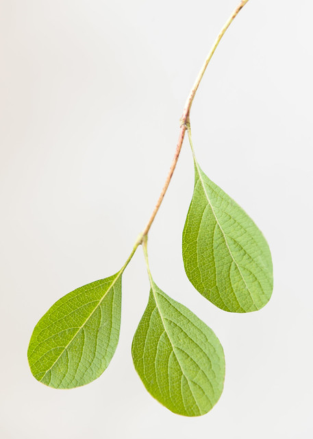
I love it when an idea pops into my head straight away.
I did a bit of PPing on a few edges; and the BG is a little uneven, checked my flashes after I'd uploaded and had one to -1 and one to -2 Lesson learned
Cheers and off to Spurn Point with Lynne shortly :dance:
 Week 30 tears by aNdy sHeader, on Flickr
I did a bit of PPing on a few edges; and the BG is a little uneven, checked my flashes after I'd uploaded and had one to -1 and one to -2
Cheers and off to Spurn Point with Lynne shortly :dance:
 Week 30 tears by aNdy sHeader, on Flickr
Brian_of_Bozeat
Jeff
- Messages
- 3,235
- Name
- Brian (not Jeff)
- Edit My Images
- No
Well, that explains why the link didn't work, there's no "tear" pic here!
Anyway, harsh critique from me on this one, but it's honest.
Very creative, making something look like something else, I like that, so 10/10 for a great idea, but it looks rushed, DOF is very shallow and as a consequence parts of the leaves are OOF, plus there's CA on the bottom leaf which says to me you didn't take your time processing?
He is capable of much better, as I bet they used to say on your school report!
Sorry.
B.
The image and your write up are there now. Forum playing up a little I think.
Last edited:
- Messages
- 19,461
- Name
- Andy
- Edit My Images
- Yes
Well, that explains why the link didn't work, there's no "tear" pic here!
Anyway, harsh critique from me on this one, but it's honest.
Very creative, making something look like something else, I like that, so 10/10 for a great idea, but it looks rushed, DOF is very shallow and as a consequence parts of the leaves are OOF, plus there's CA on the bottom leaf which says to me you didn't take your time processing?
He is capable of much better, as I bet they used to say on your school report!
Sorry.
B.
The image and your write up are there now. Forum playing up a little I think.
Morning, Brian, thanks for the crit, appreciate it
Not getting this, "Well, that explains why the link didn't work, there's no "tear" pic here!"
There isn't any CA, that's the colour from the edges of the leaf.
Shallow DOF, agree, I tried to get a little experimental. Ideally I wanted a much shallower DOF, and managed to get neither too wide or too narrow.
Saying I'm capable of much better is very kind of you.
A long week ahead so I'm sure I'll have chances to produce something else.
Cheers bud.
- Messages
- 11,087
- Name
- Allan
- Edit My Images
- No
Hi Andy, I see where you are going with this, its a nice idea, though I agree with Brian about the DoF the bottom leaf in particular is slightly OOF
I do feel it needs to be sharp all over
BG you have commented on yourself i am sure the people with the bright monitors will be along to say they think its fine, but i can see the difference on mine.
After all that I like it, even if it was a little rushed.
Enjoy your day at Spurn Point
I do feel it needs to be sharp all over
BG you have commented on yourself i am sure the people with the bright monitors will be along to say they think its fine, but i can see the difference on mine.
After all that I like it, even if it was a little rushed.
Enjoy your day at Spurn Point
- Messages
- 3,925
- Name
- Carl
- Edit My Images
- Yes
Hi Andy. Must admit I didn't see too much wrong with the image itself which I thought was quite clear, colourful and detailed. The only thing I did sorta wonder about is the somewhat tenuous link to the theme.
Brian_of_Bozeat
Jeff
- Messages
- 3,235
- Name
- Brian (not Jeff)
- Edit My Images
- No
When I looked first time the pic wasn't there, I think the forum was playing up a bit. Anyway, what you doing on here aren't you supposed to be at sperm point with that Blonde?
Typo? - maybe
Typo? - maybe
- Messages
- 19,461
- Name
- Andy
- Edit My Images
- Yes
Hi Andy, I see where you are going with this, its a nice idea, though I agree with Brian about the DoF the bottom leaf in particular is slightly OOF
I do feel it needs to be sharp all over
BG you have commented on yourself i am sure the people with the bright monitors will be along to say they think its fine, but i can see the difference on mine.
After all that I like it, even if it was a little rushed.
Enjoy your day at Spurn Point
Cheers. Allan, yeah, school boy error with DOF
Hi Andy. Must admit I didn't see too much wrong with the image itself which I thought was quite clear, colourful and detailed. The only thing I did sorta wonder about is the somewhat tenuous link to the theme.
Cheers, Carl, not sure it's a tenuous link, though

When I looked first time the pic wasn't there, I think the forum was playing up a bit. Anyway, what you doing on here aren't you supposed to be at sperm point with that Blonde?
Typo? - maybe
Spurn Point, been there and back now
Looks just great to me .... and most interesting theme interpretation.
Look closely and see imperfections ..... if you want.
Cheers, David
- Messages
- 19,461
- Name
- Andy
- Edit My Images
- Yes
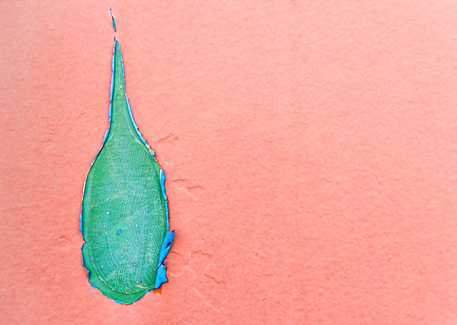
Whilst leaving the toilet at the campsite at Spurn Point I noticed this. Said to Lynne @blondie606, "There's another Tear opportunity for TP52", or I might have just ran, giggling to the car to get my camera 
Cheers.
 Week 30 tear 3 by aNdy sHeader, on Flickr
Cheers.
 Week 30 tear 3 by aNdy sHeader, on Flickr
- Messages
- 3,925
- Name
- Carl
- Edit My Images
- Yes
Strtange thing but I really do like that - colours, texture and composition all there ... plus of course well and truly themed.
- Messages
- 19,461
- Name
- Andy
- Edit My Images
- Yes
Strtange thing but I really do like that - colours, texture and composition all there ... plus of course well and truly themed.
Hi Andy, that does work great colours too
Tear #1 - I was thinking along a similar idea, but yet to pull my finger out. Lovely textures.
Tear #2 - a very nice find indeed.
Thanks all, I do like these 'found' submissions.
Cheers.
Brian_of_Bozeat
Jeff
- Messages
- 3,235
- Name
- Brian (not Jeff)
- Edit My Images
- No
Ooooo you lucky bugger. Nicely shot Andy, love the colours and the texture, it's a cracker. 
- Messages
- 19,461
- Name
- Andy
- Edit My Images
- Yes
Ooooo you lucky bugger. Nicely shot Andy, love the colours and the texture, it's a cracker.
Cheers, Brian.
Def teardrop-like ... and yes, good colour & texture. Composition-wise .. would like to see looser top crop.
Cheers, David @d00d looser crop below.
 Week 30 tear 4 by aNdy sHeader, on Flickr
- Messages
- 1,408
- Name
- Elaine
- Edit My Images
- Yes
Love your origami animals Andy, specially the first one - the drawn on eye gives the impression that he's thinking "how on earth did I end up here!"
Medical is a really great dark image and makes me wonder what she's thinking she would like to do to you
I'm not too keen on the pink and green combination for the second Tear shot, but I love the simplicity of the tear-shaped leaves
Medical is a really great dark image and makes me wonder what she's thinking she would like to do to you
I'm not too keen on the pink and green combination for the second Tear shot, but I love the simplicity of the tear-shaped leaves
- Messages
- 19,461
- Name
- Andy
- Edit My Images
- Yes
Love your origami animals Andy, specially the first one - the drawn on eye gives the impression that he's thinking "how on earth did I end up here!"
Medical is a really great dark image and makes me wonder what she's thinking she would like to do to you
I'm not too keen on the pink and green combination for the second Tear shot, but I love the simplicity of the tear-shaped leaves
Thanks for the feedback Elaine I appreciate it yes Jackie would like to do a lot of things with that but I won't go into them.
Tear I actually like the colours, I could quite easily change them, though. Again appreciate feedback and comments on the colour combination.
Thanks
- Messages
- 19,461
- Name
- Andy
- Edit My Images
- Yes
Afternoon, all.
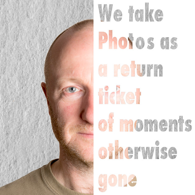
I'm struggling at bit. I have enthusiasm by the barrel full, ideas are always flowing, but I find myself questioning my submissions. Not a bad thing I guess as it 'forces' me to push myself.
Anyway, I'm working on improving my processing skills, specifically masks, layers and composites.
I liked the sentiments of this quote.
This one, I suspect, is a placeholder.
Cheers all and good luck with your Words
 Week 31 Words by aNdy sHeader, on Flickr
I'm struggling at bit. I have enthusiasm by the barrel full, ideas are always flowing, but I find myself questioning my submissions. Not a bad thing I guess as it 'forces' me to push myself.
Anyway, I'm working on improving my processing skills, specifically masks, layers and composites.
I liked the sentiments of this quote.
This one, I suspect, is a placeholder.
Cheers all and good luck with your Words
 Week 31 Words by aNdy sHeader, on Flickr
Last edited:
- Messages
- 11,087
- Name
- Allan
- Edit My Images
- No
Hi Andy, I know what you mean about struggling with it,
portrait is good as are the words just not sure they go together, but as you say a good opportunity to have a play in PS
The main thing is its different, to be honest I am expecting lots of scrabble or spaghetti pics, thats the cynic in me though
portrait is good as are the words just not sure they go together, but as you say a good opportunity to have a play in PS
The main thing is its different, to be honest I am expecting lots of scrabble or spaghetti pics, thats the cynic in me though
- Messages
- 19,461
- Name
- Andy
- Edit My Images
- Yes
Hi Andy, I know what you mean about struggling with it,
portrait is good as are the words just not sure they go together, but as you say a good opportunity to have a play in PS
The main thing is its different, to be honest I am expecting lots of scrabble or spaghetti pics, thats the cynic in me though
Cheers, yup a decent landscape, bathed in a warm sunset would be much better than my mug....alas, it was never going to happen.
My main aim ATM is to try and post something different.
- Messages
- 7,548
- Name
- susie
- Edit My Images
- Yes
Hi Andy ....yes, do keep posting something different, it's an inspiration 
Tears 1....I had to think about it ....but that's just me! Well done for finding such an unusual choice for the theme. I did wonder if a few drops of water on the leaves would have added to it, but that might make it just be too ordinary
Tear 2 ....I prefer the looser crop as suggested by d00d ....definitely very eye catching colours.
Words ...that's a great quote ....I've not seen that before. Very clever the way you've overlaid it on to your face, I like that tiny bit of eye peeping through ticket. m not too sure about the plain white background, maybe it should be more transparent....it that makes sense !!

