You are using an out of date browser. It may not display this or other websites correctly.
You should upgrade or use an alternative browser.
You should upgrade or use an alternative browser.
weekly rpn's 2018 Project 52 - Week 52 SHOWCASE Added (Complete)
- Thread starter rpn
- Start date
OP
- Messages
- 10,485
- Name
- Stan
- Edit My Images
- Yes
Nice Hard shot. Great composition, the square crop suits it too.
Thanks, Ross.
The boiled eggs a little lost but nice idea and bang on theme
Thanks, Allan
OP
- Messages
- 10,485
- Name
- Stan
- Edit My Images
- Yes
Cracking shot for hard Stan, good BG and the plate really sets it off well.
Thanks, Dave.
Good interpretation of hard and I like the composition with the contrasting eggs.
Cheers, Chris. I thought a mixture of quail and chicken eggs would add some interest to the shot.
- Messages
- 4,901
- Name
- Pete
- Edit My Images
- Yes
Hi Stan
I like this image due to the colours involved.
Pete
I like this image due to the colours involved.
Pete
D
Deleted member 68495
Guest
Match: I love the picture of the kayaks in the sea, simple yet powerful.
Hard: The little white egg on the left seems a little lost in the plate but a nice shot nevertheless. I'm impressed by the quail egg at the front as not only is it enormous but it came out ready stamped!")
Hard: The little white egg on the left seems a little lost in the plate but a nice shot nevertheless. I'm impressed by the quail egg at the front as not only is it enormous but it came out ready stamped!
OP
- Messages
- 10,485
- Name
- Stan
- Edit My Images
- Yes
Hi Stan
I like this image due to the colours involved.
Pete
Thanks, Pete.
Match: I love the picture of the kayaks in the sea, simple yet powerful.
Hard: The little white egg on the left seems a little lost in the plate but a nice shot nevertheless. I'm impressed by the quail egg at the front as not only is it enormous but it came out ready stamped!
Cheers, Martin.
It was laid by a rather large quail aka chicken.- Messages
- 4,523
- Name
- Mark Gameson
- Edit My Images
- Yes
Match - 2 great images I like the seascape even though the matching canoes are so small in the frame that gives and sense of scale.
Music - I like the composition and prefer the colour version it holds my attention for longer
Hard - Great take on the theme nicely done.
Music - I like the composition and prefer the colour version it holds my attention for longer
Hard - Great take on the theme nicely done.
OP
- Messages
- 10,485
- Name
- Stan
- Edit My Images
- Yes
So many bugs (not the computer type!) and creepy crawlies here in Cyprus. While sitting outside having my morning coffee I saw this 7 legs spider on the table and quickly grab my camera to capture a few shots before it craws away quickly. Well, as quick as it could I supposed with a leg missing.
The image quality is acceptable considered I only have my Fuji X-T2 with a 'standard' zoom lens with me and it's cropped to 75% full size.
Week 22 - Creatures (very small one)
 Creature by Stan, on Flickr
The image quality is acceptable considered I only have my Fuji X-T2 with a 'standard' zoom lens with me and it's cropped to 75% full size.
Week 22 - Creatures (very small one)
Creature by Stan, on Flickr
OP
- Messages
- 10,485
- Name
- Stan
- Edit My Images
- Yes
Bang on theme Stan, a very well taken shot of the spider.
Thanks, Dave.
Vicious looking thing, good take with just a standard zoom.
Cheers, Chris. It's a tiny wee creature but also jumps too.
Nice likkle Spidey!
Thanks, Dave.
- Messages
- 616
- Name
- Ross
- Edit My Images
- Yes
Well done getting that with a normal zoom. If you hadn't said I probably would have guessed it was taken with a macro lens.
OP
- Messages
- 10,485
- Name
- Stan
- Edit My Images
- Yes
Got a couple of idea for this week's theme and luckily managed to find some spare time to execute both.
Week 23 - Synthetic
 Synthetic Blinds by Stan, on Flickr
Week 23 - Synthetic
Synthetic Blinds by Stan, on Flickr
OP
- Messages
- 10,485
- Name
- Stan
- Edit My Images
- Yes
The second idea is very apt for current music lovers but these are from my younger years! Any idea for the other two albums? First correct answer get a bag of 
Week 23 - Synthetic 2
 Synthetic LP by Stan, on Flickr
Any idea for the other two albums? First correct answer get a bag of Week 23 - Synthetic 2
Synthetic LP by Stan, on Flickr- Messages
- 11,218
- Name
- Tim
- Edit My Images
- Yes
No idea of the albums, I'm not really into that genre of folk rock. But I do prefer the album shot to the blinds.
it has more colour, there has obviously been more work put into the composition and cropping. All in all I feel it's the stronger of the two shots.
it has more colour, there has obviously been more work put into the composition and cropping. All in all I feel it's the stronger of the two shots.
- Messages
- 644
- Name
- John
- Edit My Images
- Yes
On the other hand I think I like the blinds more Great sense of depth. Good idea for the second one and I've no idea either.
Great sense of depth. Good idea for the second one and I've no idea either.- Messages
- 5,382
- Name
- Andrea
- Edit My Images
- Yes
Another catch-up from me, Stan:
Match - not just one, but two strong images! I like them both and they're both perfect for the theme, but being a sucker for the seaside I have to say #1 is my favourite with all that open sea and those two tiny canoes
Musical - good idea and the diagonal composition works well for both, but I prefer the B&W version as it removes the distraction of the brightly coloured buttons.
Hard - another good idea and I like the assorted sizes and colours of the surrounding eggs. Square crop is a great choice for this one.
Creatures - ugh! Excellent detailed study, especially with just a standard zoom. Moving swiftly on......
Music - two really strong images and #1 is my favourite by a short head from the albums. I like the strong lines and shallow DOF in the the image of the blinds, but I also like the layout and strong colours in #2. Good ideas
OP
- Messages
- 10,485
- Name
- Stan
- Edit My Images
- Yes
No idea of the albums, I'm not really into that genre of folk rock. But I do prefer the album shot to the blinds.
it has more colour, there has obviously been more work put into the composition and cropping. All in all I feel it's the stronger of the two shots.
Cheers, Tim. I took the 'Blinds' shot quite early on as 'insurance' in case I don't have other ideas.
On the other hand I think I like the blinds more
Thanks, John.
OP
- Messages
- 10,485
- Name
- Stan
- Edit My Images
- Yes
CSNY: Deja Vu
But the blind shot is a cracker and definitely says synthetic.
Thanks, David. Spot on with the LP. The others are Moody Blues' To Our Children's Children's Children and Bob Dylan's Greatest Hits.
Album photo for me, as Tim says it's a good composition (see what I did there
Thanks, Chris.
- Messages
- 4,901
- Name
- Pete
- Edit My Images
- Yes
Hi Stan
Creature, fits the theme and good job considering the limitation of equipment available. Surely he could only run in circles given he had a missing leg.
Synthectic, Blinds, bit of a mediocre subject, would I think prefer a larger depth of field. Albums is much more interesting, but the light I think is in the wrong place. To me it should be on the left of the record. Just my 2ps worth.
Pete
OP
- Messages
- 10,485
- Name
- Stan
- Edit My Images
- Yes
Like the idea of the blinds, good use of dof, but the records take top spot for me Stan, I like that bit of colour in there and I quite like the composition you have used too.
Cheers, Michael. I like both hence why I posted them.
Another catch-up from me, Stan:
Match - not just one, but two strong images! I like them both and they're both perfect for the theme, but being a sucker for the seaside I have to say #1 is my favourite with all that open sea and those two tiny canoes
Musical - good idea and the diagonal composition works well for both, but I prefer the B&W version as it removes the distraction of the brightly coloured buttons.
Hard - another good idea and I like the assorted sizes and colours of the surrounding eggs. Square crop is a great choice for this one.
Creatures - ugh! Excellent detailed study, especially with just a standard zoom. Moving swiftly on......
Music - two really strong images and #1 is my favourite by a short head from the albums. I like the strong lines and shallow DOF in the the image of the blinds, but I also like the layout and strong colours in #2. Good ideas
Thanks, Andrea for the catch-up comments and in-depth critique.
OP
- Messages
- 10,485
- Name
- Stan
- Edit My Images
- Yes
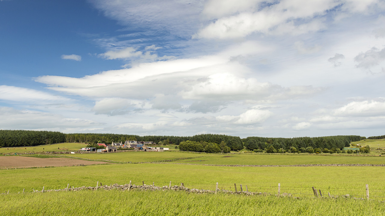
Plenty of rural areas near where I live but finding an available and safe access viewpoint for photography is harder than I thought. At the same time I was hoping for a late evening/golden hour shot but the weather just not playing ball. This is the one I prefer out of about half a dozen others. Not sure a tighter crop would be better but I quite like the sky/cloud formation in this.
Week 24 - Rural
 Rural Cairnpark by Stan, on Flickr
Week 24 - Rural
Rural Cairnpark by Stan, on Flickr- Messages
- 5,382
- Name
- Andrea
- Edit My Images
- Yes
That's a lovely scene, Stan, with beautiful colours. I scrolled the page to lose the fence at the bottom and I think you might have got away with that crop because of the huge blue sky, but it's personal taste and this certainly shouts rural and shows some lovely features of the countryside. I really like it
OP
- Messages
- 10,485
- Name
- Stan
- Edit My Images
- Yes
Nice rural scene not sure about the crop also but I think it’s ok as the only other option would be to lose a bit off the sky and as you say the sky is quite a major part of the picture, so sorry no help at all
Thanks, Allan. Great help and good to have your thoughts and comments.
That's a lovely scene, Stan, with beautiful colours. I scrolled the page to lose the fence at the bottom and I think you might have got away with that crop because of the huge blue sky, but it's personal taste and this certainly shouts rural and shows some lovely features of the countryside. I really like it
Thanks, Andrea. I want to keep the wall/fence there to add some interest and to break up an otherwise a boring foreground.
OP
- Messages
- 10,485
- Name
- Stan
- Edit My Images
- Yes
I would certainly keep the blue sky, it's great, and the use of the bottom 3rd for the horizon works.
I think it would be a bit boring without the colours, but the colours are there, and they make the shot
Cheers, Tim. I want that 1/3 ground and 2/3 sky just to show off the interesting cloud formations.