
OP
- Messages
- 10,485
- Name
- Stan
- Edit My Images
- Yes
Hi Stan,
Lost - You would have been in trouble if you'd lost it for real.
The contrast of the pink and the blue works nicely. I do like the DoF you've used there, with the background out of focus, but this eminently recognisable.
Monstrous - Wow, that certainly shows the power of the waves. Excellent. not much more to say!
Thanks, Tim.
Two excellent shots for monstrous, good white wave against the dark grey sky.
Cheers, Chris.
 Balance
")
")

 Crushed
 Flattened
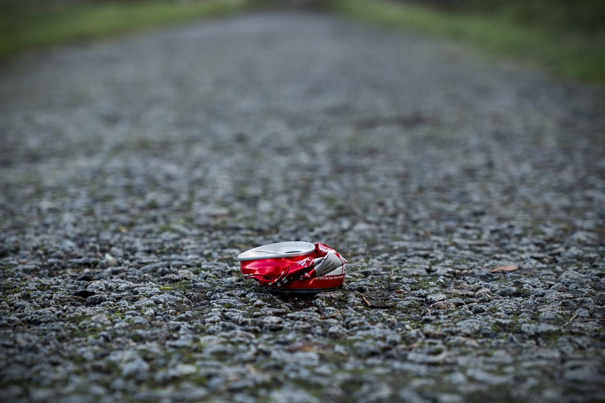

 Vehicle in Motion
 Wind In Motion
")
 Energy In Motion
 Wind Trio