You are using an out of date browser. It may not display this or other websites correctly.
You should upgrade or use an alternative browser.
You should upgrade or use an alternative browser.
weekly Wornish's 52 2022 Week 52 added : Showcase
- Thread starter wornish
- Start date
- Messages
- 4,689
- Name
- Pete
- Edit My Images
- Yes
I prefer the warmth of the colour Tools, I think more contrast could make both the B&W and colour tools stand out from the workbench a bit more.
- Messages
- 245
- Name
- Simon
- Edit My Images
- Yes
Love the deep colours of the wood, and the background really complements it - as well as the vignette to focus the eye - really nice image!
- Messages
- 3,145
- Name
- bill
- Edit My Images
- Yes
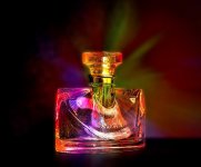
I think your chosen one is the one for me David, I like the lighting and how the colours play off of each other.
- Messages
- 3,145
- Name
- bill
- Edit My Images
- Yes
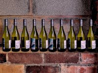
I think the first and last one for me David. Good job compositing the first one. I didn't realize until I read your post.
- Messages
- 7,134
- Edit My Images
- No
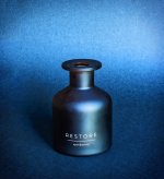
I confess I had to count them  My favourite is the colourful bottle - love it!
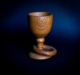
Edit: Receptacle (just catching up on comments): What a lovely subject and how clever you are! I really like the subdues lighting and background. Really brings out the warm tones of the wood.
Edit: Receptacle (just catching up on comments): What a lovely subject and how clever you are! I really like the subdues lighting and background. Really brings out the warm tones of the wood.
Last edited:
- Messages
- 516
- Name
- John
- Edit My Images
- Yes
......... I wouldn't have guessed that the first was a composite.
Me niether. I thought you may have had a good deal on a case of wine
I think I would have taken 10 pictures and turned the bottle slightly after every shot so that you have a 360 degree view by the end.
Very nice tho'
- Messages
- 1,673
- Name
- David
- Edit My Images
- Yes
Thanks all for the comments. I was in two minds between the colourful bottle and the 10 green bottles, that song came into my head so I went with that.
I also thought the colourful bottle was kind of similar to the goblet shot I used for the receptacle theme.
Unfortunately, I didn't have a case of wine to take an all in one shot hence the composite.
I also thought the colourful bottle was kind of similar to the goblet shot I used for the receptacle theme.
Unfortunately, I didn't have a case of wine to take an all in one shot hence the composite.
Last edited:
- Messages
- 2,836
- Name
- Pete
- Edit My Images
- No
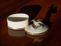
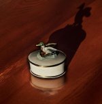
Number three for me as I like the colours and crop.
- Messages
- 1,293
- Name
- Stuart
- Edit My Images
- Yes
New - Great vibrant colours and a good image for the technique too.
Old - I though the hammer was bigger until I compared it to the chisel. Hard to choose between the colour and mono versions with both having different appealing features.
Receptacle - A lovely wood turned goblet, I don't recall ever using a lathe at school. The lighting is well handled showing of the texture of the wood.
Bottles - I didn't think it was a composite so well done on that front, as another member commented having a 360 degree view across the bottles would have been interesting to see. I also like the burst of colour in your 3rd image too.
- Messages
- 1,673
- Name
- David
- Edit My Images
- Yes
Blimey. This is a new experience getting so much feedback. Thanks for the comments.
The 52 challenge is certainly something I wish I had joined in previous years. Seeing all the different entries and comments really makes you try and do something a bit different.
The 52 challenge is certainly something I wish I had joined in previous years. Seeing all the different entries and comments really makes you try and do something a bit different.
- Messages
- 3,145
- Name
- bill
- Edit My Images
- Yes
That is beautiful David. Well done.

